- Published on
Advanced Guide: Make A Buttons With Icons With Tailwind CSS
- What is Tailwind CSS?
- The description of Buttons with icons UI component
- Why use Tailwind CSS to create a Buttons with icons UI component?
- The preview of Buttons with icons UI component
- The source code of Buttons with icons UI component
- How to create a Buttons with icons with Tailwind CSS?
- Step 1: Set up your project
- Step 2: Create HTML markup
- Step 3: Add Tailwind CSS classes
- Step 4: Customize your Buttons with icons UI component
- Conclusion
As a FrontEnd technology blogger, it's essential to stay up-to-date with the latest trends and tools in the industry. One such tool that has gained popularity in recent years is Tailwind CSS. It's a utility-first CSS framework that makes it easy to create responsive and customizable designs. In this article, we'll explore how to create a Buttons with icons UI component with Tailwind CSS.
What is Tailwind CSS?
Tailwind CSS is a utility-first CSS framework that provides a set of pre-defined classes to style HTML elements. It's different from other CSS frameworks like Bootstrap and Foundation, which provide pre-built components. With Tailwind CSS, you can create your own custom components by combining different classes.
The description of Buttons with icons UI component
Buttons with icons are a common UI component used in web applications. They allow users to perform actions by clicking on a button that has an icon associated with it. Buttons with icons are often used in navigation menus, toolbars, and forms.
Why use Tailwind CSS to create a Buttons with icons UI component?
Tailwind CSS makes it easy to create custom UI components without writing any CSS code. With Tailwind CSS, you can use pre-defined classes to style your HTML elements. This saves time and effort, as you don't have to write CSS code from scratch.
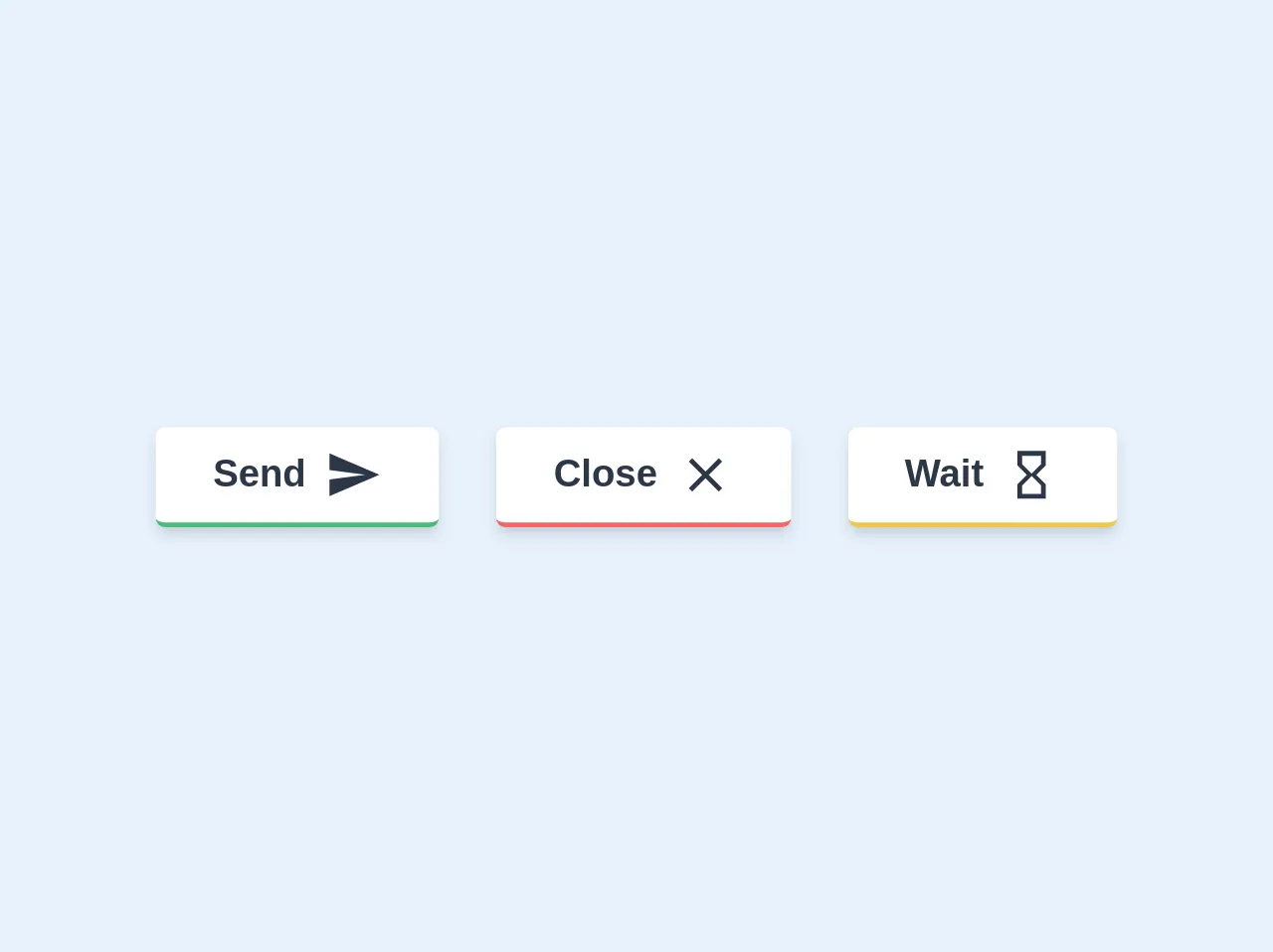
The preview of Buttons with icons UI component
Buttons with icons UI component are an essential part of any web application. They allow users to perform actions quickly and efficiently. In this tutorial, we'll show you how to create a Buttons with icons UI component using Tailwind CSS.
Free download of the Buttons with icons's source code
The source code of Buttons with icons UI component
To create a Buttons with icons UI component, you need to write HTML and CSS code. With Tailwind CSS, you can use pre-defined classes to style your HTML elements. Here's an example of the HTML and CSS code for a Buttons with icons UI component.
<div class="flex items-center justify-center">
  <div class="m-3">
    <button class="bg-white text-gray-800 font-bold rounded border-b-2 border-green-500 hover:border-green-600 hover:bg-green-500 hover:text-white shadow-md py-2 px-6 inline-flex items-center">
      <span class="mr-2">Send</span>
      <svg xmlns="http://www.w3.org/2000/svg" width="24" height="24" viewBox="0 0 24 24">
        <path fill="currentcolor" d="M2.01 21L23 12 2.01 3 2 10l15 2-15 2z"></path>
      </svg>
    </button>
  </div>

  <div class="m-3">
    <button class="bg-white text-gray-800 font-bold rounded border-b-2 border-red-500 hover:border-red-600 hover:bg-red-500 hover:text-white shadow-md py-2 px-6 inline-flex items-center">
      <span class="mr-2">Close</span>
      <svg xmlns="http://www.w3.org/2000/svg" width="24" height="24" viewBox="0 0 24 24">
       <path fill="currentcolor" d="M19 6.41L17.59 5 12 10.59 6.41 5 5 6.41 10.59 12 5 17.59 6.41 19 12 13.41 17.59 19 19 17.59 13.41 12 19 6.41z"/>
      </svg>
    </button>
  </div>

  <div class="m-3">
    <button class="bg-white text-gray-800 font-bold rounded border-b-2 border-yellow-500 hover:border-yellow-600 hover:bg-yellow-500 hover:text-white shadow-md py-2 px-6 inline-flex items-center">
      <span class="mr-2">Wait</span>
      <svg xmlns="http://www.w3.org/2000/svg" width="24" height="24" viewBox="0 0 24 24">
        <path fill="currentcolor" d="M6 2v6h.01L6 8.01 10 12l-4 4 .01.01H6V22h12v-5.99h-.01L18 16l-4-4 4-3.99-.01-.01H18V2H6zm10 14.5V20H8v-3.5l4-4 4 4zm-4-5l-4-4V4h8v3.5l-4 4z"></path>
      </svg>
    </button>
  </div>
 </div>
How to create a Buttons with icons with Tailwind CSS?
To create a Buttons with icons UI component with Tailwind CSS, follow these steps:
Step 1: Set up your project
To use Tailwind CSS in your project, you need to install it. You can install Tailwind CSS using npm or yarn. Here's how to install Tailwind CSS using npm:
npm install tailwindcss
Step 2: Create HTML markup
Create an HTML file and add the following markup:
<button class="bg-blue-500 hover:bg-blue-700 text-white font-bold py-2 px-4 rounded">
  <i class="fas fa-plus"></i> Add Item
</button>
In this markup, we're using the button element and adding the bg-blue-500 class to set the background color to blue. We're also using the hover:bg-blue-700 class to change the background color when the button is hovered over. The text-white class sets the text color to white, and the font-bold class makes the text bold. The py-2 and px-4 classes set the padding of the button, and the rounded class makes the button rounded. We're also adding an icon using the i element and the fas fa-plus class.
Step 3: Add Tailwind CSS classes
To add Tailwind CSS classes to your HTML markup, you need to create a tailwind.css file and add the following code:
@tailwind base;
@tailwind components;
@tailwind utilities;
This code imports the base, components, and utilities styles from Tailwind CSS. You can then add Tailwind CSS classes to your HTML markup.
Step 4: Customize your Buttons with icons UI component
You can customize your Buttons with icons UI component by changing the Tailwind CSS classes. For example, you can change the background color by using a different color class, or you can change the icon by using a different icon class.
Conclusion
In this article, we've explored how to create a Buttons with icons UI component with Tailwind CSS. With Tailwind CSS, you can create custom UI components without writing any CSS code. Buttons with icons are an essential part of any web application, and Tailwind CSS makes it easy to create them. By following the steps outlined in this article, you can create your own Buttons with icons UI component in no time.