- Published on
6 Critical Skills To Build A Buttons With Tailwind CSS Remarkably Well
- What is Tailwind CSS?
- The description of buttons UI component
- Why use Tailwind CSS to create a buttons UI component?
- The preview of buttons UI component
- The source code of buttons UI component
- How to create a buttons with Tailwind CSS?
- Step 1: Set up Tailwind CSS
- Step 2: Create a button
- Step 3: Customize the button
- Step 4: Create a custom button
- Conclusion
What is Tailwind CSS?
Tailwind CSS is a utility-first CSS framework that provides a set of pre-defined classes to create responsive and customizable user interfaces. It allows developers to build complex UI components quickly and efficiently, without having to write custom CSS code.
The description of buttons UI component
Buttons are one of the most commonly used UI components in web development. They are used to trigger actions, submit forms, or navigate to different pages. Buttons can be styled in various ways, such as primary, secondary, success, danger, and warning.
Why use Tailwind CSS to create a buttons UI component?
Tailwind CSS provides a set of pre-defined classes that can be used to create buttons with different styles and sizes. It also allows developers to customize the appearance of buttons by modifying the default configuration or creating custom classes.
Using Tailwind CSS to create buttons UI components has several advantages:
- Consistent styling: Tailwind CSS provides a consistent set of classes that can be used to style buttons across the entire application.
- Faster development: With Tailwind CSS, developers can create buttons quickly and efficiently, without having to write custom CSS code.
- Easy customization: Tailwind CSS allows developers to customize the appearance of buttons by modifying the default configuration or creating custom classes.
- Responsive design: Tailwind CSS provides responsive classes that can be used to create buttons that adapt to different screen sizes.
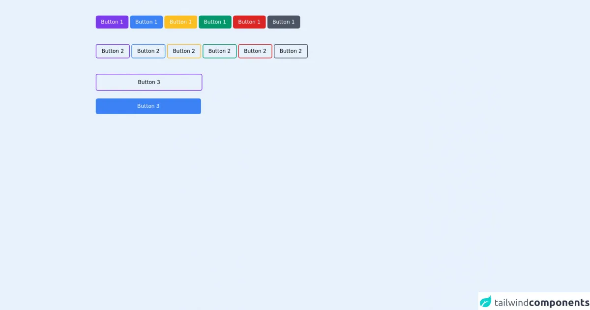
The preview of buttons UI component
Buttons UI components can be styled in various ways, such as primary, secondary, success, danger, and warning. They can also have different sizes and shapes. Here's a preview of some of the buttons that can be created with Tailwind CSS:
Free download of the buttons's source code
The source code of buttons UI component
Creating buttons with Tailwind CSS is easy and efficient. Developers can use pre-defined classes or create custom classes to style buttons. Here's an example of how to create a primary button with Tailwind CSS:
<div class="container mx-auto pr-6 pl-6 md:pr-24 md:pl-26 pt-6 pb-6 mt-6">
  <button class="bg-purple-600 text-white px-4 py-2 rounded-md text-1xl font-medium hover:bg-purple-800 transition duration-300">Button 1</button>
  <button class="bg-blue-500 text-white px-4 py-2 rounded-md text-1xl font-medium hover:bg-blue-700 transition duration-300">Button 1</button>
  <button class="bg-yellow-400 text-white px-4 py-2 rounded-md text-1xl font-medium hover:bg-yellow-600 transition duration-300">Button 1</button>
  <button class="bg-green-600 text-white px-4 py-2 rounded-md text-1xl font-medium hover:bg-green-700 transition duration-300">Button 1</button>
  <button class="bg-red-600 text-white px-4 py-2 rounded-md text-1xl font-medium hover:bg-red-700 transition duration-300">Button 1</button>
  <button class="bg-gray-600 text-white px-4 py-2 rounded-md text-1xl font-medium hover:bg-gray-700 transition duration-300">Button 1</button>
  <br/><br/><br/>
  <button class="border-2 border-purple-600 text-black px-4 py-2 rounded-md text-1xl font-medium hover:bg-purple-600 transition duration-300">Button 2</button>
  <button class="border-2 border-blue-500 text-black px-4 py-2 rounded-md text-1xl font-medium hover:bg-blue-500 transition duration-300">Button 2</button>
  <button class="border-2 border-yellow-400 text-black px-4 py-2 rounded-md text-1xl font-medium hover:bg-yellow-400 transition duration-300">Button 2</button>
  <button class="border-2 border-green-600 text-black px-4 py-2 rounded-md text-1xl font-medium hover:bg-green-600 transition duration-300">Button 2</button>
  <button class="border-2 border-red-600 text-black px-4 py-2 rounded-md text-1xl font-medium hover:bg-red-600 transition duration-300">Button 2</button>
  <button class="border-2 border-gray-600 text-black px-4 py-2 rounded-md text-1xl font-medium hover:bg-gray-600 transition duration-300">Button 2</button>
   <br/><br/><br/>
  <button class="border-2 border-purple-600 text-black px-32 py-3 rounded-md text-1xl font-medium hover:bg-purple-600 transition duration-300">Button 3</button>
  <br/><br/>
  <button class="bg-blue-500 text-white px-32 py-3 rounded-md text-1xl font-medium hover:bg-blue-700 transition duration-300">Button 3</button>
 </div>
How to create a buttons with Tailwind CSS?
To create a button with Tailwind CSS, follow these steps:
Step 1: Set up Tailwind CSS
To use Tailwind CSS, you need to install it in your project. You can install it via npm or yarn:
npm install tailwindcss
or
yarn add tailwindcss
After installing Tailwind CSS, you need to create a configuration file. You can do this by running the following command:
npx tailwindcss init
This will create a tailwind.config.js file in your project directory.
Step 2: Create a button
To create a button, you need to add the btn class to an HTML element, such as a button or a tag. You can also add other classes to style the button, such as bg-primary for a primary button or bg-secondary for a secondary button.
Here's an example of a primary button:
<button class="btn bg-primary text-white px-4 py-2 rounded-md">Click me</button>
In this example, we're using the btn, bg-primary, text-white, px-4, py-2, and rounded-md classes to create a primary button with white text, a padding of 4 pixels on the x-axis and 2 pixels on the y-axis, and rounded corners.
Step 3: Customize the button
Tailwind CSS provides a set of pre-defined classes that can be used to customize the appearance of buttons. For example, you can use the hover:bg-primary class to change the background color of a button when it's hovered over.
Here's an example of a primary button with a hover effect:
<button class="btn bg-primary text-white px-4 py-2 rounded-md hover:bg-secondary">Click me</button>
In this example, we're using the hover:bg-secondary class to change the background color of the button to secondary when it's hovered over.
Step 4: Create a custom button
If you want to create a custom button, you can use Tailwind CSS to define your own classes. For example, you can create a class called btn-primary to create a primary button with a custom color.
Here's an example of a custom primary button:
<button class="btn btn-primary text-white px-4 py-2 rounded-md">Click me</button>
In this example, we're using the btn and btn-primary classes to create a primary button with a custom color.
To define the btn-primary class, you need to add it to the backgroundColor property in the theme section of your tailwind.config.js file:
module.exports = {
  theme: {
    extend: {
      backgroundColor: {
        'primary': '#3490dc',
      }
    }
  },
  variants: {},
  plugins: [],
}
Conclusion
Creating buttons UI components with Tailwind CSS is easy and efficient. With a set of pre-defined classes and easy customization, developers can create buttons that are consistent, responsive, and visually appealing. By following the steps outlined in this article, you can create buttons with Tailwind CSS that meet your specific needs and requirements.