- Published on
Imagine You Create A Buttons With Tailwind CSS Like An Expert. Follow These 6 Steps To Get There
- What is Tailwind CSS?
- The description of Buttons ui component
- Why use Tailwind CSS to create a Buttons ui component?
- The preview of Buttons ui component.
- The source code of Buttons ui component.
- How to create a Buttons with Tailwind CSS?
- Step 1: Install Tailwind CSS
- Step 2: Create a Tailwind CSS configuration file
- Step 3: Create a HTML file
- Step 4: Create a CSS file
- Step 5: Compile the CSS file
- Step 6: Link the CSS file to the HTML file
- Conclusion
As a FrontEnd technology blogger, you must have heard of Tailwind CSS. Tailwind CSS is a utility-first CSS framework that helps developers create beautiful and responsive websites with ease. In this article, we will explore how to create a Buttons UI component using Tailwind CSS.
What is Tailwind CSS?
Tailwind CSS is a utility-first CSS framework that provides a set of pre-defined CSS classes to help developers create responsive and beautiful websites. Unlike other CSS frameworks, Tailwind CSS does not have pre-defined UI components. Instead, it provides a set of utility classes that developers can use to create their own UI components.
The description of Buttons ui component
Buttons are one of the most common UI components used in web development. They are used to trigger actions, navigate to different pages, and perform other tasks. A button usually consists of a label and an icon, and it can have different styles based on its purpose.
Why use Tailwind CSS to create a Buttons ui component?
Tailwind CSS provides a set of utility classes that can be used to create different styles of buttons. These classes can be combined to create custom styles, and they are also responsive, which means that they can adapt to different screen sizes.
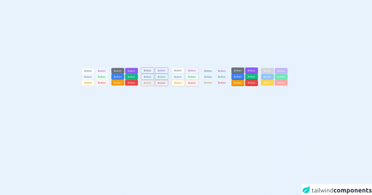
The preview of Buttons ui component.
To create a Buttons UI component using Tailwind CSS, we will use the following classes:
bg-blue-500: sets the background color of the button to bluetext-white: sets the text color of the button to whitepy-2: sets the padding on the top and bottom of the button to 2px-4: sets the padding on the left and right of the button to 4rounded-md: rounds the corners of the button
Free download of the Buttons's source code
The source code of Buttons ui component.
To create a button with Tailwind CSS, we can use the following HTML code:
<button class="bg-blue-500 text-white py-2 px-4 rounded-md">
  Click me
</button>
<div class="mb-4">
    <button class="px-4 py-2 rounded-md text-sm font-medium border-0 focus:outline-none focus:ring transition text-gray-600 bg-gray-50 hover:text-gray-800 hover:bg-gray-100 active:bg-gray-200 focus:ring-gray-300" type="submit">Button</button>
    <button class="px-4 py-2 rounded-md text-sm font-medium border-0 focus:outline-none focus:ring transition text-purple-600 bg-purple-50 hover:text-purple-800 hover:bg-purple-100 active:bg-purple-200 focus:ring-purple-300" type="submit">Button</button>
    <button class="px-4 py-2 rounded-md text-sm font-medium border-0 focus:outline-none focus:ring transition text-blue-600 bg-blue-50 hover:text-blue-800 hover:bg-blue-100 active:bg-blue-200 focus:ring-blue-300" type="submit">Button</button>
    <button class="px-4 py-2 rounded-md text-sm font-medium border-0 focus:outline-none focus:ring transition text-green-600 bg-green-50 hover:text-green-800 hover:bg-green-100 active:bg-green-200 focus:ring-green-300" type="submit">Button</button>
    <button class="px-4 py-2 rounded-md text-sm font-medium border-0 focus:outline-none focus:ring transition text-yellow-600 bg-yellow-50 hover:text-yellow-800 hover:bg-yellow-100 active:bg-yellow-200 focus:ring-yellow-300" type="submit">Button</button>
    <button class="px-4 py-2 rounded-md text-sm font-medium border-0 focus:outline-none focus:ring transition text-red-600 bg-red-50 hover:text-red-800 hover:bg-red-100 active:bg-red-200 focus:ring-red-300" type="submit">Button</button>
  </div>

  <div class="mb-4">
    <button class="px-4 py-2 rounded-md text-sm font-medium border-0 focus:outline-none focus:ring transition text-white bg-gray-500 hover:bg-gray-600 active:bg-gray-700 focus:ring-gray-300" type="submit">Button</button>
    <button class="px-4 py-2 rounded-md text-sm font-medium border-0 focus:outline-none focus:ring transition text-white bg-purple-500 hover:bg-purple-600 active:bg-purple-700 focus:ring-purple-300" type="submit">Button</button>
    <button class="px-4 py-2 rounded-md text-sm font-medium border-0 focus:outline-none focus:ring transition text-white bg-blue-500 hover:bg-blue-600 active:bg-blue-700 focus:ring-blue-300" type="submit">Button</button>
    <button class="px-4 py-2 rounded-md text-sm font-medium border-0 focus:outline-none focus:ring transition text-white bg-green-500 hover:bg-green-600 active:bg-green-700 focus:ring-green-300" type="submit">Button</button>
    <button class="px-4 py-2 rounded-md text-sm font-medium border-0 focus:outline-none focus:ring transition text-white bg-yellow-500 hover:bg-yellow-600 active:bg-yellow-700 focus:ring-yellow-300" type="submit">Button</button>
    <button class="px-4 py-2 rounded-md text-sm font-medium border-0 focus:outline-none focus:ring transition text-white bg-red-500 hover:bg-red-600 active:bg-red-700 focus:ring-red-300" type="submit">Button</button>
  </div>

  <div class="mb-4">
    <button class="px-4 py-2 rounded-md text-sm font-medium border focus:outline-none focus:ring transition text-gray-600 border-gray-600 hover:text-white hover:bg-gray-600 active:bg-gray-700 focus:ring-gray-300" type="submit">Button</button>
    <button class="px-4 py-2 rounded-md text-sm font-medium border focus:outline-none focus:ring transition text-purple-600 border-purple-600 hover:text-white hover:bg-purple-600 active:bg-purple-700 focus:ring-purple-300" type="submit">Button</button>
    <button class="px-4 py-2 rounded-md text-sm font-medium border focus:outline-none focus:ring transition text-blue-600 border-blue-600 hover:text-white hover:bg-blue-600 active:bg-blue-700 focus:ring-blue-300" type="submit">Button</button>
    <button class="px-4 py-2 rounded-md text-sm font-medium border focus:outline-none focus:ring transition text-green-600 border-green-600 hover:text-white hover:bg-green-600 active:bg-green-700 focus:ring-green-300" type="submit">Button</button>
    <button class="px-4 py-2 rounded-md text-sm font-medium border focus:outline-none focus:ring transition text-yellow-600 border-yellow-600 hover:text-white hover:bg-yellow-600 active:bg-yellow-700 focus:ring-yellow-300" type="submit">Button</button>
    <button class="px-4 py-2 rounded-md text-sm font-medium border focus:outline-none focus:ring transition text-red-600 border-red-600 hover:text-white hover:bg-red-600 active:bg-red-700 focus:ring-red-300" type="submit">Button</button>
  </div>

  <div class="mb-4">
    <button class="px-4 py-2 rounded-md text-sm font-medium border shadow focus:outline-none focus:ring transition text-gray-600 bg-gray-50 border-gray-200 hover:bg-gray-100 active:bg-gray-200 focus:ring-gray-300" type="submit">Button</button>
    <button class="px-4 py-2 rounded-md text-sm font-medium border shadow focus:outline-none focus:ring transition text-purple-600 bg-purple-50 border-purple-200 hover:bg-purple-100 active:bg-purple-200 focus:ring-purple-300" type="submit">Button</button>
    <button class="px-4 py-2 rounded-md text-sm font-medium border shadow focus:outline-none focus:ring transition text-blue-600 bg-blue-50 border-blue-200 hover:bg-blue-100 active:bg-blue-200 focus:ring-blue-300" type="submit">Button</button>
    <button class="px-4 py-2 rounded-md text-sm font-medium border shadow focus:outline-none focus:ring transition text-green-600 bg-green-50 border-green-200 hover:bg-green-100 active:bg-green-200 focus:ring-green-300" type="submit">Button</button>
    <button class="px-4 py-2 rounded-md text-sm font-medium border shadow focus:outline-none focus:ring transition text-yellow-600 bg-yellow-50 border-yellow-200 hover:bg-yellow-100 active:bg-yellow-200 focus:ring-yellow-300" type="submit">Button</button>
    <button class="px-4 py-2 rounded-md text-sm font-medium border shadow focus:outline-none focus:ring transition text-red-600 bg-red-50 border-red-200 hover:bg-red-100 active:bg-red-200 focus:ring-red-300" type="submit">Button</button>
  </div>

  <div class="mb-4">
    <button class="px-4 py-2 rounded-md text-sm font-medium focus:outline-none focus:ring transition text-gray-600 hover:bg-gray-50 active:bg-gray-100 focus:ring-gray-300" type="submit">Button</button>
    <button class="px-4 py-2 rounded-md text-sm font-medium focus:outline-none focus:ring transition text-purple-600 hover:bg-purple-50 active:bg-purple-100 focus:ring-purple-300" type="submit">Button</button>
    <button class="px-4 py-2 rounded-md text-sm font-medium focus:outline-none focus:ring transition text-blue-600 hover:bg-blue-50 active:bg-blue-100 focus:ring-blue-300" type="submit">Button</button>
    <button class="px-4 py-2 rounded-md text-sm font-medium focus:outline-none focus:ring transition text-green-600 hover:bg-green-50 active:bg-green-100 focus:ring-green-300" type="submit">Button</button>
    <button class="px-4 py-2 rounded-md text-sm font-medium focus:outline-none focus:ring transition text-yellow-600 hover:bg-yellow-50 active:bg-yellow-100 focus:ring-yellow-300" type="submit">Button</button>
    <button class="px-4 py-2 rounded-md text-sm font-medium focus:outline-none focus:ring transition text-red-600 hover:bg-red-50 active:bg-red-100 focus:ring-red-300" type="submit">Button</button>
  </div>

  <div class="mb-4">
    <button class="px-4 py-2 rounded-md text-sm font-medium border-b-2 focus:outline-none focus:ring transition text-white bg-gray-500 border-gray-800 hover:bg-gray-600 active:bg-gray-700 focus:ring-gray-300" type="submit">Button</button>
    <button class="px-4 py-2 rounded-md text-sm font-medium border-b-2 focus:outline-none focus:ring transition text-white bg-purple-500 border-purple-800 hover:bg-purple-600 active:bg-purple-700 focus:ring-purple-300" type="submit">Button</button>
    <button class="px-4 py-2 rounded-md text-sm font-medium border-b-2 focus:outline-none focus:ring transition text-white bg-blue-500 border-blue-800 hover:bg-blue-600 active:bg-blue-700 focus:ring-blue-300" type="submit">Button</button>
    <button class="px-4 py-2 rounded-md text-sm font-medium border-b-2 focus:outline-none focus:ring transition text-white bg-green-500 border-green-800 hover:bg-green-600 active:bg-green-700 focus:ring-green-300" type="submit">Button</button>
    <button class="px-4 py-2 rounded-md text-sm font-medium border-b-2 focus:outline-none focus:ring transition text-white bg-yellow-500 border-yellow-800 hover:bg-yellow-600 active:bg-yellow-700 focus:ring-yellow-300" type="submit">Button</button>
    <button class="px-4 py-2 rounded-md text-sm font-medium border-b-2 focus:outline-none focus:ring transition text-white bg-red-500 border-red-800 hover:bg-red-600 active:bg-red-700 focus:ring-red-300" type="submit">Button</button>
  </div>

  <div class="mb-4">
    <button disabled class="px-4 py-2 rounded-md cursor-default text-sm font-medium focus:outline-none focus:ring transition text-white bg-gray-300 focus:ring-gray-200" type="submit">Button</button>
    <button disabled class="px-4 py-2 rounded-md cursor-default text-sm font-medium focus:outline-none focus:ring transition text-white bg-purple-300 focus:ring-purple-200" type="submit">Button</button>
    <button disabled class="px-4 py-2 rounded-md cursor-default text-sm font-medium focus:outline-none focus:ring transition text-white bg-blue-300 focus:ring-blue-200" type="submit">Button</button>
    <button disabled class="px-4 py-2 rounded-md cursor-default text-sm font-medium focus:outline-none focus:ring transition text-white bg-green-300 focus:ring-green-200" type="submit">Button</button>
    <button disabled class="px-4 py-2 rounded-md cursor-default text-sm font-medium focus:outline-none focus:ring transition text-white bg-yellow-300 focus:ring-yellow-200" type="submit">Button</button>
    <button disabled class="px-4 py-2 rounded-md cursor-default text-sm font-medium focus:outline-none focus:ring transition text-white bg-red-300 focus:ring-red-200" type="submit">Button</button>
  </div>
How to create a Buttons with Tailwind CSS?
Now that we have an idea of what classes we need to create a button, let's go through the steps to create a Buttons UI component using Tailwind CSS.
Step 1: Install Tailwind CSS
The first step is to install Tailwind CSS. You can install Tailwind CSS using npm or yarn. Here's how to install it using npm:
npm install tailwindcss
Step 2: Create a Tailwind CSS configuration file
After installing Tailwind CSS, you need to create a configuration file. You can create a configuration file using the following command:
npx tailwindcss init
This will create a tailwind.config.js file in your project directory.
Step 3: Create a HTML file
Next, create an HTML file where you will add the button. You can create a new file called index.html and add the following code:
<!DOCTYPE html>
<html>
  <head>
    <title>Buttons UI Component</title>
    <link rel="stylesheet" href="./styles.css">
  </head>
  <body>
    <button class="bg-blue-500 text-white py-2 px-4 rounded-md">
      Click me
    </button>
  </body>
</html>
Step 4: Create a CSS file
Create a new file called styles.css in your project directory. This is where you will add the Tailwind CSS classes for the button. Add the following code to the styles.css file:
@tailwind base;
@tailwind components;
@tailwind utilities;

/* Add custom styles here */
This code imports the base, components, and utilities styles from Tailwind CSS. You can add your custom styles below this code.
Step 5: Compile the CSS file
To compile the CSS file, you need to run the following command:
npx tailwindcss build styles.css -o output.css
This will compile the styles.css file and output the compiled CSS to a file called output.css.
Step 6: Link the CSS file to the HTML file
Finally, link the compiled CSS file to the HTML file by adding the following code to the head section of the HTML file:
<link rel="stylesheet" href="./output.css">
Now you should see the button with the blue background and white text.
Conclusion
In this article, we explored how to create a Buttons UI component using Tailwind CSS. We learned about the different classes that can be used to create buttons and went through the steps to create a button using Tailwind CSS. With Tailwind CSS, you can create beautiful and responsive UI components with ease.