- Published on
Practical Guide: Build A Button Pack With Tailwind CSS
- What is Tailwind CSS?
- The description of Button Pack ui component
- Why use Tailwind CSS to create a Button Pack ui component?
- The preview of Button Pack ui component.
- The source code of Button Pack ui component.
- How to create a Button Pack with Tailwind CSS?
- Step 1: Set up the HTML
- Step 2: Style the buttons
- Step 3: Add the button pack to your web application
- Conclusion
As a FrontEnd technology blogger, you must be familiar with Tailwind CSS, a utility-first CSS framework that helps you quickly build custom designs. In this article, we will guide you through the process of building a button pack with Tailwind CSS.
What is Tailwind CSS?
Tailwind CSS is a utility-first CSS framework that provides a set of pre-defined CSS classes that you can use to style your HTML elements. Instead of writing custom CSS, you can use Tailwind CSS classes to quickly create custom designs.
The description of Button Pack ui component
A button pack is a collection of buttons with different styles and sizes that you can use in your web applications. A button pack usually includes primary, secondary, success, warning, and danger buttons, as well as buttons with different sizes.
Why use Tailwind CSS to create a Button Pack ui component?
Tailwind CSS provides a set of pre-defined CSS classes that you can use to quickly create custom designs. By using Tailwind CSS, you can save a lot of time and effort in writing custom CSS.
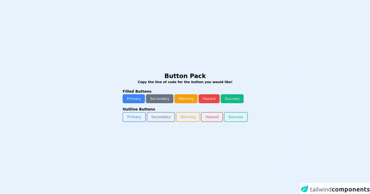
The preview of Button Pack ui component.
To create a button pack with Tailwind CSS, we will use the following classes:
bg-{color}: sets the background color of the button.text-{color}: sets the text color of the button.px-{size}: sets the horizontal padding of the button.py-{size}: sets the vertical padding of the button.rounded-{size}: sets the border radius of the button.shadow-{size}: sets the box shadow of the button.uppercase: sets the text to uppercase.font-bold: sets the font weight to bold.text-sm: sets the text size to small.
Free download of the Button Pack's source code
The source code of Button Pack ui component.
To create a button pack with Tailwind CSS, you can use the following code:
<div class="flex h-screen">
  <div class="m-auto">
    <div class="text-center mb-5">
      <p class="text-3xl text-cyan-700 font-bold">Button Pack</p>
      <p class="text-l text-cyan-600 font-semibold">Copy the line of code for the button you would like!</p>
    </div>
    <p class="text-lg text-cyan-500 font-bold">Filled Buttons</p>
    <button class="p-2 pl-5 pr-5 bg-blue-500 text-gray-100 text-lg rounded-lg focus:border-4 border-blue-300">Primary</button>
    <button class="p-2 pl-5 pr-5 bg-gray-500 text-gray-100 text-lg rounded-lg focus:border-4 border-gray-300">Secondary</button>
    <button class="p-2 pl-5 pr-5 bg-yellow-500 text-gray-100 text-lg rounded-lg focus:border-4 border-yellow-300">Warning</button>
    <button class="p-2 pl-5 pr-5 bg-red-500 text-gray-100 text-lg rounded-lg focus:border-4 border-red-300">Hazard</button>
    <button class="p-2 pl-5 pr-5 bg-green-500 text-gray-100 text-lg rounded-lg focus:border-4 border-green-300">Success</button>
    <p class="text-lg text-cyan-500 font-bold mt-4">Outline Buttons</p>
    <button class="p-2 pl-5 pr-5 bg-transparent border-2 border-blue-500 text-blue-500 text-lg rounded-lg hover:bg-blue-500 hover:text-gray-100 focus:border-4 focus:border-blue-300">Primary</button>
    <button class="p-2 pl-5 pr-5 bg-transparent border-2 border-gray-500 text-gray-500 text-lg rounded-lg hover:bg-gray-500 hover:text-gray-100 focus:border-4 focus:border-gray-300">Secondary</button>
    <button class="p-2 pl-5 pr-5 bg-transparent border-2 border-yellow-500 text-yellow-500 text-lg rounded-lg hover:bg-yellow-500 hover:text-gray-100 focus:border-4 focus:border-yellow-300">Warning</button>
    <button class="p-2 pl-5 pr-5 bg-transparent border-2 border-red-500 text-red-500 text-lg rounded-lg hover:bg-red-500 hover:text-gray-100 focus:border-4 focus:border-red-300">Hazard</button>
    <button class="p-2 pl-5 pr-5 bg-transparent border-2 border-green-500 text-green-500 text-lg rounded-lg hover:bg-green-500 hover:text-gray-100 focus:border-4 focus:border-green-300">Success</button>
  </div>
</div>
How to create a Button Pack with Tailwind CSS?
Now, let's create a button pack with Tailwind CSS. We will create a simple button pack with primary, secondary, success, warning, and danger buttons, as well as buttons with different sizes.
Step 1: Set up the HTML
First, we need to set up the HTML for our button pack. We will create a div element with a class of button-pack and add a button element for each button in the pack.
<div class="button-pack">
  <button class="button-primary">Primary</button>
  <button class="button-secondary">Secondary</button>
  <button class="button-success">Success</button>
  <button class="button-warning">Warning</button>
  <button class="button-danger">Danger</button>
  <button class="button-small">Small</button>
  <button class="button-medium">Medium</button>
  <button class="button-large">Large</button>
</div>
Step 2: Style the buttons
Next, we need to style the buttons using Tailwind CSS classes. We will use the bg-{color}, text-{color}, px-{size}, py-{size}, rounded-{size}, shadow-{size}, uppercase, font-bold, and text-sm classes to style the buttons.
/* Primary button */
.button-primary {
  background-color: #1a202c;
  color: #fff;
  padding: 0.5rem 1rem;
  border-radius: 0.25rem;
  box-shadow: 0 0.125rem 0.25rem rgba(0, 0, 0, 0.075);
  text-transform: uppercase;
  font-weight: bold;
  font-size: 0.875rem;
}

/* Secondary button */
.button-secondary {
  background-color: #e2e8f0;
  color: #1a202c;
  padding: 0.5rem 1rem;
  border-radius: 0.25rem;
  box-shadow: 0 0.125rem 0.25rem rgba(0, 0, 0, 0.075);
  text-transform: uppercase;
  font-weight: bold;
  font-size: 0.875rem;
}

/* Success button */
.button-success {
  background-color: #48bb78;
  color: #fff;
  padding: 0.5rem 1rem;
  border-radius: 0.25rem;
  box-shadow: 0 0.125rem 0.25rem rgba(0, 0, 0, 0.075);
  text-transform: uppercase;
  font-weight: bold;
  font-size: 0.875rem;
}

/* Warning button */
.button-warning {
  background-color: #f6ad55;
  color: #fff;
  padding: 0.5rem 1rem;
  border-radius: 0.25rem;
  box-shadow: 0 0.125rem 0.25rem rgba(0, 0, 0, 0.075);
  text-transform: uppercase;
  font-weight: bold;
  font-size: 0.875rem;
}

/* Danger button */
.button-danger {
  background-color: #f56565;
  color: #fff;
  padding: 0.5rem 1rem;
  border-radius: 0.25rem;
  box-shadow: 0 0.125rem 0.25rem rgba(0, 0, 0, 0.075);
  text-transform: uppercase;
  font-weight: bold;
  font-size: 0.875rem;
}

/* Small button */
.button-small {
  background-color: #1a202c;
  color: #fff;
  padding: 0.25rem 0.5rem;
  border-radius: 0.125rem;
  box-shadow: 0 0.0625rem 0.125rem rgba(0, 0, 0, 0.075);
  text-transform: uppercase;
  font-weight: bold;
  font-size: 0.75rem;
}

/* Medium button */
.button-medium {
  background-color: #1a202c;
  color: #fff;
  padding: 0.5rem 1rem;
  border-radius: 0.25rem;
  box-shadow: 0 0.125rem 0.25rem rgba(0, 0, 0, 0.075);
  text-transform: uppercase;
  font-weight: bold;
  font-size: 0.875rem;
}

/* Large button */
.button-large {
  background-color: #1a202c;
  color: #fff;
  padding: 1rem 2rem;
  border-radius: 0.5rem;
  box-shadow: 0 0.25rem 0.5rem rgba(0, 0, 0, 0.075);
  text-transform: uppercase;
  font-weight: bold;
  font-size: 1.25rem;
}
Step 3: Add the button pack to your web application
Finally, we need to add the button pack to our web application. We can do this by including the CSS file that contains the button pack styles and adding the button-pack class to the div element that contains the buttons.
<!DOCTYPE html>
<html lang="en">
  <head>
    <meta charset="UTF-8" />
    <title>Button Pack with Tailwind CSS</title>
    <link rel="stylesheet" href="button-pack.css" />
  </head>
  <body>
    <div class="button-pack">
      <button class="button-primary">Primary</button>
      <button class="button-secondary">Secondary</button>
      <button class="button-success">Success</button>
      <button class="button-warning">Warning</button>
      <button class="button-danger">Danger</button>
      <button class="button-small">Small</button>
      <button class="button-medium">Medium</button>
      <button class="button-large">Large</button>
    </div>
  </body>
</html>
Conclusion
In this article, we have shown you how to create a button pack with Tailwind CSS. By using Tailwind CSS, you can quickly create custom designs without writing custom CSS. We hope this practical guide helps you in your FrontEnd development journey.