- Published on
Ultimate Guide: Make A Button Group With Tailwind CSS
- What is Tailwind CSS?
- The description of Button group UI component
- Why use Tailwind CSS to create a Button group UI component?
- The preview of Button group UI component
- The source code of Button group UI component
- How to create a Button group with Tailwind CSS?
- Conclusion
As a FrontEnd technology blogger, you must have heard of Tailwind CSS, a utility-first CSS framework that provides a lot of pre-defined CSS classes to help you build websites faster. In this article, we will guide you on how to create a Button group UI component with Tailwind CSS.
What is Tailwind CSS?
Tailwind CSS is a utility-first CSS framework that provides a lot of pre-defined CSS classes to help you build websites faster. It is different from other CSS frameworks like Bootstrap or Foundation, which provide a lot of pre-designed components. With Tailwind CSS, you can create your own components by combining different CSS classes.
The description of Button group UI component
A Button group UI component is a set of buttons that are grouped together. It is commonly used in web applications to provide users with a set of related actions. A Button group UI component can be horizontal or vertical, and it can have different styles, such as rounded corners or different colors.
Why use Tailwind CSS to create a Button group UI component?
Tailwind CSS provides a lot of pre-defined CSS classes that can help you create a Button group UI component quickly. You don't need to write custom CSS code, which can save you a lot of time. Moreover, Tailwind CSS is highly customizable, so you can easily change the style of your Button group UI component by modifying the CSS classes.
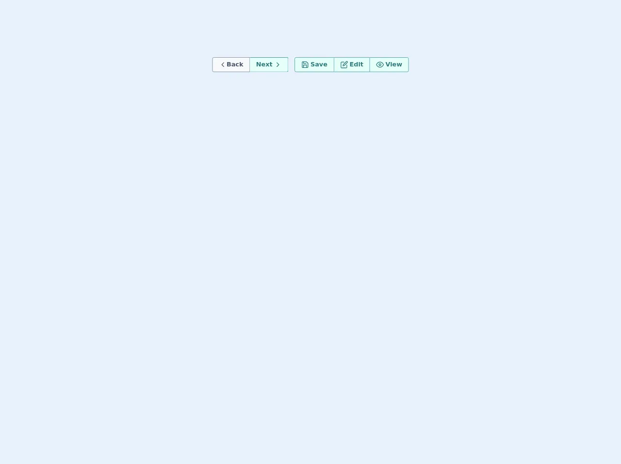
The preview of Button group UI component
To create a Button group UI component with Tailwind CSS, you can use the flex and space-x classes to align the buttons horizontally and add space between them. You can also use the rounded-l-md and rounded-r-md classes to make the first and last buttons have rounded corners. Here is a preview of what your Button group UI component could look like:
Free download of the Button group's source code
The source code of Button group UI component
To create a Button group UI component with Tailwind CSS, you need to define a container element that has the flex and space-x classes. Inside the container element, you can define each button as a button element with the px-4 py-2 and bg-gray-200 hover:bg-gray-300 classes. You can also add the rounded-l-md and rounded-r-md classes to the first and last buttons to make them have rounded corners. Here is the source code of the Button group UI component:
<div class="p-5">
    <div class="flex justify-center items-baseline flex-wrap">
        <div class="flex m-2">
            <button class="text-base  rounded-r-none  hover:scale-110 focus:outline-none flex justify-center px-4 py-2 rounded font-bold cursor-pointer
        hover:bg-gray-200
        bg-gray-100
        text-gray-700
        border duration-200 ease-in-out
        border-gray-600 transition">
                <div class="flex leading-5">
                    <svg xmlns="http://www.w3.org/2000/svg" width="100%" height="100%" fill="none" viewBox="0 0 24 24" stroke="currentColor" stroke-width="2" stroke-linecap="round" stroke-linejoin="round" class="feather feather-chevron-left w-5 h-5">
                        <polyline points="15 18 9 12 15 6"></polyline>
                    </svg>
                    Back</div>
            </button>
            <button class="text-base  rounded-l-none border-l-0  hover:scale-110 focus:outline-none flex justify-center px-4 py-2 rounded font-bold cursor-pointer
        hover:bg-teal-200
        bg-teal-100
        text-teal-700
        border duration-200 ease-in-out
        border-teal-600 transition">
                <div class="flex leading-5">Next
                    <svg xmlns="http://www.w3.org/2000/svg" width="100%" height="100%" fill="none" viewBox="0 0 24 24" stroke="currentColor" stroke-width="2" stroke-linecap="round" stroke-linejoin="round" class="feather feather-chevron-right w-5 h-5 ml-1">
                        <polyline points="9 18 15 12 9 6"></polyline>
                    </svg>
                </div>
            </button>
        </div>
        <div class="flex m-2">
            <button class="text-base  rounded-r-none  hover:scale-110 focus:outline-none flex justify-center px-4 py-2 rounded font-bold cursor-pointer
        hover:bg-teal-700 hover:text-teal-100
        bg-teal-100
        text-teal-700
        border duration-200 ease-in-out
        border-teal-600 transition">
                <div class="flex leading-5">
                    <svg xmlns="http://www.w3.org/2000/svg" width="100%" height="100%" fill="none" viewBox="0 0 24 24" stroke="currentColor" stroke-width="2" stroke-linecap="round" stroke-linejoin="round" class="feather feather-save w-5 h-5 mr-1">
                        <path d="M19 21H5a2 2 0 0 1-2-2V5a2 2 0 0 1 2-2h11l5 5v11a2 2 0 0 1-2 2z"></path>
                        <polyline points="17 21 17 13 7 13 7 21"></polyline>
                        <polyline points="7 3 7 8 15 8"></polyline>
                    </svg>
                    Save</div>
            </button>
            <button class="text-base  rounded-l-none rounded-r-none border-l-0 border-r-0  hover:scale-110 focus:outline-none flex justify-center px-4 py-2 rounded font-bold cursor-pointer
        hover:bg-teal-700 hover:text-teal-100
        bg-teal-100
        text-teal-700
        border duration-200 ease-in-out
        border-teal-600 transition">
                <div class="flex leading-5">
                    <svg xmlns="http://www.w3.org/2000/svg" width="100%" height="100%" fill="none" viewBox="0 0 24 24" stroke="currentColor" stroke-width="2" stroke-linecap="round" stroke-linejoin="round" class="feather feather-edit w-5 h-5 mr-1">
                        <path d="M11 4H4a2 2 0 0 0-2 2v14a2 2 0 0 0 2 2h14a2 2 0 0 0 2-2v-7"></path>
                        <path d="M18.5 2.5a2.121 2.121 0 0 1 3 3L12 15l-4 1 1-4 9.5-9.5z"></path>
                    </svg>
                    Edit</div>
            </button>
            <button class="text-base  rounded-l-none  hover:scale-110 focus:outline-none flex justify-center px-4 py-2 rounded font-bold cursor-pointer
        hover:bg-teal-700 hover:text-teal-100
        bg-teal-100
        text-teal-700
        border duration-200 ease-in-out
        border-teal-600 transition">
                <div class="flex leading-5">
                    <svg xmlns="http://www.w3.org/2000/svg" width="100%" height="100%" fill="none" viewBox="0 0 24 24" stroke="currentColor" stroke-width="2" stroke-linecap="round" stroke-linejoin="round" class="feather feather-eye w-5 h-5 mr-1">
                        <path d="M1 12s4-8 11-8 11 8 11 8-4 8-11 8-11-8-11-8z"></path>
                        <circle cx="12" cy="12" r="3"></circle>
                    </svg>
                    View</div>
            </button>
        </div>
    </div>

</div>
How to create a Button group with Tailwind CSS?
To create a Button group UI component with Tailwind CSS, you need to follow these steps:
- Create a container element with the
flexandspace-xclasses:
<div class="flex space-x-4">
  <!-- Buttons go here -->
</div>
- Define each button as a
buttonelement with thepx-4 py-2andbg-gray-200 hover:bg-gray-300classes:
<div class="flex space-x-4">
  <button class="px-4 py-2 bg-gray-200 hover:bg-gray-300 rounded-l-md">Button 1</button>
  <button class="px-4 py-2 bg-gray-200 hover:bg-gray-300">Button 2</button>
  <button class="px-4 py-2 bg-gray-200 hover:bg-gray-300 rounded-r-md">Button 3</button>
</div>
- Customize the Button group UI component by modifying the CSS classes.
Conclusion
In this article, we have shown you how to create a Button group UI component with Tailwind CSS. We hope that this guide will help you create your own Button group UI component quickly and easily. If you have any questions or feedback, please feel free to leave a comment below.