- Published on
The Ultimate Guide To Help You Make A Button Component (Outline) With Tailwind CSS
- What is Tailwind CSS?
- The description of Button Component (Outline) ui component
- Why use Tailwind CSS to create a Button Component (Outline) ui component?
- The preview of Button Component (Outline) ui component.
- The source code of Button Component (Outline) ui component.
- How to create a Button Component (Outline) with Tailwind CSS?
- Conclusion
What is Tailwind CSS?
Tailwind CSS is a utility-first CSS framework that allows web developers to create custom designs quickly. It provides a set of pre-defined classes that can be used to style HTML elements. With Tailwind CSS, you can create complex designs without writing any CSS code.
The description of Button Component (Outline) ui component
A button component is a user interface element that is used to trigger an action. The outline button component is a button with a transparent background and a colored border. It is commonly used as a secondary action button or a call-to-action button.
Why use Tailwind CSS to create a Button Component (Outline) ui component?
Tailwind CSS provides a set of pre-defined classes that can be used to create a button component quickly. It also allows you to customize the button component by adding your own classes or modifying the existing ones. With Tailwind CSS, you can create a button component that matches your design requirements without writing any CSS code.
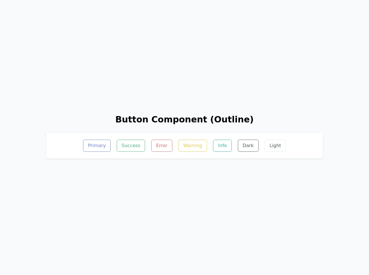
The preview of Button Component (Outline) ui component.
To create a button component (outline) with Tailwind CSS, you can use the following classes:
border: adds a border to the buttonborder-[color]: sets the color of the button bordertext-[color]: sets the color of the button texthover:border-[color]: sets the color of the button border on hoverhover:text-[color]: sets the color of the button text on hover
Free download of the Button Component (Outline)'s source code
The source code of Button Component (Outline) ui component.
To create a button component (outline) with Tailwind CSS, you can use the following HTML code:
<button class="border border-[color] text-[color] hover:border-[color] hover:text-[color]">Button</button>
To customize the button component, you can add your own classes or modify the existing ones. For example, you can change the font size of the button by adding the text-[size] class.
<div class="w-screen h-screen flex items-center justify-center bg-gray-100">
  <div class="w-full mx-auto py-16">
    <!-- Title -->
    <h1 class="text-3xl text-center font-bold mb-6">
      Button Component (Outline)
    </h1>
    <!-- End Title -->

    <!-- Outline -->
    <div
      class="bg-white px-6 py-4 my-3 w-3/4 mx-auto shadow rounded-md flex items-center"
    >
      <div class="w-full text-center mx-auto">
        <button
          type="button"
          class="border border-indigo-500 text-indigo-500 rounded-md px-4 py-2 m-2 transition duration-500 ease select-none hover:text-white hover:bg-indigo-600 focus:outline-none focus:shadow-outline"
        >
          Primary
        </button>
        <button
          type="button"
          class="border border-green-500 text-green-500 rounded-md px-4 py-2 m-2 transition duration-500 ease select-none hover:text-white hover:bg-green-600 focus:outline-none focus:shadow-outline"
        >
          Success
        </button>
        <button
          type="button"
          class="border border-red-500 text-red-500 rounded-md px-4 py-2 m-2 transition duration-500 ease select-none hover:text-white hover:bg-red-600 focus:outline-none focus:shadow-outline"
        >
          Error
        </button>
        <button
          type="button"
          class="border border-yellow-500 text-yellow-500 rounded-md px-4 py-2 m-2 transition duration-500 ease select-none hover:text-white hover:bg-yellow-600 focus:outline-none focus:shadow-outline"
        >
          Warning
        </button>
        <button
          type="button"
          class="border border-teal-500 text-teal-500 rounded-md px-4 py-2 m-2 transition duration-500 ease select-none hover:text-white hover:bg-teal-600 focus:outline-none focus:shadow-outline"
        >
          Info
        </button>
        <button
          type="button"
          class="border border-gray-700 text-gray-700 rounded-md px-4 py-2 m-2 transition duration-500 ease select-none hover:text-white hover:bg-gray-800 focus:outline-none focus:shadow-outline"
        >
          Dark
        </button>
        <button
          type="button"
          class="border border-gray-300 text-gray-700 rounded-md px-4 py-2 m-2 transition duration-500 ease select-none hover:bg-gray-300 focus:outline-none focus:shadow-outline"
        >
          Light
        </button>
      </div>
    </div>
    <!-- End Outline -->
  </div>
</div>
How to create a Button Component (Outline) with Tailwind CSS?
To create a button component (outline) with Tailwind CSS, follow these steps:
- Create a new HTML file and add the following code:
<!DOCTYPE html>
<html>
  <head>
    <title>Button Component (Outline) with Tailwind CSS</title>
    <link rel="stylesheet" href="https://cdn.jsdelivr.net/npm/[email protected]/dist/tailwind.min.css">
  </head>
  <body>
    <button class="border border-[color] text-[color] hover:border-[color] hover:text-[color]">Button</button>
  </body>
</html>
Replace
[color]with the color of your choice. For example, if you want to create a blue button, replace[color]withblue.Save the file and open it in your web browser. You should see a button with a colored border and text.
To customize the button component, you can add your own classes or modify the existing ones. For example, you can change the font size of the button by adding the
text-[size]class.
Conclusion
Creating a button component (outline) with Tailwind CSS is easy and straightforward. With the pre-defined classes provided by Tailwind CSS, you can create a button component that matches your design requirements without writing any CSS code. By following the steps outlined in this guide, you can create a button component (outline) in no time.