- Published on
Most Effective Ways To Make A Button Component (Default) With Tailwind CSS
- What is Tailwind CSS?
- The description of Button Component (Default) ui component
- Why use Tailwind CSS to create a Button Component (Default) ui component?
- The preview of Button Component (Default) ui component
- The source code of Button Component (Default) ui component
- How to create a Button Component (Default) with Tailwind CSS?
- Conclusion
As a FrontEnd developer, we always look for ways to make our lives easier and more efficient. One way to do this is by using a CSS framework that can help us create UI components quickly and easily. Tailwind CSS is one such framework that has gained popularity in recent years due to its ease of use and flexibility. In this article, we will discuss the most effective ways to make a Button Component (Default) with Tailwind CSS.
What is Tailwind CSS?
Tailwind CSS is a utility-first CSS framework that provides a set of pre-defined classes that can be used to style HTML elements. It is designed to be highly customizable and allows developers to create their own custom classes. Tailwind CSS is built on top of PostCSS, which means that it can be easily integrated into any modern FrontEnd workflow.
The description of Button Component (Default) ui component
A Button Component (Default) is a UI component that is used to trigger an action when clicked. It is one of the most commonly used UI components in web development and can be found on almost every website. A Button Component (Default) typically consists of a text label and a background color that changes when the button is hovered over or clicked.
Why use Tailwind CSS to create a Button Component (Default) ui component?
Tailwind CSS provides a set of pre-defined classes that can be used to create a Button Component (Default) quickly and easily. These classes can be customized to match the design requirements of the project. Using Tailwind CSS also ensures that the Button Component (Default) is consistent across the entire project, which can save time and effort.
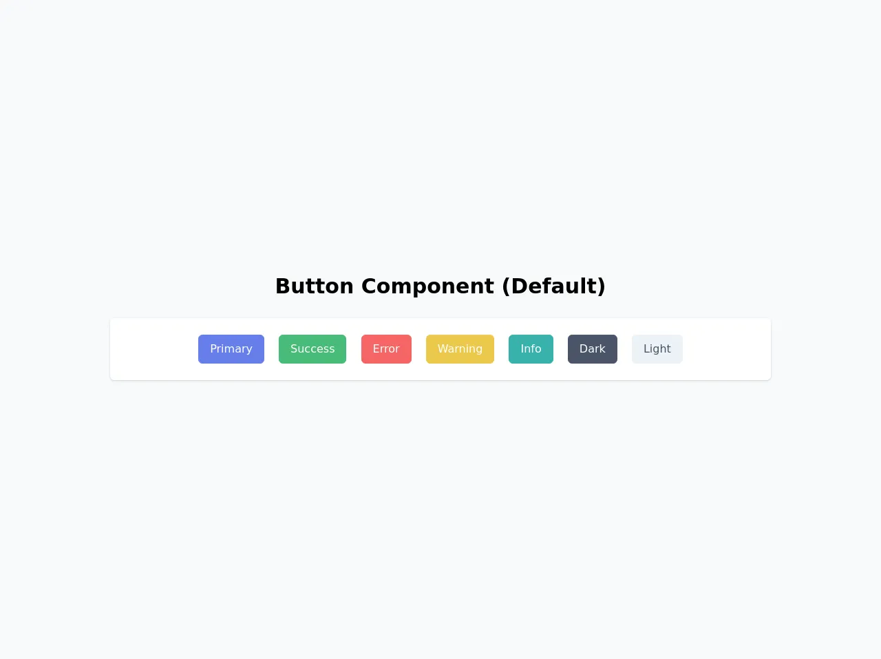
The preview of Button Component (Default) ui component
To create a Button Component (Default) with Tailwind CSS, we will use the following classes:
<button class="bg-blue-500 hover:bg-blue-700 text-white font-bold py-2 px-4 rounded">
  Button
</button>
Free download of the Button Component (Default)'s source code
The source code of Button Component (Default) ui component
To create the Button Component (Default) with Tailwind CSS, we will use the following classes:
<button class="bg-blue-500 hover:bg-blue-700 text-white font-bold py-2 px-4 rounded">
  Button
</button>
<div class="w-screen h-screen flex items-center justify-center bg-gray-100">
  <div class="w-full mx-auto py-16">
    <!-- Title -->
    <h1 class="text-3xl text-center font-bold mb-6">
      Button Component (Default)
    </h1>
    <!-- End Title -->

    <!-- Default -->
    <div
      class="bg-white px-6 py-4 my-3 w-3/4 mx-auto shadow rounded-md flex items-center"
    >
    <div class="w-full text-center mx-auto">
      <button
        type="button"
        class="border border-indigo-500 bg-indigo-500 text-white rounded-md px-4 py-2 m-2 transition duration-500 ease select-none hover:bg-indigo-600 focus:outline-none focus:shadow-outline"
      >
        Primary
      </button>
      <button
        type="button"
        class="border border-green-500 bg-green-500 text-white rounded-md px-4 py-2 m-2 transition duration-500 ease select-none hover:bg-green-600 focus:outline-none focus:shadow-outline"
      >
        Success
      </button>
      <button
        type="button"
        class="border border-red-500 bg-red-500 text-white rounded-md px-4 py-2 m-2 transition duration-500 ease select-none hover:bg-red-600 focus:outline-none focus:shadow-outline"
      >
        Error
      </button>
      <button
        type="button"
        class="border border-yellow-500 bg-yellow-500 text-white rounded-md px-4 py-2 m-2 transition duration-500 ease select-none hover:bg-yellow-600 focus:outline-none focus:shadow-outline"
      >
        Warning
      </button>
      <button
        type="button"
        class="border border-teal-500 bg-teal-500 text-white rounded-md px-4 py-2 m-2 transition duration-500 ease select-none hover:bg-teal-600 focus:outline-none focus:shadow-outline"
      >
        Info
      </button>
      <button
        type="button"
        class="border border-gray-700 bg-gray-700 text-white rounded-md px-4 py-2 m-2 transition duration-500 ease select-none hover:bg-gray-800 focus:outline-none focus:shadow-outline"
      >
        Dark
      </button>
      <button
        type="button"
        class="border border-gray-200 bg-gray-200 text-gray-700 rounded-md px-4 py-2 m-2 transition duration-500 ease select-none hover:bg-gray-300 focus:outline-none focus:shadow-outline"
      >
        Light
      </button>
      </div>
    </div>
    <!-- End Default -->
  </div>
</div>
How to create a Button Component (Default) with Tailwind CSS?
- First, we need to add the Tailwind CSS stylesheet to our HTML file. We can do this by adding the following code to the head section of our HTML file:
<link href="https://cdn.jsdelivr.net/npm/tailwindcss@latest/dist/tailwind.min.css" rel="stylesheet">
- Next, we need to create a button element in our HTML file:
<button>Button</button>
- We can now add the Tailwind CSS classes to our button element to style it:
<button class="bg-blue-500 hover:bg-blue-700 text-white font-bold py-2 px-4 rounded">Button</button>
The classes used in the above code are:
bg-blue-500: Sets the background color of the button to blue.hover:bg-blue-700: Changes the background color of the button to a darker shade of blue when the button is hovered over.text-white: Sets the text color of the button to white.font-bold: Makes the text of the button bold.py-2: Sets the padding on the top and bottom of the button to 2 units.px-4: Sets the padding on the left and right of the button to 4 units.rounded: Rounds the corners of the button.
- We can now customize the Button Component (Default) by changing the values of the Tailwind CSS classes. For example, we can change the background color of the button to red by using the
bg-red-500class:
<button class="bg-red-500 hover:bg-red-700 text-white font-bold py-2 px-4 rounded">Button</button>
Conclusion
Tailwind CSS is a powerful CSS framework that can help FrontEnd developers create UI components quickly and easily. In this article, we discussed the most effective ways to make a Button Component (Default) with Tailwind CSS. By using Tailwind CSS, we can create consistent and customizable Button Components (Default) that can be easily integrated into any project.