- Published on
How to Build A Button With Tailwind CSS?
- What is Tailwind CSS?
- The description of Button ui component
- Why use Tailwind CSS to create a Button ui component?
- The preview of Button ui component.
- The source code of Button ui component.
- How to create a Button with Tailwind CSS?
- Conclusion
What is Tailwind CSS?
Tailwind CSS is a utility-first CSS framework that provides a set of pre-defined classes to create user interfaces. It is designed to be highly customizable, which means that you can easily create your own custom styles by combining the pre-defined classes.
The description of Button ui component
A button is a common user interface element that is used to trigger an action when clicked. It is an essential part of any web application, and it is important to create buttons that are visually appealing and easy to use.
Why use Tailwind CSS to create a Button ui component?
Tailwind CSS provides a set of pre-defined classes that can be used to create buttons quickly and easily. It also provides a wide range of customization options, which means that you can easily create buttons that match the design of your application.
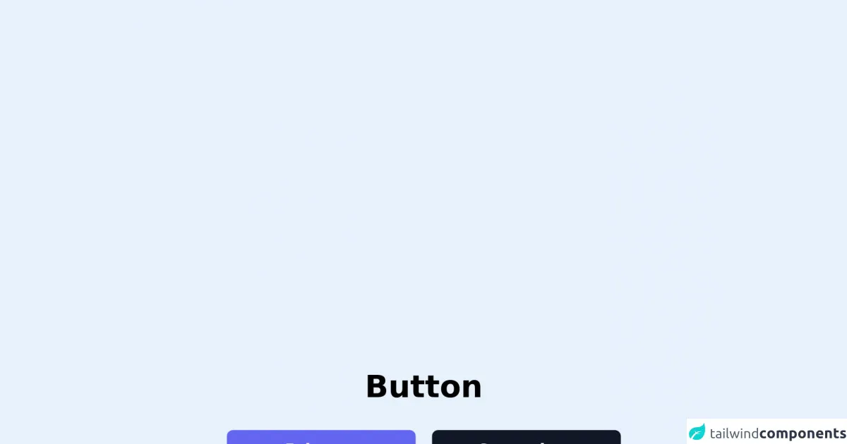
The preview of Button ui component.
To create a button with Tailwind CSS, you can use the bg-blue-500 class to set the background color to blue, the text-white class to set the text color to white, and the py-2 px-4 rounded class to set the padding, border radius, and other styles.
Free download of the Button's source code
The source code of Button ui component.
To create a button with Tailwind CSS, you can use the following HTML code:
<button class="bg-blue-500 text-white py-2 px-4 rounded">
  Click me
</button>
<div class="px-10 space-y-6">
    <h1 class="font-bold text-3xl text-center">Button</h1>
    <div class="w-96 space-y-4">
        <div class="flex space-x-4">
            <button class="flex-1 px-6 py-2 font-semibold select-none rounded-md text-white bg-indigo-500 hover:bg-indigo-600">Primary Button</button>
            <button class="flex-1 px-6 py-2 font-semibold select-none rounded-md text-white bg-gray-900 hover:bg-gray-800">Secondary Button</button>
        </div>
        <div class="flex space-x-4">
            <button class="flex-1 px-6 py-2 font-semibold select-none rounded-md text-indigo-700 bg-indigo-100 hover:bg-indigo-200">Ghost Button</button>
            <button class="flex-1 px-6 py-2 font-semibold select-none rounded-md text-gray-800 bg-gray-200 hover:bg-gray-300">Ghost Button</button>
        </div>
        <div class="flex space-x-4">
            <button class="flex-1 px-6 py-2 font-semibold select-none rounded-md text-indigo-700 border border-indigo-500 bg-transparent hover:bg-indigo-50">Outline Button</button>
            <button class="flex-1 px-6 py-2 font-semibold select-none rounded-md text-gray-800 border border-gray-500 bg-transparent hover:bg-gray-50">Outline Button</button>
        </div>
    </div>
</div>
How to create a Button with Tailwind CSS?
To create a button with Tailwind CSS, you can follow these steps:
- Start by creating a new HTML file and adding a
buttonelement.
<button></button>
- Add the
bg-blue-500class to set the background color to blue.
<button class="bg-blue-500"></button>
- Add the
text-whiteclass to set the text color to white.
<button class="bg-blue-500 text-white"></button>
- Add the
py-2 px-4classes to set the padding.
<button class="bg-blue-500 text-white py-2 px-4"></button>
- Add the
roundedclass to set the border radius.
<button class="bg-blue-500 text-white py-2 px-4 rounded"></button>
- Customize the button by adding additional classes or modifying the existing classes.
<button class="bg-blue-500 hover:bg-blue-700 text-white font-bold py-2 px-4 rounded">
  Click me
</button>
In the above example, we have added the hover:bg-blue-700 class to change the background color when the button is hovered over, the font-bold class to make the text bold, and the Click me text inside the button.
Conclusion
In this article, we have learned how to create a button with Tailwind CSS. Tailwind CSS provides a set of pre-defined classes that can be used to create buttons quickly and easily. It also provides a wide range of customization options, which means that you can easily create buttons that match the design of your application. By following the steps outlined in this article, you can create visually appealing and easy-to-use buttons for your web applications.