- Published on
6 Easy Ways To Build A Button With Tailwind CSS
- What is Tailwind CSS?
- The description of Button UI component
- Why use Tailwind CSS to create a Button UI component?
- The preview of Button UI component
- The source code of Button UI component
- How to create a Button with Tailwind CSS?
- Conclusion
As a FrontEnd technology blogger, you must have heard of Tailwind CSS. It is a popular utility-first CSS framework that helps you design and develop responsive websites faster. In this article, we will discuss how to build a Button UI component with Tailwind CSS.
What is Tailwind CSS?
Tailwind CSS is a utility-first CSS framework that provides a set of pre-defined CSS classes that you can use to style your HTML elements. It is designed to help you create responsive and customizable web designs quickly. With Tailwind CSS, you can easily create complex layouts and styles without writing custom CSS code.
The description of Button UI component
A button is a common UI component used in web applications to trigger an action. It is a clickable element that performs a specific task when clicked. Buttons can be styled in different ways to match the design of your website.
Why use Tailwind CSS to create a Button UI component?
Tailwind CSS provides a set of pre-defined CSS classes that you can use to style your button UI component. It is easy to use and customize, and it helps you create responsive designs quickly. With Tailwind CSS, you don't have to write custom CSS code for every button you create. You can simply use the pre-defined classes to style your button and customize it as per your requirements.
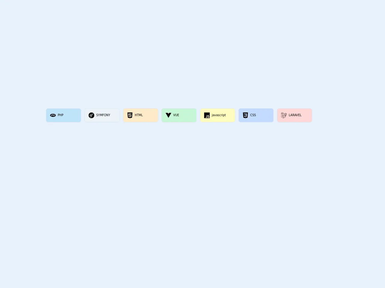
The preview of Button UI component
Free download of the Button's source code
Buttons can be styled in different ways using Tailwind CSS. You can create a simple button, a rounded button, a bordered button, or a button with an icon. Here are some examples of how you can style your button using Tailwind CSS:
Simple Button: A simple button can be created using the
bg-blue-500andtext-whiteclasses.Rounded Button: A rounded button can be created using the
rounded-fullclass.Bordered Button: A bordered button can be created using the
borderandborder-gray-500classes.Button with Icon: A button with an icon can be created using the
flexanditems-centerclasses.
The source code of Button UI component
Here is the source code for creating a simple button using Tailwind CSS.
<section class="container mx-auto px-6 my-1 flex flex-wrap -m-4">
    <div class="p-2 md:w-40 ">
        <a href="#" class="flex items-center p-4 bg-blue-200 rounded-lg shadow-xs cursor-pointer hover:bg-blue-500 hover:text-gray-100">

            <svg class="h-6 fill-current hover:text-gray-100 " viewBox="0 0 24 24" xmlns="http://www.w3.org/2000/svg"><title>PHP icon</title><path d="M7.01 10.207h-.944l-.515 2.648h.838c.556 0 .97-.105 1.242-.314.272-.21.455-.559.55-1.049.092-.47.05-.802-.124-.995-.175-.193-.523-.29-1.047-.29zM12 5.688C5.373 5.688 0 8.514 0 12s5.373 6.313 12 6.313S24 15.486 24 12c0-3.486-5.373-6.312-12-6.312zm-3.26 7.451c-.261.25-.575.438-.917.551-.336.108-.765.164-1.285.164H5.357l-.327 1.681H3.652l1.23-6.326h2.65c.797 0 1.378.209 1.744.628.366.418.476 1.002.33 1.752a2.836 2.836 0 0 1-.305.847c-.143.255-.33.49-.561.703zm4.024.715l.543-2.799c.063-.318.039-.536-.068-.651-.107-.116-.336-.174-.687-.174H11.46l-.704 3.625H9.388l1.23-6.327h1.367l-.327 1.682h1.218c.767 0 1.295.134 1.586.401s.378.7.263 1.299l-.572 2.944h-1.389zm7.597-2.265a2.782 2.782 0 0 1-.305.847c-.143.255-.33.49-.561.703a2.44 2.44 0 0 1-.917.551c-.336.108-.765.164-1.286.164h-1.18l-.327 1.682h-1.378l1.23-6.326h2.649c.797 0 1.378.209 1.744.628.366.417.477 1.001.331 1.751zM17.766 10.207h-.943l-.516 2.648h.838c.557 0 .971-.105 1.242-.314.272-.21.455-.559.551-1.049.092-.47.049-.802-.125-.995s-.524-.29-1.047-.29z"/></svg>
            <div>
              <p class=" text-xs font-medium ml-2 ">
                PHP
              </p>

            </div>
        </a>
    </div>

    <div class="p-2 md:w-40 ">
        <div class="flex items-center p-4 bg-gray-200 rounded-lg shadow-xs cursor-pointer hover:bg-gray-500 hover:text-gray-100">

            <svg class="h-6 fill-current hover:text-gray-100" role="img" viewBox="0 0 24 24" xmlns="http://www.w3.org/2000/svg"><title>Symfony icon</title><path d="M24 12c0 6.628-5.372 12-12 12S0 18.628 0 12 5.372 0 12 0s12 5.372 12 12zm-6.753-7.561c-1.22.042-2.283.715-3.075 1.644-.878 1.02-1.461 2.229-1.881 3.461-.753-.614-1.332-1.414-2.539-1.761-.966-.297-2.015-.105-2.813.514-.41.319-.71.757-.861 1.254-.36 1.176.381 2.225.719 2.6l.737.79c.15.154.519.56.339 1.138-.193.631-.951 1.037-1.732.799-.348-.106-.848-.366-.734-.73.045-.15.152-.263.21-.391.052-.11.077-.194.095-.242.141-.465-.053-1.07-.551-1.223-.465-.143-.939-.03-1.125.566-.209.68.117 1.913 1.86 2.449 2.04.628 3.765-.484 4.009-1.932.153-.907-.255-1.582-1.006-2.447l-.612-.677c-.371-.37-.497-1.002-.114-1.485.324-.409.785-.584 1.539-.379 1.103.3 1.594 1.063 2.412 1.68-.338 1.11-.56 2.223-.759 3.222l-.123.746c-.585 3.07-1.033 4.757-2.194 5.726-.234.166-.57.416-1.073.434-.266.005-.352-.176-.355-.257-.006-.184.15-.271.255-.353.154-.083.39-.224.372-.674-.016-.532-.456-.994-1.094-.973-.477.017-1.203.465-1.176 1.286.028.85.819 1.485 2.012 1.444.638-.021 2.062-.281 3.464-1.949 1.633-1.911 2.09-4.101 2.434-5.706l.383-2.116c.213.024.441.042.69.048 2.032.044 3.049-1.01 3.064-1.776.01-.464-.304-.921-.744-.91-.386.009-.718.278-.806.654-.094.428.646.813.068 1.189-.41.266-1.146.452-2.184.3l.188-1.042c.386-1.976.859-4.407 2.661-4.467.132-.007.612.006.623.323.003.105-.022.134-.147.375-.115.155-.174.345-.168.537.017.504.4.836.957.816.743-.023.955-.748.945-1.119-.032-.874-.952-1.424-2.17-1.386z"/></svg>
            <div>
              <p class="text-xs font-medium ml-2 ">
                SYMFONY
              </p>

            </div>
        </div>
    </div>
    <div class="p-2 md:w-40 ">
        <div class="flex items-center p-4 bg-orange-200 rounded-lg shadow-xs cursor-pointer hover:bg-orange-500 hover:text-gray-100">

            <svg class="h-6 fill-current hover:text-gray-100" role="img" viewBox="0 0 24 24" xmlns="http://www.w3.org/2000/svg"><title>HTML5 icon</title><path d="M1.5 0h21l-1.91 21.563L11.977 24l-8.564-2.438L1.5 0zm7.031 9.75l-.232-2.718 10.059.003.23-2.622L5.412 4.41l.698 8.01h9.126l-.326 3.426-2.91.804-2.955-.81-.188-2.11H6.248l.33 4.171L12 19.351l5.379-1.443.744-8.157H8.531z"/></svg>
            <div>
              <p class=" text-xs font-medium ml-2 ">
                HTML
              </p>

            </div>
        </div>
    </div>

    <div class="p-2 md:w-40 ">
        <div class="flex items-center p-4 bg-green-200 rounded-lg shadow-xs cursor-pointer hover:bg-green-500 hover:text-gray-100">

            <svg class="h-6 fill-current hover:text-gray-100" role="img" viewBox="0 0 24 24" xmlns="http://www.w3.org/2000/svg"><title>Vue.js icon</title><path d="M19.197 1.608l.003-.006h-4.425L12 6.4v.002l-2.772-4.8H4.803v.005H0l12 20.786L24 1.608"/></svg>
            <div>
              <p class=" text-xs font-medium ml-2 ">
                VUE
              </p>

            </div>
        </div>
    </div>
    <div class="p-2 md:w-40 ">
        <div class="flex items-center p-4 bg-yellow-200 rounded-lg shadow-xs cursor-pointer hover:bg-yellow-500 hover:text-gray-100">

            <svg class="h-6 fill-current hover:text-gray-100" role="img" viewBox="0 0 24 24" xmlns="http://www.w3.org/2000/svg"><title>JavaScript icon</title><path d="M0 0h24v24H0V0zm22.034 18.276c-.175-1.095-.888-2.015-3.003-2.873-.736-.345-1.554-.585-1.797-1.14-.091-.33-.105-.51-.046-.705.15-.646.915-.84 1.515-.66.39.12.75.42.976.9 1.034-.676 1.034-.676 1.755-1.125-.27-.42-.404-.601-.586-.78-.63-.705-1.469-1.065-2.834-1.034l-.705.089c-.676.165-1.32.525-1.71 1.005-1.14 1.291-.811 3.541.569 4.471 1.365 1.02 3.361 1.244 3.616 2.205.24 1.17-.87 1.545-1.966 1.41-.811-.18-1.26-.586-1.755-1.336l-1.83 1.051c.21.48.45.689.81 1.109 1.74 1.756 6.09 1.666 6.871-1.004.029-.09.24-.705.074-1.65l.046.067zm-8.983-7.245h-2.248c0 1.938-.009 3.864-.009 5.805 0 1.232.063 2.363-.138 2.711-.33.689-1.18.601-1.566.48-.396-.196-.597-.466-.83-.855-.063-.105-.11-.196-.127-.196l-1.825 1.125c.305.63.75 1.172 1.324 1.517.855.51 2.004.675 3.207.405.783-.226 1.458-.691 1.811-1.411.51-.93.402-2.07.397-3.346.012-2.054 0-4.109 0-6.179l.004-.056z"/></svg>
            <div>
              <p class=" text-xs font-medium text-uppercase ml-2 ">
                javascript
              </p>

            </div>
        </div>
    </div>
    <div class="p-2 md:w-40 ">
        <div class="flex items-center p-4 bg-indigo-200 rounded-lg shadow-xs cursor-pointer hover:bg-indigo-500 hover:text-gray-100">

            <svg class="h-6 fill-current hover:text-gray-100" role="img" viewBox="0 0 24 24" xmlns="http://www.w3.org/2000/svg"><title>CSS3 icon</title><path d="M1.5 0h21l-1.91 21.563L11.977 24l-8.565-2.438L1.5 0zm17.09 4.413L5.41 4.41l.213 2.622 10.125.002-.255 2.716h-6.64l.24 2.573h6.182l-.366 3.523-2.91.804-2.956-.81-.188-2.11h-2.61l.29 3.855L12 19.288l5.373-1.53L18.59 4.414z"/></svg>
            <div>
              <p class=" text-xs font-medium ml-2 ">
                CSS
              </p>

            </div>
        </div>
    </div>
    <div class="p-2 md:w-40 ">
        <div class="flex items-center p-4 bg-red-200 rounded-lg shadow-xs cursor-pointer hover:bg-red-500 hover:text-gray-100">

            <svg class="h-6 fill-current hover:text-gray-100" role="img" viewBox="0 0 24 24" xmlns="http://www.w3.org/2000/svg"><title>Laravel icon</title><path d="M23.644 5.43c.009.032.014.065.014.099v5.15c0 .135-.073.26-.189.326l-4.323 2.49v4.934c0 .135-.072.258-.188.326L9.931 23.95c-.021.012-.043.02-.066.027-.008.002-.016.008-.024.01-.063.018-.13.018-.192 0-.011-.002-.02-.008-.029-.012-.021-.008-.043-.014-.063-.025L.534 18.755c-.117-.068-.189-.191-.189-.326V2.974c0-.033.005-.066.014-.098.003-.012.01-.021.014-.032.006-.02.014-.04.023-.058.004-.013.015-.022.023-.033.012-.016.021-.031.033-.045.012-.01.025-.018.037-.027.014-.012.027-.024.041-.034h.001L5.044.05c.115-.067.259-.067.375 0l4.512 2.597h.002c.015.01.027.021.041.033.012.009.025.018.037.027.013.014.021.029.033.045.008.011.02.021.025.033.011.019.017.038.024.058.003.011.011.021.013.032.01.031.014.064.014.098v9.652l3.76-2.164V5.527c0-.033.005-.066.014-.098.003-.011.009-.021.013-.032.007-.02.014-.039.024-.059.007-.012.018-.021.025-.033.012-.015.021-.03.033-.043.012-.012.025-.02.037-.028.014-.011.026-.023.041-.032h.001l4.513-2.598c.116-.067.259-.067.375 0l4.513 2.598c.016.01.027.021.042.031.012.01.025.018.036.028.013.014.022.029.034.044.008.012.019.021.024.033.011.02.018.039.024.059.006.011.012.022.015.033zm-.74 5.032V6.179l-1.578.908-2.182 1.256v4.283l3.76-2.164zm-4.511 7.75v-4.287l-2.146 1.225-6.127 3.498v4.326l8.273-4.762zM1.095 3.624v14.588l8.273 4.762v-4.326l-4.322-2.445-.002-.003h-.002c-.014-.01-.025-.021-.04-.031-.011-.01-.024-.018-.035-.027l-.001-.002c-.013-.012-.021-.025-.031-.039-.01-.012-.021-.023-.028-.037h-.002c-.008-.014-.013-.031-.02-.047-.006-.016-.014-.027-.018-.043-.004-.018-.006-.037-.008-.057-.002-.014-.006-.027-.006-.041V5.789l-2.18-1.257-1.578-.908zM5.231.81l-3.76 2.164 3.76 2.164 3.758-2.164L5.231.81zm1.956 13.505l2.182-1.256V3.624l-1.58.909-2.182 1.256v9.435l1.58-.909zM18.769 3.364l-3.76 2.164 3.76 2.163 3.759-2.164-3.759-2.163zm-.376 4.979l-2.182-1.256-1.579-.908v4.283l2.182 1.256 1.579.908V8.343zm-8.65 9.654l5.514-3.148 2.756-1.572-3.757-2.163-4.324 2.489-3.941 2.27 3.752 2.124z"/></svg>
            <div>
              <p class=" text-xs font-medium ml-2 ">
                LARAVEL
              </p>

            </div>
        </div>
    </div>


</section>
How to create a Button with Tailwind CSS?
Here are the steps to create a button with Tailwind CSS:
- Create a new HTML file and add a button element to it.
<button>Click Me</button>
- Add the Tailwind CSS CDN to your HTML file.
<link rel="stylesheet" href="https://cdn.jsdelivr.net/npm/tailwindcss@latest/dist/tailwind.min.css">
- Add the pre-defined classes to your button element to style it.
<button class="bg-blue-500 text-white font-bold py-2 px-4 rounded">Click Me</button>
- Customize the button as per your requirements by adding or modifying the pre-defined classes.
<button class="bg-red-500 text-white font-bold py-2 px-4 rounded-full">Click Me</button>
Conclusion
In this article, we discussed how to build a Button UI component with Tailwind CSS. We learned about the benefits of using Tailwind CSS and how it can help you create responsive and customizable web designs quickly. We also saw some examples of how you can style your button using Tailwind CSS. With Tailwind CSS, you can easily create complex layouts and styles without writing custom CSS code.