- Published on
Advanced Guide: Build A Bouncing Alert With Tailwind CSS
- What is Tailwind CSS?
- The description of Bouncing Alert UI component
- Why use Tailwind CSS to create a Bouncing Alert UI component?
- The preview of Bouncing Alert UI component
- The source code of Bouncing Alert UI component
- How to create a Bouncing Alert with Tailwind CSS?
- Step 1: Create the HTML structure
- Step 2: Add Tailwind CSS classes
- Step 3: Customize the Bouncing Alert
- Conclusion
As a FrontEnd technology blogger, it's important to stay up to date with the latest trends and tools in the industry. One such tool that has gained popularity in recent times is Tailwind CSS. Tailwind CSS is a utility-first CSS framework that allows developers to create responsive and customizable designs with ease. In this article, we will explore how to build a Bouncing Alert UI component using Tailwind CSS.
What is Tailwind CSS?
Tailwind CSS is a utility-first CSS framework that provides a set of pre-defined classes that can be used to style HTML elements. It is designed to be highly customizable and allows developers to create unique designs without writing any custom CSS. Tailwind CSS is gaining popularity due to its ease of use, flexibility, and ability to speed up the development process.
The description of Bouncing Alert UI component
A Bouncing Alert UI component is a notification that appears on the screen and bounces up and down a few times before disappearing. It is commonly used to display success or error messages to users. The Bouncing Alert UI component is a great way to grab the user's attention and provide feedback on their actions.
Why use Tailwind CSS to create a Bouncing Alert UI component?
Tailwind CSS provides a set of pre-defined classes that can be used to create animations, transitions, and other effects. This makes it easy to create a Bouncing Alert UI component without writing any custom CSS. Additionally, Tailwind CSS is highly customizable, which means that you can easily modify the component to fit your specific needs.
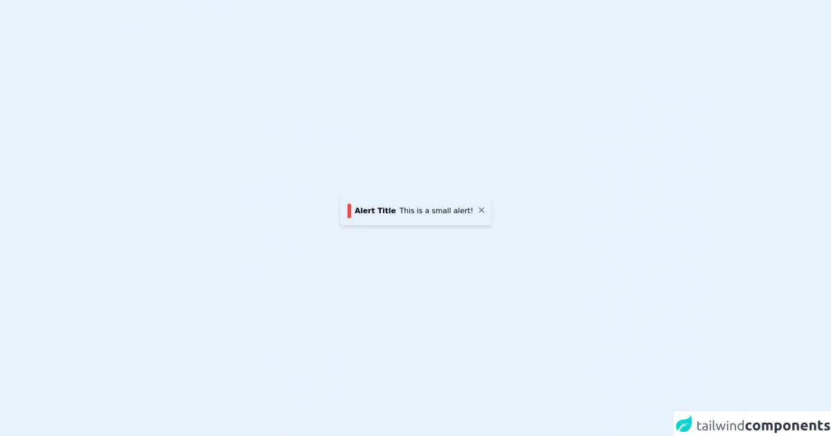
The preview of Bouncing Alert UI component
To create a Bouncing Alert UI component, we will use Tailwind CSS to add animation and transition classes to our HTML elements. The result will be a notification that bounces up and down a few times before disappearing.
Free download of the Bouncing Alert's source code
The source code of Bouncing Alert UI component
To create a Bouncing Alert UI component, we will use HTML and Tailwind CSS. The HTML will contain a div element with the class "alert". We will then use Tailwind CSS to add animation and transition classes to the div element.
<div class="flex h-screen">
  <div class="m-auto">
    <div class="shadow-md p-4 flex flex-row rounded-lg animate-bounce">
      <div class="bg-red-500 inline-block rounded-lg p-1 mr-1"></div>
      <b class="p-1">Alert Title</b>
      <p class="p-1">This is a small alert!</p>
      <a class="h-5 w-5 text-gray-500 inline-block p-1">
        <svg xmlns="http://www.w3.org/2000/svg" class="h-5 w-5" viewBox="0 0 20 20" fill="currentColor">
          <path fill-rule="evenodd" d="M4.293 4.293a1 1 0 011.414 0L10 8.586l4.293-4.293a1 1 0 111.414 1.414L11.414 10l4.293 4.293a1 1 0 01-1.414 1.414L10 11.414l-4.293 4.293a1 1 0 01-1.414-1.414L8.586 10 4.293 5.707a1 1 0 010-1.414z" clip-rule="evenodd" />
        </svg>
      </a>
    </div>
  </div>
</div>
How to create a Bouncing Alert with Tailwind CSS?
To create a Bouncing Alert with Tailwind CSS, we will follow these steps:
Step 1: Create the HTML structure
We will start by creating the HTML structure for our Bouncing Alert. We will create a div element with the class "alert" and add a message inside the div element.
<div class="alert">
    Your message goes here.
</div>
Step 2: Add Tailwind CSS classes
Next, we will add Tailwind CSS classes to our HTML element to create the bouncing animation effect. We will use the "animate-bounce" class to create the bouncing animation and the "transition-all" class to create a smooth transition.
<div class="alert animate-bounce transition-all">
    Your message goes here.
</div>
Step 3: Customize the Bouncing Alert
Finally, we can customize the Bouncing Alert by modifying the Tailwind CSS classes. For example, we can change the background color of the alert by adding the "bg-green-500" class.
<div class="alert animate-bounce transition-all bg-green-500">
    Your message goes here.
</div>
Conclusion
In this article, we explored how to build a Bouncing Alert UI component using Tailwind CSS. We learned that Tailwind CSS is a powerful tool that can be used to create responsive and customizable designs with ease. By following the steps outlined in this article, you can create a Bouncing Alert UI component that will grab the user's attention and provide feedback on their actions.