- Published on
Imagine You Build A Bootstrap Style Pagination With Tailwind CSS Like An Expert. Follow These 6 Steps To Get There
- What is Tailwind CSS?
- The description of Bootstrap style pagination ui component
- Why use Tailwind CSS to create a Bootstrap style pagination ui component?
- The preview of Bootstrap style pagination ui component.
- The source code of Bootstrap style pagination ui component.
- How to create a Bootstrap style pagination with Tailwind CSS?
- Step 1: Create a new HTML file
- Step 2: Add Tailwind CSS
- Step 3: Add custom CSS
- Step 4: Customize the pagination component
- Step 5: Test your pagination component
- Step 6: Deploy your pagination component
- Conclusion
Pagination is an essential part of any website that displays a large amount of data. Bootstrap is a popular CSS framework that provides a pagination component. However, if you want to create a Bootstrap style pagination with a different CSS framework, like Tailwind CSS, you can do it easily. In this article, we will show you how to create a Bootstrap style pagination with Tailwind CSS.
What is Tailwind CSS?
Tailwind CSS is a utility-first CSS framework that provides a set of pre-defined classes to style your HTML elements. It allows you to create custom designs quickly and efficiently without writing any CSS code. Tailwind CSS is highly customizable and can be used with any JavaScript framework or library.
The description of Bootstrap style pagination ui component
Bootstrap provides a pagination component that allows you to split your content into multiple pages. It includes the previous and next buttons, page numbers, and the ability to jump to the first and last pages. The pagination component is fully responsive and can be customized using CSS.
Why use Tailwind CSS to create a Bootstrap style pagination ui component?
Tailwind CSS is a great alternative to Bootstrap because it provides a similar set of pre-defined classes that can be used to create a Bootstrap style pagination. Tailwind CSS is also highly customizable, which means you can create a unique design that matches your website's branding.
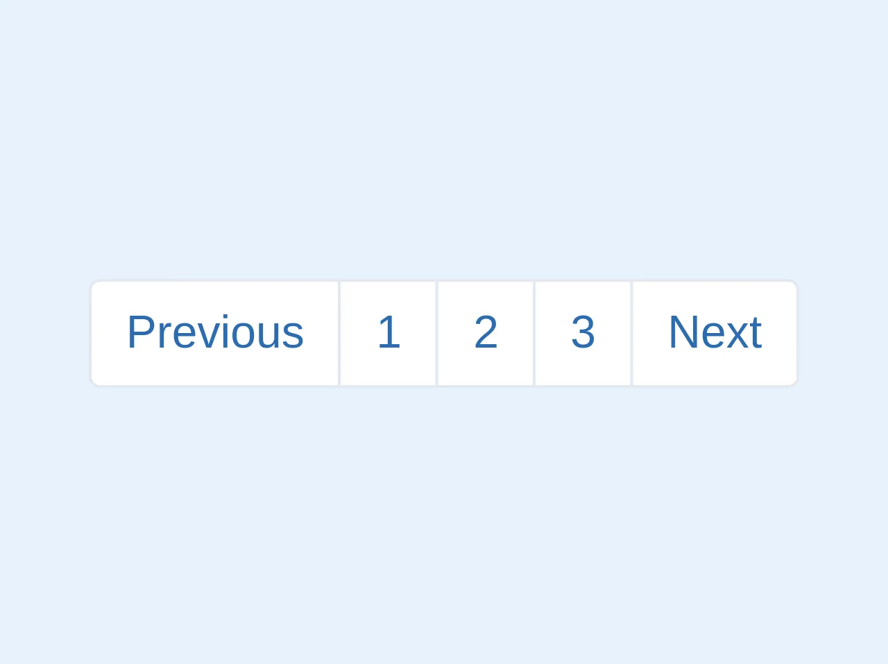
The preview of Bootstrap style pagination ui component.
To create a Bootstrap style pagination with Tailwind CSS, you can use the following HTML code:
<nav class="flex justify-center">
  <ul class="pagination">
    <li class="page-item disabled">
      <a class="page-link" href="#" tabindex="-1" aria-disabled="true">Previous</a>
    </li>
    <li class="page-item active" aria-current="page">
      <a class="page-link" href="#">1 <span class="sr-only">(current)</span></a>
    </li>
    <li class="page-item"><a class="page-link" href="#">2</a></li>
    <li class="page-item"><a class="page-link" href="#">3</a></li>
    <li class="page-item"><a class="page-link" href="#">Next</a></li>
  </ul>
</nav>
Free download of the Bootstrap style pagination's source code
The source code of Bootstrap style pagination ui component.
To create a Bootstrap style pagination with Tailwind CSS, you can use the following CSS code:
.pagination {
  display: inline-flex;
  border-radius: 0.25rem;
}

.page-item {
  display: inline-block;
  margin-right: 0.25rem;
}

.page-link {
  display: block;
  padding: 0.5rem 0.75rem;
  color: #3490dc;
  background-color: #fff;
  border: 1px solid #dee2e6;
  border-radius: 0.25rem;
}

.page-link:hover {
  color: #fff;
  background-color: #3490dc;
  border-color: #3490dc;
}

.page-link:focus {
  outline: none;
  box-shadow: 0 0 0 0.2rem rgba(52, 144, 220, 0.25);
}

.page-item.active .page-link {
  z-index: 1;
  color: #fff;
  background-color: #3490dc;
  border-color: #3490dc;
}

.page-item.disabled .page-link {
  color: #6c757d;
  pointer-events: none;
  background-color: #fff;
  border-color: #dee2e6;
}

.page-item:first-child .page-link {
  margin-left: 0;
  border-top-left-radius: 0.25rem;
  border-bottom-left-radius: 0.25rem;
}

.page-item:last-child .page-link {
  margin-right: 0;
  border-top-right-radius: 0.25rem;
  border-bottom-right-radius: 0.25rem;
}
<!-- This is an example component -->
<div>
	<ul class="flex pl-0 list-none rounded my-2">
		<li class="relative block py-2 px-3 leading-tight bg-white border border-gray-300 text-blue-700 border-r-0 ml-0 rounded-l hover:bg-gray-200"><a class="page-link" href="#">Previous</a></li>
		<li class="relative block py-2 px-3 leading-tight bg-white border border-gray-300 text-blue-700 border-r-0 hover:bg-gray-200"><a class="page-link" href="#">1</a></li>
		<li class="relative block py-2 px-3 leading-tight bg-white border border-gray-300 text-blue-700 border-r-0 hover:bg-gray-200"><a class="page-link" href="#">2</a></li>
		<li class="relative block py-2 px-3 leading-tight bg-white border border-gray-300 text-blue-700 border-r-0 hover:bg-gray-200"><a class="page-link" href="#">3</a></li>
		<li class="relative block py-2 px-3 leading-tight bg-white border border-gray-300 text-blue-700 rounded-r hover:bg-gray-200"><a class="page-link" href="#">Next</a></li>
	</ul>
</div>
How to create a Bootstrap style pagination with Tailwind CSS?
To create a Bootstrap style pagination with Tailwind CSS, follow these six steps:
Step 1: Create a new HTML file
Create a new HTML file and add the following code:
<!DOCTYPE html>
<html lang="en">
<head>
  <meta charset="UTF-8">
  <title>Bootstrap Style Pagination with Tailwind CSS</title>
  <link rel="stylesheet" href="https://cdn.jsdelivr.net/npm/[email protected]/dist/tailwind.min.css">
</head>
<body>
  <nav class="flex justify-center">
    <ul class="pagination">
      <li class="page-item disabled">
        <a class="page-link" href="#" tabindex="-1" aria-disabled="true">Previous</a>
      </li>
      <li class="page-item active" aria-current="page">
        <a class="page-link" href="#">1 <span class="sr-only">(current)</span></a>
      </li>
      <li class="page-item"><a class="page-link" href="#">2</a></li>
      <li class="page-item"><a class="page-link" href="#">3</a></li>
      <li class="page-item"><a class="page-link" href="#">Next</a></li>
    </ul>
  </nav>
</body>
</html>
This code includes the necessary HTML structure for the pagination component.
Step 2: Add Tailwind CSS
Add the Tailwind CSS stylesheet to the head section of your HTML file. You can use the CDN link or download the CSS file and link to it locally.
<link rel="stylesheet" href="https://cdn.jsdelivr.net/npm/[email protected]/dist/tailwind.min.css">
Step 3: Add custom CSS
Add the custom CSS code to your HTML file. This code will style the pagination component using Tailwind CSS classes.
.pagination {
  display: inline-flex;
  border-radius: 0.25rem;
}

.page-item {
  display: inline-block;
  margin-right: 0.25rem;
}

.page-link {
  display: block;
  padding: 0.5rem 0.75rem;
  color: #3490dc;
  background-color: #fff;
  border: 1px solid #dee2e6;
  border-radius: 0.25rem;
}

.page-link:hover {
  color: #fff;
  background-color: #3490dc;
  border-color: #3490dc;
}

.page-link:focus {
  outline: none;
  box-shadow: 0 0 0 0.2rem rgba(52, 144, 220, 0.25);
}

.page-item.active .page-link {
  z-index: 1;
  color: #fff;
  background-color: #3490dc;
  border-color: #3490dc;
}

.page-item.disabled .page-link {
  color: #6c757d;
  pointer-events: none;
  background-color: #fff;
  border-color: #dee2e6;
}

.page-item:first-child .page-link {
  margin-left: 0;
  border-top-left-radius: 0.25rem;
  border-bottom-left-radius: 0.25rem;
}

.page-item:last-child .page-link {
  margin-right: 0;
  border-top-right-radius: 0.25rem;
  border-bottom-right-radius: 0.25rem;
}
Step 4: Customize the pagination component
You can customize the pagination component by changing the colors, font sizes, and other properties. Tailwind CSS provides a wide range of utility classes that can be used to customize your design.
Step 5: Test your pagination component
Test your pagination component by opening the HTML file in your browser. You should see the pagination component with the previous and next buttons, page numbers, and the ability to jump to the first and last pages.
Step 6: Deploy your pagination component
Deploy your pagination component to your website or web application. You can use the same HTML and CSS code in your project, or you can integrate the pagination component into your existing codebase.
Conclusion
Creating a Bootstrap style pagination with Tailwind CSS is easy and straightforward. Tailwind CSS provides a set of pre-defined classes that can be used to create a similar design to Bootstrap. You can customize your design using Tailwind CSS utility classes and deploy your pagination component to your website or web application. With these six steps, you can create a professional-looking pagination component that will enhance your user experience.