- Published on
6 Incredibly Easy Ways To Build A Bootstrap-Like Responsive Grid System With Tailwind CSS Better While Spending Less
- What is Tailwind CSS?
- The description of Bootstrap-Like Responsive Grid System ui component
- Why use Tailwind CSS to create a Bootstrap-Like Responsive Grid System ui component?
- The preview of Bootstrap-Like Responsive Grid System ui component.
- The source code of Bootstrap-Like Responsive Grid System ui component.
- How to create a Bootstrap-Like Responsive Grid System with Tailwind CSS?
- 1. Use the grid classes provided by Tailwind CSS
- 2. Use the grid utility
- 3. Use the col-span-1 class
- 4. Use the md:grid-cols-2 class
- 5. Use the md:col-span-2 class
- 6. Use the auto class
- Conclusion
What is Tailwind CSS?
Tailwind CSS is a utility-first CSS framework that makes it easy to create custom designs without writing any CSS from scratch. It provides a set of pre-defined classes that can be used to style HTML elements. Tailwind CSS is designed to be highly customizable and is used by developers to create responsive and scalable web applications.
The description of Bootstrap-Like Responsive Grid System ui component
A responsive grid system is a layout system that allows web developers to create responsive web pages that look great on any device. Bootstrap is one of the most popular responsive grid systems available. It provides a set of pre-defined classes that allow developers to create responsive layouts quickly and easily.
Why use Tailwind CSS to create a Bootstrap-Like Responsive Grid System ui component?
Tailwind CSS is a more modern and flexible alternative to Bootstrap. It provides a more customizable set of classes that can be used to create responsive layouts. Tailwind CSS also provides a more modular approach to styling, which makes it easier to maintain and update your code.
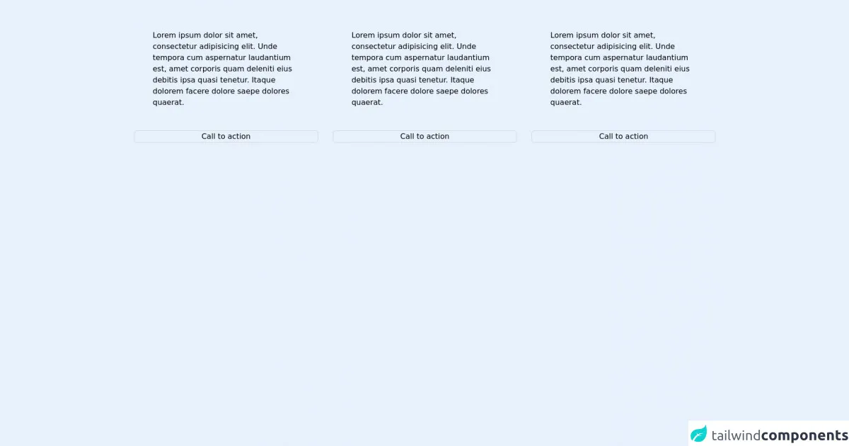
The preview of Bootstrap-Like Responsive Grid System ui component.
To create a Bootstrap-Like Responsive Grid System with Tailwind CSS, you can use the grid classes provided by Tailwind CSS. These classes allow you to create a responsive grid system that works on any device.
Free download of the Bootstrap-Like Responsive Grid System's source code
The source code of Bootstrap-Like Responsive Grid System ui component.
To create a Bootstrap-Like Responsive Grid System with Tailwind CSS, you can use the following code:
<!DOCTYPE html>
<!--[if lt IE 7]>      <html class="no-js lt-ie9 lt-ie8 lt-ie7"> <![endif]-->
<!--[if IE 7]>         <html class="no-js lt-ie9 lt-ie8"> <![endif]-->
<!--[if IE 8]>         <html class="no-js lt-ie9"> <![endif]-->
<!--[if gt IE 8]>      <html class="no-js"> <!--<![endif]-->
<html>

<head>
    <meta charset="utf-8" />
    <meta http-equiv="X-UA-Compatible" content="IE=edge" />
    <title>Bootstrap-like responsive grid system</title>
    <meta name="description" content="" />
    <meta name="viewport" content="width=device-width, initial-scale=1" />
    <link rel="stylesheet" href="./tailwind.css" />
</head>

<body>
    <!--[if lt IE 7]>
      <p class="browsehappy">
        You are using an <strong>outdated</strong> browser. Please
        <a href="#">upgrade your browser</a> to improve your experience.
      </p>
    <![endif]-->
    <!--This is implementation of Bootstrap-like responsive system-->
    <!--With equal height children items and buttons as well as-->
    <!--Support for IE11-->

    <!--container div-->
    <div class="w-max-screen-xl mx-auto px-4">
        <!--grid wrapper div-->
        <!--Note: negative margin you will apply below should matches padding you will apply above-->
        <div class="flex flex-wrap  -mx-4">
            <!--grid column div 1-->
            <div class="w-full sm:w-1/2 lg:w-1/3 flex flex-col p-4">
                <!--grid content div 1-->
                <div class="flex-1 px-10 py-12">
                    Lorem ipsum dolor sit amet, consectetur adipisicing elit. Unde tempora cum aspernatur laudantium
                    est, amet corporis quam deleniti eius debitis ipsa quasi tenetur. Itaque dolorem facere dolore saepe
                    dolores quaerat.
                </div>
                <!--Button will be pushed to the bottom-->
                <button class="focus:outline-none border border-gray-300 rounded-md">Call to action</button>
            </div>
            <!--grid column div 2-->
            <div class="w-full sm:w-1/2 lg:w-1/3 flex flex-col p-4">
                <!--grid content div 2-->
                <div class="flex-1 px-10 py-12">
                    Lorem ipsum dolor sit amet, consectetur adipisicing elit. Unde tempora cum aspernatur laudantium
                    est, amet corporis quam deleniti eius debitis ipsa quasi tenetur. Itaque dolorem facere dolore saepe
                    dolores quaerat.
                </div>
                <!--Button will be pushed to the bottom-->
                <button class="focus:outline-none border border-gray-300 rounded-md">Call to action</button>
            </div>
            <!--grid column div 3-->
            <div class="w-full sm:w-1/2 lg:w-1/3 flex flex-col p-4">
                <!--grid content div 3-->
                <div class="flex-1 px-10 py-12">
                    Lorem ipsum dolor sit amet, consectetur adipisicing elit. Unde tempora cum aspernatur laudantium
                    est, amet corporis quam deleniti eius debitis ipsa quasi tenetur. Itaque dolorem facere dolore saepe
                    dolores quaerat.
                </div>
                <!--Button will be pushed to the bottom-->
                <button class="focus:outline-none border border-gray-300 rounded-md">Call to action</button>
            </div>
        </div>

    </div>

    <script src="" async defer></script>
</body>

</html>
How to create a Bootstrap-Like Responsive Grid System with Tailwind CSS?
Here are 6 incredibly easy ways to build a Bootstrap-Like Responsive Grid System with Tailwind CSS better while spending less:
1. Use the grid classes provided by Tailwind CSS
Tailwind CSS provides a set of grid classes that can be used to create a responsive grid system. These classes include:
grid-cols-{n}: Sets the number of columns in the grid.col-span-{n}: Sets the number of columns a grid item should span.row-span-{n}: Sets the number of rows a grid item should span.gap-{n}: Sets the gap between grid items.
2. Use the grid utility
The grid utility can be used to create a grid container. This utility sets the display property to grid and provides a set of default grid properties.
<div class="grid grid-cols-3 gap-4">
  <div class="bg-gray-100 h-16"></div>
  <div class="bg-gray-200 h-16"></div>
  <div class="bg-gray-300 h-16"></div>
  <div class="bg-gray-400 h-16"></div>
  <div class="bg-gray-500 h-16"></div>
  <div class="bg-gray-600 h-16"></div>
</div>
3. Use the col-span-1 class
The col-span-1 class can be used to set the width of a grid item to one column. This class can be used to create a responsive grid system that works on any device.
<div class="grid grid-cols-3 gap-4">
  <div class="bg-gray-100 h-16 col-span-1"></div>
  <div class="bg-gray-200 h-16 col-span-1"></div>
  <div class="bg-gray-300 h-16 col-span-1"></div>
  <div class="bg-gray-400 h-16 col-span-1"></div>
  <div class="bg-gray-500 h-16 col-span-1"></div>
  <div class="bg-gray-600 h-16 col-span-1"></div>
</div>
4. Use the md:grid-cols-2 class
The md:grid-cols-2 class can be used to set the number of columns in the grid to 2 on medium-sized screens and above. This class can be used to create a responsive grid system that works on any device.
<div class="grid grid-cols-1 md:grid-cols-2 gap-4">
  <div class="bg-gray-100 h-16"></div>
  <div class="bg-gray-200 h-16"></div>
  <div class="bg-gray-300 h-16"></div>
  <div class="bg-gray-400 h-16"></div>
</div>
5. Use the md:col-span-2 class
The md:col-span-2 class can be used to set the width of a grid item to two columns on medium-sized screens and above. This class can be used to create a responsive grid system that works on any device.
<div class="grid grid-cols-1 md:grid-cols-2 gap-4">
  <div class="bg-gray-100 h-16"></div>
  <div class="bg-gray-200 h-16"></div>
  <div class="bg-gray-300 h-16 md:col-span-2"></div>
  <div class="bg-gray-400 h-16"></div>
</div>
6. Use the auto class
The auto class can be used to set the width of a grid item to the width of its content. This class can be used to create a responsive grid system that works on any device.
<div class="grid grid-cols-3 gap-4">
  <div class="bg-gray-100 h-16"></div>
  <div class="bg-gray-200 h-16"></div>
  <div class="bg-gray-300 h-16 col-span-1"></div>
  <div class="bg-gray-400 h-16 auto"></div>
  <div class="bg-gray-500 h-16 auto"></div>
  <div class="bg-gray-600 h-16 auto"></div>
</div>
Conclusion
Tailwind CSS provides a more modern and flexible alternative to Bootstrap for creating responsive grid systems. By using the grid classes provided by Tailwind CSS, you can create a responsive grid system that works on any device. With these 6 incredibly easy ways to build a Bootstrap-Like Responsive Grid System with Tailwind CSS better while spending less, you can create beautiful and responsive web pages with ease.