- Published on
The Ninja Guide To How To Create A Bootstrap Like Pagination With Tailwind CSS Better
- What is Tailwind CSS?
- The description of Bootstrap Like Pagination ui component
- Why use Tailwind CSS to create a Bootstrap Like Pagination ui component?
- The preview of Bootstrap Like Pagination ui component
- The source code of Bootstrap Like Pagination ui component
- How to create a Bootstrap Like Pagination with Tailwind CSS?
- Step 1: Define the HTML structure for the pagination component
- Step 2: Apply the Tailwind CSS classes to style the pagination component
- Step 3: Add JavaScript code to handle pagination events
- Conclusion
As a FrontEnd technology blogger, you must have heard of Tailwind CSS and Bootstrap. Both of them are popular CSS frameworks that can help developers create beautiful and responsive UI components quickly. In this article, we will explore how to create a Bootstrap like pagination with Tailwind CSS better.
What is Tailwind CSS?
Tailwind CSS is a utility-first CSS framework that provides a set of pre-defined classes to style HTML elements. It allows developers to create custom designs quickly by combining these classes. Tailwind CSS is highly customizable and can be configured to match the design requirements of any project.
The description of Bootstrap Like Pagination ui component
Pagination is a common UI component used in web applications to divide content into multiple pages. Bootstrap provides a pre-built pagination component that can be easily integrated into any web application. The Bootstrap pagination component is highly customizable and can be styled according to the design requirements of the project.
Why use Tailwind CSS to create a Bootstrap Like Pagination ui component?
Tailwind CSS provides a set of pre-defined classes that can be used to create a Bootstrap like pagination component quickly. The classes can be customized to match the design requirements of the project. Using Tailwind CSS to create a Bootstrap like pagination component is faster and more efficient than creating it from scratch.
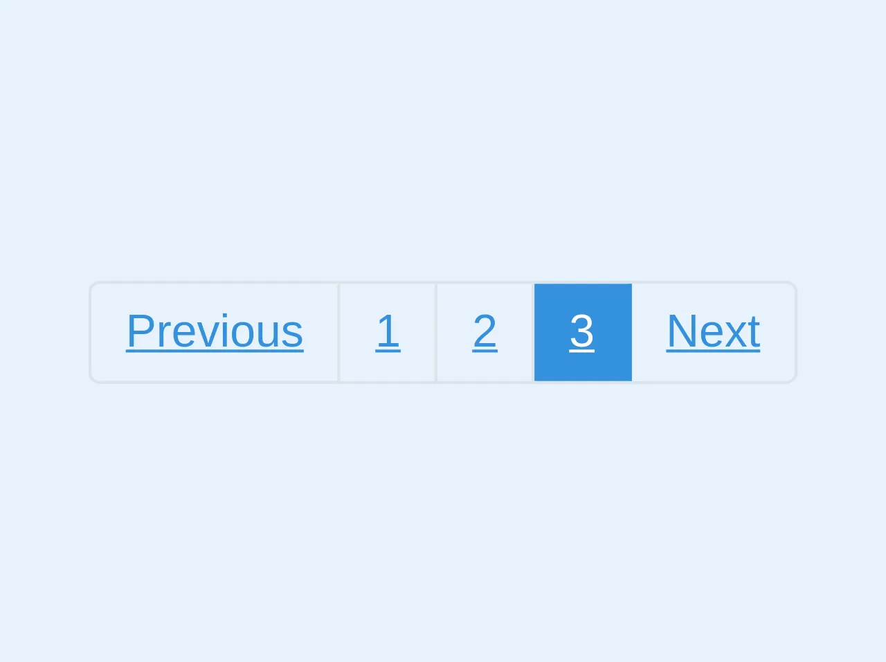
The preview of Bootstrap Like Pagination ui component
To create a Bootstrap like pagination component with Tailwind CSS, we first need to understand the structure of the component. The Bootstrap pagination component consists of a list of page numbers and navigation buttons. The active page number is highlighted, and the navigation buttons allow the user to move to the next or previous page.
Free download of the Bootstrap Like Pagination's source code
The source code of Bootstrap Like Pagination ui component
To create a Bootstrap like pagination component with Tailwind CSS, we need to define the HTML structure and apply the Tailwind CSS classes. The following code shows the HTML structure and the Tailwind CSS classes used to create the Bootstrap like pagination component.
<ul class="flex list-reset border border-grey-light rounded w-auto font-sans">
  <li><a class="block hover:text-white hover:bg-blue text-blue border-r border-grey-light px-3 py-2" href="#">Previous</a></li>
  <li><a class="block hover:text-white hover:bg-blue text-blue border-r border-grey-light px-3 py-2" href="#">1</a></li>
  <li><a class="block hover:text-white hover:bg-blue text-blue border-r border-grey-light px-3 py-2" href="#">2</a></li>
  <li><a class="block text-white bg-blue border-r border-blue px-3 py-2" href="#">3</a></li>
  <li><a class="block hover:text-white hover:bg-blue text-blue px-3 py-2" href="#">Next</a></li>
</ul>
How to create a Bootstrap Like Pagination with Tailwind CSS?
To create a Bootstrap like pagination with Tailwind CSS, follow these steps:
- Define the HTML structure for the pagination component.
- Apply the Tailwind CSS classes to style the pagination component.
- Add JavaScript code to handle pagination events.
Step 1: Define the HTML structure for the pagination component
The HTML structure for the Bootstrap like pagination component is as follows:
<nav class="flex items-center justify-between">
  <div class="flex">
    <a href="#" class="px-3 py-2 rounded-l-md bg-gray-200 text-gray-700 hover:bg-gray-300">
      Previous
    </a>
    <a href="#" class="px-3 py-2 rounded-r-md bg-gray-200 text-gray-700 hover:bg-gray-300">
      Next
    </a>
  </div>
  <div class="flex">
    <a href="#" class="px-3 py-2 bg-gray-200 text-gray-700 hover:bg-gray-300">1</a>
    <a href="#" class="px-3 py-2 bg-gray-200 text-gray-700 hover:bg-gray-300">2</a>
    <a href="#" class="px-3 py-2 bg-gray-200 text-gray-700 hover:bg-gray-300">3</a>
  </div>
</nav>
In this HTML structure, we have a nav element that contains two div elements. The first div element contains the navigation buttons, and the second div element contains the page numbers.
Step 2: Apply the Tailwind CSS classes to style the pagination component
To style the pagination component, we need to apply the Tailwind CSS classes to the HTML elements. The following classes are used to style the pagination component:
/* Navigation buttons */
.rounded-l-md {
  border-top-left-radius: 0.25rem;
  border-bottom-left-radius: 0.25rem;
}

.rounded-r-md {
  border-top-right-radius: 0.25rem;
  border-bottom-right-radius: 0.25rem;
}

/* Page numbers */
.bg-gray-200 {
  background-color: #edf2f7;
}

.text-gray-700 {
  color: #4a5568;
}

.hover\:bg-gray-300:hover {
  background-color: #e2e8f0;
}
These classes define the styles for the navigation buttons and the page numbers. We use the rounded-l-md and rounded-r-md classes to apply rounded corners to the navigation buttons. The bg-gray-200, text-gray-700, and hover:bg-gray-300 classes are used to style the page numbers.
Step 3: Add JavaScript code to handle pagination events
To handle pagination events, we need to add JavaScript code to the web page. The following code shows how to handle the click event on the navigation buttons:
const prevButton = document.querySelector('.rounded-l-md');
const nextButton = document.querySelector('.rounded-r-md');

prevButton.addEventListener('click', () => {
  // Handle previous button click
});

nextButton.addEventListener('click', () => {
  // Handle next button click
});
In this code, we select the navigation buttons using the querySelector method and add a click event listener to each button. When the user clicks on the button, the corresponding event handler is called.
Conclusion
In this article, we have explored how to create a Bootstrap like pagination with Tailwind CSS better. We have learned how to define the HTML structure, apply the Tailwind CSS classes, and handle pagination events using JavaScript. Using Tailwind CSS to create a Bootstrap like pagination component is faster and more efficient than creating it from scratch. With Tailwind CSS, you can create custom designs quickly and easily.