- Published on
Learn How To Create A Bootstrap Card With Tailwind CSS from the Pros
- What is Tailwind CSS?
- The description of Bootstrap Card UI component
- Why use Tailwind CSS to create a Bootstrap Card UI component?
- The preview of Bootstrap Card UI component
- The source code of Bootstrap Card UI component
- How to create a Bootstrap Card with Tailwind CSS?
- Step 1: Setting up the HTML structure
- Step 2: Styling the card with Tailwind CSS
- Step 3: Adding more styles with Tailwind CSS
- Conclusion
Are you looking to create a Bootstrap Card UI component for your website? Do you want to learn how to do it with Tailwind CSS? In this article, we will walk you through the steps to create a Bootstrap Card using Tailwind CSS.
What is Tailwind CSS?
Tailwind CSS is a utility-first CSS framework that allows developers to create custom designs quickly. It offers a set of pre-defined classes that can be used to style HTML elements. Tailwind CSS is gaining popularity among developers because of its simplicity and ease of use.
The description of Bootstrap Card UI component
Bootstrap Card is a UI component that is used to display content in a structured and organized way. It is a container that can hold text, images, and other HTML elements. Bootstrap Card is a popular UI component among developers because of its flexibility and ease of use.
Why use Tailwind CSS to create a Bootstrap Card UI component?
Tailwind CSS is a great choice for creating Bootstrap Cards because it offers a set of pre-defined classes that can be used to style the card. This makes it easy for developers to create custom designs without having to write CSS from scratch. Tailwind CSS also offers a responsive design that works well on all screen sizes.
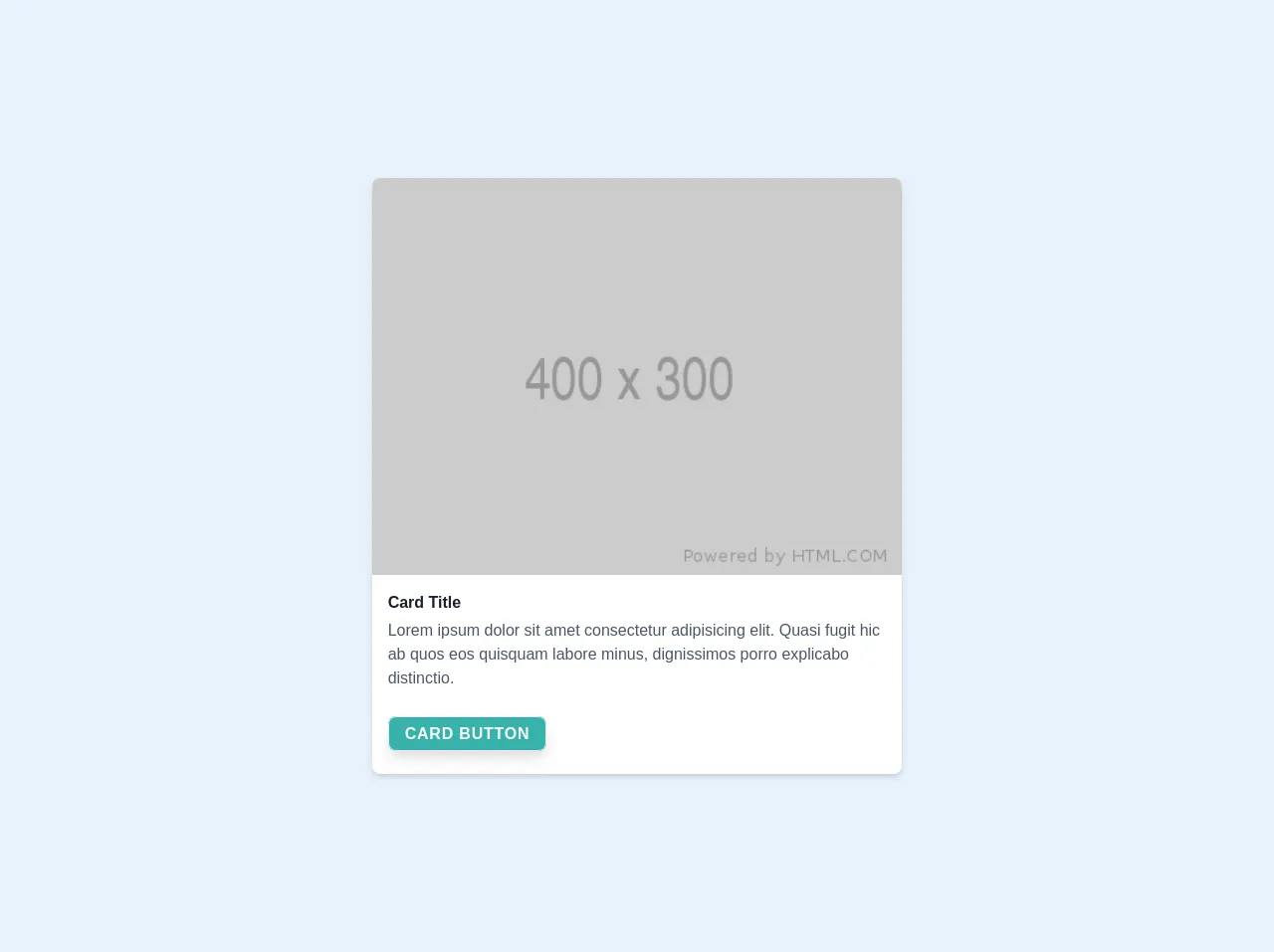
The preview of Bootstrap Card UI component
Bootstrap Card UI component is a container that can hold text, images, and other HTML elements. It is a popular UI component among developers because of its flexibility and ease of use.
Free download of the Bootstrap Card's source code
The source code of Bootstrap Card UI component
To create a Bootstrap Card UI component with Tailwind CSS, you need to write HTML and CSS code. The HTML code defines the structure of the card, while the CSS code styles the card.
<!doctype html>
<html lang="en">

<head>
  <meta charset="utf-8">
  <meta name="viewport" content="width=device-width, initial-scale=1, shrink-to-fit=no">
  <!--  <link rel="icon" type="image/png" sizes="32x32" href="/favicon-32x32.png">
  <link rel="icon" type="image/png" sizes="16x16" href="/favicon-16x16.png"> -->
  <link rel="stylesheet" href="/build/tailwind.css">
  <title>Welcome to Tailwind!</title>
</head>

<body class="antialiased bg-gray-300 h-screen text-gray-900 font-sans">

  <div class="flex my-10">
    <div class="bg-white w-1/2 m-auto border-1  border-dashed border-gray-100 shadow-md rounded-lg overflow-hidden">
      <img src="https://via.placeholder.com/400x300" alt="" class="w-full object-cover object-center" />
      <div class="p-4">
        <p class="mb-1 text-gray-900 font-semibold">Card Title</p>

        <span class="text-gray-700">Lorem ipsum dolor sit amet consectetur adipisicing elit. Quasi fugit hic ab quos eos
          quisquam labore minus, dignissimos porro explicabo distinctio.</span>

        <div class="mt-8 mb-3">
          <a href="#"
            class="px-4 py-2 bg-teal-500 shadow-lg border rounded-lg text-white uppercase font-semibold tracking-wider focus:outline-none focus:shadow-outline hover:bg-teal-400 active:bg-teal-400">Card
            Button</a>
        </div>
      </div>
    </div>
  </div>

</body>
</html>
How to create a Bootstrap Card with Tailwind CSS?
To create a Bootstrap Card with Tailwind CSS, follow these steps:
Step 1: Setting up the HTML structure
The first step is to set up the HTML structure of the card. You can use the following code as a starting point:
<div class="bg-white rounded-lg shadow-lg">
  <img src="https://via.placeholder.com/150" alt="Placeholder" class="w-full h-48 object-cover rounded-t-lg">
  <div class="p-4">
    <h2 class="text-gray-800 font-semibold text-lg mb-2">Card Title</h2>
    <p class="text-gray-700">Lorem ipsum dolor sit amet, consectetur adipiscing elit. Sed non risus. Suspendisse lectus tortor, dignissim sit amet, adipiscing nec, ultricies sed, dolor.</p>
  </div>
</div>
This code creates a basic card structure with an image, title, and description.
Step 2: Styling the card with Tailwind CSS
The next step is to style the card using Tailwind CSS classes. Here's an example of how you can style the card:
<div class="bg-white rounded-lg shadow-lg">
  <img src="https://via.placeholder.com/150" alt="Placeholder" class="w-full h-48 object-cover rounded-t-lg">
  <div class="p-4">
    <h2 class="text-gray-800 font-semibold text-lg mb-2">Card Title</h2>
    <p class="text-gray-700">Lorem ipsum dolor sit amet, consectetur adipiscing elit. Sed non risus. Suspendisse lectus tortor, dignissim sit amet, adipiscing nec, ultricies sed, dolor.</p>
    <div class="mt-4">
      <a href="#" class="text-gray-700 font-semibold">Read more</a>
    </div>
  </div>
</div>
This code adds some padding, a background color, and a drop shadow to the card. It also adds some margin to the read more link.
Step 3: Adding more styles with Tailwind CSS
You can add more styles to the card using Tailwind CSS classes. Here are some examples:
<div class="bg-white rounded-lg shadow-lg">
  <img src="https://via.placeholder.com/150" alt="Placeholder" class="w-full h-48 object-cover rounded-t-lg">
  <div class="p-4">
    <h2 class="text-gray-800 font-semibold text-lg mb-2">Card Title</h2>
    <p class="text-gray-700">Lorem ipsum dolor sit amet, consectetur adipiscing elit. Sed non risus. Suspendisse lectus tortor, dignissim sit amet, adipiscing nec, ultricies sed, dolor.</p>
    <div class="mt-4">
      <a href="#" class="text-gray-700 font-semibold">Read more</a>
      <div class="flex items-center mt-4">
        <img src="https://via.placeholder.com/50" alt="Placeholder" class="w-10 h-10 rounded-full mr-4">
        <div>
          <p class="text-gray-800 font-semibold">Author Name</p>
          <p class="text-gray-700">Published on January 1, 2022</p>
        </div>
      </div>
    </div>
  </div>
</div>
This code adds an author section with an image, name, and publication date. It also adds some margin to the author section.
Conclusion
Creating a Bootstrap Card UI component with Tailwind CSS is easy and straightforward. Tailwind CSS offers a set of pre-defined classes that can be used to style the card, making it easy for developers to create custom designs. By following the steps outlined in this article, you can create a Bootstrap Card UI component for your website in no time.