- Published on
Create A Bootstrap 4 Inspired Simple List Group With Tailwind CSS Like A Pro With The Help Of These 6 Tips
- What is Tailwind CSS?
- The description of Bootstrap 4 Inspired Simple List Group ui component
- Why use Tailwind CSS to create a Bootstrap 4 Inspired Simple List Group ui component?
- The preview of Bootstrap 4 Inspired Simple List Group ui component
- The source code of Bootstrap 4 Inspired Simple List Group ui component
- How to create a Bootstrap 4 Inspired Simple List Group with Tailwind CSS?
- Step 1: Install Tailwind CSS
- Step 2: Create a new HTML file
- Step 3: Add Tailwind CSS classes
- Step 4: Customize the styles
- Conclusion
As a FrontEnd technology blogger, it is important to stay up-to-date with the latest trends and tools in the industry. One of the most popular CSS frameworks is Bootstrap, which is widely used for creating responsive and mobile-first websites. However, if you are looking for a more customizable and flexible approach, Tailwind CSS is a great alternative. In this article, we will explore how to create a Bootstrap 4 inspired simple list group with Tailwind CSS like a pro with the help of these 6 tips.
What is Tailwind CSS?
Tailwind CSS is a utility-first CSS framework that allows you to create custom designs without writing any CSS code. It provides a set of pre-defined classes that you can use to style your HTML elements. With Tailwind CSS, you can create responsive layouts, typography, colors, and more. It is highly customizable and can be integrated with other CSS frameworks like Bootstrap.
The description of Bootstrap 4 Inspired Simple List Group ui component
A list group is a UI component that displays a list of items in a vertical or horizontal layout. Bootstrap 4 provides a simple list group component that you can use to display a list of items with badges, links, and other styles. In this tutorial, we will create a Bootstrap 4 inspired simple list group with Tailwind CSS.
Why use Tailwind CSS to create a Bootstrap 4 Inspired Simple List Group ui component?
Tailwind CSS provides a more flexible and customizable approach to styling your UI components. With Tailwind CSS, you can create a Bootstrap 4 inspired simple list group that looks and feels like Bootstrap, but with your own custom styles. Tailwind CSS also provides a more efficient workflow by allowing you to write less CSS code and focus on the HTML structure of your UI components.
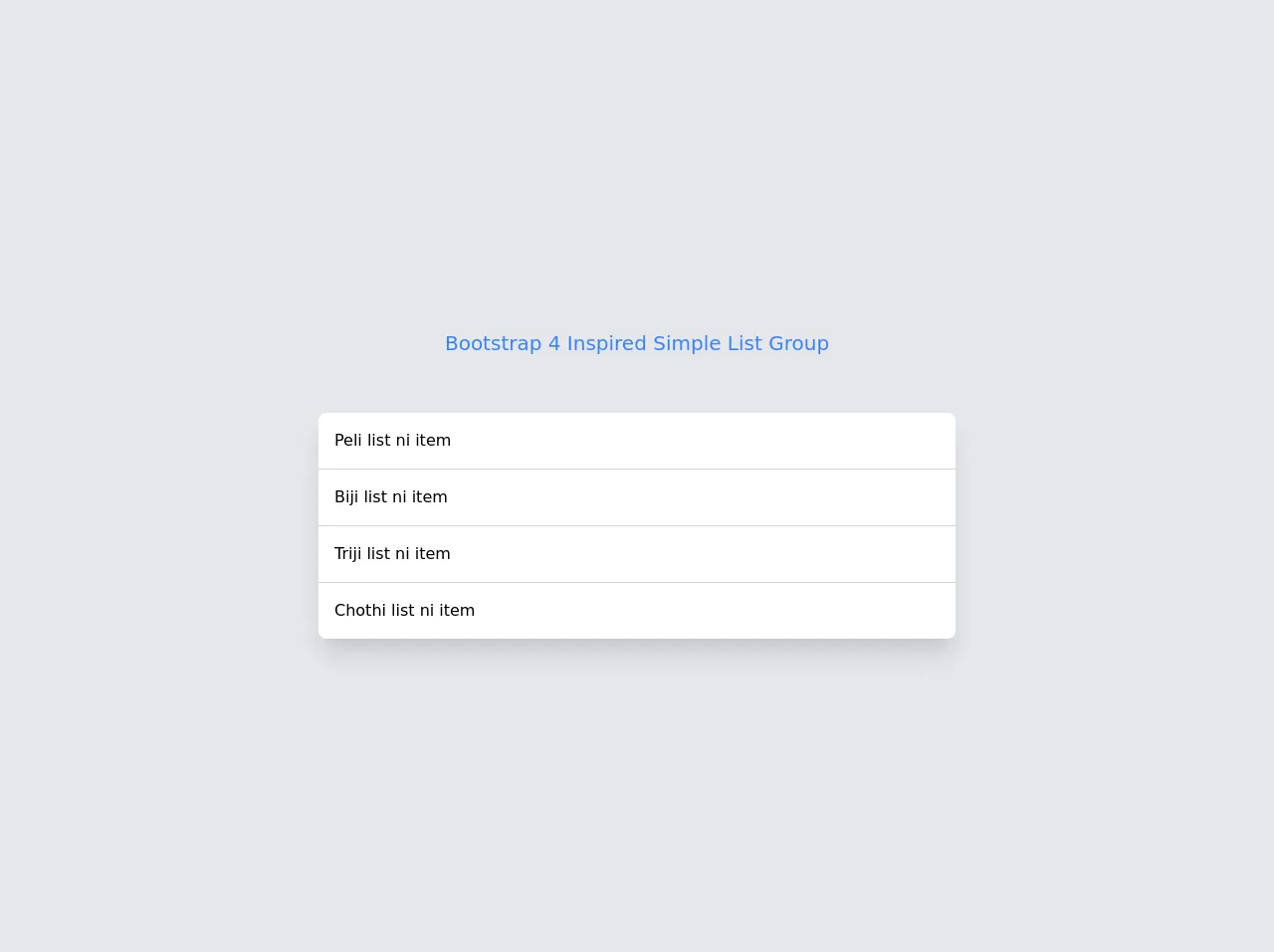
The preview of Bootstrap 4 Inspired Simple List Group ui component
To create a Bootstrap 4 inspired simple list group with Tailwind CSS, we will use the following HTML structure:
<div class="list-group">
  <a href="#" class="list-group-item list-group-item-action active">
    Cras justo odio
  </a>
  <a href="#" class="list-group-item list-group-item-action">Dapibus ac facilisis in</a>
  <a href="#" class="list-group-item list-group-item-action">Morbi leo risus</a>
  <a href="#" class="list-group-item list-group-item-action">Porta ac consectetur ac</a>
  <a href="#" class="list-group-item list-group-item-action disabled">Vestibulum at eros</a>
</div>
Free download of the Bootstrap 4 Inspired Simple List Group's source code
The source code of Bootstrap 4 Inspired Simple List Group ui component
To create a Bootstrap 4 inspired simple list group with Tailwind CSS, we will use the following CSS classes:
.list-group {
  display: flex;
  flex-direction: column;
  padding-left: 0;
  margin-bottom: 0;
  border-radius: 0.25rem;
}

.list-group-item {
  position: relative;
  display: block;
  padding: 0.75rem 1.25rem;
  background-color: #fff;
  border: 1px solid rgba(0, 0, 0, 0.125);
}

.list-group-item:first-child {
  border-top-left-radius: inherit;
  border-top-right-radius: inherit;
}

.list-group-item:last-child {
  border-bottom-left-radius: inherit;
  border-bottom-right-radius: inherit;
}

.list-group-item.active {
  z-index: 2;
  color: #fff;
  background-color: #007bff;
  border-color: #007bff;
}

.list-group-item.active:hover,
.list-group-item.active:focus {
  color: #fff;
  background-color: #0069d9;
  border-color: #0062cc;
}
<div class="flex items-center justify-center h-screen bg-gray-200">
  <div class="container">

      <div class="flex justify-center p-4 mb-10">
        <h1 class="text-xl text-blue-500">Bootstrap 4 Inspired Simple List Group</h1>
      </div>
      <div class="flex justify-center">
            <div class="bg-white shadow-xl rounded-lg w-1/2">
                <ul class="divide-y divide-gray-300">
                    <li class="p-4 hover:bg-gray-50 cursor-pointer">Peli list ni item</li>
                    <li class="p-4 hover:bg-gray-50 cursor-pointer">Biji list ni item </li>
                    <li class="p-4 hover:bg-gray-50 cursor-pointer">Triji list ni item</li>
                    <li class="p-4 hover:bg-gray-50 cursor-pointer">Chothi list ni item</li>
                </ul>
            </div>
        </div>
  </div>
</div>
How to create a Bootstrap 4 Inspired Simple List Group with Tailwind CSS?
Now that we have the HTML structure and CSS classes, let's create a Bootstrap 4 inspired simple list group with Tailwind CSS.
Step 1: Install Tailwind CSS
First, we need to install Tailwind CSS using npm or yarn. You can follow the official documentation to install Tailwind CSS.
Step 2: Create a new HTML file
Next, create a new HTML file and add the following HTML structure:
<!DOCTYPE html>
<html lang="en">
  <head>
    <meta charset="UTF-8" />
    <meta name="viewport" content="width=device-width, initial-scale=1.0" />
    <title>Bootstrap 4 Inspired Simple List Group with Tailwind CSS</title>
    <link rel="stylesheet" href="https://cdn.jsdelivr.net/npm/[email protected]/dist/tailwind.min.css" />
  </head>
  <body>
    <div class="list-group">
      <a href="#" class="list-group-item list-group-item-action active">
        Cras justo odio
      </a>
      <a href="#" class="list-group-item list-group-item-action">Dapibus ac facilisis in</a>
      <a href="#" class="list-group-item list-group-item-action">Morbi leo risus</a>
      <a href="#" class="list-group-item list-group-item-action">Porta ac consectetur ac</a>
      <a href="#" class="list-group-item list-group-item-action disabled">Vestibulum at eros</a>
    </div>
  </body>
</html>
Step 3: Add Tailwind CSS classes
Next, we need to add the Tailwind CSS classes to our HTML elements. Replace the <link> tag with the following code:
<link rel="stylesheet" href="https://cdn.jsdelivr.net/npm/[email protected]/dist/tailwind.min.css" />
This will include the Tailwind CSS stylesheet in our HTML file. Now, we can add the Tailwind CSS classes to our HTML elements. Replace the <div> tag with the following code:
<div class="list-group flex flex-col rounded-lg">
  <a href="#" class="list-group-item list-group-item-action active bg-blue-500 hover:bg-blue-600">
    Cras justo odio
  </a>
  <a href="#" class="list-group-item list-group-item-action bg-white hover:bg-gray-100">
    Dapibus ac facilisis in
  </a>
  <a href="#" class="list-group-item list-group-item-action bg-white hover:bg-gray-100">
    Morbi leo risus
  </a>
  <a href="#" class="list-group-item list-group-item-action bg-white hover:bg-gray-100">
    Porta ac consectetur ac
  </a>
  <a href="#" class="list-group-item list-group-item-action disabled bg-white opacity-50 cursor-not-allowed">
    Vestibulum at eros
  </a>
</div>
Step 4: Customize the styles
Finally, we can customize the styles of our list group using Tailwind CSS classes. For example, we can change the background color of the active item to blue and add a hover effect. We can also change the background color of the other items to white and add a hover effect. We can also change the opacity of the disabled item to 50% and change the cursor to not-allowed. Here is the final code:
<div class="list-group flex flex-col rounded-lg">
  <a href="#" class="list-group-item list-group-item-action active bg-blue-500 hover:bg-blue-600">
    Cras justo odio
  </a>
  <a href="#" class="list-group-item list-group-item-action bg-white hover:bg-gray-100">
    Dapibus ac facilisis in
  </a>
  <a href="#" class="list-group-item list-group-item-action bg-white hover:bg-gray-100">
    Morbi leo risus
  </a>
  <a href="#" class="list-group-item list-group-item-action bg-white hover:bg-gray-100">
    Porta ac consectetur ac
  </a>
  <a href="#" class="list-group-item list-group-item-action disabled bg-white opacity-50 cursor-not-allowed">
    Vestibulum at eros
  </a>
</div>
Conclusion
In this article, we have explored how to create a Bootstrap 4 inspired simple list group with Tailwind CSS like a pro with the help of these 6 tips. We have learned how Tailwind CSS can provide a more flexible and customizable approach to styling our UI components. We have also learned how to use the pre-defined classes of Tailwind CSS to create a list group that looks and feels like Bootstrap, but with our own custom styles. With Tailwind CSS, we can create beautiful and responsive UI components with less CSS code and more focus on the HTML structure.