- Published on
3 Things You Must Know To Create A Blue Buttons Example With Tailwind CSS
- What is Tailwind CSS?
- The description of Blue buttons example ui component
- Why use Tailwind CSS to create a Blue buttons example ui component?
- The preview of Blue buttons example ui component
- The source code of Blue buttons example ui component
- How to create a Blue buttons example with Tailwind CSS?
- Step 1: Set up a new project
- Step 2: Add the HTML code for the buttons
- Step 3: Style the buttons with Tailwind CSS classes
- Step 4: Customize the buttons
- Conclusion
What is Tailwind CSS?
Tailwind CSS is a utility-first CSS framework that provides a set of pre-defined CSS classes that can be used to style HTML elements. It is designed to help developers build responsive and customizable user interfaces quickly and efficiently. With Tailwind CSS, you can create complex UI components with minimal CSS code.
The description of Blue buttons example ui component
The Blue buttons example UI component is a set of buttons that are styled with a blue color scheme. This component can be used in a variety of applications, such as e-commerce websites, social media platforms, and mobile apps. The buttons are designed to be visually appealing and easy to use, with clear labels and hover effects.
Why use Tailwind CSS to create a Blue buttons example ui component?
Tailwind CSS provides a wide range of pre-defined CSS classes that can be used to style UI components quickly and easily. This makes it an ideal choice for creating the Blue buttons example UI component. With Tailwind CSS, you can customize the colors, sizes, and styles of the buttons without having to write a lot of CSS code. This saves time and makes it easier to maintain the codebase.
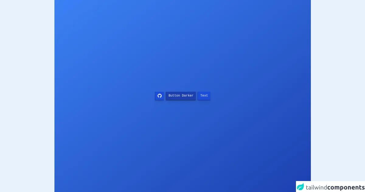
The preview of Blue buttons example ui component
The Blue buttons example UI component consists of three buttons with different sizes and styles. The buttons are styled with a blue color scheme and have hover effects that make them stand out.
Free download of the Blue buttons example's source code
The source code of Blue buttons example ui component
To create the Blue buttons example UI component with Tailwind CSS, you can use the following HTML and CSS code:
<div class="bg-gradient-to-tl from-blue-800 to-blue-500 text-white font-mono flex flex-col min-h-screen">
	<div class="flex flex-row-reverse flex-wrap m-auto">
		<button class="rounded px-3 py-2 m-1 border-b-4 border-l-2 shadow-lg bg-blue-700 border-blue-800 text-white">
        Text
    </button>
    <button class="rounded px-3 py-2 m-1 border-b-4 border-l-2 shadow-lg bg-blue-800 border-blue-900 text-white">
        Button Darker
    </button>
		<button class="rounded px-3 py-2 m-1 border-b-4 border-l-2 shadow-lg bg-blue-700 border-blue-800" href="">
			<svg role="img" viewBox="0 0 24 24" xmlns="http://www.w3.org/2000/svg"
				class="w-5 h-5 text-white fill-current text-center">
				<title>GitHub icon</title>
				<path
					d="M12 .297c-6.63 0-12 5.373-12 12 0 5.303 3.438 9.8 8.205 11.385.6.113.82-.258.82-.577 0-.285-.01-1.04-.015-2.04-3.338.724-4.042-1.61-4.042-1.61C4.422 18.07 3.633 17.7 3.633 17.7c-1.087-.744.084-.729.084-.729 1.205.084 1.838 1.236 1.838 1.236 1.07 1.835 2.809 1.305 3.495.998.108-.776.417-1.305.76-1.605-2.665-.3-5.466-1.332-5.466-5.93 0-1.31.465-2.38 1.235-3.22-.135-.303-.54-1.523.105-3.176 0 0 1.005-.322 3.3 1.23.96-.267 1.98-.399 3-.405 1.02.006 2.04.138 3 .405 2.28-1.552 3.285-1.23 3.285-1.23.645 1.653.24 2.873.12 3.176.765.84 1.23 1.91 1.23 3.22 0 4.61-2.805 5.625-5.475 5.92.42.36.81 1.096.81 2.22 0 1.606-.015 2.896-.015 3.286 0 .315.21.69.825.57C20.565 22.092 24 17.592 24 12.297c0-6.627-5.373-12-12-12" />
			</svg>
		</button>
	</div>
</div>
How to create a Blue buttons example with Tailwind CSS?
To create the Blue buttons example UI component with Tailwind CSS, follow these steps:
Step 1: Set up a new project
Create a new HTML file and link to the Tailwind CSS stylesheet in the head section of the file.
<!DOCTYPE html>
<html>
  <head>
    <title>Blue Buttons Example</title>
    <link rel="stylesheet" href="https://cdn.jsdelivr.net/npm/[email protected]/dist/tailwind.min.css">
  </head>
  <body>
    <!-- Your HTML code goes here -->
  </body>
</html>
Step 2: Add the HTML code for the buttons
Add the HTML code for the three buttons to the body section of the file.
<button class="bg-blue-500 hover:bg-blue-700 text-white font-bold py-2 px-4 rounded">
  Button
</button>

<button class="bg-blue-500 hover:bg-blue-700 text-white font-bold py-2 px-4 rounded-full">
  Button
</button>

<button class="bg-blue-500 hover:bg-blue-700 text-white font-bold py-3 px-6 rounded-lg">
  Button
</button>
Step 3: Style the buttons with Tailwind CSS classes
Use the Tailwind CSS classes to style the buttons with a blue color scheme and hover effects.
<button class="bg-blue-500 hover:bg-blue-700 text-white font-bold py-2 px-4 rounded">
  Button
</button>

<button class="bg-blue-500 hover:bg-blue-700 text-white font-bold py-2 px-4 rounded-full">
  Button
</button>

<button class="bg-blue-500 hover:bg-blue-700 text-white font-bold py-3 px-6 rounded-lg">
  Button
</button>
Step 4: Customize the buttons
You can customize the buttons by changing the color scheme, size, and style using Tailwind CSS classes.
<button class="bg-green-500 hover:bg-green-700 text-white font-bold py-2 px-4 rounded">
  Button
</button>

<button class="bg-green-500 hover:bg-green-700 text-white font-bold py-2 px-4 rounded-full">
  Button
</button>

<button class="bg-green-500 hover:bg-green-700 text-white font-bold py-3 px-6 rounded-lg">
  Button
</button>
Conclusion
Tailwind CSS is a powerful tool for creating responsive and customizable user interfaces quickly and efficiently. With its wide range of pre-defined CSS classes, you can style UI components with minimal CSS code. The Blue buttons example UI component is a great example of how Tailwind CSS can be used to create visually appealing and easy-to-use UI components. By following the steps outlined in this article, you can create your own Blue buttons example UI component with Tailwind CSS.