- Published on
What You Need To Make A Blog's Posts Card With Tailwind CSS
- The description of Blog's Posts Card ui component
- Why use Tailwind CSS to create a Blog's Posts Card ui component?
- The preview of Blog's Posts Card ui component
- The source code of Blog's Posts Card ui component
- How to create a Blog's Posts Card with Tailwind CSS?
- Conclusion
Tailwind CSS is a utility-first CSS framework that is rapidly gaining popularity among front-end developers. It provides a set of pre-defined classes that can be used to style HTML elements, making it easier to create responsive and customizable user interfaces.
The description of Blog's Posts Card ui component
A Blog's Posts Card is a UI component that displays a summary of a blog post, including the title, author, date, and a brief excerpt. It is commonly used on blog homepages or archive pages to showcase the latest or most popular posts.
Why use Tailwind CSS to create a Blog's Posts Card ui component?
Tailwind CSS provides a wide range of pre-defined classes that make it easy to create responsive and customizable UI components. By using Tailwind CSS, you can save time and effort in writing custom CSS styles from scratch. Additionally, Tailwind CSS provides a consistent and maintainable codebase that is easy to read and understand.
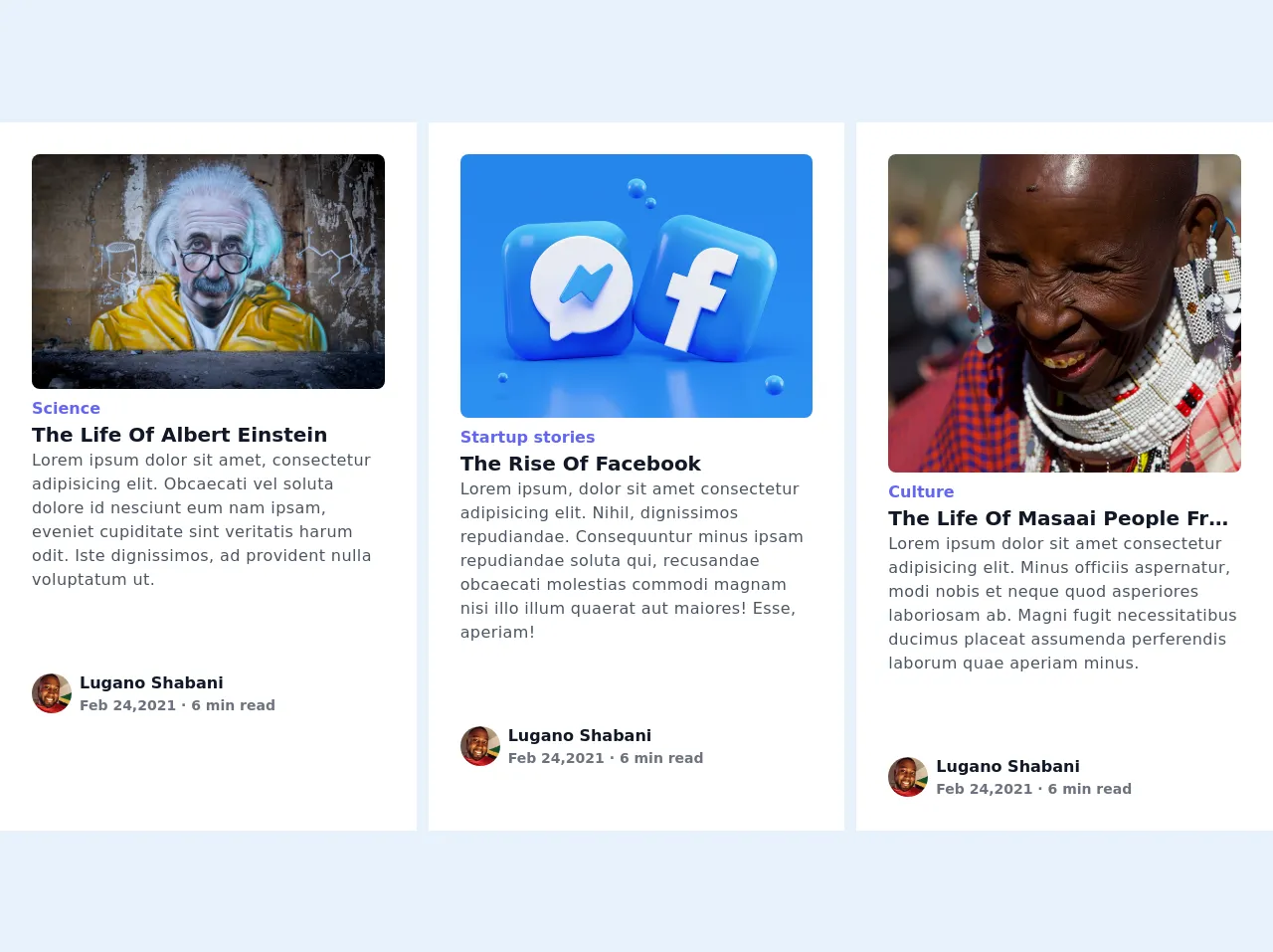
The preview of Blog's Posts Card ui component
To create a Blog's Posts Card ui component with Tailwind CSS, we will use a combination of flexbox and grid layout. The card will have a header section that displays the post title, author, and date, and a body section that displays the post excerpt. The card will also have a thumbnail image that is positioned to the left of the header section.
Free download of the Blog's Posts Card's source code
The source code of Blog's Posts Card ui component
To create a Blog's Posts Card ui component with Tailwind CSS, we will use HTML and CSS. The HTML will define the structure of the card, while the CSS will apply the necessary styles to achieve the desired layout and design.
<!DOCTYPE html>
<!--[if lt IE 7]> <html class="no-js lt-ie9 lt-ie8 lt-ie7"> <![endif]-->
<!--[if IE 7]> <html class="no-js lt-ie9 lt-ie8"> <![endif]-->
<!--[if IE 8]> <html class="no-js lt-ie9"> <![endif]-->
<!--[if gt IE 8]> <html class="no-js"> <!--<![endif]-->
<html>
<head>
<meta charset="utf-8" />
<meta http-equiv="X-UA-Compatible" content="IE=edge" />
<title></title>
<meta name="description" content="" />
<meta name="viewport" content="width=device-width, initial-scale=1" />
<link rel="stylesheet" href="" />
<!--CDN's link to Tailwindcss version 2-->
<link
href="https://unpkg.com/tailwindcss@^2/dist/tailwind.min.css"
rel="stylesheet"
/>
</head>
<body class="antialiased md:bg-gray-100">
<!--Parent div-->
<div class="grid grid-cols-1 md:grid-cols-3 gap-3">
<!--First card-->
<div class="md:p-8 p-2 bg-white">
<!--Banner image-->
<img
class="rounded-lg w-full"
src="https://images.unsplash.com/photo-1603349206295-dde20617cb6a?ixid=MXwxMjA3fDB8MHxwaG90by1wYWdlfHx8fGVufDB8fHw%3D&ixlib=rb-1.2.1&auto=format&fit=crop&w=750&q=80
"
/>
<!--Tag-->
<p class="text-indigo-500 font-semibold text-base mt-2">Science</p>
<!--Title-->
<h1
class="font-semibold text-gray-900 leading-none text-xl mt-1 capitalize truncate"
>
the life of albert einstein
</h1>
<!--Description-->
<div class="max-w-full">
<p class="text-base font-medium tracking-wide text-gray-600 mt-1">
Lorem ipsum dolor sit amet, consectetur adipisicing elit. Obcaecati
vel soluta dolore id nesciunt eum nam ipsam, eveniet cupiditate sint
veritatis harum odit. Iste dignissimos, ad provident nulla
voluptatum ut.
</p>
</div>
<div class="flex items-center space-x-2 mt-20">
<!--Author's profile photo-->
<img
class="w-10 h-10 object-cover object-center rounded-full"
src="https://randomuser.me/api/portraits/men/54.jpg"
alt="random user"
/>
<div>
<!--Author name-->
<p class="text-gray-900 font-semibold">Lugano Shabani</p>
<p class="text-gray-500 font-semibold text-sm">
Feb 24,2021 · 6 min read
</p>
</div>
</div>
</div>
<!--End of first card-->
<!--Second Tag-->
<div class="p-8 bg-white">
<!--Banner image-->
<img
class="rounded-lg w-full"
src="https://images.unsplash.com/photo-1611162618071-b39a2ec055fb?ixid=MXwxMjA3fDB8MHxwaG90by1wYWdlfHx8fGVufDB8fHw%3D&ixlib=rb-1.2.1&auto=format&fit=crop&w=667&q=80
"
/>
<!--Tag-->
<p class="text-indigo-500 font-semibold text-base mt-2">
Startup stories
</p>
<!--Title-->
<h1
class="font-semibold text-gray-900 leading-none text-xl mt-1 capitalize truncate"
>
The rise of facebook
</h1>
<!--Description-->
<div class="max-w-full">
<p class="text-base font-medium tracking-wide text-gray-600 mt-1">
Lorem ipsum, dolor sit amet consectetur adipisicing elit. Nihil,
dignissimos repudiandae. Consequuntur minus ipsam repudiandae soluta
qui, recusandae obcaecati molestias commodi magnam nisi illo illum
quaerat aut maiores! Esse, aperiam!
</p>
</div>
<div class="flex items-center space-x-2 mt-20">
<!--Author's profile photo-->
<img
class="w-10 h-10 object-cover object-center rounded-full"
src="https://randomuser.me/api/portraits/men/54.jpg"
alt="random user"
/>
<div>
<!--Author name-->
<p class="text-gray-900 font-semibold">Lugano Shabani</p>
<p class="text-gray-500 font-semibold text-sm">
Feb 24,2021 · 6 min read
</p>
</div>
</div>
</div>
<!--End of first card-->
<!--Third card-->
<div class="p-8 bg-white">
<!--Banner image-->
<img class="h-80 rounded-lg w-full object-cover object-center" src="
https://images.unsplash.com/photo-1580867532901-7e3707f178ce?ixid=MXwxMjA3fDB8MHxwaG90by1wYWdlfHx8fGVufDB8fHw%3D&ixlib=rb-1.2.1&auto=format&fit=crop&w=732&q=80"
" >
<!--Tag-->
<p class="text-indigo-500 font-semibold text-base mt-2">Culture</p>
<!--Title-->
<h1
class="font-semibold text-gray-900 leading-none text-xl mt-1 capitalize truncate"
>
the life of masaai people from tanzania
</h1>
<!--Description-->
<div class="max-w-full">
<p class="text-base font-medium tracking-wide text-gray-600 mt-1">
Lorem ipsum dolor sit amet consectetur adipisicing elit. Minus
officiis aspernatur, modi nobis et neque quod asperiores laboriosam
ab. Magni fugit necessitatibus ducimus placeat assumenda perferendis
laborum quae aperiam minus.
</p>
</div>
<div class="flex items-center space-x-2 mt-20">
<!--Author's profile photo-->
<img
class="w-10 h-10 object-cover object-center rounded-full"
src="https://randomuser.me/api/portraits/men/54.jpg"
alt="random user"
/>
<div>
<!--Author name-->
<p class="text-gray-900 font-semibold">Lugano Shabani</p>
<p class="text-gray-500 font-semibold text-sm">
Feb 24,2021 · 6 min read
</p>
</div>
</div>
</div>
<!--End of first card-->
</div>
<!--End of parent div-->
<script src="" async defer></script>
</body>
</html>
How to create a Blog's Posts Card with Tailwind CSS?
To create a Blog's Posts Card with Tailwind CSS, follow the steps below:
- Create a new HTML file and add the following code:
<div class="max-w-md mx-auto bg-white rounded-xl shadow-md overflow-hidden md:max-w-2xl">
  <div class="md:flex">
    <div class="md:flex-shrink-0">
      <img class="h-48 w-full object-cover md:w-48" src="https://via.placeholder.com/150" alt="Blog post thumbnail">
    </div>
    <div class="p-8">
      <div class="uppercase tracking-wide text-sm text-indigo-500 font-semibold">Case study</div>
      <a href="#" class="block mt-1 text-lg leading-tight font-medium text-black hover:underline">Finding customers for your new business</a>
      <p class="mt-2 text-gray-500">Lorem ipsum dolor sit amet, consectetur adipiscing elit. Morbi sagittis, quam nec bibendum placerat, nunc lacus tristique enim, vel accumsan lorem dolor sit amet quam.</p>
      <div class="mt-4">
        <a href="#" class="text-indigo-500 hover:text-indigo-600 font-medium">Read more</a>
      </div>
    </div>
  </div>
</div>
- Add the necessary Tailwind CSS classes to the HTML elements to achieve the desired layout and design. The classes used in the code above are:
max-w-md: sets the maximum width of the card to 28rem.mx-auto: centers the card horizontally.bg-white: sets the background color of the card to white.rounded-xl: rounds the corners of the card.shadow-md: adds a shadow effect to the card.overflow-hidden: hides any content that exceeds the boundaries of the card.md:max-w-2xl: sets the maximum width of the card to 42rem on medium and larger screens.md:flex: sets the display property of the card to flex on medium and larger screens.md:flex-shrink-0: prevents the thumbnail image from shrinking on medium and larger screens.h-48: sets the height of the thumbnail image to 12rem.w-full: sets the width of the thumbnail image to 100%.object-cover: scales the thumbnail image to cover the entire container.md:w-48: sets the width of the thumbnail image to 12rem on medium and larger screens.p-8: adds padding to the content section of the card.uppercase: converts the text to uppercase.tracking-wide: adds letter spacing to the text.text-sm: sets the font size of the text to 0.875rem.text-indigo-500: sets the text color to indigo-500.font-semibold: sets the font weight to semibold.block: sets the display property of the link to block.mt-1: adds margin to the top of the link.text-lg: sets the font size of the link to 1.5rem.leading-tight: sets the line height of the link to 1.2.font-medium: sets the font weight to medium.text-black: sets the text color to black.hover:underline: underlines the link on hover.mt-2: adds margin to the top of the excerpt.text-gray-500: sets the text color to gray-500.mt-4: adds margin to the top of the read more link.text-indigo-500: sets the text color to indigo-500.hover:text-indigo-600: sets the text color to indigo-600 on hover.font-medium: sets the font weight to medium.
- Save the HTML file and open it in a web browser to see the Blog's Posts Card.
Conclusion
In this article, we have learned how to create a Blog's Posts Card ui component with Tailwind CSS. We have seen how Tailwind CSS provides a wide range of pre-defined classes that make it easy to create responsive and customizable UI components. By following the steps outlined in this article, you can create your own Blog's Posts Card with ease and efficiency.