- Published on
6 Steps To Build A Blogs With Tailwind CSS Like A Pro In Under An Hour
- What is Tailwind CSS?
- The description of Blogs ui component
- Why use Tailwind CSS to create a Blogs ui component?
- The preview of Blogs ui component
- The source code of Blogs ui component
- How to create a Blogs with Tailwind CSS?
- Step 1: Set up your project
- Step 2: Add Tailwind CSS to your project
- Step 3: Add the header section
- Step 4: Add the main content section
- Step 5: Add the sidebar section
- Step 6: Add the footer section
- Conclusion
Are you looking to build a blog with a beautiful and responsive UI? If yes, then Tailwind CSS is the perfect tool for you. In this article, we will walk you through the process of building a blog with Tailwind CSS in just six easy steps.
What is Tailwind CSS?
Tailwind CSS is a utility-first CSS framework that gives you complete control over your designs. It provides a set of pre-defined classes that can be used to style your HTML elements. With Tailwind CSS, you can create complex layouts and designs without writing a single line of CSS.
The description of Blogs ui component
A blog is a website that contains written content on various topics. It usually consists of articles, images, and videos. A blog UI component is a set of HTML and CSS code that can be used to create a blog layout. It includes elements like headers, footers, navigation bars, and content sections.
Why use Tailwind CSS to create a Blogs ui component?
Tailwind CSS makes it easy to create a blog UI component because it provides a set of pre-defined classes that can be used to style your HTML elements. It also allows you to customize your designs by creating your own classes or modifying the existing ones. With Tailwind CSS, you can create a beautiful and responsive blog UI component in no time.
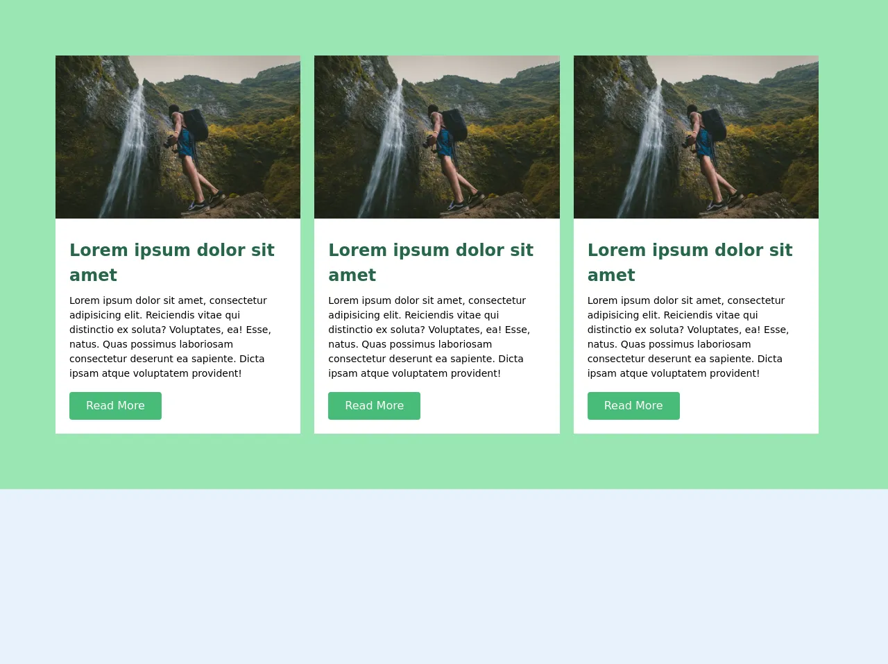
The preview of Blogs ui component
To create a blog UI component, we will use Tailwind CSS classes to style our HTML elements. Here is a preview of what our blog UI component will look like:
Free download of the Blogs's source code
The source code of Blogs ui component
Here is the source code for our blog UI component. We will use HTML and Tailwind CSS classes to create the layout.
<!-- This is an example component -->

    <div class="blogs__wraper bg-green-300  py-20 px-20">

        <div class="flex justify-between items-center">

     <div class="blogs bg-white mr-5">
         <img src="https://images.unsplash.com/photo-1489396160836-2c99c977e970?ixlib=rb-1.2.1&ixid=eyJhcHBfaWQiOjEyMDd9&auto=format&fit=crop&w=800&q=60" class="">
         <div class="p-5">
        <h1 class="text-2xl font-bold text-green-800 py-2">Lorem ipsum dolor sit amet</h1>
         <p class="bg-white text-sm text-black">Lorem ipsum dolor sit amet, consectetur adipisicing elit. Reiciendis vitae qui distinctio ex soluta? Voluptates, ea! Esse, natus. Quas possimus laboriosam consectetur deserunt ea sapiente. Dicta ipsam atque voluptatem provident!</p>
         <a href="" class="py-2 px-3 mt-4 px-6 text-white bg-green-500 inline-block rounded">Read More</a>
         </div>
     </div>


     <div class="blogs bg-white mr-5">
        <img src="https://images.unsplash.com/photo-1489396160836-2c99c977e970?ixlib=rb-1.2.1&ixid=eyJhcHBfaWQiOjEyMDd9&auto=format&fit=crop&w=800&q=60" class="">
        <div class="p-5">
            <h1 class="text-2xl font-bold text-green-800 py-2">Lorem ipsum dolor sit amet</h1>
        <p class="bg-white text-sm text-black">Lorem ipsum dolor sit amet, consectetur adipisicing elit. Reiciendis vitae qui distinctio ex soluta? Voluptates, ea! Esse, natus. Quas possimus laboriosam consectetur deserunt ea sapiente. Dicta ipsam atque voluptatem provident!</p>
        <a href="" class="py-2 px-3 mt-4 px-6 text-white bg-green-500 inline-block rounded">Read More</a>
        </div>
    </div>

    <div class="blogs bg-white mr-5">
        <img src="https://images.unsplash.com/photo-1489396160836-2c99c977e970?ixlib=rb-1.2.1&ixid=eyJhcHBfaWQiOjEyMDd9&auto=format&fit=crop&w=800&q=60" class="">
        <div class="p-5">
            <h1 class="text-2xl font-bold text-green-800 py-2">Lorem ipsum dolor sit amet</h1>
        <p class="bg-white text-sm text-black">Lorem ipsum dolor sit amet, consectetur adipisicing elit. Reiciendis vitae qui distinctio ex soluta? Voluptates, ea! Esse, natus. Quas possimus laboriosam consectetur deserunt ea sapiente. Dicta ipsam atque voluptatem provident!</p>
        <a href="" class="py-2 px-3 mt-4 px-6 text-white bg-green-500 inline-block rounded">Read More</a>
        </div>
    </div>
    </div>
    </div>
How to create a Blogs with Tailwind CSS?
Now that we have a preview and source code for our blog UI component, let's walk through the six steps to create a blog with Tailwind CSS.
Step 1: Set up your project
The first step is to set up your project. You can use any code editor or IDE of your choice. Create a new HTML file and add the necessary boilerplate code.
Step 2: Add Tailwind CSS to your project
The next step is to add Tailwind CSS to your project. You can do this by either downloading the CSS file or by installing it using npm. Once you have added Tailwind CSS to your project, you can start using its classes to style your HTML elements.
Step 3: Add the header section
The header section usually contains the blog title, logo, and navigation bar. You can use Tailwind CSS classes to create a responsive header section. Use the flexbox layout to align the elements properly.
Step 4: Add the main content section
The main content section usually contains the blog posts. You can use Tailwind CSS classes to create a responsive main content section. Use the grid layout to create a two or three-column layout.
Step 5: Add the sidebar section
The sidebar section usually contains the categories, tags, and recent posts. You can use Tailwind CSS classes to create a responsive sidebar section. Use the flexbox layout to align the elements properly.
Step 6: Add the footer section
The footer section usually contains the copyright information and social media links. You can use Tailwind CSS classes to create a responsive footer section. Use the flexbox layout to align the elements properly.
Conclusion
In this article, we have walked you through the process of building a blog with Tailwind CSS in just six easy steps. With Tailwind CSS, you can create a beautiful and responsive blog UI component in no time. So, what are you waiting for? Start building your blog with Tailwind CSS today!