- Published on
How To Make A Blog Post Card Grid Layout With Tailwind CSS In 6 Easy Steps?
- What is Tailwind CSS?
- The description of Blog Post Card Grid Layout ui component
- Why use Tailwind CSS to create a Blog Post Card Grid Layout ui component?
- The preview of Blog Post Card Grid Layout ui component.
- The source code of Blog Post Card Grid Layout ui component.
- How to create a Blog Post Card Grid Layout with Tailwind CSS?
- Step 1: Set up your HTML file
- Step 2: Add Tailwind CSS to your project
- Step 3: Add Tailwind CSS classes to your HTML elements
- Step 4: Create a grid layout
- Step 5: Add responsive classes
- Step 6: Customize your Blog Post Card Grid Layout
- Conclusion
What is Tailwind CSS?
Tailwind CSS is a utility-first CSS framework that provides a set of pre-defined classes to help you quickly build custom designs. With Tailwind CSS, you can create complex layouts and designs without writing any custom CSS code. It is a popular choice among developers due to its simplicity, flexibility, and ease of use.
The description of Blog Post Card Grid Layout ui component
A Blog Post Card Grid Layout is a common UI component used in many websites and blogs. It is a grid-based layout that displays multiple blog posts in a card format. Each card typically contains a featured image, a title, a short description, and a read more button. The Blog Post Card Grid Layout is a great way to showcase your blog posts and make it easy for users to navigate through your content.
Why use Tailwind CSS to create a Blog Post Card Grid Layout ui component?
Tailwind CSS provides a set of pre-defined classes that can be used to create a Blog Post Card Grid Layout quickly and easily. With Tailwind CSS, you can customize the layout and design of your Blog Post Card Grid Layout without writing any custom CSS code. This saves time and effort and allows you to focus on the functionality of your website or blog.
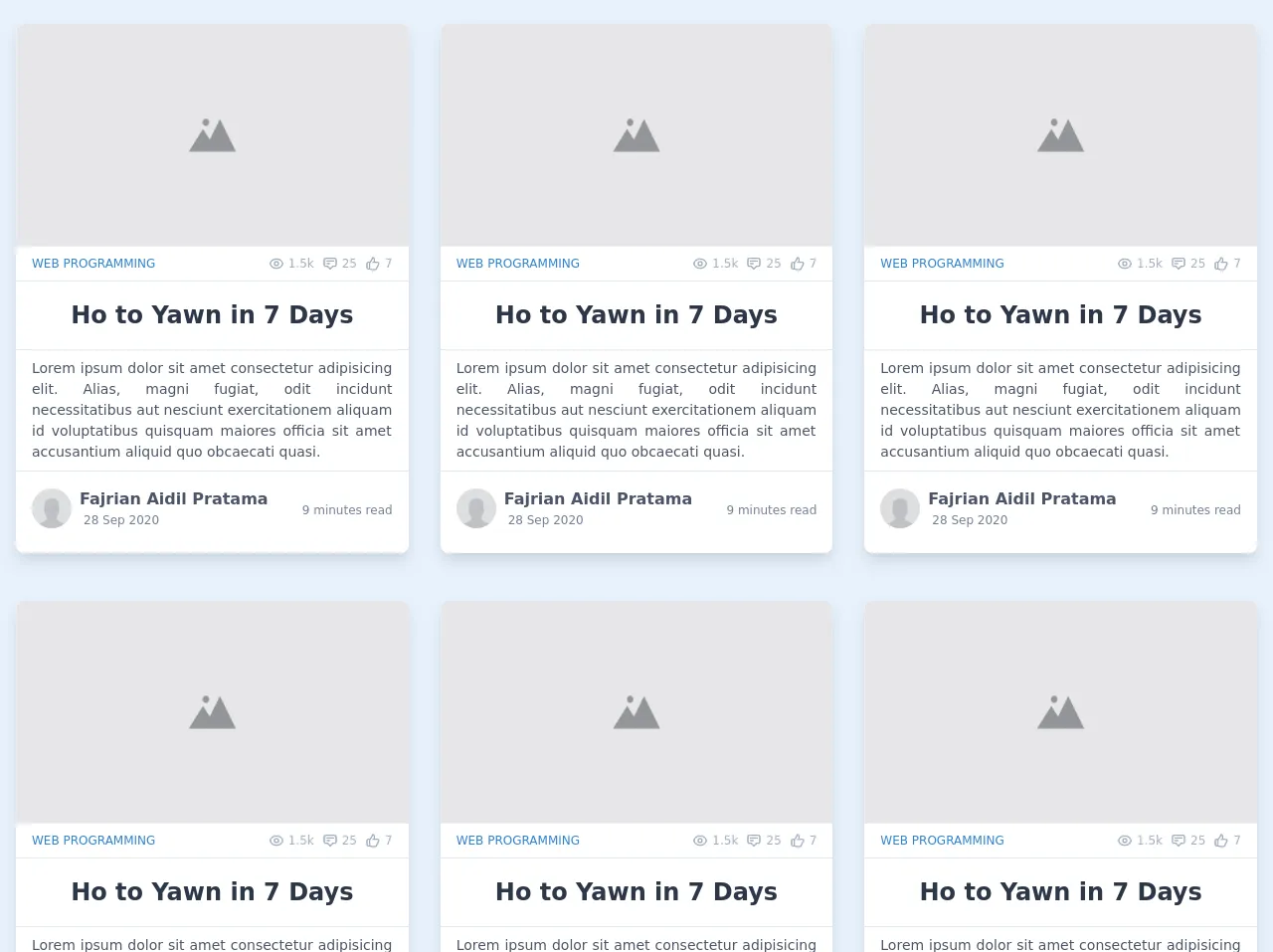
The preview of Blog Post Card Grid Layout ui component.
To create a Blog Post Card Grid Layout, we will use Tailwind CSS classes to style the HTML elements. The final result will look something like this:
Free download of the Blog Post Card Grid Layout's source code
The source code of Blog Post Card Grid Layout ui component.
To create the Blog Post Card Grid Layout, we will use HTML and Tailwind CSS classes. The source code for the Blog Post Card Grid Layout is as follows:
<!-- This is an example component -->
<section class="flex flex-row flex-wrap mx-auto">
<!-- Card Component -->
<div
class="transition-all duration-150 flex w-full px-4 py-6 md:w-1/2 lg:w-1/3"
>
<div
class="flex flex-col items-stretch min-h-full pb-4 mb-6 transition-all duration-150 bg-white rounded-lg shadow-lg hover:shadow-2xl"
>
<div class="md:flex-shrink-0">
<img
src="https://www.unfe.org/wp-content/uploads/2019/04/SM-placeholder-1024x512.png"
alt="Blog Cover"
class="object-fill w-full rounded-lg rounded-b-none md:h-56"
/>
</div>
<div class="flex items-center justify-between px-4 py-2 overflow-hidden">
<span class="text-xs font-medium text-blue-600 uppercase">
Web Programming
</span>
<div class="flex flex-row items-center">
<div
class="text-xs font-medium text-gray-500 flex flex-row items-center mr-2"
>
<svg
class="w-4 h-4 mr-1"
fill="none"
stroke="currentColor"
viewBox="0 0 24 24"
xmlns="http://www.w3.org/2000/svg"
>
<path
stroke-linecap="round"
stroke-linejoin="round"
stroke-width="2"
d="M15 12a3 3 0 11-6 0 3 3 0 016 0z"
></path>
<path
stroke-linecap="round"
stroke-linejoin="round"
stroke-width="2"
d="M2.458 12C3.732 7.943 7.523 5 12 5c4.478 0 8.268 2.943 9.542 7-1.274 4.057-5.064 7-9.542 7-4.477 0-8.268-2.943-9.542-7z"
></path>
</svg>
<span>1.5k</span>
</div>
<div
class="text-xs font-medium text-gray-500 flex flex-row items-center mr-2"
>
<svg
class="w-4 h-4 mr-1"
fill="none"
stroke="currentColor"
viewBox="0 0 24 24"
xmlns="http://www.w3.org/2000/svg"
>
<path
stroke-linecap="round"
stroke-linejoin="round"
stroke-width="2"
d="M7 8h10M7 12h4m1 8l-4-4H5a2 2 0 01-2-2V6a2 2 0 012-2h14a2 2 0 012 2v8a2 2 0 01-2 2h-3l-4 4z"
></path>
</svg>
<span>25</span>
</div>
<div
class="text-xs font-medium text-gray-500 flex flex-row items-center"
>
<svg
class="w-4 h-4 mr-1"
fill="none"
stroke="currentColor"
viewBox="0 0 24 24"
xmlns="http://www.w3.org/2000/svg"
>
<path
stroke-linecap="round"
stroke-linejoin="round"
stroke-width="2"
d="M14 10h4.764a2 2 0 011.789 2.894l-3.5 7A2 2 0 0115.263 21h-4.017c-.163 0-.326-.02-.485-.06L7 20m7-10V5a2 2 0 00-2-2h-.095c-.5 0-.905.405-.905.905 0 .714-.211 1.412-.608 2.006L7 11v9m7-10h-2M7 20H5a2 2 0 01-2-2v-6a2 2 0 012-2h2.5"
></path>
</svg>
<span>7</span>
</div>
</div>
</div>
<hr class="border-gray-300" />
<div class="flex flex-wrap items-center flex-1 px-4 py-1 text-center mx-auto">
<a href="#" class="hover:underline">
<h2 class="text-2xl font-bold tracking-normal text-gray-800">
Ho to Yawn in 7 Days
</h2>
</a>
</div>
<hr class="border-gray-300" />
<p
class="flex flex-row flex-wrap w-full px-4 py-2 overflow-hidden text-sm text-justify text-gray-700"
>
Lorem ipsum dolor sit amet consectetur adipisicing elit. Alias, magni
fugiat, odit incidunt necessitatibus aut nesciunt exercitationem aliquam
id voluptatibus quisquam maiores officia sit amet accusantium aliquid
quo obcaecati quasi.
</p>
<hr class="border-gray-300" />
<section class="px-4 py-2 mt-2">
<div class="flex items-center justify-between">
<div class="flex items-center flex-1">
<img
class="object-cover h-10 rounded-full"
src="https://thumbs.dreamstime.com/b/default-avatar-photo-placeholder-profile-icon-eps-file-easy-to-edit-default-avatar-photo-placeholder-profile-icon-124557887.jpg"
alt="Avatar"
/>
<div class="flex flex-col mx-2">
<a href="" class="font-semibold text-gray-700 hover:underline">
Fajrian Aidil Pratama
</a>
<span class="mx-1 text-xs text-gray-600">28 Sep 2020</span>
</div>
</div>
<p class="mt-1 text-xs text-gray-600">9 minutes read</p>
</div>
</section>
</div>
</div>
</section>
How to create a Blog Post Card Grid Layout with Tailwind CSS?
Here are the 6 easy steps to create a Blog Post Card Grid Layout with Tailwind CSS:
Step 1: Set up your HTML file
Create an HTML file and add the necessary HTML elements to create the Blog Post Card Grid Layout. Each card will be contained within a div element with the class "card". Inside the card div, we will add the necessary HTML elements to display the blog post information.
Step 2: Add Tailwind CSS to your project
Add Tailwind CSS to your project by either downloading the CSS file or linking to the CDN. You can find the instructions on how to do this on the Tailwind CSS website.
Step 3: Add Tailwind CSS classes to your HTML elements
Add the necessary Tailwind CSS classes to your HTML elements to style them. For example, you can use the "bg-gray-100" class to set the background color of the card to gray.
Step 4: Create a grid layout
Create a grid layout by using the "grid" and "grid-cols-x" classes. The "grid" class sets the display property to grid, and the "grid-cols-x" class sets the number of columns in the grid.
Step 5: Add responsive classes
Add responsive classes to your HTML elements to make sure they look good on all screen sizes. You can use the "sm", "md", "lg", and "xl" classes to target specific screen sizes.
Step 6: Customize your Blog Post Card Grid Layout
Customize your Blog Post Card Grid Layout by adding your own styles and classes. You can use the Tailwind CSS documentation to find the classes you need to create your desired layout.
Conclusion
In conclusion, creating a Blog Post Card Grid Layout with Tailwind CSS is a quick and easy process that can save you time and effort. With Tailwind CSS, you can create complex layouts and designs without writing any custom CSS code. By following the 6 easy steps outlined in this article, you can create a professional-looking Blog Post Card Grid Layout for your website or blog.