- Published on
The 5 Really Obvious Ways To Build A Blog Post With Tailwind CSS Better That You Ever Did

- What is Tailwind CSS?
- The description of Blog Post ui component
- Why use Tailwind CSS to create a Blog Post ui component?
- The preview of Blog Post ui component.
- The source code of Blog Post ui component.
- How to create a Blog Post with Tailwind CSS?
- Conclusion
If you are a FrontEnd technology blogger, you know that one of the most important things is to have a well-designed blog. A good design can help you to attract more readers and keep them engaged with your content. Tailwind CSS is a great tool that can help you to build a blog post with a beautiful and responsive design. In this article, we will show you the 5 really obvious ways to build a blog post with Tailwind CSS better than you ever did.
What is Tailwind CSS?
Tailwind CSS is a utility-first CSS framework that allows you to quickly build custom designs without writing any CSS. It provides a set of pre-defined classes that you can use to style your HTML elements. Tailwind CSS is very flexible and allows you to customize your design by changing the configuration file.
The description of Blog Post ui component
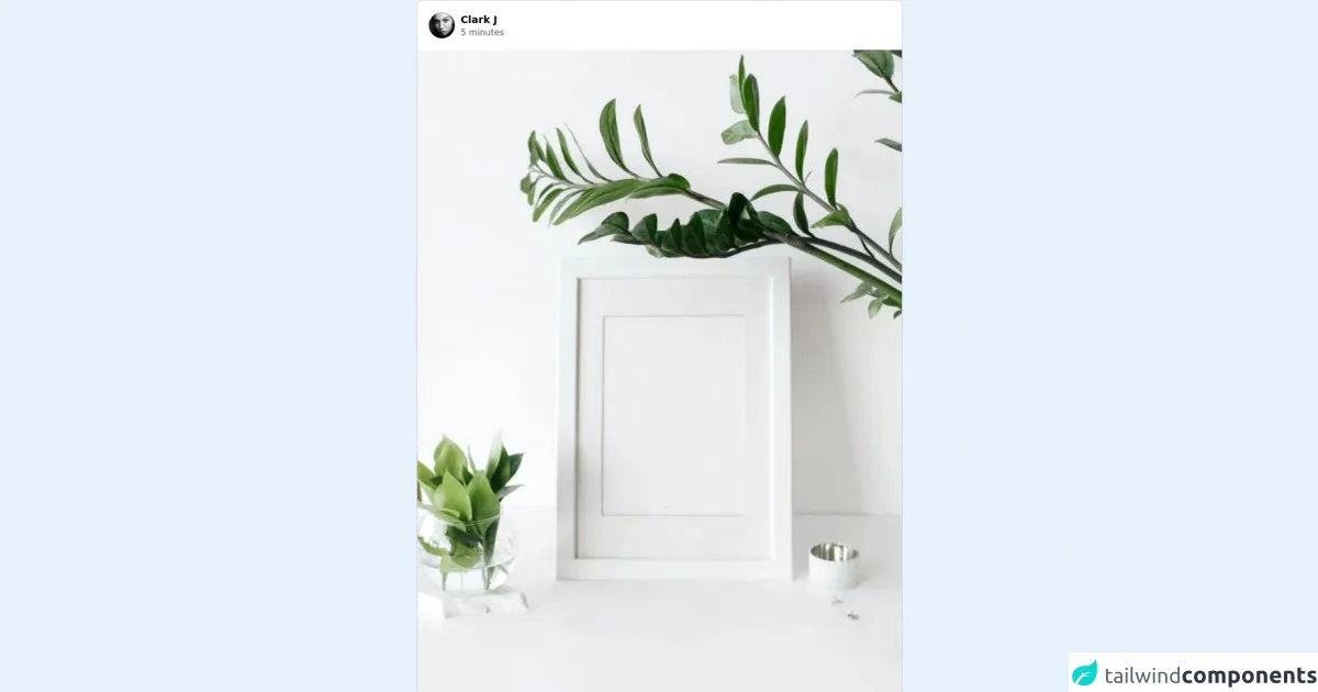
A Blog Post ui component is a block of content that displays a blog post. It usually consists of a title, an image, a description, and some buttons to share or comment on the post. The Blog Post ui component should be responsive and adapt to different screen sizes.
Why use Tailwind CSS to create a Blog Post ui component?
Tailwind CSS is a great choice to create a Blog Post ui component because it provides a set of pre-defined classes that you can use to style your HTML elements. This makes it easy to create a responsive design that looks great on all devices. Tailwind CSS also allows you to customize your design by changing the configuration file, which gives you a lot of flexibility.
The preview of Blog Post ui component.
To create a Blog Post ui component with Tailwind CSS, you can use the following classes:
bg-white: sets the background color to white.shadow-md: adds a shadow to the element.rounded-md: rounds the corners of the element.overflow-hidden: hides any overflow content.hover:shadow-lg: adds a larger shadow on hover.
Free download of the Blog Post's source code
The source code of Blog Post ui component.
To create a Blog Post ui component with Tailwind CSS, you can use the following HTML code:
<div class="bg-white shadow-md rounded-md overflow-hidden hover:shadow-lg">
  <img src="blog-post-image.jpg" alt="Blog Post Image" class="w-full h-64 object-cover">
  <div class="p-4">
    <h2 class="text-2xl font-bold mb-2">Blog Post Title</h2>
    <p class="text-gray-700 text-base">Blog Post Description</p>
    <div class="mt-4">
      <a href="#" class="text-blue-500 hover:text-blue-700 mr-4">Share</a>
      <a href="#" class="text-blue-500 hover:text-blue-700">Comment</a>
    </div>
  </div>
</div>
<!-- This is an example component -->
<div class="max-w-sm sm:max-w-md md:max-w-lg lg:max-w-xl xl:max-w-2xl w-full">
    <div class="bg-white max-w-sm sm:max-w-md md:max-w-lg lg:max-w-xl xl:max-w-2xl rounded overflow-hidden shadow-none mb-10 sm:rounded-lg max-w-2xl border border-gray-300">
        <header class="flex flex-start">
            <div>
                <a href="#" class="cursor-pointer m-4 flex items-center text-sm outline-none focus:outline-none focus:border-gray-300 transition duration-150 ease-in-out">
                    <img src="https://images.pexels.com/photos/3460478/pexels-photo-3460478.jpeg?auto=compress&cs=tinysrgb&dpr=1&w=500" class="h-9 w-9 rounded-full object-cover"
                    alt="usuario" />
                    <div>
                        <p class="block ml-2 font-bold">Clark J</p>
                        <span class="block ml-2 text-xs text-gray-600">5 minutes</span>
                    </div>
                </a>
            </div>
        </header>
        <img class="w-full max-w-full min-w-full"
        src="https://images.pexels.com/photos/5797991/pexels-photo-5797991.jpeg?auto=compress&cs=tinysrgb&h=750&w=1260"
            alt="post">

        <div class="px-6 pt-4">
            <div class="mb-2">
                <div class="flex items-center">
                    <span class="mr-3 inline-flex items-center cursor-pointer">
                        <svg class="text-gray-700 inline-block h-7 w-7" xmlns="http://www.w3.org/2000/svg" fill="none" viewBox="0 0 24 24" stroke="currentColor">
                            <path stroke-linecap="round" stroke-linejoin="round" stroke-width="2" d="M4.318 6.318a4.5 4.5 0 000 6.364L12 20.364l7.682-7.682a4.5 4.5 0 00-6.364-6.364L12 7.636l-1.318-1.318a4.5 4.5 0 00-6.364 0z" />
                        </svg>
                    </span>
                    <span class="mr-3 inline-flex items-center cursor-pointer">
                        <svg class="text-gray-700 inline-block h-7 w-7 " xmlns="http://www.w3.org/2000/svg" fill="none" viewBox="0 0 24 24" stroke="currentColor">
                            <path stroke-linecap="round" stroke-linejoin="round" stroke-width="2" d="M8 12h.01M12 12h.01M16 12h.01M21 12c0 4.418-4.03 8-9 8a9.863 9.863 0 01-4.255-.949L3 20l1.395-3.72C3.512 15.042 3 13.574 3 12c0-4.418 4.03-8 9-8s9 3.582 9 8z" />
                        </svg>
                    </span>
                </div>
                <span class="text-gray-600 text-sm font-bold">1,300 Likes</span>
            </div>
            <div class="">
                <div class="text-sm mb-2 flex flex-start items-center">
                    <a href="#" class="cursor-pointer flex items-center text-sm border-2 border-transparent rounded-full focus:outline-none focus:border-gray-300 transition duration-150 ease-in-out">
                        <img class="h-8 w-8 rounded-full object-cover"
                        src="https://images.pexels.com/photos/3460478/pexels-photo-3460478.jpeg?auto=compress&cs=tinysrgb&dpr=1&w=500"
                        alt="usuario" />
                    </a>
                    <p class="font-bold ml-2">
                        <a class="cursor-pointer">Carlos:</a>
                        <span class="text-gray-700 font-medium ml-1">
                            New post, I like plants
                        </span>
                    </p>
                </div>
                <a class="text-gray-400 text-sm cursor-pointer font-semibold">23 comments</a>
            </div>

        </div>

        <div class="px-6 pt-4 pb-3">
            <div class="flex items-start">
                <textarea class="w-full resize-none outline-none appearance-none" aria-label="Agrega un comentario..." placeholder="Agrega un comentario..."  autocomplete="off" autocorrect="off" style="height: 36px;"></textarea>
                <button class="mb-2 focus:outline-none border-none bg-transparent text-blue-600">Publicar</button>
            </div>
        </div>
    </div>
</div>
How to create a Blog Post with Tailwind CSS?
To create a Blog Post with Tailwind CSS, you can follow these steps:
- Create a new HTML file and add the necessary HTML code for the Blog Post ui component.
- Add the Tailwind CSS CDN to your HTML file.
- Add the necessary classes to your HTML elements to style them with Tailwind CSS.
- Customize your design by changing the configuration file.
Conclusion
In conclusion, Tailwind CSS is a great tool that can help you to build a blog post with a beautiful and responsive design. By following the 5 really obvious ways to build a blog post with Tailwind CSS better than you ever did, you can create a blog post that looks great on all devices and attracts more readers to your blog.