- Published on
3 Things You Must Know To Build A Blog Homepage With Tailwind CSS
- What is Tailwind CSS?
- The description of Blog Homepage ui component
- Why use Tailwind CSS to create a Blog Homepage ui component?
- The preview of Blog Homepage ui component.
- The source code of Blog Homepage ui component.
- How to create a Blog Homepage with Tailwind CSS?
- Step 1: Set up your HTML file
- Step 2: Add Tailwind CSS to your project
- Step 3: Style your HTML elements
- Step 4: Add responsive design classes
- Step 5: Preview and test your blog homepage
- Conclusion
As a FrontEnd technology blogger, you must be aware of the importance of having an attractive and user-friendly blog homepage. In this article, we will discuss the three things you must know to build a blog homepage with Tailwind CSS.
What is Tailwind CSS?
Tailwind CSS is a utility-first CSS framework that allows you to create custom designs without writing any CSS code. It provides a set of pre-defined classes that you can use to style your HTML elements. Tailwind CSS is highly customizable, and you can use it to create any design you want.
The description of Blog Homepage ui component
A blog homepage is the first thing that a user sees when they visit your blog. It should be attractive, easy to navigate, and provide a clear idea of what your blog is about. A typical blog homepage consists of a header, a navigation menu, a featured section, a blog post section, and a footer.
Why use Tailwind CSS to create a Blog Homepage ui component?
Tailwind CSS provides a set of pre-defined classes that you can use to style your HTML elements. This makes it easy to create a blog homepage without writing any CSS code. Tailwind CSS is highly customizable, and you can use it to create any design you want. It also provides responsive design classes, which makes it easy to create a blog homepage that looks great on all devices.
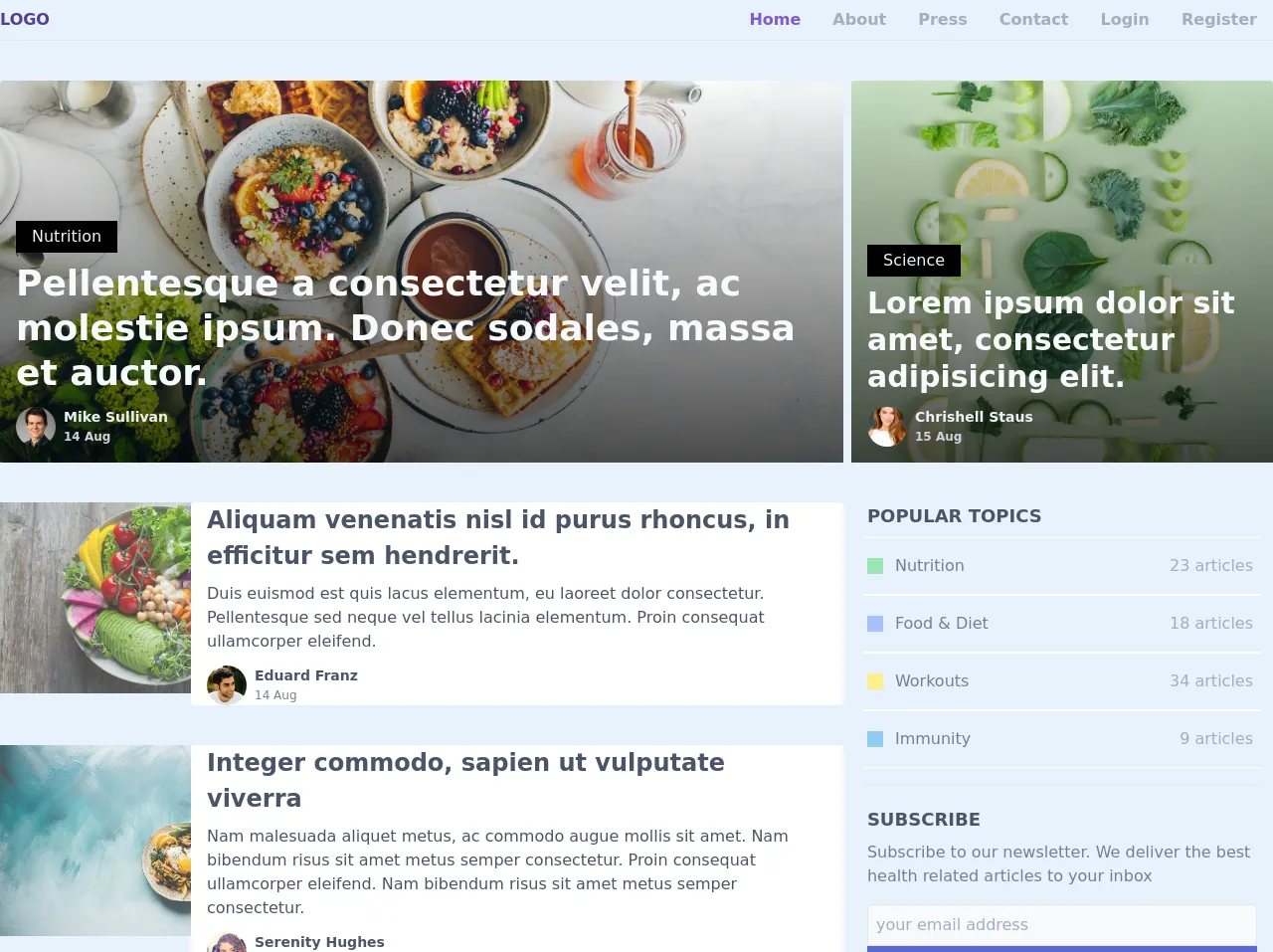
The preview of Blog Homepage ui component.
To create a blog homepage with Tailwind CSS, you can use the pre-defined classes to style your HTML elements. Here is a preview of what the blog homepage UI component will look like:
Free download of the Blog Homepage's source code
The source code of Blog Homepage ui component.
To create a blog homepage with Tailwind CSS, you can use the pre-defined classes to style your HTML elements. Here is the source code of the blog homepage UI component:
<div class="max-w-screen-xl mx-auto">
    <!-- header -->
    <header class="flex items-center justify-between py-2 border-b">
      <a href="#" class="px-2 lg:px-0 uppercase font-bold text-purple-800">
        LOGO
      </a>
      <ul class="inline-flex items-center">
        <li class="px-2 md:px-4">
          <a href="" class="text-purple-600 font-semibold hover:text-purple-500"> Home </a>
        </li>
        <li class="px-2 md:px-4">
          <a href="" class="text-gray-500 font-semibold hover:text-purple-500"> About </a>
        </li>
        <li class="px-2 md:px-4">
          <a href="" class="text-gray-500 font-semibold hover:text-purple-500"> Press </a>
        </li>
        <li class="px-2 md:px-4">
          <a href="" class="text-gray-500 font-semibold hover:text-purple-500"> Contact </a>
        </li>
        <li class="px-2 md:px-4 hidden md:block">
          <a href="" class="text-gray-500 font-semibold hover:text-purple-500"> Login </a>
        </li>
        <li class="px-2 md:px-4 hidden md:block">
          <a href="" class="text-gray-500 font-semibold hover:text-purple-500"> Register </a>
        </li>
      </ul>

    </header>
    <!-- header ends here -->

    <main class="mt-10">
      <div class="block md:flex md:space-x-2 px-2 lg:p-0">
        <a
          class="mb-4 md:mb-0 w-full md:w-2/3 relative rounded inline-block"
          style="height: 24em;"
          href="./blog.html"
        >
          <div class="absolute left-0 bottom-0 w-full h-full z-10"
            style="background-image: linear-gradient(180deg,transparent,rgba(0,0,0,.7));"></div>
          <img src="https://images.unsplash.com/photo-1493770348161-369560ae357d?ixlib=rb-1.2.1&ixid=eyJhcHBfaWQiOjEyMDd9&auto=format&fit=crop&w=2100&q=80" class="absolute left-0 top-0 w-full h-full rounded z-0 object-cover" />
          <div class="p-4 absolute bottom-0 left-0 z-20">
            <span class="px-4 py-1 bg-black text-gray-200 inline-flex items-center justify-center mb-2">Nutrition</span>
            <h2 class="text-4xl font-semibold text-gray-100 leading-tight">
              Pellentesque a consectetur velit, ac molestie ipsum. Donec sodales, massa et auctor.
            </h2>
            <div class="flex mt-3">
              <img src="https://randomuser.me/api/portraits/men/97.jpg"
                class="h-10 w-10 rounded-full mr-2 object-cover" />
              <div>
                <p class="font-semibold text-gray-200 text-sm"> Mike Sullivan </p>
                <p class="font-semibold text-gray-400 text-xs"> 14 Aug </p>
              </div>
            </div>
          </div>
        </a>

        <a class="w-full md:w-1/3 relative rounded"
          style="height: 24em;"
          href="./blog.html"
        >
          <div class="absolute left-0 top-0 w-full h-full z-10"
            style="background-image: linear-gradient(180deg,transparent,rgba(0,0,0,.7));"></div>
          <img src="https://images.unsplash.com/photo-1543362906-acfc16c67564?ixlib=rb-1.2.1&ixid=eyJhcHBfaWQiOjEyMDd9&auto=format&fit=crop&w=1301&q=80" class="absolute left-0 top-0 w-full h-full rounded z-0 object-cover" />
          <div class="p-4 absolute bottom-0 left-0 z-20">
            <span class="px-4 py-1 bg-black text-gray-200 inline-flex items-center justify-center mb-2">Science</span>
            <h2 class="text-3xl font-semibold text-gray-100 leading-tight">Lorem ipsum dolor sit amet, consectetur
              adipisicing elit.</h2>
            <div class="flex mt-3">
              <img
                src="https://images-na.ssl-images-amazon.com/images/M/MV5BODFjZTkwMjItYzRhMS00OWYxLWI3YTUtNWIzOWQ4Yjg4NGZiXkEyXkFqcGdeQXVyMTQ0ODAxNzE@._V1_UX172_CR0,0,172,256_AL_.jpg"
                class="h-10 w-10 rounded-full mr-2 object-cover" />
              <div>
                <p class="font-semibold text-gray-200 text-sm"> Chrishell Staus </p>
                <p class="font-semibold text-gray-400 text-xs"> 15 Aug </p>
              </div>
            </div>
          </div>
        </div>
      </a>

      <div class="block lg:flex lg:space-x-2 px-2 lg:p-0 mt-10 mb-10">
        <!-- post cards -->
        <div class="w-full lg:w-2/3">

          <a class="block rounded w-full lg:flex mb-10"
            href="./blog-single-1.html"
          >
            <div
              class="h-48 lg:w-48 flex-none bg-cover text-center overflow-hidden opacity-75"
              style="background-image: url('https://images.unsplash.com/photo-1512621776951-a57141f2eefd?ixlib=rb-1.2.1&ixid=eyJhcHBfaWQiOjEyMDd9&auto=format&fit=crop&w=2100&q=80')"
              title="deit is very important"
            >
            </div>
            <div class="bg-white rounded px-4 flex flex-col justify-between leading-normal">
              <div>
                <div class="mt-3 md:mt-0 text-gray-700 font-bold text-2xl mb-2">
                  Aliquam venenatis nisl id purus rhoncus, in efficitur sem hendrerit.
                </div>
                <p class="text-gray-700 text-base">
                  Duis euismod est quis lacus elementum, eu laoreet dolor consectetur.
                  Pellentesque sed neque vel tellus lacinia elementum. Proin consequat ullamcorper eleifend.
                </p>
              </div>
              <div class="flex mt-3">
                <img src="https://randomuser.me/api/portraits/men/86.jpg"
                  class="h-10 w-10 rounded-full mr-2 object-cover" />
                <div>
                  <p class="font-semibold text-gray-700 text-sm capitalize"> eduard franz </p>
                  <p class="text-gray-600 text-xs"> 14 Aug </p>
                </div>
              </div>
            </div>
          </a>

          <div class="rounded w-full lg:flex mb-10">
            <div class="h-48 lg:w-48 flex-none bg-cover text-center overflow-hidden opacity-75"
              style="background-image: url('https://images.unsplash.com/photo-1515003197210-e0cd71810b5f?ixlib=rb-1.2.1&ixid=eyJhcHBfaWQiOjEyMDd9&auto=format&fit=crop&w=2100&q=80')" title="deit is very important">
            </div>
            <div class="bg-white rounded px-4 flex flex-col justify-between leading-normal">
              <div>
                <div class="mt-3 md:mt-0 text-gray-700 font-bold text-2xl mb-2">
                  Integer commodo, sapien ut vulputate viverra
                </div>
                <p class="text-gray-700 text-base">
                  Nam malesuada aliquet metus, ac commodo augue mollis sit amet.
                  Nam bibendum risus sit amet metus semper consectetur.
                  Proin consequat ullamcorper eleifend.
                  Nam bibendum risus sit amet metus semper consectetur.
                </p>
              </div>
              <div class="flex mt-3">
                <img src="https://randomuser.me/api/portraits/women/54.jpg"
                  class="h-10 w-10 rounded-full mr-2 object-cover" />
                <div>
                  <p class="font-semibold text-gray-700 text-sm capitalize"> Serenity Hughes </p>
                  <p class="text-gray-600 text-xs"> 14 Aug </p>
                </div>
              </div>
            </div>
          </div>

          <div class="rounded w-full lg:flex mb-10">
            <div class="h-48 lg:w-48 flex-none bg-cover text-center overflow-hidden opacity-75"
              style="background-image: url('https://images.unsplash.com/photo-1512621776951-a57141f2eefd?ixlib=rb-1.2.1&ixid=eyJhcHBfaWQiOjEyMDd9&auto=format&fit=crop&w=2100&q=80')" title="deit is very important">
            </div>
            <div class="bg-white rounded px-4 flex flex-col justify-between leading-normal">
              <div>
                <div class="mt-3 md:mt-0 text-gray-700 font-bold text-2xl mb-2">
                  Suspendisse varius justo eu risus laoreet fermentum non aliquam dolor
                </div>
                <p class="text-gray-700 text-base">
                  Mauris porttitor, velit at tempus vulputate, odio turpis facilisis dui,
                  vitae eleifend odio ipsum at odio. Phasellus luctus scelerisque felis eget suscipit.
                </p>
              </div>
              <div class="flex mt-3">
                <img src="https://randomuser.me/api/portraits/men/86.jpg"
                  class="h-10 w-10 rounded-full mr-2 object-cover" />
                <div>
                  <p class="font-semibold text-gray-700 text-sm capitalize"> eduard franz </p>
                  <p class="text-gray-600 text-xs"> 14 Aug </p>
                </div>
              </div>
            </div>
          </div>

        </div>

        <!-- right sidebar -->
        <div class="w-full lg:w-1/3 px-3">
          <!-- topics -->
          <div class="mb-4">
            <h5 class="font-bold text-lg uppercase text-gray-700 px-1 mb-2"> Popular Topics </h5>
            <ul>
              <li class="px-1 py-4 border-b border-t border-white hover:border-gray-200 transition duration-300">
                <a href="#" class="flex items-center text-gray-600 cursor-pointer">
                  <span class="inline-block h-4 w-4 bg-green-300 mr-3"></span>
                  Nutrition
                  <span class="text-gray-500 ml-auto">23 articles</span>
                  <i class='text-gray-500 bx bx-right-arrow-alt ml-1'></i>
                </a>
              </li>
              <li class="px-1 py-4 border-b border-t border-white hover:border-gray-200 transition duration-300">
                <a href="#" class="flex items-center text-gray-600 cursor-pointer">
                  <span class="inline-block h-4 w-4 bg-indigo-300 mr-3"></span>
                  Food & Diet
                  <span class="text-gray-500 ml-auto">18 articles</span>
                  <i class='text-gray-500 bx bx-right-arrow-alt ml-1'></i>
                </a>
              </li>
              <li class="px-1 py-4 border-b border-t border-white hover:border-gray-200 transition duration-300">
                <a href="#" class="flex items-center text-gray-600 cursor-pointer">
                  <span class="inline-block h-4 w-4 bg-yellow-300 mr-3"></span>
                  Workouts
                  <span class="text-gray-500 ml-auto">34 articles</span>
                  <i class='text-gray-500 bx bx-right-arrow-alt ml-1'></i>
                </a>
              </li>
              <li class="px-1 py-4 border-b border-t border-white hover:border-gray-200 transition duration-300">
                <a href="#" class="flex items-center text-gray-600 cursor-pointer">
                  <span class="inline-block h-4 w-4 bg-blue-300 mr-3"></span>
                  Immunity
                  <span class="text-gray-500 ml-auto">9 articles</span>
                  <i class='text-gray-500 bx bx-right-arrow-alt ml-1'></i>
                </a>
              </li>
            </ul>
          </div>

          <!-- divider -->
          <div class="border border-dotted"></div>

          <!-- subscribe -->
          <div class="p-1 mt-4 mb-4">
            <h5 class="font-bold text-lg uppercase text-gray-700 mb-2"> Subscribe </h5>
            <p class="text-gray-600">
              Subscribe to our newsletter. We deliver the best health related articles to your inbox
            </p>
            <input placeholder="your email address"
              class="text-gray-700 bg-gray-100 rounded-t hover:outline-none p-2 w-full mt-4 border" />
            <button class="px-4 py-2 bg-indigo-600 text-gray-200 rounded-b w-full capitalize tracking-wide">
              Subscribe
            </button>
          </div>

          <!-- divider -->
          <div class="border border-dotted"></div>

        </div>

      </div>
    </main>
    <!-- main ends here -->

    <!-- footer -->
    <footer class="border-t mt-32 pt-12 pb-32 px-4 lg:px-0">
      <div class="flex">

        <div class="w-full md:w-1/3 lg:w-1/4">
          <h6 class="font-semibold text-gray-700 mb-4">Company</h6>
          <ul>
            <li> <a href="" class="block text-gray-600 py-2">Team</a> </li>
            <li> <a href="" class="block text-gray-600 py-2">About us</a> </li>
            <li> <a href="" class="block text-gray-600 py-2">Press</a> </li>
          </ul>
        </div>

        <div class="w-full md:w-1/3 lg:w-1/4">
          <h6 class="font-semibold text-gray-700 mb-4">Content</h6>
          <ul>
            <li> <a href="" class="block text-gray-600 py-2">Blog</a> </li>
            <li> <a href="" class="block text-gray-600 py-2">Privacy Policy</a> </li>
            <li> <a href="" class="block text-gray-600 py-2">Terms & Conditions</a> </li>
            <li> <a href="" class="block text-gray-600 py-2">Documentation</a> </li>
          </ul>
        </div>

      </div>
    </footer>
  </div>
How to create a Blog Homepage with Tailwind CSS?
To create a blog homepage with Tailwind CSS, you need to follow these steps:
Step 1: Set up your HTML file
Create an HTML file and add the necessary HTML elements for your blog homepage. You can use the pre-defined classes from Tailwind CSS to style your HTML elements.
Step 2: Add Tailwind CSS to your project
You can add Tailwind CSS to your project by downloading the CSS file from the official website or by installing it using a package manager like npm. Once you have added Tailwind CSS to your project, you can start using the pre-defined classes to style your HTML elements.
Step 3: Style your HTML elements
You can use the pre-defined classes from Tailwind CSS to style your HTML elements. For example, you can use the bg-gray-100 class to set the background color of an element to gray.
Step 4: Add responsive design classes
Tailwind CSS provides responsive design classes that allow you to create a blog homepage that looks great on all devices. For example, you can use the md:grid-cols-2 class to set the number of columns in a grid to 2 on medium-sized devices.
Step 5: Preview and test your blog homepage
Once you have styled your HTML elements, you can preview and test your blog homepage on different devices to ensure that it looks great on all devices.
Conclusion
In this article, we discussed the three things you must know to build a blog homepage with Tailwind CSS. We discussed what Tailwind CSS is, the description of a blog homepage UI component, why you should use Tailwind CSS to create a blog homepage, and how to create a blog homepage with Tailwind CSS. By following these steps, you can create a blog homepage that is attractive, easy to navigate, and provides a clear idea of what your blog is about.