- Published on
How to Create A Blog Grid With Tailwind CSS?
- What is Tailwind CSS?
- The description of Blog grid ui component
- Why use Tailwind CSS to create a Blog grid ui component?
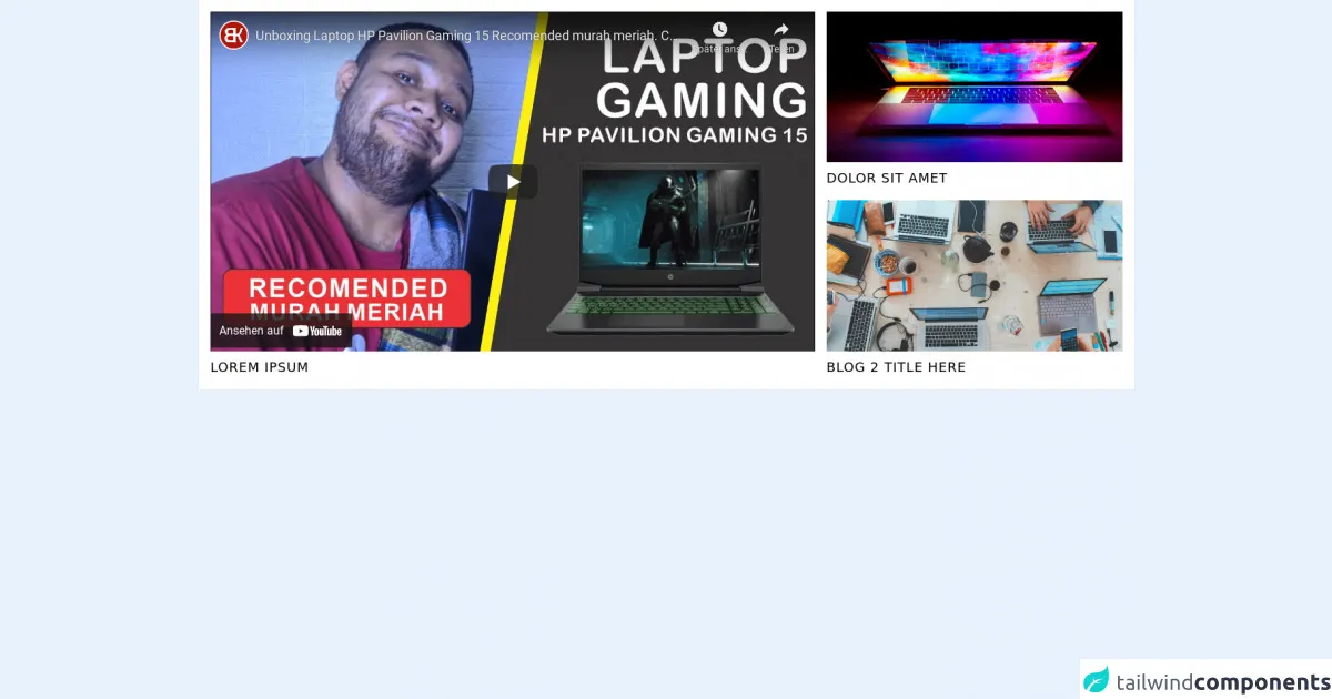
- The preview of Blog grid ui component.
- The source code of Blog grid ui component.
- How to create a Blog grid with Tailwind CSS?
- Step 1: Create the HTML markup
- Step 2: Add Tailwind CSS classes
- Step 3: Customize the blog grid
- Conclusion
What is Tailwind CSS?
Tailwind CSS is a utility-first CSS framework that provides a set of pre-defined CSS classes that can be used to style HTML elements. It is designed to make it easy to create custom designs without writing any CSS code. With Tailwind CSS, you can quickly create responsive and mobile-first designs.
The description of Blog grid ui component
A blog grid is a common UI component used in many websites to display a list of blog posts. It is usually a grid of cards that contain a thumbnail image, title, and a short description of the blog post. The blog grid is an essential component of any blog website as it helps users to quickly find and browse through the latest blog posts.
Why use Tailwind CSS to create a Blog grid ui component?
Tailwind CSS provides a set of pre-defined CSS classes that can be used to create a responsive and mobile-first blog grid. It saves time and effort by eliminating the need to write custom CSS code. With Tailwind CSS, you can easily customize the blog grid to match your website's design and branding.
The preview of Blog grid ui component.
To create a blog grid with Tailwind CSS, we will use a combination of CSS classes to style the HTML elements. The blog grid will be responsive, mobile-first, and will look great on all devices.
Free download of the Blog grid's source code
The source code of Blog grid ui component.
The source code for the blog grid is straightforward and easy to understand. We will use HTML and Tailwind CSS classes to create the blog grid.
<style>
  .pt-\[56\.25\%\] {
    padding-top: 56.25%;
}
</style>


<section class="grid grid-cols-3 container mx-auto gap-4 p-4 bg-white">
  <div class="col-span-2 row-span-2">
    <div class="relative pt-[56.25%] overflow-hidden">
      <iframe class="absolute inset-0 w-full h-full border-0" src="https://www.youtube.com/embed/8VTb2votTM0" title="YouTube video player" frameborder="0" allow="accelerometer; autoplay; clipboard-write; encrypted-media; gyroscope; picture-in-picture" allowfullscreen></iframe>
    </div>

    <h3 class="mt-2 text-lg truncate uppercase tracking-wider">Lorem Ipsum</h3>
  </div>

  <div class="relative">
    <div class="relative pt-[56.25%] overflow-hidden">
      <img class="absolute inset-0 w-full h-full object-cover" src="https://images.unsplash.com/photo-1603302576837-37561b2e2302?ixid=MnwxMjA3fDB8MHxwaG90by1wYWdlfHx8fGVufDB8fHx8&ixlib=rb-1.2.1&auto=format&fit=crop&w=1168&q=80" alt="" />
    </div>

    <h3 class="absolute inset-x-0 bg-white bottom-0 pt-2 text-lg truncate uppercase tracking-wider">Dolor Sit Amet</h3>
  </div>

  <div class="relative">
    <div class="relative pt-[56.25%] overflow-hidden">
      <img class="absolute inset-0 w-full h-full object-cover" src="https://images.unsplash.com/photo-1519389950473-47ba0277781c?ixlib=rb-1.2.1&ixid=MnwxMjA3fDB8MHxwaG90by1wYWdlfHx8fGVufDB8fHx8&auto=format&fit=crop&w=1170&q=80" alt="" />
    </div>

    <h3 class="absolute inset-x-0 bg-white bottom-0 pt-2 text-lg truncate uppercase tracking-wider">Blog 2 Title here</h3>
  </div>
</section>
How to create a Blog grid with Tailwind CSS?
To create a blog grid with Tailwind CSS, follow the steps below:
Step 1: Create the HTML markup
The first step is to create the HTML markup for the blog grid. We will use a combination of HTML elements and Tailwind CSS classes to create the grid.
<div class="grid grid-cols-1 sm:grid-cols-2 md:grid-cols-3 gap-4">
  <div class="bg-white rounded-lg shadow-lg overflow-hidden">
    <img src="https://via.placeholder.com/350x150" alt="Blog post thumbnail" class="w-full h-48 object-cover">
    <div class="p-4">
      <h2 class="text-lg font-bold mb-2">Blog post title</h2>
      <p class="text-gray-600">Lorem ipsum dolor sit amet, consectetur adipiscing elit. Sed ac elit vitae tortor sodales blandit.</p>
    </div>
  </div>
  <!-- Repeat the above code for each blog post -->
</div>
In the above code, we have created a grid container with one column on small screens, two columns on medium screens, and three columns on large screens. We have also added a gap of 4 units between each column.
Inside the grid container, we have created a card for each blog post. Each card contains an image, title, and a short description of the blog post.
Step 2: Add Tailwind CSS classes
Next, we will add Tailwind CSS classes to style the HTML elements. We will use a combination of layout, typography, and color classes to create a beautiful and responsive blog grid.
<div class="grid grid-cols-1 sm:grid-cols-2 md:grid-cols-3 gap-4">
  <div class="bg-white rounded-lg shadow-lg overflow-hidden">
    <img src="https://via.placeholder.com/350x150" alt="Blog post thumbnail" class="w-full h-48 object-cover">
    <div class="p-4">
      <h2 class="text-lg font-bold mb-2 text-gray-800 hover:text-blue-600 transition-colors duration-300">Blog post title</h2>
      <p class="text-gray-600">Lorem ipsum dolor sit amet, consectetur adipiscing elit. Sed ac elit vitae tortor sodales blandit.</p>
      <div class="mt-4">
        <a href="#" class="text-blue-600 hover:text-blue-800 transition-colors duration-300">Read more</a>
      </div>
    </div>
  </div>
  <!-- Repeat the above code for each blog post -->
</div>
In the above code, we have added Tailwind CSS classes to style the HTML elements. We have used the bg-white, rounded-lg, and shadow-lg classes to create a card-like appearance for each blog post.
We have also used the object-cover class to ensure that the image fits the container without stretching or distorting. We have added a hover effect to the blog post title and the "Read more" link using the hover:text-blue-600 and hover:text-blue-800 classes.
Step 3: Customize the blog grid
Finally, we can customize the blog grid to match our website's design and branding. We can change the colors, fonts, and spacing by modifying the Tailwind CSS classes.
For example, we can change the background color of the blog post card by adding the bg-gray-100 class. We can change the font size and color of the blog post title by adding the text-xl and text-blue-600 classes. We can also add padding and margin to the HTML elements using the p-6 and m-4 classes.
Conclusion
In this article, we have learned how to create a blog grid with Tailwind CSS. We have seen how easy it is to create a responsive and mobile-first blog grid using pre-defined CSS classes. We have also seen how we can customize the blog grid to match our website's design and branding.
Tailwind CSS is a powerful CSS framework that can save time and effort when creating UI components like the blog grid. With Tailwind CSS, you can focus on designing and building great websites without worrying about writing custom CSS code.