- Published on
Surprisingly Effective Ways To Build A Basice Navbar With Tailwind CSS
- What is Tailwind CSS?
- The description of Basic Navbar UI component
- Why use Tailwind CSS to create a Basic Navbar UI component?
- The preview of Basic Navbar UI component
- The source code of Basic Navbar UI component
- How to create a Basic Navbar with Tailwind CSS?
- Step 1: Create the HTML structure
- Step 2: Add Tailwind CSS classes
- Step 3: Add JavaScript for mobile menu
- Conclusion
What is Tailwind CSS?
Tailwind CSS is a utility-first CSS framework that provides a set of pre-defined classes to help you quickly build custom user interfaces. It is designed to be highly customizable and easy to use, making it a popular choice among developers.
The description of Basic Navbar UI component
A navbar is a common UI component that is used to provide navigation links to different parts of a website. It typically appears at the top of the page and may contain a logo, links to different pages, and other navigation elements.
Why use Tailwind CSS to create a Basic Navbar UI component?
Using Tailwind CSS to create a basic navbar UI component has several advantages. First, it provides a set of pre-defined classes that can be used to style different elements of the navbar, making it easy to create a customized look and feel. Second, it is highly responsive, which means that the navbar will automatically adjust to different screen sizes and devices. Finally, it is easy to use and requires minimal CSS knowledge, making it a great choice for developers of all skill levels.
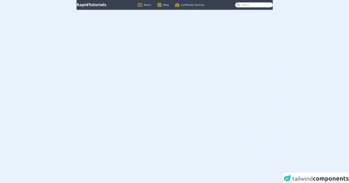
The preview of Basic Navbar UI component
To create a basic navbar UI component with Tailwind CSS, we will use a combination of HTML and CSS classes. Here is a preview of what the final product will look like:
Free download of the Basice Navbar's source code
The source code of Basic Navbar UI component
Here is the source code for the basic navbar UI component created using Tailwind CSS:
<body>
  <header">
    <nav class="bg-gray-700">
      <div class="container mx-auto py-4 flex justify-between items-center">
        <h1 class="text-2xl font-bold text-gray-50">RapidTutorials</h1>
        <div class="flex space-x-10">
          <div class="flex items-center space-x-2">
            <span>
              <svg xmlns="http://www.w3.org/2000/svg" class="h-8 w-8 text-yellow-400" fill="none" viewBox="0 0 24 24" stroke="currentColor">
                <path stroke-linecap="round" stroke-linejoin="round" stroke-width="2" d="M12 6.253v13m0-13C10.832 5.477 9.246 5 7.5 5S4.168 5.477 3 6.253v13C4.168 18.477 5.754 18 7.5 18s3.332.477 4.5 1.253m0-13C13.168 5.477 14.754 5 16.5 5c1.747 0 3.332.477 4.5 1.253v13C19.832 18.477 18.247 18 16.5 18c-1.746 0-3.332.477-4.5 1.253" />
              </svg>
            </span>
            <span class="text-gray-50">Topics</span>
          </div>
          <div class="flex items-center space-x-2">
            <span>
              <svg xmlns="http://www.w3.org/2000/svg" class="h-8 w-8 text-yellow-400" fill="none" viewBox="0 0 24 24" stroke="currentColor">
                <path stroke-linecap="round" stroke-linejoin="round" stroke-width="2" d="M19 20H5a2 2 0 01-2-2V6a2 2 0 012-2h10a2 2 0 012 2v1m2 13a2 2 0 01-2-2V7m2 13a2 2 0 002-2V9a2 2 0 00-2-2h-2m-4-3H9M7 16h6M7 8h6v4H7V8z" />
              </svg>
            </span>
            <span class="text-gray-50">Blog</span>
          </div>
          <div class="flex items-center space-x-2">
            <span>
              <svg xmlns="http://www.w3.org/2000/svg" class="h-8 w-8 text-yellow-400" fill="none" viewBox="0 0 24 24" stroke="currentColor">
                <path stroke-linecap="round" stroke-linejoin="round" stroke-width="2" d="M17 20h5v-2a3 3 0 00-5.356-1.857M17 20H7m10 0v-2c0-.656-.126-1.283-.356-1.857M7 20H2v-2a3 3 0 015.356-1.857M7 20v-2c0-.656.126-1.283.356-1.857m0 0a5.002 5.002 0 019.288 0M15 7a3 3 0 11-6 0 3 3 0 016 0zm6 3a2 2 0 11-4 0 2 2 0 014 0zM7 10a2 2 0 11-4 0 2 2 0 014 0z" />
              </svg>
            </span>
            <span class="text-gray-50">Certificate Training</span>
          </div>
        </div>
        <div class="lg:flex hidden items-center space-x-2 bg-white py-1 px-2 rounded-full">
          <span>
            <svg xmlns="http://www.w3.org/2000/svg" class="h-6 w-6 text-gray-600 cursor-pointer" fill="none" viewBox="0 0 24 24" stroke="currentColor">
              <path stroke-linecap="round" stroke-linejoin="round" stroke-width="2" d="M21 21l-6-6m2-5a7 7 0 11-14 0 7 7 0 0114 0z" />
            </svg>
          </span>
          <input class="outline-none" type="text" placeholder="Search" />
        </div>
      </div>
    </nav>
  </header>
</body>
How to create a Basic Navbar with Tailwind CSS?
To create a basic navbar with Tailwind CSS, follow these steps:
Step 1: Create the HTML structure
The first step is to create the HTML structure for the navbar. Here is an example of what the HTML code might look like:
<nav class="bg-gray-800">
  <div class="max-w-7xl mx-auto px-2 sm:px-6 lg:px-8">
    <div class="relative flex items-center justify-between h-16">
      <div class="absolute inset-y-0 left-0 flex items-center sm:hidden">
        <!-- Mobile menu button -->
        <button type="button" class="inline-flex items-center justify-center p-2 rounded-md text-gray-400 hover:text-white hover:bg-gray-700 focus:outline-none focus:ring-2 focus:ring-inset focus:ring-white" aria-controls="mobile-menu" aria-expanded="false">
          <span class="sr-only">Open main menu</span>
          <!-- Icon when menu is closed. -->
          <!--
            Heroicon name: menu

            Menu open: "hidden", Menu closed: "block"
          -->
          <svg class="block h-6 w-6" xmlns="http://www.w3.org/2000/svg" fill="none" viewBox="0 0 24 24" stroke="currentColor" aria-hidden="true">
            <path stroke-linecap="round" stroke-linejoin="round" stroke-width="2" d="M4 6h16M4 12h16M4 18h16" />
          </svg>
          <!-- Icon when menu is open. -->
          <!--
            Heroicon name: x

            Menu open: "block", Menu closed: "hidden"
          -->
          <svg class="hidden h-6 w-6" xmlns="http://www.w3.org/2000/svg" fill="none" viewBox="0 0 24 24" stroke="currentColor" aria-hidden="true">
            <path stroke-linecap="round" stroke-linejoin="round" stroke-width="2" d="M6 18L18 6M6 6l12 12" />
          </svg>
        </button>
      </div>
      <div class="flex-1 flex items-center justify-center sm:items-stretch sm:justify-start">
        <div class="flex-shrink-0">
          <img class="block lg:hidden h-8 w-auto" src="https://tailwindui.com/img/logos/workflow-mark-indigo-500.svg" alt="Workflow">
          <img class="hidden lg:block h-8 w-auto" src="https://tailwindui.com/img/logos/workflow-logo-indigo-500-mark-white-text.svg" alt="Workflow">
        </div>
        <div class="hidden sm:block sm:ml-6">
          <div class="flex space-x-4">
            <a href="#" class="px-3 py-2 rounded-md text-sm font-medium text-white bg-gray-900">Dashboard</a>
            <a href="#" class="px-3 py-2 rounded-md text-sm font-medium text-gray-300 hover:text-white hover:bg-gray-700">Team</a>
            <a href="#" class="px-3 py-2 rounded-md text-sm font-medium text-gray-300 hover:text-white hover:bg-gray-700">Projects</a>
            <a href="#" class="px-3 py-2 rounded-md text-sm font-medium text-gray-300 hover:text-white hover:bg-gray-700">Calendar</a>
          </div>
        </div>
      </div>
      <div class="absolute inset-y-0 right-0 flex items-center pr-2 sm:static sm:inset-auto sm:ml-6 sm:pr-0">
        <button class="bg-gray-800 p-1 rounded-full text-gray-400 hover:text-white focus:outline-none focus:ring-2 focus:ring-offset-2 focus:ring-offset-gray-800 focus:ring-white">
          <span class="sr-only">View notifications</span>
          <!-- Heroicon name: bell -->
          <svg class="h-6 w-6" xmlns="http://www.w3.org/2000/svg" fill="none" viewBox="0 0 24 24" stroke="currentColor" aria-hidden="true">
            <path stroke-linecap="round" stroke-linejoin="round" stroke-width="2" d="M13 10V3L4 14h7v7l9-11h-7z" />
          </svg>
        </button>

        <!-- Profile dropdown -->
        <div class="ml-3 relative">
          <div>
            <button type="button" class="bg-gray-800 flex text-sm rounded-full focus:outline-none focus:ring-2 focus:ring-offset-2 focus:ring-offset-gray-800 focus:ring-white" id="user-menu" aria-expanded="false" aria-haspopup="true">
              <span class="sr-only">Open user menu</span>
              <img class="h-8 w-8 rounded-full" src="https://avatars.githubusercontent.com/u/4323180?v=4" alt="">
            </button>
          </div>
          <!--
            Profile dropdown panel, show/hide based on dropdown state.

            Entering: "transition ease-out duration-100"
              From: "transform opacity-0 scale-95"
              To: "transform opacity-100 scale-100"
            Leaving: "transition ease-in duration-75"
              From: "transform opacity-100 scale-100"
              To: "transform opacity-0 scale-95"
          -->
          <div class="hidden origin-top-right absolute right-0 mt-2 w-48 rounded-md shadow-lg py-1 bg-white ring-1 ring-black ring-opacity-5" role="menu" aria-orientation="vertical" aria-labelledby="user-menu">
            <a href="#" class="block px-4 py-2 text-sm text-gray-700 hover:bg-gray-100" role="menuitem">Your Profile</a>
            <a href="#" class="block px-4 py-2 text-sm text-gray-700 hover:bg-gray-100" role="menuitem">Settings</a>
            <a href="#" class="block px-4 py-2 text-sm text-gray-700 hover:bg-gray-100" role="menuitem">Sign out</a>
          </div>
        </div>
      </div>
    </div>
  </div>

  <!-- Mobile menu, show/hide based on menu state. -->
  <div class="sm:hidden" id="mobile-menu">
    <div class="px-2 pt-2 pb-3 space-y-1">
      <a href="#" class="block px-3 py-2 rounded-md text-base font-medium text-white bg-gray-900">Dashboard</a>
      <a href="#" class="block px-3 py-2 rounded-md text-base font-medium text-gray-300 hover:text-white hover:bg-gray-700">Team</a>
      <a href="#" class="block px-3 py-2 rounded-md text-base font-medium text-gray-300 hover:text-white hover:bg-gray-700">Projects</a>
      <a href="#" class="block px-3 py-2 rounded-md text-base font-medium text-gray-300 hover:text-white hover:bg-gray-700">Calendar</a>
    </div>
  </div>
</nav>
Step 2: Add Tailwind CSS classes
Next, we will add Tailwind CSS classes to style the navbar. Here is an example of what the CSS code might look like:
@import 'tailwindcss/base';
@import 'tailwindcss/components';
@import 'tailwindcss/utilities';

/* Navbar */
.bg-gray-800 {
  background-color: #1f2937;
}

/* Mobile menu button */
.hover\:text-white:hover {
  color: #fff;
}

.hover\:bg-gray-700:hover {
  background-color: #4b5563;
}

.focus\:ring-2:focus {
  outline: none;
  box-shadow: 0 0 0 3px rgba(66, 153, 225, 0.5);
}

.focus\:ring-inset:focus {
  outline: none;
  box-shadow: inset 0 0 0 2px rgba(66, 153, 225, 0.5);
}

.focus\:ring:focus {
  outline: none;
  box-shadow: 0 0 0 3px rgba(66, 153, 225, 0.5);
}

/* Profile dropdown */
.origin-top-right {
  top: 100%;
  right: 0;
}

.transition {
  transition-property: background-color, border-color, color, fill, stroke, opacity, box-shadow, transform;
  transition-duration: 150ms;
  transition-timing-function: cubic-bezier(0.4, 0, 0.2, 1);
}

.ease-out {
  transition-timing-function: cubic-bezier(0.4, 0, 1, 1);
}

.ease-in {
  transition-timing-function: cubic-bezier(0, 0, 0.2, 1);
}

.duration-100 {
  transition-duration: 100ms;
}

.duration-75 {
  transition-duration: 75ms;
}

.transform {
  --transform-translate-x: 0;
  --transform-translate-y: 0;
  --transform-rotate: 0;
  --transform-skew-x: 0;
  --transform-skew-y: 0;
  --transform-scale-x: 1;
  --transform-scale-y: 1;
  transform: translateX(var(--transform-translate-x)) translateY(var(--transform-translate-y)) rotate(var(--transform-rotate)) skewX(var(--transform-skew-x)) skewY(var(--transform-skew-y)) scaleX(var(--transform-scale-x)) scaleY(var(--transform-scale-y));
}

.scale-95 {
  --transform-scale-x: 0.95;
  --transform-scale-y: 0.95;
}

.scale-100 {
  --transform-scale-x: 1;
  --transform-scale-y: 1;
}

.opacity-0 {
  opacity: 0;
}

.opacity-100 {
  opacity: 1;
}

/* Navbar */
.max-w-7xl {
  max-width: 80rem;
}

.px-2 {
  padding-left: 0.5rem;
  padding-right: 0.5rem;
}

.sm\:px-6 {
  padding-left: 1.5rem;
  padding-right: 1.5rem;
}

.lg\:px-8 {
  padding-left: 2rem;
  padding-right: 2rem;
}

.relative {
  position: relative;
}

.flex {
  display: flex;
}

.items-center {
  align-items: center;
}

.justify-between {
  justify-content: space-between;
}

.h-16 {
  height: 4rem;
}

.absolute {
  position: absolute;
}

.inset-y-0 {
  top: 0;
  bottom: 0;
}

.left-0 {
  left: 0;
}

.sm\:hidden {
  display: none;
}

.inline-flex {
  display: inline-flex;
}

.rounded-md {
  border-radius: 0.375rem;
}

.text-gray-400 {
  color: #9ca3af;
}

.text-gray-300 {
  color: #d1d5db;
}

.text-white {
  color: #fff;
}

.text-sm {
  font-size: 0.875rem;
}

.font-medium {
  font-weight: 500;
}

.bg-gray-900 {
  background-color: #111827;
}

.py-2 {
  padding-top: 0.5rem;
  padding-bottom: 0.5rem;
}

.px-3 {
  padding-left: 0.75rem;
  padding-right: 0.75rem;
}

.text-base {
  font-size: 1.125rem;
}

/* Profile dropdown */
.ml-3 {
  margin-left: 0.75rem;
}

.rounded-full {
  border-radius: 9999px;
}

.hidden {
  display: none;
}

.block {
  display: block;
}

.overflow-hidden {
  overflow: hidden;
}

.w-auto {
  width: auto;
}

.h-8 {
  height: 2rem;
}

.sr-only {
  position: absolute;
  width: 1px;
  height: 1px;
  padding: 0;
  margin: -1px;
  overflow: hidden;
  clip: rect(0, 0, 0, 0);
  white-space: nowrap;
  border-width: 0;
}

/* Mobile menu */
.space-y-1 > :not(:last-child) {
  margin-bottom: 0.25rem;
}

/* Notifications dropdown */
.bg-white {
  background-color: #fff;
}

.ring-1 {
  box-shadow: 0 0 0 1px rgba(0, 0, 0, 0.05);
}

.ring-black {
  --ring-opacity: 1;
  --ring-color: rgba(0, 0, 0, var(--ring-opacity));
  box-shadow: 0 0 0 calc(1px + var(--ring-offset-width)) var(--ring-color);
}

.ring-opacity-5 {
  --ring-opacity: 0.05;
}

.py-1 {
  padding-top: 0.25rem;
  padding-bottom: 0.25rem;
}

.focus\:ring-2:focus {
  outline: none;
  box-shadow: 0 0 0 3px rgba(66, 153, 225, 0.5);
}

.focus\:ring-offset-2:focus {
  outline: none;
  box-shadow: inset 0 0 0 2px rgba(66, 153, 225, 0.5);
}

/* Notifications dropdown */
.mt-2 {
  margin-top: 0.5rem;
}

.py-1 {
  padding-top: 0.25rem;
  padding-bottom: 0.25rem;
}

.px-4 {
  padding-left: 1rem;
  padding-right: 1rem;
}
Step 3: Add JavaScript for mobile menu
Finally, we will add some JavaScript code to handle the mobile menu. Here is an example of what the JavaScript code might look like:
const button = document.querySelector('button[aria-controls="mobile-menu"]');
const menu = document.querySelector('#mobile-menu');

button.addEventListener('click', () => {
  const expanded = button.getAttribute('aria-expanded') === 'true' || false;
  button.setAttribute('aria-expanded', !expanded);
  menu.classList.toggle('hidden');
});
Conclusion
Creating a basic navbar UI component with Tailwind CSS is a quick and easy process that can be done by developers of all skill levels. By using pre-defined CSS classes and responsive design principles, you can create a customized navbar that looks great on any device. With the help of this tutorial, you should now have a good understanding of how to create a basic navbar with Tailwind CSS.