- Published on
A Complete Guide To Create A Basic Select With Tailwind CSS
- What is Tailwind CSS?
- The Description of Basic Select UI Component
- Why Use Tailwind CSS to Create a Basic Select UI Component?
- The Preview of Basic Select UI Component
- The Source Code of Basic Select UI Component
- How to Create a Basic Select with Tailwind CSS?
- Conclusion
What is Tailwind CSS?
Tailwind CSS is a utility-first CSS framework that allows developers to quickly create custom designs without writing any CSS. It provides a wide range of pre-defined classes that can be used to style HTML elements.
The Description of Basic Select UI Component
A basic select UI component is a dropdown list that allows users to select one option from a list of options. It is a common UI element used in web forms, search bars, and other interactive components.
Why Use Tailwind CSS to Create a Basic Select UI Component?
Tailwind CSS provides a simple and efficient way to create a basic select UI component. It offers a wide range of pre-defined classes that can be used to style the component without writing any custom CSS. This saves time and effort and allows developers to focus on the functionality of the component.
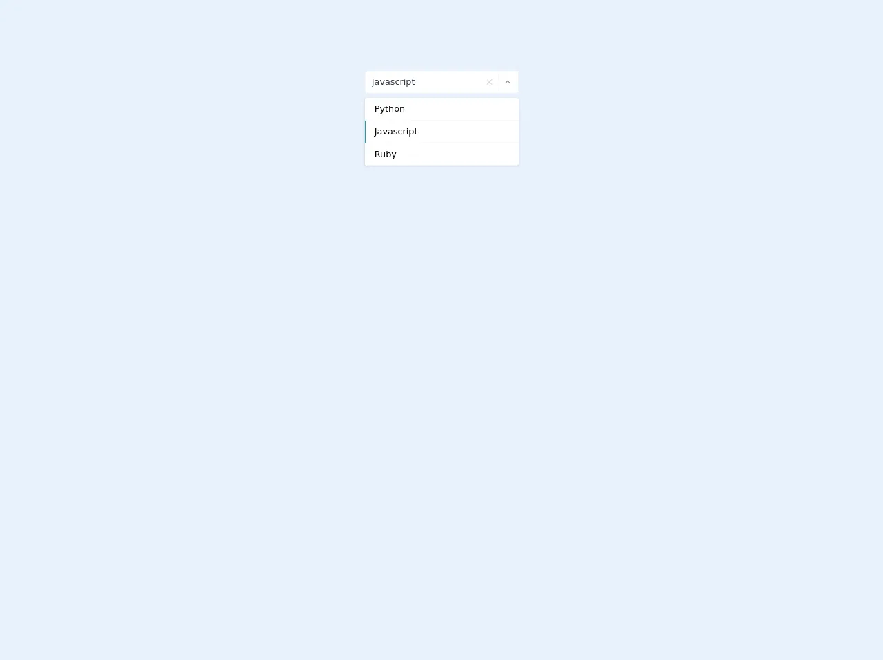
The Preview of Basic Select UI Component
To create a basic select UI component with Tailwind CSS, we will use the select and option HTML elements. We will also use Tailwind CSS classes to style the component.
Free download of the Basic select's source code
The Source Code of Basic Select UI Component
To create a basic select UI component with Tailwind CSS, we will use the following HTML and Tailwind CSS classes:
<style>
    .top-100 {top: 100%}
    .bottom-100 {bottom: 100%}
    .max-h-select {
        max-height: 300px;
    }
</style>


<div class="flex-auto flex flex-col items-center h-64">
    <div class="flex flex-col items-center relative">
        <div class="w-full  svelte-1l8159u">
            <div class="my-2 bg-white p-1 flex border border-gray-200 rounded svelte-1l8159u">
                <div class="flex flex-auto flex-wrap"></div>
                <input value="Javascript" class="p-1 px-2 appearance-none outline-none w-full text-gray-800  svelte-1l8159u">
                <div>
                    <button class="cursor-pointer w-6 h-full flex items-center text-gray-400 outline-none focus:outline-none">
                        <svg xmlns="http://www.w3.org/2000/svg" width="100%" height="100%" fill="none" viewBox="0 0 24 24" stroke="currentColor" stroke-width="2" stroke-linecap="round" stroke-linejoin="round" class="feather feather-x w-4 h-4">
                            <line x1="18" y1="6" x2="6" y2="18"></line>
                            <line x1="6" y1="6" x2="18" y2="18"></line>
                        </svg>
                    </button>
                </div>
                <div class="text-gray-300 w-8 py-1 pl-2 pr-1 border-l flex items-center border-gray-200 svelte-1l8159u">
                    <button class="cursor-pointer w-6 h-6 text-gray-600 outline-none focus:outline-none">
                        <svg xmlns="http://www.w3.org/2000/svg" width="100%" height="100%" fill="none" viewBox="0 0 24 24" stroke="currentColor" stroke-width="2" stroke-linecap="round" stroke-linejoin="round" class="feather feather-chevron-up w-4 h-4">
                            <polyline points="18 15 12 9 6 15"></polyline>
                        </svg>
                    </button>
                </div>
            </div>
        </div>
        <div class="absolute shadow top-100 z-40 w-full lef-0 rounded max-h-select overflow-y-auto svelte-5uyqqj">
            <div class="flex flex-col w-full">
                <div class="cursor-pointer w-full border-gray-100 rounded-t border-b
            hover:bg-teal-100" style="">
                    <div class="flex w-full items-center p-2 pl-2 border-transparent bg-white border-l-2 relative hover:bg-teal-600 hover:text-teal-100 hover:border-teal-600">
                        <div class="w-full items-center flex">
                            <div class="mx-2 leading-6  ">Python </div>
                        </div>
                    </div>
                </div>
                <div class="cursor-pointer w-full border-gray-100 border-b
            hover:bg-teal-100 " style="">
                    <div class="flex w-full items-center p-2 pl-2 border-transparent bg-white border-l-2 relative hover:bg-teal-600 hover:text-teal-100 border-teal-600">
                        <div class="w-full items-center flex">
                            <div class="mx-2 leading-6  ">Javascript </div>
                        </div>
                    </div>
                </div>
                <div class="cursor-pointer w-full border-gray-100 rounded-b
            hover:bg-teal-100 " style="">
                    <div class="flex w-full items-center p-2 pl-2 border-transparent bg-white border-l-2 relative  hover:bg-teal-600 hover:text-teal-100 hover:border-teal-600">
                        <div class="w-full items-center flex">
                            <div class="mx-2 leading-6  ">Ruby </div>
                        </div>
                    </div>
                </div>
            </div>
        </div>
    </div>
</div>
How to Create a Basic Select with Tailwind CSS?
To create a basic select UI component with Tailwind CSS, follow the steps below:
- Create a
selectelement in HTML.
<select class="block w-full rounded-md border-gray-300 shadow-sm focus:border-indigo-500 focus:ring focus:ring-indigo-200 focus:ring-opacity-50">
</select>
- Add
optionelements inside theselectelement.
<select class="block w-full rounded-md border-gray-300 shadow-sm focus:border-indigo-500 focus:ring focus:ring-indigo-200 focus:ring-opacity-50">
  <option>Option 1</option>
  <option>Option 2</option>
  <option>Option 3</option>
</select>
- Apply Tailwind CSS classes to style the component.
<select class="block w-full rounded-md border-gray-300 shadow-sm focus:border-indigo-500 focus:ring focus:ring-indigo-200 focus:ring-opacity-50">
  <option class="py-2">Option 1</option>
  <option class="py-2">Option 2</option>
  <option class="py-2">Option 3</option>
</select>
In the above example, we have applied the py-2 class to the option elements to add padding to the top and bottom of each option.
- Customize the component further using Tailwind CSS classes.
<select class="block w-full rounded-md border-gray-300 shadow-sm focus:border-indigo-500 focus:ring focus:ring-indigo-200 focus:ring-opacity-50 bg-white">
  <option class="py-2">Option 1</option>
  <option class="py-2">Option 2</option>
  <option class="py-2">Option 3</option>
</select>
In the above example, we have added the bg-white class to the select element to change the background color to white.
Conclusion
Creating a basic select UI component with Tailwind CSS is a simple and efficient process. By using pre-defined classes, developers can easily style the component without writing any custom CSS. This saves time and effort and allows developers to focus on the functionality of the component.