- Published on
6 Easy Ways To Make A Basic Card Pot With Tailwind CSS
- What is Tailwind CSS?
- The description of Basic card Pot ui component
- Why use Tailwind CSS to create a Basic card Pot ui component?
- The preview of Basic card Pot ui component
- The source code of Basic card Pot ui component
- How to create a Basic card Pot with Tailwind CSS?
- Conclusion
What is Tailwind CSS?
Tailwind CSS is a utility-first CSS framework that provides a set of pre-defined classes to create user interfaces. It allows you to create complex designs with ease by using simple and intuitive classes. With Tailwind CSS, you can create responsive and mobile-first designs that are easy to maintain and customize.
The description of Basic card Pot ui component
A basic card pot is a simple user interface component that displays information in a card-like format. It is commonly used to display product information, news articles, or other types of content. A basic card pot typically consists of a header, an image, a title, and some text.
Why use Tailwind CSS to create a Basic card Pot ui component?
Tailwind CSS provides a set of pre-defined classes that make it easy to create a basic card pot. By using Tailwind CSS, you can create a responsive and mobile-first design that is easy to maintain and customize. Additionally, Tailwind CSS provides a wide range of utility classes that allow you to style your basic card pot in any way you want.
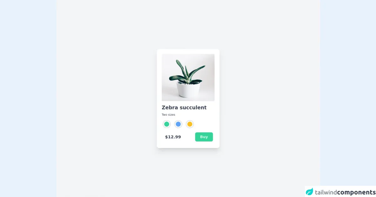
The preview of Basic card Pot ui component
To create a basic card pot with Tailwind CSS, you can use the following HTML and CSS code:
Free download of the Basic card Pot's source code
The source code of Basic card Pot ui component
To create a basic card pot with Tailwind CSS, you can use the following HTML and CSS code:
<!-- Create By Joker Banny -->
<!-- POT -->
<div class="min-h-screen bg-gray-100 flex justify-center items-center">
  <div class="w- p-6 bg-white rounded-xl shadow-xl hover:shadow-2xl hover:scale-105 transition-all transform duration-500">
    <img class="w-64 object-cover rounded-t-md" src="https://images.unsplash.com/photo-1509223197845-458d87318791" alt="" />
    <div class="mt-4">
      <h1 class="text-2xl font-bold text-gray-700">Zebra succulent</h1>
      <p class="text-sm mt-2 text-gray-700">Two sizes</p>
      <div class="mt-3 space-x-4 flex p-1">
        <div class="p-1 border-4 rounded-full cursor-pointer hover:border-green-200 hover:scale-105 transition transform duration-200">
          <span class="block h-6 w-6 bg-green-400 rounded-full"> </span>
        </div>
        <div class="p-1 border-4 rounded-full cursor-pointer hover:border-blue-200 hover:scale-105 transition transform duration-200">
          <span class="block h-6 w-6 bg-blue-400 rounded-full"> </span>
        </div>
        <div class="p-1 border-4 rounded-full cursor-pointer hover:border-yellow-200 hover:scale-105 transition transform duration-200">
          <span class="block h-6 w-6 bg-yellow-400 rounded-full"> </span>
        </div>
      </div>
      <div class="mt-4 mb-2 flex justify-between pl-4 pr-2">
        <button class="block text-xl font-semibold text-gray-700 cursor-auto">$12.99</button>
        <button class="text-lg block font-semibold py-2 px-6 text-green-100 hover:text-white bg-green-400 rounded-lg shadow hover:shadow-md transition duration-300">Buy</button>
      </div>
    </div>
  </div>
</div>
How to create a Basic card Pot with Tailwind CSS?
Creating a basic card pot with Tailwind CSS is easy. Here are six simple steps to follow:
- Create a new HTML file and add the following code:
<div class="bg-white rounded-lg overflow-hidden shadow-md">
  <img class="w-full h-48 object-cover" src="https://source.unsplash.com/random" alt="Sunset in the mountains">
  <div class="p-4">
    <h3 class="font-bold text-xl mb-2">Mountain Sunset</h3>
    <p class="text-gray-700 text-base">Lorem ipsum dolor sit amet, consectetur adipiscing elit. Sed euismod, tellus eu ullamcorper dictum, orci mauris aliquam mauris, quis pellentesque massa urna vel magna. Sed gravida, tortor ut bibendum rhoncus, ante sapien pulvinar libero, non maximus lorem est vel lacus.</p>
  </div>
</div>
Add the necessary Tailwind CSS classes to the HTML code. For example, you can add the
bg-white,rounded-lg,overflow-hidden, andshadow-mdclasses to thedivelement.Add an image to the card pot by using the
imgelement. You can use thew-full,h-48, andobject-coverclasses to set the width, height, and object-fit properties of the image.Add a header to the card pot by using the
h3element. You can use thefont-boldandtext-xlclasses to set the font weight and size of the header.Add some text to the card pot by using the
pelement. You can use thetext-gray-700andtext-baseclasses to set the color and size of the text.Customize the card pot by using additional Tailwind CSS classes. For example, you can change the background color, font size, and padding of the card pot by using the
bg-red-500,text-lg, andp-6classes, respectively.
Conclusion
In conclusion, creating a basic card pot with Tailwind CSS is easy and straightforward. By using Tailwind CSS, you can create a responsive and mobile-first design that is easy to maintain and customize. Additionally, Tailwind CSS provides a wide range of utility classes that allow you to style your basic card pot in any way you want.