- Published on
How To Create A Basic Card With Tailwind CSS In 5 Easy Steps
- What is Tailwind CSS?
- The description of Basic card ui component
- Why use Tailwind CSS to create a Basic card ui component?
- The preview of Basic card ui component.
- The source code of Basic card ui component.
- How to create a Basic card with Tailwind CSS?
- Step 1: Set up your HTML structure
- Step 2: Add Tailwind CSS to your project
- Step 3: Apply the appropriate classes
- Step 4: Customize the styles
- Step 5: Preview and test your basic card
- Conclusion
What is Tailwind CSS?
Tailwind CSS is a utility-first CSS framework that allows you to quickly build custom designs without writing any CSS. It provides pre-defined classes that you can use to style your HTML elements. With Tailwind CSS, you can easily create responsive and modern UI components.
The description of Basic card ui component
A basic card is a UI component that is commonly used to display information. It usually consists of a title, an image, and some text. The card can be used to display products, articles, or any other type of content.
Why use Tailwind CSS to create a Basic card ui component?
Tailwind CSS provides pre-defined classes that make it easy to create a basic card UI component. You don't have to write any CSS code, which saves you time and effort. Additionally, Tailwind CSS is highly customizable, so you can easily modify the styles to fit your design needs.
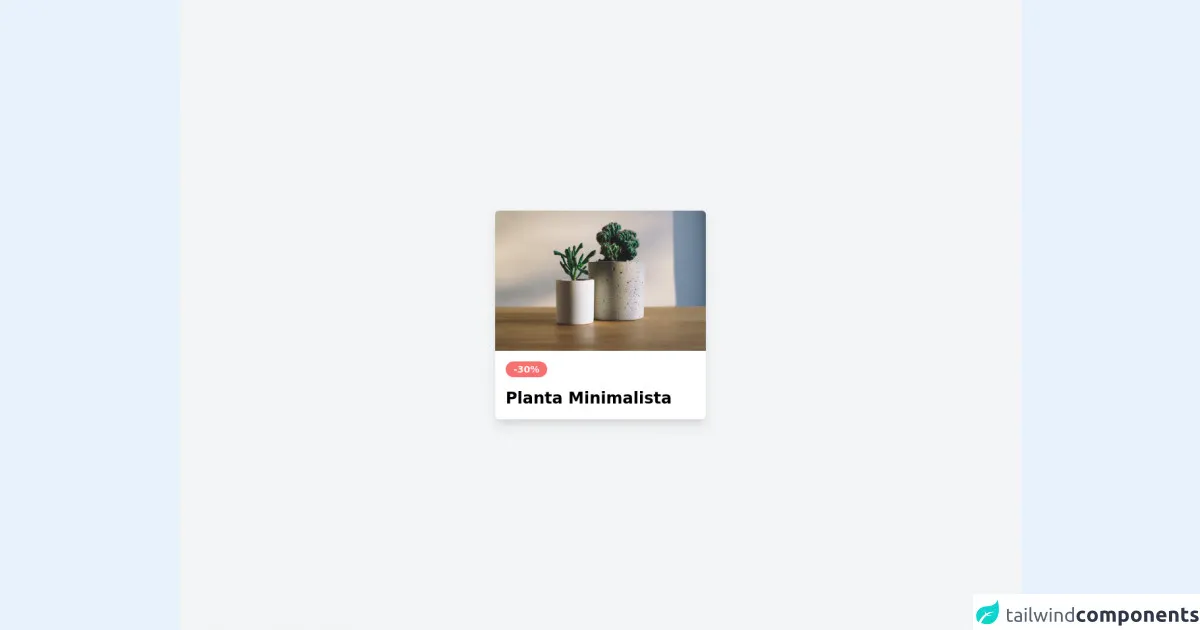
The preview of Basic card ui component.
To create a basic card with Tailwind CSS, you will need to define the HTML structure and apply the appropriate classes. Here's a preview of what the basic card will look like:
Free download of the Basic card's source code
The source code of Basic card ui component.
To create a basic card with Tailwind CSS, you will need to define the HTML structure and apply the appropriate classes. Here's the source code for the basic card:
<!-- Create Card By Joker Banny -->
<div class="min-h-screen bg-gray-100 flex justify-center items-center">
  <div class="w-80 rounded-md cursor-pointer shadow-lg overflow-hidden hover:shadow-xl transform hover:scale-105 duration-500">
    <img src="https://images.unsplash.com/photo-1463320898484-cdee8141c787?ixid=MnwxMjA3fDB8MHxwaG90by1wYWdlfHx8fGVufDB8fHx8&ixlib=rb-1.2.1&auto=format&fit=crop&w=1050&q=80" alt="" />
    <div class="p-4 bg-white">
      <spna class="text-sm font-semibold text-red-50 bg-red-400 py-1 px-3 rounded-full">-30%</spna>
      <h1 class="mt-4 font-bold text-2xl">Planta Minimalista</h1>
    </div>
  </div>
</div>
How to create a Basic card with Tailwind CSS?
Now that you have an idea of what the basic card will look like and what the source code is, let's dive into the steps to create a basic card with Tailwind CSS.
Step 1: Set up your HTML structure
The first step is to define the HTML structure of the basic card. Here's an example of what the HTML structure should look like:
<div class="max-w-sm rounded overflow-hidden shadow-lg">
  <img class="w-full" src="img/card-top.jpg" alt="Sunset in the mountains">
  <div class="px-6 py-4">
    <div class="font-bold text-xl mb-2">The Coldest Sunset</div>
    <p class="text-gray-700 text-base">
      Lorem ipsum dolor sit amet, consectetur adipisicing elit. Voluptatibus quia, nulla! Maiores et perferendis eaque, exercitationem praesentium nihil.
    </p>
  </div>
</div>
In this example, we have a div element with the classes max-w-sm, rounded, overflow-hidden, and shadow-lg. This creates a container for the card with a maximum width of sm, rounded corners, and a shadow effect.
Inside the container, we have an img element with the class w-full. This sets the width of the image to 100% of the container width.
Below the image, we have another div element with the classes px-6 and py-4. This sets the padding for the content inside the container.
Inside this div element, we have a div element with the classes font-bold and text-xl. This sets the font weight to bold and the font size to extra large for the title.
Below the title, we have a p element with the classes text-gray-700 and text-base. This sets the text color to gray and the font size to base for the description.
Step 2: Add Tailwind CSS to your project
To use Tailwind CSS, you will need to add it to your project. You can do this by including the Tailwind CSS file in your HTML file or by installing it via a package manager like npm.
Step 3: Apply the appropriate classes
Now that you have set up your HTML structure and added Tailwind CSS to your project, you can start applying the appropriate classes to your HTML elements.
For the container, you can apply the following classes:
<div class="max-w-sm rounded overflow-hidden shadow-lg">
For the image, you can apply the following class:
<img class="w-full" src="img/card-top.jpg" alt="Sunset in the mountains">
For the title, you can apply the following classes:
<div class="font-bold text-xl mb-2">The Coldest Sunset</div>
For the description, you can apply the following classes:
<p class="text-gray-700 text-base">
  Lorem ipsum dolor sit amet, consectetur adipisicing elit. Voluptatibus quia, nulla! Maiores et perferendis eaque, exercitationem praesentium nihil.
</p>
Step 4: Customize the styles
Tailwind CSS provides a wide range of pre-defined classes that you can use to customize the styles of your basic card. For example, you can change the background color, font size, or border radius of the container by applying the appropriate classes.
Here are some examples of how you can customize the styles of your basic card:
<div class="max-w-sm rounded-lg overflow-hidden shadow-md bg-white">
<div class="font-bold text-2xl mb-4">The Coldest Sunset</div>
<p class="text-gray-600 text-sm">
  Lorem ipsum dolor sit amet, consectetur adipisicing elit. Voluptatibus quia, nulla! Maiores et perferendis eaque, exercitationem praesentium nihil.
</p>
Step 5: Preview and test your basic card
Once you have applied the appropriate classes and customized the styles, you can preview and test your basic card. Make sure that it looks and functions as intended on different devices and browsers.
Conclusion
Creating a basic card UI component with Tailwind CSS is easy and straightforward. By following the steps outlined in this article, you can quickly create a basic card that looks great and functions well. Tailwind CSS provides a wide range of pre-defined classes that you can use to customize the styles of your basic card, making it highly customizable and flexible.