- Published on
6 Easy Ways To Make A Basic Button Collection With Tailwind CSS Without Even Thinking About It
- What is Tailwind CSS?
- The description of Basic Button Collection ui component
- Why use Tailwind CSS to create a Basic Button Collection ui component?
- The preview of Basic Button Collection ui component
- The source code of Basic Button Collection ui component
- How to create a Basic Button Collection with Tailwind CSS?
- Step 1: Install Tailwind CSS
- Step 2: Create a container
- Step 3: Create your buttons
- Step 4: Add button sizes
- Step 5: Add button borders
- Step 6: Add button hover effects
- Conclusion
What is Tailwind CSS?
Tailwind CSS is a utility-first CSS framework that allows you to quickly build custom user interfaces. It provides a set of pre-defined CSS classes that you can use to style your HTML elements. With Tailwind CSS, you can create complex layouts and designs without writing any custom CSS code.
The description of Basic Button Collection ui component
A Basic Button Collection is a collection of buttons that are styled in a consistent way. It is a common UI component that you will find on most websites and applications. A Basic Button Collection typically includes buttons for primary actions, secondary actions, and tertiary actions.
Why use Tailwind CSS to create a Basic Button Collection ui component?
Tailwind CSS makes it easy to create a Basic Button Collection because it provides pre-defined CSS classes for styling buttons. You don't need to write any custom CSS code, which saves you time and effort. Additionally, Tailwind CSS provides responsive design utilities, which means that you can create a Basic Button Collection that looks great on all screen sizes.
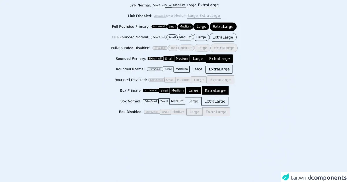
The preview of Basic Button Collection ui component
Here is a preview of what a Basic Button Collection created with Tailwind CSS might look like:
Free download of the Basic Button Collection's source code
The source code of Basic Button Collection ui component
Here is the source code for a Basic Button Collection created with Tailwind CSS:
<div class="flex h-14 flex-row items-center justify-center gap-2">
  <div class="relative h-fit w-fit px-2 py-0 text-lg">
    <p>Link Normal:</p>
  </div>
  <button class="relative h-fit w-fit border-b border-black text-xs ">
    <p>ExtraSmall</p>
  </button>
  <button class="relative h-fit w-fit border-b border-black text-sm ">
    <p>Small</p>
  </button>
  <button class="text-md relative h-fit w-fit border-b-2 border-black px-1 ">
    <p>Medium</p>
  </button>
  <button class="relative h-fit w-fit border-b-2 border-black px-1 text-lg ">
    <p>Large</p>
  </button>
  <button class="relative h-fit w-fit border-b-4 border-black px-1 text-xl ">
    <p>ExtraLarge</p>
  </button>
</div>
<div class="flex h-14 flex-row items-center justify-center gap-2">
  <div class="relative h-fit w-fit px-2 py-0 text-lg">
    <p>Link Disabled:</p>
  </div>
  <button
    class="relative h-fit w-fit cursor-not-allowed border-b border-gray-400 text-xs text-gray-400"
  >
    <p>ExtraSmall</p>
  </button>
  <button
    class="relative h-fit w-fit cursor-not-allowed border-b border-gray-400 text-sm text-gray-400"
  >
    <p>Small</p>
  </button>
  <button
    class="text-md relative h-fit w-fit cursor-not-allowed border-b-2 border-gray-400 px-1 text-gray-400"
  >
    <p>Medium</p>
  </button>
  <button
    class="relative h-fit w-fit cursor-not-allowed border-b-2 border-gray-400 px-1 text-lg text-gray-400"
  >
    <p>Large</p>
  </button>
  <button
    class="relative h-fit w-fit cursor-not-allowed border-b-4 border-gray-400 px-1 text-xl text-gray-400"
  >
    <p>ExtraLarge</p>
  </button>
</div>
<div class="flex h-14 flex-row items-center justify-center gap-2">
  <div class="relative h-fit w-fit px-2 py-0 text-lg">
    <p>Full-Rounded Primary:</p>
  </div>
  <button class="relative h-fit w-fit rounded-full border bg-black px-2 py-0 text-xs text-white">
    <p>ExtraSmall</p>
  </button>
  <button class="relative h-fit w-fit rounded-full border bg-black px-2 py-1 text-sm text-white">
    <p>Small</p>
  </button>
  <button class="text-md relative h-fit w-fit rounded-full border bg-black px-2 py-1 text-white">
    <p>Medium</p>
  </button>
  <button class="relative h-fit w-fit rounded-full border bg-black px-4 py-1 text-lg text-white">
    <p>Large</p>
  </button>
  <button class="relative h-fit w-fit rounded-full border bg-black px-4 py-2 text-xl text-white">
    <p>ExtraLarge</p>
  </button>
</div>
<div class="flex h-14 flex-row items-center justify-center gap-2">
  <div class="relative h-fit w-fit px-2 py-0 text-lg">
    <p>Full-Rounded Normal:</p>
  </div>
  <button class="relative h-fit w-fit rounded-full border border-black px-2 py-0 text-xs ">
    <p>ExtraSmall</p>
  </button>
  <button class="relative h-fit w-fit rounded-full border border-black px-2 py-1 text-sm ">
    <p>Small</p>
  </button>
  <button class="text-md relative h-fit w-fit rounded-full border border-black px-2 py-1 ">
    <p>Medium</p>
  </button>
  <button class="relative h-fit w-fit rounded-full border border-black px-4 py-1 text-lg ">
    <p>Large</p>
  </button>
  <button class="relative h-fit w-fit rounded-full border border-black px-4 py-2 text-xl ">
    <p>ExtraLarge</p>
  </button>
</div>
<div class="flex h-14 flex-row items-center justify-center gap-2">
  <div class="relative h-fit w-fit px-2 py-0 text-lg">
    <p>Full-Rounded Disabled:</p>
  </div>
  <button
    class="relative h-fit w-fit cursor-not-allowed rounded-full border border-gray-400 bg-gray-200 px-2 py-0 text-xs text-gray-400"
  >
    <p>ExtraSmall</p>
  </button>
  <button
    class="relative h-fit w-fit cursor-not-allowed rounded-full border border-gray-400 bg-gray-200 px-2 py-1 text-sm text-gray-400"
  >
    <p>Small</p>
  </button>
  <button
    class="text-md relative h-fit w-fit cursor-not-allowed rounded-full border border-gray-400 bg-gray-200 px-2 py-1 text-gray-400"
  >
    <p>Medium</p>
  </button>
  <button
    class="relative h-fit w-fit cursor-not-allowed rounded-full border border-gray-400 bg-gray-200 px-4 py-1 text-lg text-gray-400"
  >
    <p>Large</p>
  </button>
  <button
    class="relative h-fit w-fit cursor-not-allowed rounded-full border border-gray-400 bg-gray-200 px-4 py-2 text-xl text-gray-400"
  >
    <p>ExtraLarge</p>
  </button>
</div>
<div class="flex h-14 flex-row items-center justify-center gap-2">
  <div class="relative h-fit w-fit px-2 py-0 text-lg">
    <p>Rounded Primary:</p>
  </div>
  <button class="relative h-fit w-fit rounded border bg-black px-2 py-0 text-xs text-white">
    <p>ExtraSmall</p>
  </button>
  <button class="relative h-fit w-fit rounded border bg-black px-2 py-1 text-sm text-white">
    <p>Small</p>
  </button>
  <button class="text-md relative h-fit w-fit rounded border bg-black px-2 py-1 text-white">
    <p>Medium</p>
  </button>
  <button class="relative h-fit w-fit rounded border bg-black px-4 py-1 text-lg text-white">
    <p>Large</p>
  </button>
  <button class="relative h-fit w-fit rounded border bg-black px-4 py-2 text-xl text-white">
    <p>ExtraLarge</p>
  </button>
</div>
<div class="flex h-14 flex-row items-center justify-center gap-2">
  <div class="relative h-fit w-fit px-2 py-0 text-lg">
    <p>Rounded Normal:</p>
  </div>
  <button class="relative h-fit w-fit rounded border border-black px-2 py-0 text-xs ">
    <p>ExtraSmall</p>
  </button>
  <button class="relative h-fit w-fit rounded border border-black px-2 py-1 text-sm ">
    <p>Small</p>
  </button>
  <button class="text-md relative h-fit w-fit rounded border border-black px-2 py-1 ">
    <p>Medium</p>
  </button>
  <button class="relative h-fit w-fit rounded border border-black px-4 py-1 text-lg ">
    <p>Large</p>
  </button>
  <button class="relative h-fit w-fit rounded border border-black px-4 py-2 text-xl ">
    <p>ExtraLarge</p>
  </button>
</div>
<div class="flex h-14 flex-row items-center justify-center gap-2">
  <div class="relative h-fit w-fit px-2 py-0 text-lg">
    <p>Rounded Disabled:</p>
  </div>
  <button
    class="relative h-fit w-fit cursor-not-allowed rounded border border-gray-400 bg-gray-200 px-2 py-0 text-xs text-gray-400"
  >
    <p>ExtraSmall</p>
  </button>
  <button
    class="relative h-fit w-fit cursor-not-allowed rounded border border-gray-400 bg-gray-200 px-2 py-1 text-sm text-gray-400"
  >
    <p>Small</p>
  </button>
  <button
    class="text-md relative h-fit w-fit cursor-not-allowed rounded border border-gray-400 bg-gray-200 px-2 py-1 text-gray-400"
  >
    <p>Medium</p>
  </button>
  <button
    class="relative h-fit w-fit cursor-not-allowed rounded border border-gray-400 bg-gray-200 px-4 py-1 text-lg text-gray-400"
  >
    <p>Large</p>
  </button>
  <button
    class="relative h-fit w-fit cursor-not-allowed rounded border border-gray-400 bg-gray-200 px-4 py-2 text-xl text-gray-400"
  >
    <p>ExtraLarge</p>
  </button>
</div>
<div class="flex h-14 flex-row items-center justify-center gap-2">
  <div class="relative h-fit w-fit px-2 py-0 text-lg">
    <p>Box Primary:</p>
  </div>
  <button class="relative h-fit w-fit border bg-black px-2 py-0  text-xs text-white">
    <p>ExtraSmall</p>
  </button>
  <button class="relative h-fit w-fit border bg-black px-2 py-1  text-sm text-white">
    <p>Small</p>
  </button>
  <button class="text-md relative h-fit w-fit border bg-black px-2  py-1 text-white">
    <p>Medium</p>
  </button>
  <button class="relative h-fit w-fit border bg-black px-4 py-1  text-lg text-white">
    <p>Large</p>
  </button>
  <button class="relative h-fit w-fit border bg-black px-4 py-2  text-xl text-white">
    <p>ExtraLarge</p>
  </button>
</div>
<div class="flex h-14 flex-row items-center justify-center gap-2">
  <div class="relative h-fit w-fit px-2 py-0 text-lg">
    <p>Box Normal:</p>
  </div>
  <button class="relative h-fit w-fit border border-black px-2 py-0  text-xs ">
    <p>ExtraSmall</p>
  </button>
  <button class="relative h-fit w-fit border border-black px-2 py-1  text-sm ">
    <p>Small</p>
  </button>
  <button class="text-md relative h-fit w-fit border border-black px-2  py-1 ">
    <p>Medium</p>
  </button>
  <button class="relative h-fit w-fit border border-black px-4 py-1  text-lg ">
    <p>Large</p>
  </button>
  <button class="relative h-fit w-fit border border-black px-4 py-2  text-xl ">
    <p>ExtraLarge</p>
  </button>
</div>
<div class="flex h-14 flex-row items-center justify-center gap-2">
  <div class="relative h-fit w-fit px-2 py-0 text-lg">
    <p>Box Disabled:</p>
  </div>
  <button
    class="relative h-fit w-fit cursor-not-allowed border border-gray-400 bg-gray-200  px-2 py-0 text-xs text-gray-400"
  >
    <p>ExtraSmall</p>
  </button>
  <button
    class="relative h-fit w-fit cursor-not-allowed border border-gray-400 bg-gray-200  px-2 py-1 text-sm text-gray-400"
  >
    <p>Small</p>
  </button>
  <button
    class="text-md relative h-fit w-fit cursor-not-allowed border border-gray-400  bg-gray-200 px-2 py-1 text-gray-400"
  >
    <p>Medium</p>
  </button>
  <button
    class="relative h-fit w-fit cursor-not-allowed border border-gray-400 bg-gray-200  px-4 py-1 text-lg text-gray-400"
  >
    <p>Large</p>
  </button>
  <button
    class="relative h-fit w-fit cursor-not-allowed border border-gray-400 bg-gray-200  px-4 py-2 text-xl text-gray-400"
  >
    <p>ExtraLarge</p>
  </button>
</div>
How to create a Basic Button Collection with Tailwind CSS?
Creating a Basic Button Collection with Tailwind CSS is easy. Here are six steps to get you started:
Step 1: Install Tailwind CSS
The first step is to install Tailwind CSS. You can do this by adding the Tailwind CSS CDN to your HTML file or by installing it with a package manager like npm.
Step 2: Create a container
Next, create a container element that will hold your buttons. You can use any HTML element for this, but a div element is a good choice.
<div class="button-container"></div>
Step 3: Create your buttons
Create your buttons using the button element and add the Tailwind CSS classes to style them. You can use the bg and text classes to set the background color and text color of your buttons.
<button class="bg-blue-500 text-white">Primary Button</button>
<button class="bg-gray-500 text-white">Secondary Button</button>
<button class="bg-green-500 text-white">Tertiary Button</button>
Step 4: Add button sizes
Tailwind CSS provides classes for setting the size of your buttons. You can use the w and h classes to set the width and height of your buttons.
<button class="bg-blue-500 text-white w-24 h-10">Primary Button</button>
<button class="bg-gray-500 text-white w-24 h-10">Secondary Button</button>
<button class="bg-green-500 text-white w-24 h-10">Tertiary Button</button>
Step 5: Add button borders
You can add borders to your buttons using the border class. You can also use the rounded class to add rounded corners to your buttons.
<button class="bg-blue-500 text-white w-24 h-10 border border-blue-700 rounded">Primary Button</button>
<button class="bg-gray-500 text-white w-24 h-10 border border-gray-700 rounded">Secondary Button</button>
<button class="bg-green-500 text-white w-24 h-10 border border-green-700 rounded">Tertiary Button</button>
Step 6: Add button hover effects
Finally, you can add hover effects to your buttons using the hover class. You can use the hover:bg and hover:text classes to set the background color and text color of your buttons when they are hovered over.
<button class="bg-blue-500 text-white w-24 h-10 border border-blue-700 rounded hover:bg-blue-700 hover:text-white">Primary Button</button>
<button class="bg-gray-500 text-white w-24 h-10 border border-gray-700 rounded hover:bg-gray-700 hover:text-white">Secondary Button</button>
<button class="bg-green-500 text-white w-24 h-10 border border-green-700 rounded hover:bg-green-700 hover:text-white">Tertiary Button</button>
Conclusion
Creating a Basic Button Collection with Tailwind CSS is easy and requires no custom CSS code. With Tailwind CSS, you can create a consistent and responsive UI component that looks great on all screen sizes. By following the six steps outlined in this article, you can create a Basic Button Collection without even thinking about it.