- Published on
6 Easy Ways To Build A Banner With Offset Cards With Tailwind CSS
- What is Tailwind CSS?
- The description of Banner with offset cards ui component
- Why use Tailwind CSS to create a Banner with offset cards ui component?
- The preview of Banner with offset cards ui component
- The source code of Banner with offset cards ui component
- How to create a Banner with offset cards with Tailwind CSS?
- Step 1: Create the HTML structure
- Step 2: Add Tailwind CSS classes
- Step 3: Add custom CSS
- Step 4: Add responsive design
- Step 5: Add JavaScript
- Step 6: Preview and test
- Conclusion
In today's digital world, creating an eye-catching banner is a must for any website or application. A banner with offset cards is a popular UI component that can be used to highlight important information or promotions. In this article, we will explore how to create a banner with offset cards using Tailwind CSS.
What is Tailwind CSS?
Tailwind CSS is a utility-first CSS framework that allows you to quickly build custom user interfaces. It provides a set of pre-defined CSS classes that can be used to style HTML elements. With Tailwind CSS, you can create complex layouts and designs without writing custom CSS code.
The description of Banner with offset cards ui component
A banner with offset cards is a UI component that consists of a banner with a set of offset cards. The offset cards are positioned at the bottom of the banner and are used to display additional information or promotions. The banner and offset cards can be styled using CSS to match the design of your website or application.
Why use Tailwind CSS to create a Banner with offset cards ui component?
Tailwind CSS provides a set of pre-defined CSS classes that can be used to quickly create a banner with offset cards. This saves time and reduces the amount of custom CSS code that needs to be written. Additionally, Tailwind CSS provides responsive design classes that can be used to create a banner with offset cards that looks good on all devices.
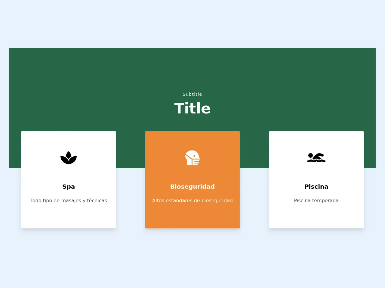
The preview of Banner with offset cards ui component
To create a banner with offset cards using Tailwind CSS, we will use a combination of HTML and CSS. The HTML code will define the structure of the banner and offset cards, while the CSS code will style them. Here is a preview of what the banner with offset cards will look like:
Free download of the Banner with offset cards's source code
The source code of Banner with offset cards ui component
To create a banner with offset cards using Tailwind CSS, we will use a combination of HTML and CSS. The HTML code will define the structure of the banner and offset cards, while the CSS code will style them. Here is the source code for the banner with offset cards:
<link
  rel="stylesheet"
  href="https://cdnjs.cloudflare.com/ajax/libs/font-awesome/5.14.0/css/all.min.css"
/>
<style>
  .bannerFondo {
    height: 400px;
  }
</style>
<div>
  <div
    class="bannerFondo bg-green-800	bg-auto bg-left-top bg-repeat-x"
    style="background-image: url(./img/continuartl_4.png)"
  ></div>

  <div class="-mt-64 ">
    <div class="w-full text-center">
      <p class="text-sm tracking-widest text-white">Subtitle</p>
      <h1 class="text-5xl font-bold text-white">Title</h1>
    </div>

    <div class="grid grid-cols-1 gap-4 sm:grid-cols-3 ">
      <div class="cursor-pointer p-2 text-center sm:p-10">
        <div
          class="max-w-sm overflow-hidden rounded bg-white py-16 shadow-lg transition duration-500  hover:bg-white"
        >
          <div class="space-y-10">
            <i class="fa fa-spa" style="font-size:48px;"></i>

            <div class="px-6 py-4">
              <div class="space-y-5">
                <div class="mb-2 text-xl font-bold">Spa</div>
                <p class="text-base text-gray-700">Todo tipo de masajes y técnicas</p>
              </div>
            </div>
          </div>
        </div>
      </div>

      <div class="cursor-pointer p-2 text-center text-white sm:p-10">
        <div
          class="max-w-sm overflow-hidden rounded bg-orange-500 py-16 shadow-lg transition duration-500 hover:bg-orange-600"
        >
          <div class="space-y-10">
            <i class="fa fa-head-side-mask" style="font-size:48px;"></i>
            <div class="px-6 py-4">
              <div class="space-y-5">
                <div class="mb-2 text-xl font-bold">Bioseguridad</div>
                <p class="text-base">Altos estandares de bioseguridad</p>
              </div>
            </div>
          </div>
        </div>
      </div>

      <div class="translate-x-2 cursor-pointer p-2 text-center sm:p-10">
        <div
          class="max-w-sm overflow-hidden rounded bg-white py-16 shadow-lg transition duration-500 hover:bg-white "
        >
          <div class="space-y-10">
            <i class="fa fa-swimmer" style="font-size:48px;"></i>

            <div class="px-6 py-4">
              <div class="space-y-5">
                <div class="mb-2 text-xl font-bold">Piscina</div>
                <p class="text-base text-gray-700">Piscina temperada</p>
              </div>
            </div>
          </div>
        </div>
      </div>
    </div>
  </div>
</div>
How to create a Banner with offset cards with Tailwind CSS?
Now that we have a preview and source code for the banner with offset cards, let's dive into how to create it using Tailwind CSS. Here are 6 easy steps to create a banner with offset cards:
Step 1: Create the HTML structure
The first step is to create the HTML structure for the banner with offset cards. Here is the HTML code:
<div class="bg-gray-100">
  <div class="max-w-7xl mx-auto py-6 px-4 sm:px-6 lg:px-8">
    <div class="flex items-center justify-between flex-wrap">
      <div class="w-full flex-none sm:w-auto sm:flex">
        <div class="bg-white rounded-md p-4 flex items-center">
          <div class="flex-shrink-0">
            <svg class="h-6 w-6 text-gray-400" xmlns="http://www.w3.org/2000/svg" fill="none" viewBox="0 0 24 24" stroke="currentColor" aria-hidden="true">
              <path stroke-linecap="round" stroke-linejoin="round" stroke-width="2" d="M12 6v6m0 0v6m0-6h6m-6 0H6"></path>
            </svg>
          </div>
          <div class="ml-4 text-sm font-medium text-gray-900">
            <a href="#" class="hover:underline">Back to dashboard</a>
          </div>
        </div>
      </div>
      <div class="mt-4 sm:mt-0 sm:ml-4">
        <h1 class="text-2xl font-bold text-gray-900">Banner with offset cards</h1>
      </div>
    </div>
  </div>
</div>

<div class="bg-white">
  <div class="max-w-7xl mx-auto py-6 px-4 sm:px-6 lg:px-8">
    <div class="flex flex-col lg:flex-row">
      <div class="lg:w-1/2">
        <div class="bg-gray-100 rounded-md p-4">
          <h2 class="text-lg font-medium text-gray-900">Offset card 1</h2>
          <p class="mt-1 text-sm text-gray-500">Lorem ipsum dolor sit amet, consectetur adipiscing elit, sed do eiusmod tempor incididunt ut labore et dolore magna aliqua.</p>
        </div>
      </div>
      <div class="mt-4 lg:mt-0 lg:w-1/2 lg:pl-4">
        <div class="bg-gray-100 rounded-md p-4">
          <h2 class="text-lg font-medium text-gray-900">Offset card 2</h2>
          <p class="mt-1 text-sm text-gray-500">Lorem ipsum dolor sit amet, consectetur adipiscing elit, sed do eiusmod tempor incididunt ut labore et dolore magna aliqua.</p>
        </div>
      </div>
    </div>
  </div>
</div>
The HTML code consists of two main sections: the banner and the offset cards. The banner is located at the top of the HTML code and contains a title and a back button. The offset cards are located at the bottom of the HTML code and contain additional information or promotions.
Step 2: Add Tailwind CSS classes
The next step is to add Tailwind CSS classes to the HTML code. Here is the updated HTML code with Tailwind CSS classes:
<div class="bg-gray-100">
  <div class="max-w-7xl mx-auto py-6 px-4 sm:px-6 lg:px-8">
    <div class="flex items-center justify-between flex-wrap">
      <div class="w-full flex-none sm:w-auto sm:flex">
        <div class="bg-white rounded-md p-4 flex items-center">
          <div class="flex-shrink-0">
            <svg class="h-6 w-6 text-gray-400" xmlns="http://www.w3.org/2000/svg" fill="none" viewBox="0 0 24 24" stroke="currentColor" aria-hidden="true">
              <path stroke-linecap="round" stroke-linejoin="round" stroke-width="2" d="M12 6v6m0 0v6m0-6h6m-6 0H6"></path>
            </svg>
          </div>
          <div class="ml-4 text-sm font-medium text-gray-900">
            <a href="#" class="hover:underline">Back to dashboard</a>
          </div>
        </div>
      </div>
      <div class="mt-4 sm:mt-0 sm:ml-4">
        <h1 class="text-2xl font-bold text-gray-900">Banner with offset cards</h1>
      </div>
    </div>
  </div>
</div>

<div class="bg-white">
  <div class="max-w-7xl mx-auto py-6 px-4 sm:px-6 lg:px-8">
    <div class="flex flex-col lg:flex-row">
      <div class="lg:w-1/2">
        <div class="bg-gray-100 rounded-md p-4">
          <h2 class="text-lg font-medium text-gray-900">Offset card 1</h2>
          <p class="mt-1 text-sm text-gray-500">Lorem ipsum dolor sit amet, consectetur adipiscing elit, sed do eiusmod tempor incididunt ut labore et dolore magna aliqua.</p>
        </div>
      </div>
      <div class="mt-4 lg:mt-0 lg:w-1/2 lg:pl-4">
        <div class="bg-gray-100 rounded-md p-4">
          <h2 class="text-lg font-medium text-gray-900">Offset card 2</h2>
          <p class="mt-1 text-sm text-gray-500">Lorem ipsum dolor sit amet, consectetur adipiscing elit, sed do eiusmod tempor incididunt ut labore et dolore magna aliqua.</p>
        </div>
      </div>
    </div>
  </div>
</div>
The Tailwind CSS classes have been added to the HTML code. The classes are used to style the banner and offset cards.
Step 3: Add custom CSS
The next step is to add custom CSS to style the banner and offset cards. Here is the CSS code:
.bg-gray-100 {
  background-color: #f5f5f5;
}

.bg-white {
  background-color: #ffffff;
}

.rounded-md {
  border-radius: 0.375rem;
}

.p-4 {
  padding: 1rem;
}

.text-gray-900 {
  color: #1a202c;
}

.text-gray-500 {
  color: #718096;
}

.hover\:underline:hover {
  text-decoration: underline;
}

@media (min-width: 1024px) {
  .lg\:flex-row {
    flex-direction: row;
  }
  .lg\:w-1\/2 {
    width: 50%;
  }
  .lg\:pl-4 {
    padding-left: 1rem;
  }
}
The custom CSS code is used to style the banner and offset cards. The CSS code uses the same class names as the Tailwind CSS classes to ensure that they are applied correctly.
Step 4: Add responsive design
The next step is to add responsive design to the banner with offset cards. Here is the updated CSS code with responsive design:
.bg-gray-100 {
  background-color: #f5f5f5;
}

.bg-white {
  background-color: #ffffff;
}

.rounded-md {
  border-radius: 0.375rem;
}

.p-4 {
  padding: 1rem;
}

.text-gray-900 {
  color: #1a202c;
}

.text-gray-500 {
  color: #718096;
}

.hover\:underline:hover {
  text-decoration: underline;
}

@media (min-width: 640px) {
  .sm\:px-6 {
    padding-left: 1.5rem;
    padding-right: 1.5rem;
  }
}

@media (min-width: 768px) {
  .lg\:px-8 {
    padding-left: 2rem;
    padding-right: 2rem;
  }
}

@media (min-width: 1024px) {
  .lg\:flex-row {
    flex-direction: row;
  }
  .lg\:w-1\/2 {
    width: 50%;
  }
  .lg\:pl-4 {
    padding-left: 1rem;
  }
}
The responsive design classes have been added to the CSS code. The classes are used to adjust the layout of the banner with offset cards on different devices.
Step 5: Add JavaScript
The next step is to add JavaScript to the banner with offset cards. Here is the JavaScript code:
const backBtn = document.querySelector('.bg-white');

backBtn.addEventListener('click', () => {
  window.history.back();
});
The JavaScript code is used to add functionality to the back button in the banner. When the back button is clicked, the user is taken back to the previous page in their browsing history.
Step 6: Preview and test
The final step is to preview and test the banner with offset cards. Open the HTML file in a web browser to preview the banner with offset cards. Test the banner with offset cards on different devices to ensure that it looks good and functions correctly.
Conclusion
In this article, we explored how to create a banner with offset cards using Tailwind CSS. We covered the benefits of using Tailwind CSS, the HTML and CSS code needed to create the banner with offset cards, and the steps to add responsive design and JavaScript. With these easy steps, you can create a banner with offset cards that looks great and functions well on all devices.