- Published on
Most Effective Ways To Build A Awesome Modal With Tailwind CSS
- What is Tailwind CSS?
- The description of Awesome Modal UI component
- Why use Tailwind CSS to create an Awesome Modal UI component?
- The preview of Awesome Modal UI component
- The source code of Awesome Modal UI component
- How to create an Awesome Modal with Tailwind CSS?
- Conclusion
What is Tailwind CSS?
Tailwind CSS is a utility-first CSS framework that allows you to rapidly build custom user interfaces. It provides a set of pre-defined CSS classes that you can use to style your HTML elements. With Tailwind CSS, you can create complex layouts and designs without writing custom CSS code.
The description of Awesome Modal UI component
A modal is a UI component that displays content on top of the current page. It is commonly used to display additional information or to prompt the user for input. An awesome modal is a modal that is visually appealing, easy to use, and accessible.
Why use Tailwind CSS to create an Awesome Modal UI component?
Tailwind CSS provides a set of pre-defined CSS classes that you can use to style your UI components. This makes it easy to create a consistent and visually appealing UI. Additionally, Tailwind CSS is highly customizable, which means you can easily modify the default styles to match your branding or design requirements.
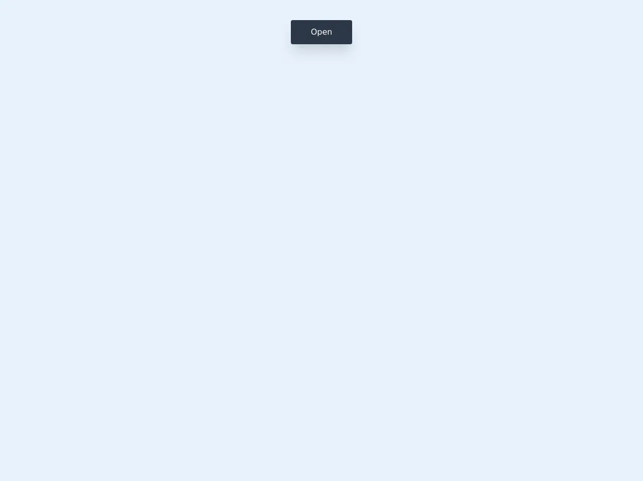
The preview of Awesome Modal UI component
To create an awesome modal with Tailwind CSS, we will use the following classes:
fixed: This class positions the modal relative to the viewport.inset-0: This class sets the top, right, bottom, and left properties to 0, which makes the modal cover the entire viewport.bg-gray-900: This class sets the background color of the modal to gray.opacity-50: This class sets the opacity of the modal to 50%, which makes the content behind the modal partially visible.z-50: This class sets the z-index of the modal to 50, which ensures that it is displayed on top of other content.flex: This class sets the display property of the modal to flex, which allows us to center the content vertically and horizontally.items-center: This class centers the content vertically.justify-center: This class centers the content horizontally.
Free download of the Awesome Modal's source code
The source code of Awesome Modal UI component
To create an awesome modal with Tailwind CSS, we will use the following HTML and CSS code:
<div class="fixed inset-0 bg-gray-900 opacity-50 z-50"></div>

<div class="fixed inset-0 flex items-center justify-center z-50">
  <div class="bg-white rounded-lg p-8">
    <h2 class="text-2xl font-bold mb-4">Modal Title</h2>
    <p class="mb-4">Modal Content</p>
    <button class="bg-blue-500 hover:bg-blue-700 text-white font-bold py-2 px-4 rounded">Close</button>
  </div>
</div>
/* No custom CSS required */
<style>
  dialog[open] {
    animation: appear 0.15s cubic-bezier(0, 1.8, 1, 1.8);
  }

  dialog::backdrop {
    background: linear-gradient(45deg, rgba(0, 0, 0, 0.5), rgba(54, 54, 54, 0.5));
    backdrop-filter: blur(3px);
  }

  @keyframes appear {
    from {
      opacity: 0;
      transform: translateX(-3rem);
    }

    to {
      opacity: 1;
      transform: translateX(0);
    }
  }
</style>

<section class=" flex h-screen w-screen items-start justify-center p-10">
  <button
    onclick="document.getElementById('myModal').showModal()"
    id="btn"
    class="text rounded bg-gray-800 py-3 px-10 text-white shadow-xl"
  >
    Open
  </button>
</section>

<dialog id="myModal" class="h-auto w-11/12 rounded-md bg-white  p-5 md:w-1/2 ">
  <div class="flex h-auto w-full flex-col ">
    <!-- Header -->
    <div class="flex h-auto w-full items-center justify-center">
      <div class="flex h-auto w-10/12 items-center justify-center py-3 text-2xl font-bold">
        Modal Header
      </div>
      <div
        onclick="document.getElementById('myModal').close();"
        class="flex h-auto w-1/12 cursor-pointer justify-center"
      >
        <svg
          xmlns="http://www.w3.org/2000/svg"
          width="24"
          height="24"
          viewBox="0 0 24 24"
          fill="none"
          stroke="#000000"
          stroke-width="2"
          stroke-linecap="round"
          stroke-linejoin="round"
          class="feather feather-x"
        >
          <line x1="18" y1="6" x2="6" y2="18"></line>
          <line x1="6" y1="6" x2="18" y2="18"></line>
        </svg>
      </div>
      <!--Header End-->
    </div>
    <!-- Modal Content-->
    <div
      class="flex h-auto w-full items-center justify-center rounded bg-gray-200 py-10 px-2 text-center text-gray-500"
    >
      This is a text inside the modal. You can add your content here.
    </div>
    <!-- End of Modal Content-->
  </div>
</dialog>
How to create an Awesome Modal with Tailwind CSS?
To create an awesome modal with Tailwind CSS, follow these steps:
- Create a button or link that will trigger the modal.
- Add an event listener to the button or link that will show the modal when clicked.
- Create the HTML markup for the modal.
- Apply the Tailwind CSS classes to the modal to style it.
- Add an event listener to the close button that will hide the modal when clicked.
Here is an example of how to create an awesome modal with Tailwind CSS:
<!-- Step 1: Create a button or link that will trigger the modal -->
<button id="open-modal" class="bg-blue-500 hover:bg-blue-700 text-white font-bold py-2 px-4 rounded">
  Open Modal
</button>

<!-- Step 3: Create the HTML markup for the modal -->
<div id="modal" class="fixed inset-0 bg-gray-900 opacity-50 z-50"></div>

<div class="fixed inset-0 flex items-center justify-center z-50">
  <div class="bg-white rounded-lg p-8">
    <h2 class="text-2xl font-bold mb-4">Modal Title</h2>
    <p class="mb-4">Modal Content</p>
    <button id="close-modal" class="bg-blue-500 hover:bg-blue-700 text-white font-bold py-2 px-4 rounded">Close</button>
  </div>
</div>

<script>
  const openModalButton = document.getElementById('open-modal');
  const closeModalButton = document.getElementById('close-modal');
  const modal = document.getElementById('modal');

  // Step 2: Add an event listener to the button or link that will show the modal when clicked
  openModalButton.addEventListener('click', () => {
    modal.style.display = 'block';
  });

  // Step 5: Add an event listener to the close button that will hide the modal when clicked
  closeModalButton.addEventListener('click', () => {
    modal.style.display = 'none';
  });
</script>
Conclusion
Tailwind CSS is a powerful CSS framework that allows you to create custom UI components quickly and easily. By using the pre-defined CSS classes provided by Tailwind CSS, you can create an awesome modal that is visually appealing, easy to use, and accessible. With the steps outlined in this article, you can create an awesome modal with Tailwind CSS in no time.