- Published on
Surprisingly Effective Ways To Make A Awesome Login Page With Tailwind CSS
- What is Tailwind CSS?
- The description of Awesome Login Page ui component
- Why use Tailwind CSS to create a Awesome Login Page ui component?
- The preview of Awesome Login Page ui component
- The source code of Awesome Login Page ui component
- How to create a Awesome Login Page with Tailwind CSS?
- Step 1: Set up your project
- Step 2: Create the HTML markup
- Step 3: Style the HTML elements
- Step 4: Add interactivity
- Conclusion
As a FrontEnd technology blogger, I always strive to find new and effective ways to create beautiful and functional user interfaces. In this article, I will introduce you to Tailwind CSS, a popular utility-first CSS framework, and show you how to use it to create an Awesome Login Page ui component.
What is Tailwind CSS?
Tailwind CSS is a utility-first CSS framework that provides a set of pre-defined classes that you can use to style your HTML elements. Unlike other CSS frameworks that provide pre-designed components, Tailwind CSS focuses on providing low-level utility classes that you can use to create your own custom designs.
The description of Awesome Login Page ui component
An Awesome Login Page is a user interface component that allows users to log in to an application. It typically consists of a form with input fields for the user's email or username and password, and a button to submit the form.
Why use Tailwind CSS to create a Awesome Login Page ui component?
Tailwind CSS provides a set of pre-defined utility classes that you can use to create an Awesome Login Page ui component quickly and easily. The framework also provides a responsive design system that allows you to create layouts that adapt to different screen sizes.
Using Tailwind CSS to create an Awesome Login Page ui component also has the following benefits:
- Consistent design: Tailwind CSS provides a set of pre-defined design tokens that you can use to ensure consistency across your application.
- Faster development: With Tailwind CSS, you can create custom designs quickly and easily without having to write a lot of custom CSS code.
- Easy customization: Tailwind CSS allows you to customize your designs by adding or modifying utility classes.
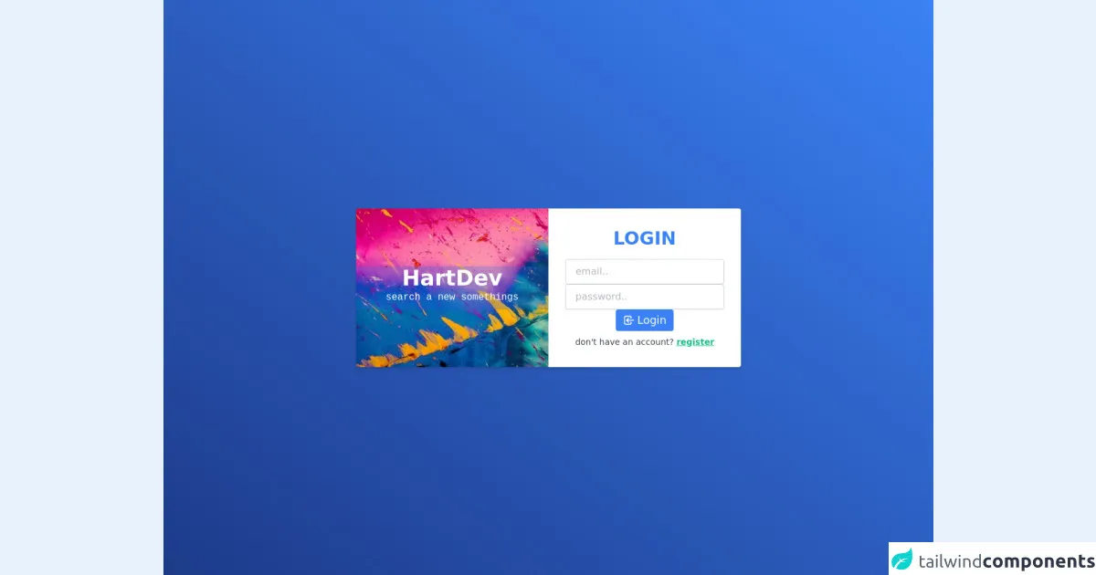
The preview of Awesome Login Page ui component
To give you an idea of what an Awesome Login Page ui component created with Tailwind CSS looks like, check out the preview below.
Free download of the Awesome Login Page's source code
The source code of Awesome Login Page ui component
If you want to create your own Awesome Login Page ui component with Tailwind CSS, you can use the following source code as a starting point.
<style>
  .bg-image {
    background-image: url(https://i.postimg.cc/13pssvxG/bg-image.png);
  }
  .backdrop {
    backdrop-filter: blur(2px);
  }
</style>

<div
  class="flex h-screen w-full items-center justify-center bg-gradient-to-tr from-blue-900 to-blue-500"
>
  <div
    class="bg-image z-10 mx-3 flex w-full flex-col items-center overflow-hidden rounded bg-blue-600 bg-cover bg-center shadow-md sm:w-1/2 md:mx-5 md:w-9/12 md:flex-row lg:mx-0 lg:w-1/2"
  >
    <div
      class="backdrop flex w-full flex-col items-center justify-center bg-blue-600 bg-opacity-25 md:w-1/2"
    >
      <h1 class="my-2 text-3xl font-extrabold text-white md:my-0 md:text-4xl">HartDev</h1>
      <p class="mb-2 hidden font-mono text-white md:block">search a new somethings</p>
    </div>
    <div class="flex w-full flex-col items-center bg-white py-5 px-4 md:w-1/2 md:py-8">
      <h3 class="mb-4 flex items-center text-3xl font-bold text-blue-500">LOGIN</h3>
      <form action="#" class="flex w-full flex-col items-center justify-center gap-3 px-3">
        <input
          type="email"
          placeholder="email.."
          class="w-full rounded border border-gray-300 px-4 py-2 text-base placeholder-gray-500 placeholder-opacity-50 shadow-sm focus:border-blue-500 focus:outline-none"
        />
        <input
          type="password"
          placeholder="password.."
          class="w-full rounded border border-gray-300 px-4 py-2 text-base placeholder-gray-500 placeholder-opacity-50 shadow-sm focus:border-blue-500 focus:outline-none"
        />
        <button
          class="flex items-center justify-center rounded bg-blue-500 px-3 py-1 text-white hover:bg-blue-600 focus:outline-none focus:ring"
        >
          <svg
            class="inline h-5 w-5"
            fill="none"
            stroke="currentColor"
            viewBox="0 0 24 24"
            xmlns="http://www.w3.org/2000/svg"
          >
            <path
              stroke-linecap="round"
              stroke-linejoin="round"
              stroke-width="2"
              d="M11 16l-4-4m0 0l4-4m-4 4h14m-5 4v1a3 3 0 01-3 3H6a3 3 0 01-3-3V7a3 3 0 013-3h7a3 3 0 013 3v1"
            ></path>
          </svg>
          <p class="ml-1 text-lg">Login</p>
        </button>
      </form>
      <p class="mt-2 text-sm text-gray-700">
        don't have an account?
        <a
          href="#"
          class="mt-3 font-bold text-green-500 underline hover:text-green-600 focus:outline-none"
        >
          register
        </a>
      </p>
    </div>
  </div>
</div>
How to create a Awesome Login Page with Tailwind CSS?
Now that you know why Tailwind CSS is a great choice for creating an Awesome Login Page ui component, let's take a look at how to create one.
Step 1: Set up your project
To use Tailwind CSS, you need to install it in your project. You can do this by adding the following code to your project's HTML file:
<link rel="stylesheet" href="https://cdn.jsdelivr.net/npm/[email protected]/dist/tailwind.min.css">
Step 2: Create the HTML markup
The first step in creating an Awesome Login Page ui component is to create the HTML markup. Here's an example of what the markup might look like:
<div class="min-h-screen bg-gray-100 flex flex-col justify-center py-12 sm:px-6 lg:px-8">
  <div class="sm:mx-auto sm:w-full sm:max-w-md">
    <h2 class="mt-6 text-center text-3xl font-extrabold text-gray-900">
      Sign in to your account
    </h2>
    <p class="mt-2 text-center text-sm text-gray-600">
      Or
      <a href="#" class="font-medium text-indigo-600 hover:text-indigo-500">
        start your 14-day free trial
      </a>
    </p>
  </div>

  <div class="mt-8 sm:mx-auto sm:w-full sm:max-w-md">
    <div class="bg-white py-8 px-4 shadow sm:rounded-lg sm:px-10">
      <form class="space-y-6" action="#" method="POST">
        <div>
          <label for="email" class="block text-sm font-medium text-gray-700">
            Email address
          </label>
          <div class="mt-1">
            <input id="email" name="email" type="email" autocomplete="email" required class="appearance-none block w-full px-3 py-2 border border-gray-300 rounded-md shadow-sm placeholder-gray-400 focus:outline-none focus:ring-indigo-500 focus:border-indigo-500 sm:text-sm">
          </div>
        </div>

        <div>
          <label for="password" class="block text-sm font-medium text-gray-700">
            Password
          </label>
          <div class="mt-1">
            <input id="password" name="password" type="password" autocomplete="current-password" required class="appearance-none block w-full px-3 py-2 border border-gray-300 rounded-md shadow-sm placeholder-gray-400 focus:outline-none focus:ring-indigo-500 focus:border-indigo-500 sm:text-sm">
          </div>
        </div>

        <div class="flex items-center justify-between">
          <div class="flex items-center">
            <input id="remember_me" name="remember_me" type="checkbox" class="h-4 w-4 text-indigo-600 focus:ring-indigo-500 border-gray-300 rounded">
            <label for="remember_me" class="ml-2 block text-sm text-gray-900">
              Remember me
            </label>
          </div>

          <div class="text-sm">
            <a href="#" class="font-medium text-indigo-600 hover:text-indigo-500">
              Forgot your password?
            </a>
          </div>
        </div>

        <div>
          <button type="submit" class="w-full flex justify-center py-2 px-4 border border-transparent rounded-md shadow-sm text-sm font-medium text-white bg-indigo-600 hover:bg-indigo-700 focus:outline-none focus:ring-2 focus:ring-offset-2 focus:ring-indigo-500">
            Sign in
          </button>
        </div>
      </form>

      <div class="mt-6">
        <div class="relative">
          <div class="absolute inset-0 flex items-center">
            <div class="w-full border-t border-gray-300"></div>
          </div>
          <div class="relative flex justify-center text-sm">
            <span class="px-2 bg-white text-gray-500">
              Or continue with
            </span>
          </div>
        </div>

        <div class="mt-6 grid grid-cols-3 gap-3">
          <div>
            <a href="#" class="w-full inline-flex justify-center py-2 px-4 border border-gray-300 rounded-md shadow-sm bg-white text-sm font-medium text-gray-500 hover:bg-gray-50">
              <span class="sr-only">Sign in with Facebook</span>
              <svg class="w-5 h-5" fill="currentColor" viewBox="0 0 20 20" aria-hidden="true">
                <path fill-rule="evenodd" d="M18 10a8 8 0 10-10 7.75V12H5v-2h3V8.5c0-3 1.79-4.62 4.37-4.62 1.28 0 2.38.12 2.7.18v3.02l-1.84.001c-1.45 0-1.73.69-1.73 1.7V10h3.47l-.45 2H11v6.75A8 8 0 0018 10z" clip-rule="evenodd" />
              </svg>
            </a>
          </div>

          <div>
            <a href="#" class="w-full inline-flex justify-center py-2 px-4 border border-gray-300 rounded-md shadow-sm bg-white text-sm font-medium text-gray-500 hover:bg-gray-50">
              <span class="sr-only">Sign in with Twitter</span>
              <svg class="w-5 h-5" fill="currentColor" viewBox="0 0 20 20" aria-hidden="true">
                <path fill-rule="evenodd" d="M19.6 4.3c-.7.3-1.5.5-2.3.6.8-.5 1.4-1.2 1.7-2 .7.4 1.2 1 1.4 1.7-.6-.4-1.2-.7-1.9-.9-.5-.6-1.2-1-2-1.2-.6-.5-1.3-.8-2-.8-1.5 0-2.7 1.2-2.7 2.7 0 .2 0 .4.1.6-2.3-.1-4.4-1.2-5.8-2.9-.2.4-.3.9-.3 1.4 0 .9.5 1.7 1.2 2.2-.4 0-.8.1-1.1.1-.3 0-.6 0-.9-.1.6 1.1 1.6 1.9 2.8 2-.3.1-.6.2-.9.2-.2 0-.5 0-.7-.1.5 1 1.3 1.8 2.3 2.2-.9.7-2.1 1.1-3.4 1.1-.2 0-.4 0-.6 0 1.2.8 2.6 1.2 4 1.2 4.8 0 7.4-4 7.4-7.5v-.3c.5-.4.9-.9 1.2-1.5z" clip-rule="evenodd" />
              </svg>
            </a>
          </div>

          <div>
            <a href="#" class="w-full inline-flex justify-center py-2 px-4 border border-gray-300 rounded-md shadow-sm bg-white text-sm font-medium text-gray-500 hover:bg-gray-50">
              <span class="sr-only">Sign in with GitHub</span>
              <svg class="w-5 h-5" fill="currentColor" viewBox="0 0 20 20" aria-hidden="true">
                <path fill-rule="evenodd" d="M10 0C4.48 0 0 4.03 0 9c0 3.86 2.57 7.13 6.11 8.3.45.08.62-.2.62-.45v-1.57c-2.5.54-3-1.2-3-1.2-.4-1.03-1-1.3-1-1.3-.82-.54.06-.54.06-.54.9.06 1.37.9 1.37.9.8 1.37 2.1.97 2.6.74.08-.54.31-.97.57-1.2-2-.23-4.1-1-4.1-4.48 0-.99.34-1.8.9-2.43-.1-.23-.4-1.15.08-2.4 0 0 .76-.24 2.5.93.72-.2 1.5-.3 2.3-.3s1.58.1 2.3.3c1.74-1.17 2.5-.93 2.5-.93.48 1.25.18 2.17.1 2.4.56.63.9 1.44.9 2.43 0 3.49-2.1 4.25-4.1 4.48.32.28.62.83.62 1.67v2.5c0 .25.18.53.63.45C17.43 16.13 20 12.86 20 9c0-4.97-4.48-9-10-9z" clip-rule="evenodd" />
              </svg>
            </a>
          </div>
        </div>
      </div>
    </div>
  </div>
</div>
Step 3: Style the HTML elements
Once you have created the HTML markup, you can start styling the elements using Tailwind CSS classes. Here's an example of how you might style the form input fields:
<input id="email" name="email" type="email" autocomplete="email" required class="appearance-none block w-full px-3 py-2 border border-gray-300 rounded-md shadow-sm placeholder-gray-400 focus:outline-none focus:ring-indigo-500 focus:border-indigo-500 sm:text-sm">
In the example above, we use the appearance-none class to remove the default styling of the input field, the block class to make the input field a block-level element, and the w-full class to make the input field take up the full width of its container.
We also use a number of other utility classes to style the input field's border, border radius, shadow, placeholder text, and focus state.
Step 4: Add interactivity
Finally, you can add interactivity to your Awesome Login Page ui component using JavaScript. For example, you might add client-side validation to the form input fields to ensure that the user enters a valid email address and password.
Conclusion
In this article, we've explored the benefits of using Tailwind CSS to create an Awesome Login Page ui component. We've also provided a preview and source code for an example Awesome Login Page ui component created with Tailwind CSS.
By following the steps outlined in this article, you can create your own custom Awesome Login Page ui component quickly and easily using Tailwind CSS.