- Published on
6 Ideas To Help You Build A Atlassian - Feature Card With Tailwind CSS Like A Pro
- What is Tailwind CSS?
- The description of Atlassian - Feature Card ui component
- Why use Tailwind CSS to create a Atlassian - Feature Card ui component?
- The preview of Atlassian - Feature Card ui component
- The source code of Atlassian - Feature Card ui component
- How to create a Atlassian - Feature Card with Tailwind CSS?
- 1. Define the HTML structure
- 2. Add the image
- 3. Style the Atlassian - Feature Card
- 4. Customize the Atlassian - Feature Card
- 5. Add animations
- 6. Make it responsive
- Conclusion
What is Tailwind CSS?
Tailwind CSS is a utility-first CSS framework that allows you to create custom designs quickly and efficiently. It provides a set of pre-defined classes that you can use to style your HTML elements without writing any CSS code.
The description of Atlassian - Feature Card ui component
Atlassian - Feature Card is a UI component that is used to showcase a product feature or service. It is a card-like design that includes an image, title, description, and call-to-action button.
Why use Tailwind CSS to create a Atlassian - Feature Card ui component?
Tailwind CSS is a great choice for creating Atlassian - Feature Card UI components because it allows you to create custom designs quickly and efficiently. It provides a set of pre-defined classes that you can use to style your HTML elements without writing any CSS code. This saves you time and effort and allows you to focus on the design and functionality of your UI component.
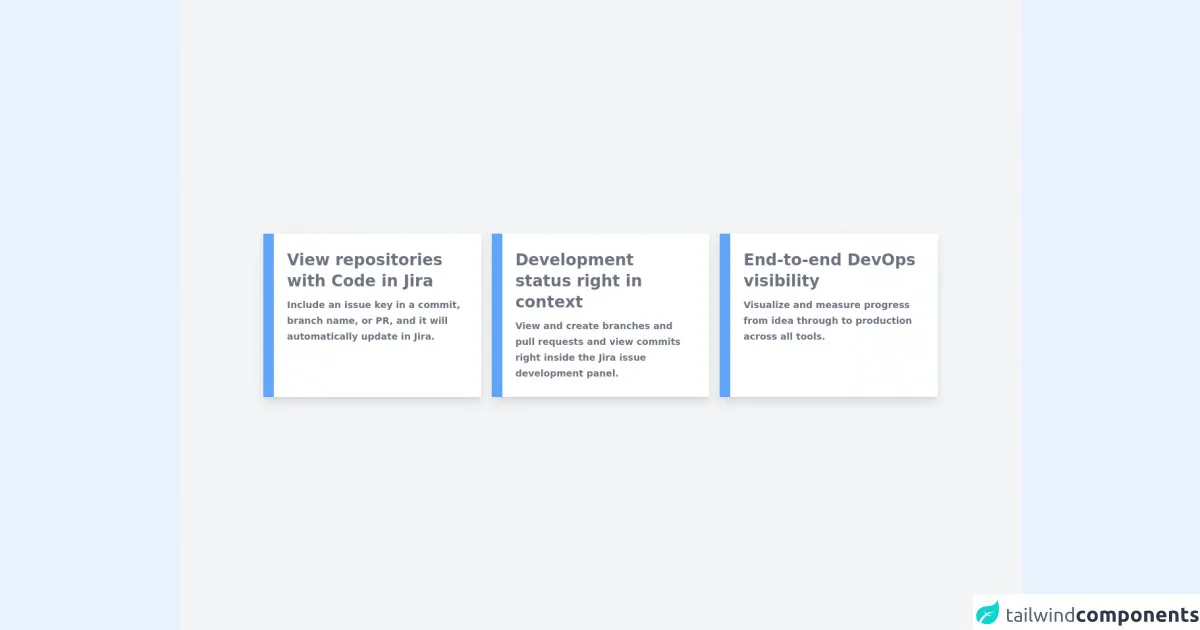
The preview of Atlassian - Feature Card ui component
Free download of the Atlassian - Feature Card's source code
The source code of Atlassian - Feature Card ui component
<div class="flex h-screen items-center justify-center bg-gray-100">
  <div class="grid max-w-5xl grid-cols-12 gap-4">
    <!-- Card 1 -->
    <div class="relative col-span-4 grid">
      <a
        class="group w-full rounded-sm bg-white py-6 pr-6 pl-9 shadow-lg delay-75 duration-200 hover:shadow-2xl"
        href=""
      >
        <!-- Title -->
        <p class="text-2xl font-bold text-gray-500 group-hover:text-gray-700">
          View repositories with Code in Jira
        </p>

        <!-- Description -->
        <p class="mt-2 text-sm font-semibold leading-6 text-gray-500 group-hover:text-gray-700">
          Include an issue key in a commit, branch name, or PR, and it will automatically update in
          Jira.
        </p>

        <!-- Color -->
        <div class="absolute top-0 left-0 h-full w-4 bg-blue-400 group-hover:bg-blue-600"></div>
      </a>
    </div>

    <!-- Card 2 -->
    <div class="relative col-span-4 grid">
      <a
        class="group w-full rounded-sm bg-white py-6 pr-6 pl-9 shadow-lg delay-75 duration-200 hover:shadow-2xl"
        href=""
      >
        <!-- Title -->
        <p class="text-2xl font-bold text-gray-500 group-hover:text-gray-700">
          Development status right in context
        </p>

        <!-- Description -->
        <p class="mt-2 text-sm font-semibold leading-6 text-gray-500 group-hover:text-gray-700">
          View and create branches and pull requests and view commits right inside the Jira issue
          development panel.
        </p>

        <!-- Color -->
        <div class="absolute top-0 left-0 h-full w-4 bg-blue-400 group-hover:bg-blue-600"></div>
      </a>
    </div>

    <!-- Card 3 -->
    <div class="relative col-span-4 grid">
      <a
        class="group w-full rounded-sm bg-white py-6 pr-6 pl-9 shadow-lg delay-75 duration-200 hover:shadow-2xl"
        href=""
      >
        <!-- Title -->
        <p class="text-2xl font-bold text-gray-500 group-hover:text-gray-700">
          End-to-end DevOps visibility
        </p>

        <!-- Description -->
        <p class="mt-2 text-sm font-semibold leading-6 text-gray-500 group-hover:text-gray-700">
          Visualize and measure progress from idea through to production across all tools.
        </p>

        <!-- Color -->
        <div class="absolute top-0 left-0 h-full w-4 bg-blue-400 group-hover:bg-blue-600"></div>
      </a>
    </div>
  </div>
</div>
How to create a Atlassian - Feature Card with Tailwind CSS?
Here are 6 ideas to help you build an Atlassian - Feature Card with Tailwind CSS like a pro:
1. Define the HTML structure
The first step in creating an Atlassian - Feature Card is to define the HTML structure. The structure should include a container div, an image div, a content div, and a button div. Here is an example:
<div class="max-w-sm rounded overflow-hidden shadow-lg">
  <div class="px-6 py-4">
    <div class="font-bold text-xl mb-2">Feature Name</div>
    <p class="text-gray-700 text-base">
      Feature Description
    </p>
  </div>
  <div class="px-6 py-4">
    <button class="bg-blue-500 hover:bg-blue-700 text-white font-bold py-2 px-4 rounded">
      Call to Action
    </button>
  </div>
</div>
2. Add the image
The next step is to add the image to the Atlassian - Feature Card. You can do this by adding an image tag inside the image div. Here is an example:
<div class="max-w-sm rounded overflow-hidden shadow-lg">
  <div class="px-6 py-4">
    <div class="font-bold text-xl mb-2">Feature Name</div>
    <p class="text-gray-700 text-base">
      Feature Description
    </p>
  </div>
  <div class="px-6 py-4">
    <button class="bg-blue-500 hover:bg-blue-700 text-white font-bold py-2 px-4 rounded">
      Call to Action
    </button>
  </div>
  <img class="w-full" src="https://via.placeholder.com/350x150" alt="Feature Image">
</div>
3. Style the Atlassian - Feature Card
The next step is to style the Atlassian - Feature Card using Tailwind CSS classes. Here are some classes you can use:
max-w-sm: sets the maximum width of the card to smallrounded: rounds the corners of the cardoverflow-hidden: hides any content that overflows the cardshadow-lg: adds a shadow to the cardpx-6: adds padding to the left and right of the cardpy-4: adds padding to the top and bottom of the cardfont-bold: makes the text boldtext-xl: sets the font size to extra largemb-2: adds margin to the bottom of the elementtext-gray-700: sets the text color to graytext-base: sets the font size to basebg-blue-500: sets the background color to bluehover:bg-blue-700: changes the background color to blue on hovertext-white: sets the text color to whitepy-2: adds padding to the top and bottom of the buttonpx-4: adds padding to the left and right of the buttonrounded: rounds the corners of the button
4. Customize the Atlassian - Feature Card
You can customize the Atlassian - Feature Card by changing the colors, fonts, and sizes. Here are some classes you can use:
text-red-500: sets the text color to redfont-serif: sets the font to a serif fonttext-2xl: sets the font size to extra extra largebg-green-500: sets the background color to greenhover:bg-green-700: changes the background color to green on hovertext-yellow-500: sets the text color to yellowtext-lg: sets the font size to large
5. Add animations
You can add animations to the Atlassian - Feature Card using Tailwind CSS classes. Here are some classes you can use:
transition: adds a transition effect to the elementduration-500: sets the duration of the transition to 500msease-in-out: sets the easing function of the transition to ease-in-outtransform: applies a transformation to the elementhover:scale-105: scales the element to 105% on hover
6. Make it responsive
You can make the Atlassian - Feature Card responsive using Tailwind CSS classes. Here are some classes you can use:
sm:max-w-xs: sets the maximum width of the card to extra small on small screensmd:max-w-sm: sets the maximum width of the card to small on medium screenslg:max-w-md: sets the maximum width of the card to medium on large screensxl:max-w-lg: sets the maximum width of the card to large on extra large screens
Conclusion
Creating an Atlassian - Feature Card with Tailwind CSS is a great way to showcase your product features or services. With Tailwind CSS, you can create custom designs quickly and efficiently, saving you time and effort. By following these 6 ideas, you can build an Atlassian - Feature Card with Tailwind CSS like a pro.