- Published on
Here Are 6 Ways To Build A Article Card With Tailwind CSS
- What is Tailwind CSS?
- The description of Article Card UI component
- Why use Tailwind CSS to create an Article Card UI component?
- The preview of Article Card UI component
- The source code of Article Card UI component
- How to create an Article Card with Tailwind CSS?
- 1. Basic Article Card
- 2. Article Card with Image
- 3. Article Card with Icon
- 4. Article Card with Tags
- 5. Article Card with Button
- 6. Article Card with Rating
- Conclusion
As a FrontEnd technology blogger, you may have heard of Tailwind CSS, a utility-first CSS framework that makes styling your website much more efficient. In this article, we’ll explore how to use Tailwind CSS to create an Article Card UI component.
What is Tailwind CSS?
Tailwind CSS is a utility-first CSS framework that allows you to rapidly build custom designs without leaving your HTML. It provides a set of pre-defined CSS classes that you can use to style your HTML elements. With Tailwind CSS, you can create complex designs without writing any custom CSS.
The description of Article Card UI component
An Article Card UI component is a common design pattern used on many websites. It is typically used to display a summary of an article, including the title, author, date, and a brief description. Article cards are often used in lists or grids to display multiple articles in a compact and visually appealing way.
Why use Tailwind CSS to create an Article Card UI component?
Tailwind CSS is an excellent choice for creating an Article Card UI component because it provides a set of pre-defined classes that can be used to style each element of the card. This means that you can create a consistent and visually appealing design without writing any custom CSS.
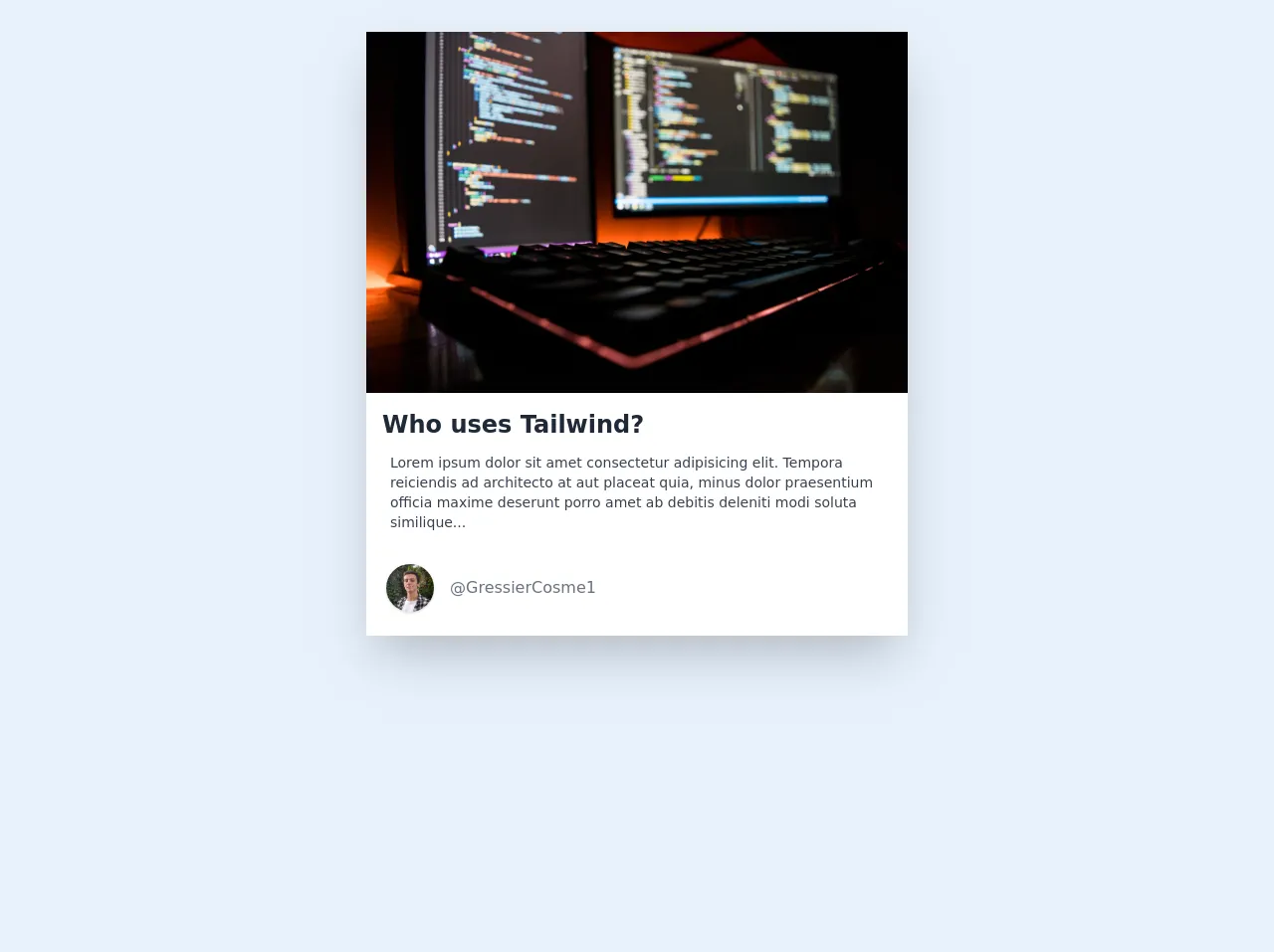
The preview of Article Card UI component
An Article Card UI component typically consists of a container element that holds the card's content. The content includes the article's title, author, date, and a brief description. The card may also include an image or icon to represent the article.
Free download of the Article Card's source code
The source code of Article Card UI component
To create an Article Card UI component with Tailwind CSS, you’ll need to define the HTML structure of the card and apply the appropriate Tailwind CSS classes to each element.
<!-- This is an example component -->
<div class="m-auto max-w-xl px-4 py-8">
  <div class="bg-white shadow-2xl">
    <div>
      <img
        src="https://images.unsplash.com/photo-1571171637578-41bc2dd41cd2?ixid=MXwxMjA3fDB8MHxwaG90by1wYWdlfHx8fGVufDB8fHw%3D&ixlib=rb-1.2.1&auto=format&fit=crop&w=1350&q=80"
      />
    </div>
    <div class="mt-2 bg-white px-4 py-2">
      <h2 class="text-2xl font-bold text-gray-800">Who uses Tailwind?</h2>
      <p class="my-3 mr-1 px-2 text-xs text-gray-700 sm:text-sm">
        Lorem ipsum dolor sit amet consectetur adipisicing elit. Tempora reiciendis ad architecto at
        aut placeat quia, minus dolor praesentium officia maxime deserunt porro amet ab debitis
        deleniti modi soluta similique...
      </p>
      <div class="user -ml-3 mt-8 mb-4 flex items-center">
        <div class="user-logo">
          <img
            class="mx-4 h-10 w-10 rounded-full object-cover shadow sm:h-12  sm:w-12"
            src="https://images.unsplash.com/photo-1607789382281-1152591ec0da?ixid=MXwxMjA3fDB8MHxwaG90by1wYWdlfHx8fGVufDB8fHw%3D&ixlib=rb-1.2.1&auto=format&fit=crop&w=2000&q=80"
            alt="avatar"
          />
        </div>
        <a href="https://twitter.com/GressierCosme1" target="_blank" class="text-gray-500"
          >@GressierCosme1</a
        >
      </div>
    </div>
  </div>
</div>
How to create an Article Card with Tailwind CSS?
Here are six ways to build an Article Card with Tailwind CSS:
1. Basic Article Card
The most basic Article Card consists of a container element with a title, author, date, and description. Here’s how to create a basic Article Card with Tailwind CSS:
<div class="bg-white shadow-md rounded-md p-4">
  <h2 class="text-lg font-medium mb-2">Article Title</h2>
  <p class="text-gray-600 text-sm mb-2">Author Name | Date</p>
  <p class="text-gray-700 text-sm">Article Description</p>
</div>
2. Article Card with Image
To add an image to the Article Card, you can use the w-full class to make the image span the full width of the card. Here’s an example:
<div class="bg-white shadow-md rounded-md p-4">
  <img src="https://via.placeholder.com/150" alt="Article Image" class="w-full mb-2">
  <h2 class="text-lg font-medium mb-2">Article Title</h2>
  <p class="text-gray-600 text-sm mb-2">Author Name | Date</p>
  <p class="text-gray-700 text-sm">Article Description</p>
</div>
3. Article Card with Icon
To add an icon to the Article Card, you can use the flex class to align the icon to the left of the card. Here’s an example:
<div class="bg-white shadow-md rounded-md p-4 flex">
  <div class="mr-4">
    <i class="fas fa-newspaper fa-2x text-gray-600"></i>
  </div>
  <div>
    <h2 class="text-lg font-medium mb-2">Article Title</h2>
    <p class="text-gray-600 text-sm mb-2">Author Name | Date</p>
    <p class="text-gray-700 text-sm">Article Description</p>
  </div>
</div>
4. Article Card with Tags
To add tags to the Article Card, you can use the flex-wrap class to wrap the tags onto multiple lines. Here’s an example:
<div class="bg-white shadow-md rounded-md p-4">
  <h2 class="text-lg font-medium mb-2">Article Title</h2>
  <p class="text-gray-600 text-sm mb-2">Author Name | Date</p>
  <p class="text-gray-700 text-sm">Article Description</p>
  <div class="flex-wrap mt-2">
    <span class="bg-gray-200 text-gray-600 rounded-full px-2 py-1 text-xs mr-2 mb-2">Tag 1</span>
    <span class="bg-gray-200 text-gray-600 rounded-full px-2 py-1 text-xs mr-2 mb-2">Tag 2</span>
    <span class="bg-gray-200 text-gray-600 rounded-full px-2 py-1 text-xs mr-2 mb-2">Tag 3</span>
  </div>
</div>
5. Article Card with Button
To add a button to the Article Card, you can use the bg-blue-500 hover:bg-blue-700 text-white font-bold py-2 px-4 rounded class to style the button. Here’s an example:
<div class="bg-white shadow-md rounded-md p-4">
  <h2 class="text-lg font-medium mb-2">Article Title</h2>
  <p class="text-gray-600 text-sm mb-2">Author Name | Date</p>
  <p class="text-gray-700 text-sm">Article Description</p>
  <button class="bg-blue-500 hover:bg-blue-700 text-white font-bold py-2 px-4 rounded mt-2">Read More</button>
</div>
6. Article Card with Rating
To add a rating to the Article Card, you can use the flex class to align the rating to the right of the card. Here’s an example:
<div class="bg-white shadow-md rounded-md p-4 flex justify-between">
  <div>
    <h2 class="text-lg font-medium mb-2">Article Title</h2>
    <p class="text-gray-600 text-sm mb-2">Author Name | Date</p>
    <p class="text-gray-700 text-sm">Article Description</p>
  </div>
  <div class="flex items-center">
    <i class="fas fa-star text-yellow-400 mr-1"></i>
    <i class="fas fa-star text-yellow-400 mr-1"></i>
    <i class="fas fa-star text-yellow-400 mr-1"></i>
    <i class="fas fa-star text-gray-400 mr-1"></i>
    <i class="fas fa-star text-gray-400 mr-1"></i>
  </div>
</div>
Conclusion
In this article, we’ve explored how to use Tailwind CSS to create an Article Card UI component. We’ve covered six different ways to build an Article Card, including basic cards, cards with images, icons, tags, buttons, and ratings. With Tailwind CSS, you can create complex designs without writing any custom CSS, making it an excellent choice for building UI components like Article Cards.