- Published on
The 5 Really Obvious Ways To Create A Another Navbar With Tailwind CSS Better That You Ever Did
- What is Tailwind CSS?
- The description of another navbar ui component
- Why use Tailwind CSS to create a another navbar ui component?
- The preview of another navbar ui component
- The source code of another navbar ui component
- How to create a another navbar with Tailwind CSS?
- Step 1: Set up the HTML structure
- Step 2: Add Tailwind CSS to the project
- Step 3: Customize the navbar using Tailwind CSS classes
- Step 4: Add JavaScript to toggle the mobile menu
- Step 5: Add JavaScript to toggle the profile dropdown
- Conclusion
What is Tailwind CSS?
Tailwind CSS is a utility-first CSS framework that allows developers to easily create responsive and customizable user interfaces. With Tailwind CSS, developers can quickly build UI components without writing any custom CSS.
The description of another navbar ui component
A navbar is a common UI component used in web applications to provide navigation links to different parts of the application. Another navbar is a variation of the traditional navbar that provides a different layout and design.
Why use Tailwind CSS to create a another navbar ui component?
Tailwind CSS provides a wide range of utility classes that can be used to create custom UI components. With Tailwind CSS, developers can easily create another navbar with a unique design and layout without writing any custom CSS.
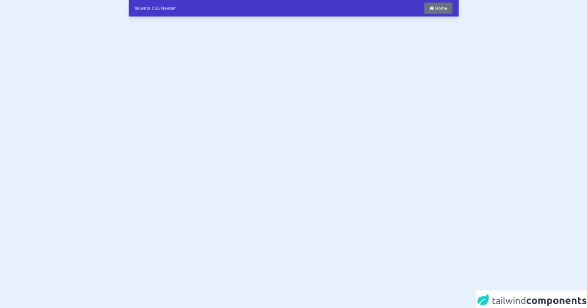
The preview of another navbar ui component
Here is a preview of the another navbar UI component that we will be creating with Tailwind CSS.
Free download of the another navbar's source code
The source code of another navbar ui component
Here is the source code for the another navbar UI component that we will be creating with Tailwind CSS.
<head>
  <link
    rel="stylesheet"
    href="https://cdnjs.cloudflare.com/ajax/libs/font-awesome/5.15.4/css/all.min.css"
  />
</head>
<!-- Tailwind CSS better navbar -->
<nav class="flex h-16 items-center justify-between bg-indigo-700 shadow-lg">
  <div class="logo">
    <h1 class="ml-5 cursor-pointer text-white">Tailwind CSS Navbar</h1>
  </div>
  <ul>
    <li>
      <a
        class="mr-6 rounded bg-gray-500 p-3 pl-5 pr-5 text-white transition-all hover:bg-gray-600"
        href=""
        ><i class="fas fa-home"></i> Home</a
      >
    </li>
  </ul>
</nav>
How to create a another navbar with Tailwind CSS?
To create a another navbar with Tailwind CSS, follow these steps:
Step 1: Set up the HTML structure
The first step is to set up the HTML structure for the navbar. Here is an example HTML structure for the another navbar:
<nav class="bg-gray-800">
  <div class="max-w-7xl mx-auto px-2 sm:px-6 lg:px-8">
    <div class="relative flex items-center justify-between h-16">
      <div class="absolute inset-y-0 left-0 flex items-center sm:hidden">
        <!-- Mobile menu button -->
        <button type="button" class="inline-flex items-center justify-center p-2 rounded-md text-gray-400 hover:text-white hover:bg-gray-700 focus:outline-none focus:ring-2 focus:ring-inset focus:ring-white" aria-controls="mobile-menu" aria-expanded="false">
          <span class="sr-only">Open main menu</span>
          <!-- Icon when menu is closed. -->
          <!--
            Heroicon name: menu

            Menu open: "hidden", Menu closed: "block"
          -->
          <svg class="block h-6 w-6" xmlns="http://www.w3.org/2000/svg" fill="none" viewBox="0 0 24 24" stroke="currentColor" aria-hidden="true">
            <path stroke-linecap="round" stroke-linejoin="round" stroke-width="2" d="M4 6h16M4 12h16M4 18h16" />
          </svg>
          <!-- Icon when menu is open. -->
          <!--
            Heroicon name: x

            Menu open: "block", Menu closed: "hidden"
          -->
          <svg class="hidden h-6 w-6" xmlns="http://www.w3.org/2000/svg" fill="none" viewBox="0 0 24 24" stroke="currentColor" aria-hidden="true">
            <path stroke-linecap="round" stroke-linejoin="round" stroke-width="2" d="M6 18L18 6M6 6l12 12" />
          </svg>
        </button>
      </div>
      <div class="flex-1 flex items-center justify-center sm:items-stretch sm:justify-start">
        <div class="flex-shrink-0">
          <img class="block lg:hidden h-8 w-auto" src="https://tailwindui.com/img/logos/workflow-mark-indigo-500.svg" alt="Workflow">
          <img class="hidden lg:block h-8 w-auto" src="https://tailwindui.com/img/logos/workflow-logo-indigo-500-mark-white-text.svg" alt="Workflow">
        </div>
        <div class="hidden sm:block sm:ml-6">
          <div class="flex space-x-4">
            <!-- Current: "bg-gray-900 text-white", Default: "text-gray-300 hover:bg-gray-700 hover:text-white" -->
            <a href="#" class="bg-gray-900 text-white px-3 py-2 rounded-md text-sm font-medium">Dashboard</a>

            <a href="#" class="text-gray-300 hover:bg-gray-700 hover:text-white px-3 py-2 rounded-md text-sm font-medium">Team</a>

            <a href="#" class="text-gray-300 hover:bg-gray-700 hover:text-white px-3 py-2 rounded-md text-sm font-medium">Projects</a>

            <a href="#" class="text-gray-300 hover:bg-gray-700 hover:text-white px-3 py-2 rounded-md text-sm font-medium">Calendar</a>
          </div>
        </div>
      </div>
      <div class="absolute inset-y-0 right-0 flex items-center pr-2 sm:static sm:inset-auto sm:ml-6 sm:pr-0">
        <button class="bg-gray-800 p-1 rounded-full text-gray-400 hover:text-white focus:outline-none focus:ring-2 focus:ring-offset-2 focus:ring-offset-gray-800 focus:ring-white">
          <span class="sr-only">View notifications</span>
          <!-- Heroicon name: bell -->
          <svg class="h-6 w-6" xmlns="http://www.w3.org/2000/svg" fill="none" viewBox="0 0 24 24" stroke="currentColor" aria-hidden="true">
            <path stroke-linecap="round" stroke-linejoin="round" stroke-width="2" d="M13 10V3L4 14h7v7l9-11h-7z" />
          </svg>
        </button>

        <!-- Profile dropdown -->
        <div class="ml-3 relative">
          <div>
            <button type="button" class="bg-gray-800 flex text-sm rounded-full focus:outline-none focus:ring-2 focus:ring-offset-2 focus:ring-offset-gray-800 focus:ring-white" id="user-menu" aria-expanded="false" aria-haspopup="true">
              <span class="sr-only">Open user menu</span>
              <img class="h-8 w-8 rounded-full" src="https://avatars.githubusercontent.com/u/2918581?s=400&u=5a9b9b4d8b3c3f2f8d1f7c7a1c4c7f7a1f7b4d3d&v=4" alt="">
            </button>
          </div>
          <!--
            Profile dropdown panel, show/hide based on dropdown state.

            Entering: "transition ease-out duration-100"
              From: "transform opacity-0 scale-95"
              To: "transform opacity-100 scale-100"
            Leaving: "transition ease-in duration-75"
              From: "transform opacity-100 scale-100"
              To: "transform opacity-0 scale-95"
          -->
          <div class="hidden origin-top-right absolute right-0 mt-2 w-48 rounded-md shadow-lg py-1 bg-white ring-1 ring-black ring-opacity-5" role="menu" aria-orientation="vertical" aria-labelledby="user-menu">
            <a href="#" class="block px-4 py-2 text-sm text-gray-700 hover:bg-gray-100" role="menuitem">Your Profile</a>

            <a href="#" class="block px-4 py-2 text-sm text-gray-700 hover:bg-gray-100" role="menuitem">Settings</a>

            <a href="#" class="block px-4 py-2 text-sm text-gray-700 hover:bg-gray-100" role="menuitem">Sign out</a>
          </div>
        </div>
      </div>
    </div>
  </div>

  <!-- Mobile menu, show/hide based on menu state. -->
  <div class="sm:hidden" id="mobile-menu">
    <div class="px-2 pt-2 pb-3 space-y-1">
      <!-- Current: "bg-gray-900 text-white", Default: "text-gray-300 hover:bg-gray-700 hover:text-white" -->
      <a href="#" class="bg-gray-900 text-white block px-3 py-2 rounded-md text-base font-medium">Dashboard</a>

      <a href="#" class="text-gray-300 hover:bg-gray-700 hover:text-white block px-3 py-2 rounded-md text-base font-medium">Team</a>

      <a href="#" class="text-gray-300 hover:bg-gray-700 hover:text-white block px-3 py-2 rounded-md text-base font-medium">Projects</a>

      <a href="#" class="text-gray-300 hover:bg-gray-700 hover:text-white block px-3 py-2 rounded-md text-base font-medium">Calendar</a>
    </div>
  </div>
</nav>
Step 2: Add Tailwind CSS to the project
To use Tailwind CSS, you need to add the Tailwind CSS stylesheet to your project. You can do this by either downloading the stylesheet from the Tailwind CSS website or by using a package manager like npm.
<link href="https://cdn.jsdelivr.net/npm/tailwindcss@latest/dist/tailwind.min.css" rel="stylesheet">
Step 3: Customize the navbar using Tailwind CSS classes
Tailwind CSS provides a wide range of utility classes that can be used to customize the navbar. Here are some examples of Tailwind CSS classes that can be used to customize the navbar:
bg-gray-800: Sets the background color of the navbar to gray-800.max-w-7xl: Sets the maximum width of the navbar to 7xl.px-2: Adds padding of 2 units to the left and right of the navbar.sm:px-6: Adds padding of 6 units to the left and right of the navbar on small screens.lg:px-8: Adds padding of 8 units to the left and right of the navbar on large screens.relative: Sets the position of the navbar to relative.flex: Sets the display of the navbar to flex.items-center: Centers the items in the navbar vertically.justify-between: Justifies the items in the navbar so that they are evenly spaced.absolute: Sets the position of the mobile menu button and the profile dropdown to absolute.inset-y-0: Sets the top and bottom positions of the mobile menu button and the profile dropdown to 0.left-0: Sets the left position of the mobile menu button to 0.hidden: Hides the mobile menu button and the profile dropdown on large screens.sm:hidden: Hides the mobile menu button on small screens.flex-1: Sets the flex-grow property of the navbar to 1.sm:items-stretch: Stretches the items in the navbar vertically on small screens.sm:justify-start: Justifies the items in the navbar to the start on small screens.flex-shrink-0: Prevents the logo from shrinking on small screens.text-gray-300: Sets the color of the navbar text to gray-300.hover:bg-gray-700: Sets the background color of the navbar to gray-700 on hover.hover:text-white: Sets the color of the navbar text to white on hover.px-3: Adds padding of 3 units to the left and right of the navbar links.py-2: Adds padding of 2 units to the top and bottom of the navbar links.rounded-md: Rounds the corners of the navbar links.text-sm: Sets the font size of the navbar text to small.font-medium: Sets the font weight of the navbar text to medium.bg-gray-900: Sets the background color of the current navbar link to gray-900.text-white: Sets the color of the current navbar link text to white.absolute: Sets the position of the profile dropdown to absolute.right-0: Sets the right position of the profile dropdown to 0.ml-3: Adds margin of 3 units to the left of the profile dropdown.origin-top-right: Sets the origin of the profile dropdown to the top right.mt-2: Adds margin of 2 units to the top of the profile dropdown.w-48: Sets the width of the profile dropdown to 48 units.rounded-md: Rounds the corners of the profile dropdown.shadow-lg: Adds a shadow to the profile dropdown.py-1: Adds padding of 1 unit to the top and bottom of the profile dropdown.bg-white: Sets the background color of the profile dropdown to white.ring-1: Adds a ring of 1 unit to the profile dropdown.ring-black: Sets the color of the ring to black.ring-opacity-5: Sets the opacity of the ring to 5%.block: Sets the display of the mobile menu links to block on small screens.space-y-1: Adds spacing of 1 unit between the mobile menu links on small screens.
Step 4: Add JavaScript to toggle the mobile menu
To toggle the mobile menu when the mobile menu button is clicked, you need to add some JavaScript code. Here is an example JavaScript code that can be used to toggle the mobile menu:
const button = document.querySelector('button[aria-controls="mobile-menu"]');
const menu = document.querySelector('#mobile-menu');

button.addEventListener('click', () => {
  const expanded = button.getAttribute('aria-expanded') === 'true' || false;
  button.setAttribute('aria-expanded', !expanded);
  menu.classList.toggle('hidden');
});
Step 5: Add JavaScript to toggle the profile dropdown
To toggle the profile dropdown when the profile button is clicked, you need to add some JavaScript code. Here is an example JavaScript code that can be used to toggle the profile dropdown:
const button = document.querySelector('button[aria-haspopup="true"]');
const menu = document.querySelector('#user-menu');

button.addEventListener('click', () => {
  const expanded = button.getAttribute('aria-expanded') === 'true' || false;
  button.setAttribute('aria-expanded', !expanded);
  menu.classList.toggle('hidden');
});
Conclusion
In this article, we have learned how to create a another navbar UI component with Tailwind CSS. We have seen how Tailwind CSS provides a wide range of utility classes that can be used to customize UI components without writing any custom CSS. We have also seen how to use JavaScript to toggle the mobile menu and the profile dropdown. With these skills, you can create custom UI components that are responsive and easy to maintain.