- Published on
Advanced Guide: Build A Animation Modal With Tailwind CSS
- What is Tailwind CSS?
- The description of Animation Modal ui component
- Why use Tailwind CSS to create a Animation Modal ui component?
- The preview of Animation Modal ui component.
- The source code of Animation Modal ui component.
- How to create a Animation Modal with Tailwind CSS?
- Step 1: Create the HTML markup
- Step 2: Add Tailwind CSS classes
- Step 3: Add JavaScript code
- Conclusion
Are you looking for a way to add more interactivity to your website? Animations can be a great way to make your website more engaging and user-friendly. In this article, we will show you how to build an animation modal with Tailwind CSS.
What is Tailwind CSS?
Tailwind CSS is a utility-first CSS framework that allows you to quickly build custom user interfaces. It provides a set of pre-defined classes that you can use to style your HTML elements. Tailwind CSS is designed to be highly customizable, which makes it a great choice for building complex user interfaces.
The description of Animation Modal ui component
An animation modal is a UI component that displays content in a pop-up window that appears on top of the current page. The modal window is animated to draw the user's attention to the content. This type of UI component is commonly used for displaying notifications, alerts, and other important information.
Why use Tailwind CSS to create a Animation Modal ui component?
Tailwind CSS makes it easy to create custom UI components like the animation modal. It provides a set of pre-defined classes that you can use to style your HTML elements. This means you don't have to spend time writing custom CSS code to create your UI components. Instead, you can focus on building your UI components and let Tailwind CSS handle the styling.
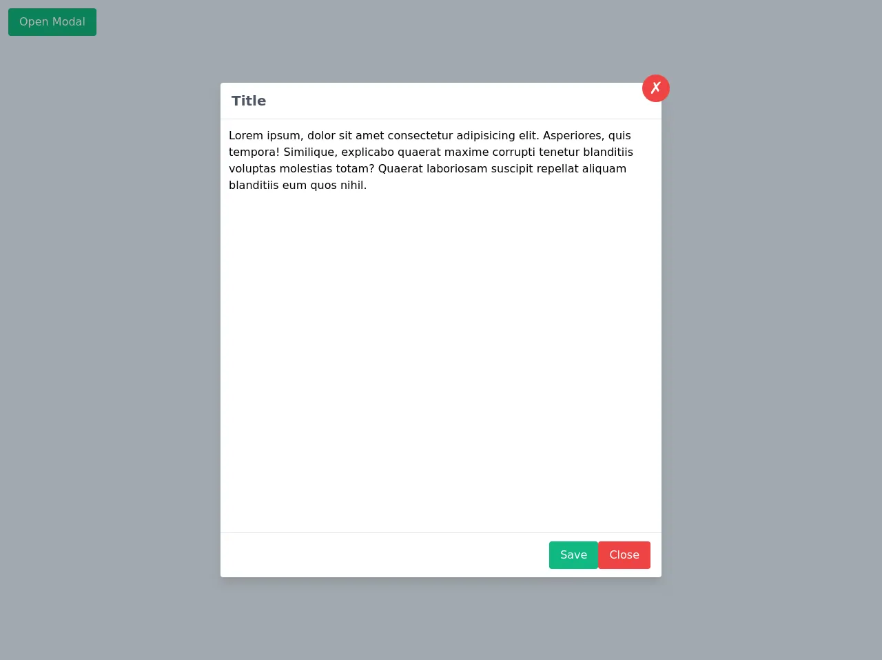
The preview of Animation Modal ui component.
To give you an idea of what the animation modal looks like, here is a preview:
Free download of the Animation Modal's source code
The source code of Animation Modal ui component.
Here is the source code for the animation modal:
<div class="p-3">
<button
onclick="openModal(true)"
class="rounded bg-green-500 px-4 py-2 text-white hover:bg-green-600 focus:outline-none"
>
Open Modal
</button>
</div>
<!-- overlay -->
<div
id="modal_overlay"
class="absolute inset-0 flex hidden h-screen w-full items-start justify-center bg-black bg-opacity-30 pt-10 md:items-center md:pt-0"
>
<!-- modal -->
<div
id="modal"
class="pacity-0 relative h-1/2 w-10/12 -translate-y-full scale-150 transform rounded bg-white shadow-lg transition-opacity transition-transform duration-300 md:h-3/4 md:w-1/2"
>
<!-- button close -->
<button
onclick="openModal(false)"
class="absolute -top-3 -right-3 h-10 w-10 rounded-full bg-red-500 text-2xl text-white hover:bg-red-600 focus:outline-none"
>
✗
</button>
<!-- header -->
<div class="border-b border-gray-200 px-4 py-3">
<h2 class="text-xl font-semibold text-gray-600">Title</h2>
</div>
<!-- body -->
<div class="w-full p-3">
Lorem ipsum, dolor sit amet consectetur adipisicing elit. Asperiores, quis tempora! Similique,
explicabo quaerat maxime corrupti tenetur blanditiis voluptas molestias totam? Quaerat
laboriosam suscipit repellat aliquam blanditiis eum quos nihil.
</div>
<!-- footer -->
<div
class="absolute bottom-0 left-0 flex w-full items-center justify-end gap-3 border-t border-gray-200 px-4 py-3"
>
<button
class="rounded bg-green-500 px-4 py-2 text-white hover:bg-green-600 focus:outline-none"
>
Save
</button>
<button
onclick="openModal(false)"
class="rounded bg-red-500 px-4 py-2 text-white hover:bg-red-600 focus:outline-none"
>
Close
</button>
</div>
</div>
</div>
<script>
const modal_overlay = document.querySelector('#modal_overlay')
const modal = document.querySelector('#modal')
function openModal(value) {
const modalCl = modal.classList
const overlayCl = modal_overlay
if (value) {
overlayCl.classList.remove('hidden')
setTimeout(() => {
modalCl.remove('opacity-0')
modalCl.remove('-translate-y-full')
modalCl.remove('scale-150')
}, 100)
} else {
modalCl.add('-translate-y-full')
setTimeout(() => {
modalCl.add('opacity-0')
modalCl.add('scale-150')
}, 100)
setTimeout(() => overlayCl.classList.add('hidden'), 300)
}
}
openModal(true)
</script>
How to create a Animation Modal with Tailwind CSS?
Now that we've covered the basics, let's dive into how to create an animation modal with Tailwind CSS.
Step 1: Create the HTML markup
The first step is to create the HTML markup for the animation modal. Here is an example:
<div class="fixed z-10 inset-0 overflow-y-auto">
  <div class="flex items-center justify-center min-h-screen pt-4 px-4 pb-20 text-center sm:block sm:p-0">
    <div class="fixed inset-0 transition-opacity">
      <div class="absolute inset-0 bg-gray-500 opacity-75"></div>
    </div>
    <div class="inline-block align-bottom bg-white rounded-lg px-4 pt-5 pb-4 text-left overflow-hidden shadow-xl transform transition-all sm:my-8 sm:align-middle sm:max-w-lg sm:w-full sm:p-6">
      <div>
        <div class="mx-auto flex items-center justify-center h-12 w-12 rounded-full bg-green-100">
          <svg class="h-6 w-6 text-green-600" xmlns="http://www.w3.org/2000/svg" fill="none" viewBox="0 0 24 24" stroke="currentColor" aria-hidden="true">
            <path stroke-linecap="round" stroke-linejoin="round" stroke-width="2" d="M5 13l4 4L19 7"></path>
          </svg>
        </div>
        <div class="mt-3 text-center sm:mt-5">
          <h3 class="text-lg leading-6 font-medium text-gray-900">
            Payment successful
          </h3>
          <div class="mt-2">
            <p class="text-sm text-gray-500">
              Lorem ipsum dolor sit amet consectetur adipisicing elit. Consequatur amet labore.
            </p>
          </div>
        </div>
      </div>
      <div class="mt-5 sm:mt-6">
        <button type="button" class="inline-flex justify-center w-full rounded-md border border-transparent shadow-sm px-4 py-2 bg-green-600 text-base font-medium text-white hover:bg-green-700 focus:outline-none focus:ring-2 focus:ring-offset-2 focus:ring-green-500 sm:text-sm">
          Go back to dashboard
        </button>
      </div>
    </div>
  </div>
</div>
Step 2: Add Tailwind CSS classes
The next step is to add Tailwind CSS classes to the HTML markup. Here is an example:
<div class="fixed z-10 inset-0 overflow-y-auto">
  <div class="flex items-center justify-center min-h-screen pt-4 px-4 pb-20 text-center sm:block sm:p-0">
    <div class="fixed inset-0 transition-opacity">
      <div class="absolute inset-0 bg-gray-500 opacity-75"></div>
    </div>
    <div class="inline-block align-bottom bg-white rounded-lg px-4 pt-5 pb-4 text-left overflow-hidden shadow-xl transform transition-all sm:my-8 sm:align-middle sm:max-w-lg sm:w-full sm:p-6">
      <div>
        <div class="mx-auto flex items-center justify-center h-12 w-12 rounded-full bg-green-100">
          <svg class="h-6 w-6 text-green-600" xmlns="http://www.w3.org/2000/svg" fill="none" viewBox="0 0 24 24" stroke="currentColor" aria-hidden="true">
            <path stroke-linecap="round" stroke-linejoin="round" stroke-width="2" d="M5 13l4 4L19 7"></path>
          </svg>
        </div>
        <div class="mt-3 text-center sm:mt-5">
          <h3 class="text-lg leading-6 font-medium text-gray-900">
            Payment successful
          </h3>
          <div class="mt-2">
            <p class="text-sm text-gray-500">
              Lorem ipsum dolor sit amet consectetur adipisicing elit. Consequatur amet labore.
            </p>
          </div>
        </div>
      </div>
      <div class="mt-5 sm:mt-6">
        <button type="button" class="inline-flex justify-center w-full rounded-md border border-transparent shadow-sm px-4 py-2 bg-green-600 text-base font-medium text-white hover:bg-green-700 focus:outline-none focus:ring-2 focus:ring-offset-2 focus:ring-green-500 sm:text-sm">
          Go back to dashboard
        </button>
      </div>
    </div>
  </div>
</div>
Step 3: Add JavaScript code
The final step is to add JavaScript code to show and hide the animation modal. Here is an example:
const openModal = document.querySelector('#open-modal');
const closeModal = document.querySelector('#close-modal');
const modal = document.querySelector('#modal');

openModal.addEventListener('click', () => {
  modal.classList.add('opacity-100');
  modal.classList.remove('opacity-0');
  modal.classList.add('pointer-events-auto');
});

closeModal.addEventListener('click', () => {
  modal.classList.remove('opacity-100');
  modal.classList.add('opacity-0');
  modal.classList.remove('pointer-events-auto');
});
Conclusion
In this article, we showed you how to build an animation modal with Tailwind CSS. We hope this tutorial has been helpful and that you can use what you've learned to create your own custom UI components. Remember, Tailwind CSS is a powerful tool that can help you build complex user interfaces quickly and easily.