- Published on
Make A Animation Demos With Tailwind CSS Like A Pro With The Help Of These 6 Tips
- What is Tailwind CSS?
- The description of Animation demos ui component
- Why use Tailwind CSS to create a Animation demos ui component?
- The preview of Animation demos ui component
- The source code of Animation demos ui component
- How to create a Animation demos with Tailwind CSS?
- 1. Use the @keyframes rule to define animations
- 2. Use the animation property to apply animations to elements
- 3. Use the transition property to create smooth transitions
- 4. Use the transform property to create 3D effects
- 5. Use the hover and focus states to create interactive animations
- 6. Use the group-hover and group-focus states to create group animations
- Conclusion
Front-end developers are always looking for ways to make their websites more engaging and interactive. One way to achieve this is by adding animations to the UI components. Tailwind CSS is a popular CSS framework that can help developers create beautiful and responsive UI components quickly. In this article, we will discuss how to make animation demos with Tailwind CSS like a pro with the help of these 6 tips.
What is Tailwind CSS?
Tailwind CSS is a utility-first CSS framework that provides a set of pre-defined CSS classes to create UI components quickly. It is designed to be highly customizable, and developers can easily modify the styles to match their design requirements. Tailwind CSS also provides a responsive grid system that makes it easy to create responsive layouts.
The description of Animation demos ui component
Animation demos UI component is a set of UI components that have animations applied to them. These animations can be used to make the UI components more engaging and interactive. Some examples of animation demos UI components are animated buttons, animated cards, and animated menus.
Why use Tailwind CSS to create a Animation demos ui component?
Tailwind CSS provides a set of pre-defined CSS classes that can be used to create animation demos UI components quickly. These classes can be easily customized to match the design requirements. Tailwind CSS also provides a responsive grid system that makes it easy to create responsive animation demos UI components.
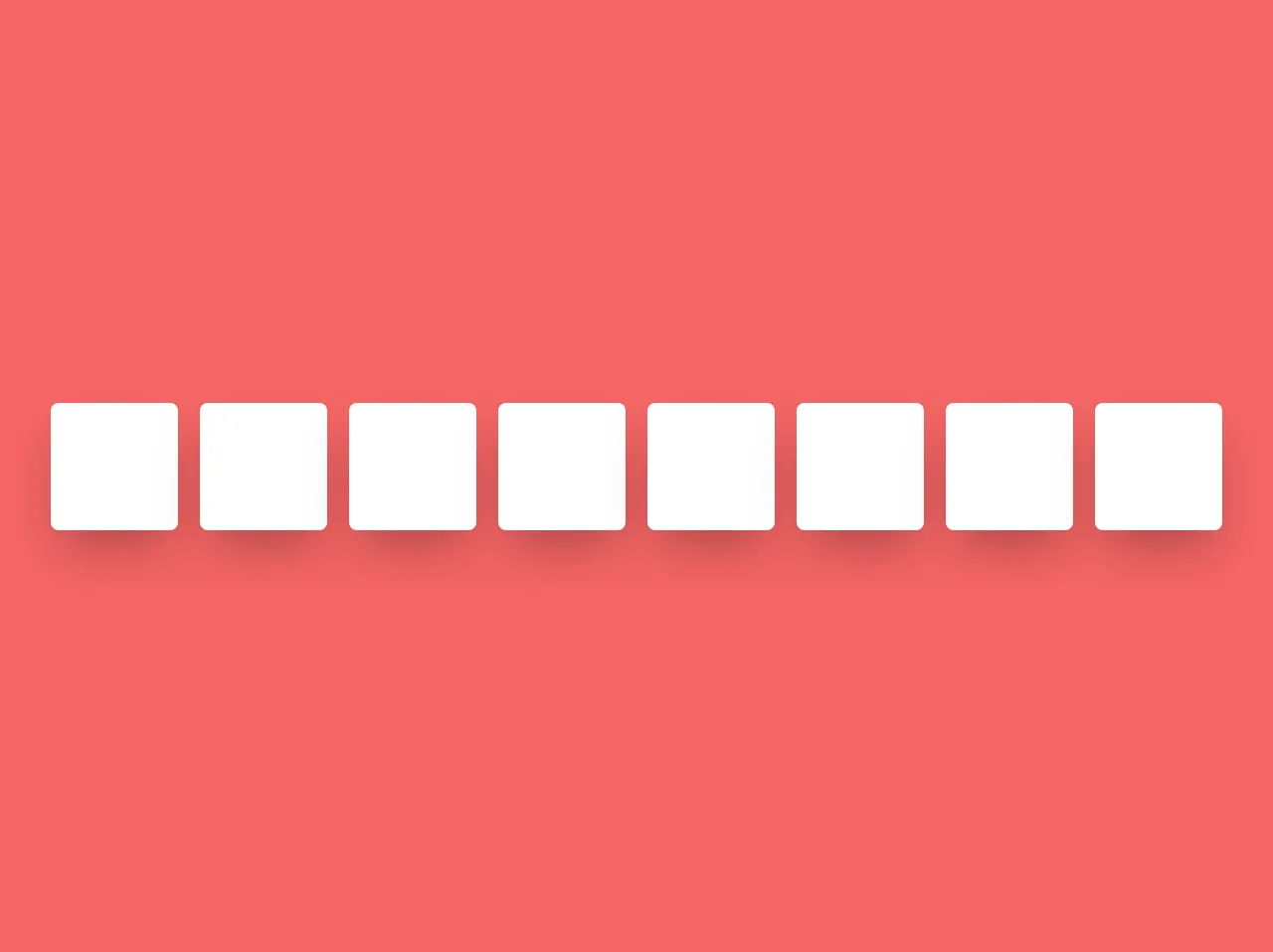
The preview of Animation demos ui component
Free download of the Animation demos's source code
The source code of Animation demos ui component
<!-- animation -->
<section
  class="flex min-h-screen flex-wrap items-center justify-around bg-red-500 p-10 sm:flex-col md:flex-row"
>
  <!-- scale -->
  <div class="relative mb-5 h-32 w-32 cursor-pointer">
    <div class="absolute inset-0 rounded-lg bg-white opacity-25 shadow-2xl"></div>
    <div class="absolute inset-0 transform  transition duration-300 hover:scale-75">
      <div class="h-full w-full rounded-lg bg-white shadow-2xl"></div>
    </div>
  </div>

  <!-- roatate and scale -->
  <div class="relative mb-5 h-32 w-32 cursor-pointer">
    <div class="absolute inset-0 rounded-lg bg-white opacity-25 shadow-2xl"></div>
    <div class="absolute inset-0 transform transition duration-300 hover:rotate-90 hover:scale-75">
      <div class="h-full w-full rounded-lg bg-white shadow-2xl"></div>
    </div>
  </div>

  <!-- rotate -->
  <div class="relative mb-5 h-32 w-32 cursor-pointer">
    <div class="absolute inset-0 rounded-lg bg-white opacity-25 shadow-2xl"></div>
    <div class="absolute inset-0 transform  transition duration-300 hover:rotate-45">
      <div class="h-full w-full rounded-lg bg-white shadow-2xl"></div>
    </div>
  </div>

  <!-- rotate minus -->
  <div class="relative mb-5 h-32 w-32 cursor-pointer">
    <div class="absolute inset-0 rounded-lg bg-white opacity-25 shadow-2xl"></div>
    <div class="absolute inset-0 transform  transition duration-300 hover:-rotate-45">
      <div class="h-full w-full rounded-lg bg-white shadow-2xl"></div>
    </div>
  </div>

  <!-- Origin -->
  <div class="relative mb-5 h-32 w-32 cursor-pointer">
    <div class="absolute inset-0 rounded-lg bg-white opacity-25 shadow-2xl"></div>
    <div class="absolute inset-0 origin-left transform transition duration-300 hover:-rotate-45">
      <div class="h-full w-full rounded-lg bg-white shadow-2xl"></div>
    </div>
  </div>

  <!-- translate -->
  <div class="relative mb-5 h-32 w-32 cursor-pointer">
    <div class="absolute inset-0 rounded-lg bg-white opacity-25 shadow-2xl"></div>
    <div class="absolute inset-0 transform transition duration-300 hover:-translate-x-10">
      <div class="h-full w-full rounded-lg bg-white shadow-2xl"></div>
    </div>
  </div>

  <div class="relative mb-5 h-32 w-32 cursor-pointer">
    <div class="absolute inset-0 rounded-lg bg-white opacity-25 shadow-2xl"></div>

    <div
      class="absolute inset-0 transform transition duration-300 hover:translate-x-full hover:rotate-90 hover:scale-150"
    >
      <div class="h-full w-full rounded-lg bg-white shadow-2xl"></div>
    </div>
  </div>

  <!-- skew -->
  <div class="relative mb-5 h-32 w-32 cursor-pointer">
    <div class="absolute inset-0 rounded-lg bg-white opacity-25 shadow-2xl"></div>
    <div class="absolute inset-0 transform transition duration-300 hover:skew-y-12">
      <div class="h-full w-full rounded-lg bg-white shadow-2xl"></div>
    </div>
  </div>
</section>
How to create a Animation demos with Tailwind CSS?
Here are 6 tips to help you create animation demos with Tailwind CSS like a pro:
1. Use the @keyframes rule to define animations
The @keyframes rule is used to define animations in CSS. It allows you to specify the keyframes of an animation and the properties that should be applied at each keyframe. To use the @keyframes rule with Tailwind CSS, you can define the animation in your CSS file and then apply it to an element using the animation property.
2. Use the animation property to apply animations to elements
The animation property is used to apply animations to elements in CSS. It allows you to specify the name of the animation, the duration, and the timing function. To use the animation property with Tailwind CSS, you can apply the pre-defined animation classes to an element.
3. Use the transition property to create smooth transitions
The transition property is used to create smooth transitions between different states of an element. It allows you to specify the properties that should be transitioned, the duration, and the timing function. To use the transition property with Tailwind CSS, you can apply the pre-defined transition classes to an element.
4. Use the transform property to create 3D effects
The transform property is used to create 3D effects in CSS. It allows you to rotate, scale, and translate elements in 3D space. To use the transform property with Tailwind CSS, you can apply the pre-defined transform classes to an element.
5. Use the hover and focus states to create interactive animations
The hover and focus states are used to create interactive animations in CSS. They allow you to apply styles to an element when it is hovered over or focused on. To use the hover and focus states with Tailwind CSS, you can apply the pre-defined hover and focus classes to an element.
6. Use the group-hover and group-focus states to create group animations
The group-hover and group-focus states are used to create group animations in CSS. They allow you to apply styles to a group of elements when one of the elements is hovered over or focused on. To use the group-hover and group-focus states with Tailwind CSS, you can apply the pre-defined group-hover and group-focus classes to a parent element.
Conclusion
In this article, we discussed how to make animation demos with Tailwind CSS like a pro with the help of these 6 tips. Tailwind CSS provides a set of pre-defined CSS classes that can be used to create beautiful and responsive animation demos UI components quickly. By using the @keyframes rule, animation property, transition property, transform property, hover and focus states, and group-hover and group-focus states, you can create engaging and interactive animation demos UI components that will make your website stand out.