- Published on
Ultimate Guide: Make A Animated Spinner Button With Tailwind CSS
- What is Tailwind CSS?
- The Description of Animated Spinner Button UI Component
- Why Use Tailwind CSS to Create an Animated Spinner Button UI Component?
- The Preview of Animated Spinner Button UI Component
- The Source Code of Animated Spinner Button UI Component
- How to Create an Animated Spinner Button with Tailwind CSS?
- Conclusion
Are you looking for a way to make your website more interactive and engaging? One way to achieve this is by adding animated UI components, such as spinner buttons. In this article, we will show you how to create an animated spinner button using Tailwind CSS.
What is Tailwind CSS?
Tailwind CSS is a utility-first CSS framework that provides a set of pre-defined classes to style your HTML elements. It allows you to quickly design and customize your website without having to write custom CSS code.
The Description of Animated Spinner Button UI Component
An animated spinner button is a UI component that is commonly used to indicate that a process is in progress. It is usually displayed as a circular icon that rotates continuously until the process is complete.
Why Use Tailwind CSS to Create an Animated Spinner Button UI Component?
Tailwind CSS provides a set of pre-defined classes that can be used to create complex UI components quickly. It also allows you to customize the design of your components by modifying the pre-defined classes or creating your own.
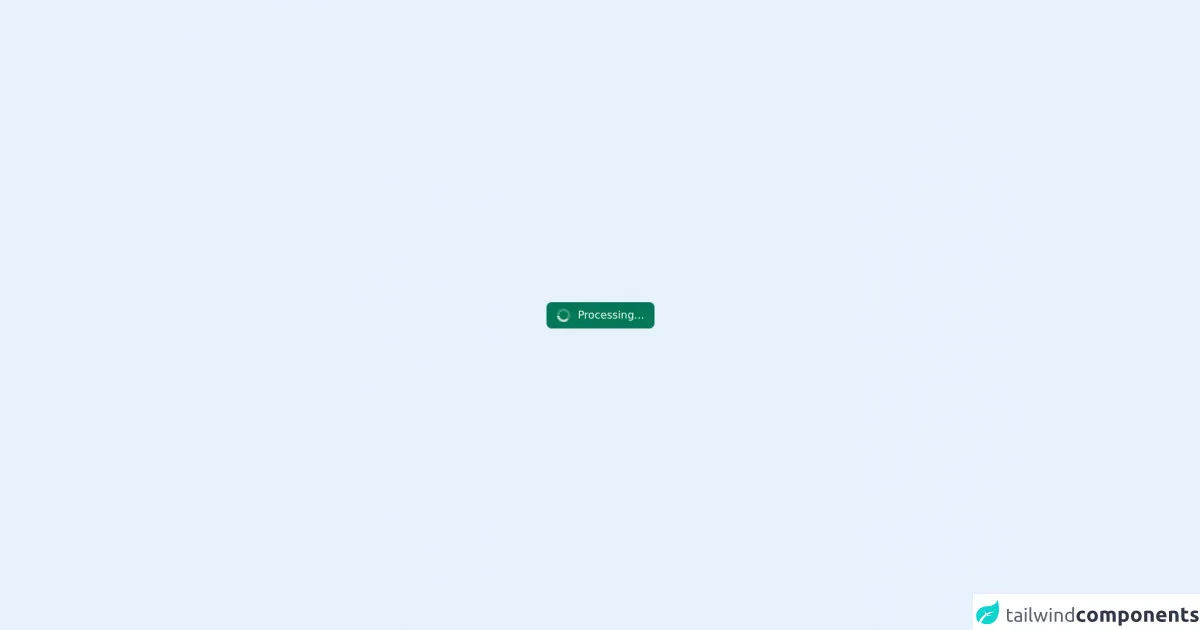
The Preview of Animated Spinner Button UI Component
To create an animated spinner button using Tailwind CSS, we will use the following classes:
bg-transparent: sets the background color of the button to transparentborder-4: sets the border width of the button to 4pxborder-gray-200: sets the border color of the button to gray-200rounded-full: sets the border radius of the button to 50%w-6: sets the width of the button to 6remh-6: sets the height of the button to 6remanimate-spin: adds a spin animation to the button
Free download of the Animated spinner button's source code
The Source Code of Animated Spinner Button UI Component
To create the animated spinner button, we will use the following HTML code:
<button class="bg-transparent border-4 border-gray-200 rounded-full w-6 h-6 animate-spin"></button>
<div class="flex h-screen w-screen items-center justify-center">
  <button
    type="button"
    class="flex items-center rounded-lg bg-green-700 px-4 py-2 text-white"
    disabled
  >
    <svg
      class="mr-3 h-5 w-5 animate-spin text-white"
      xmlns="http://www.w3.org/2000/svg"
      fill="none"
      viewBox="0 0 24 24"
    >
      <circle
        class="opacity-25"
        cx="12"
        cy="12"
        r="10"
        stroke="currentColor"
        stroke-width="4"
      ></circle>
      <path
        class="opacity-75"
        fill="currentColor"
        d="M4 12a8 8 0 018-8V0C5.373 0 0 5.373 0 12h4zm2 5.291A7.962 7.962 0 014 12H0c0 3.042 1.135 5.824 3 7.938l3-2.647z"
      ></path>
    </svg>
    <span class="font-medium"> Processing... </span>
  </button>
</div>
How to Create an Animated Spinner Button with Tailwind CSS?
To create an animated spinner button using Tailwind CSS, follow these steps:
- Create a new HTML file and add the following code:
<!DOCTYPE html>
<html>
<head>
	<title>Animated Spinner Button</title>
	<link rel="stylesheet" href="https://cdn.jsdelivr.net/npm/[email protected]/dist/tailwind.min.css">
</head>
<body>
	<button class="bg-transparent border-4 border-gray-200 rounded-full w-6 h-6 animate-spin"></button>
</body>
</html>
Save the file and open it in your web browser. You should see a circular button that spins continuously.
To customize the design of the button, you can modify the pre-defined classes or create your own. For example, you can change the background color of the button by adding the
bg-red-500class:
<button class="bg-red-500 border-4 border-gray-200 rounded-full w-6 h-6 animate-spin"></button>
Save the file and refresh your web browser. You should see the button with a red background color.
You can also create your own classes by adding them to the
tailwind.config.jsfile. For example, you can create a class that sets the font size of the button to 2rem:
module.exports = {
  theme: {
    extend: {
      fontSize: {
        '2xl': '2rem',
      },
    },
  },
  variants: {},
  plugins: [],
}
- Save the file and add the
text-2xlclass to the button:
<button class="bg-red-500 border-4 border-gray-200 rounded-full w-6 h-6 animate-spin text-2xl"></button>
- Save the file and refresh your web browser. You should see the button with a larger font size.
Conclusion
In this article, we have shown you how to create an animated spinner button using Tailwind CSS. By using pre-defined classes and customizing them, you can create complex UI components quickly and easily. We hope this article has been helpful in showing you how to add interactive and engaging elements to your website.