- Published on
Imagine You Make A Animated Gradient Spinner With Tailwind CSS Like An Expert. Follow These 6 Steps To Get There
- What is Tailwind CSS?
- The description of Animated gradient spinner ui component
- Why use Tailwind CSS to create a Animated gradient spinner ui component?
- The preview of Animated gradient spinner ui component
- The source code of Animated gradient spinner ui component
- How to create a Animated gradient spinner with Tailwind CSS?
- Step 1: Set up your HTML
- Step 2: Style your container
- Step 3: Style your spinner
- Step 4: Define your animation
- Step 5: Add a gradient
- Step 6: Add a tail
- Conclusion
What is Tailwind CSS?
Tailwind CSS is a utility-first CSS framework that allows you to create custom designs without writing any CSS. It provides a set of pre-defined classes that you can use to style your HTML elements. Tailwind CSS is a popular choice among developers because it is easy to use and highly customizable.
The description of Animated gradient spinner ui component
An animated gradient spinner is a UI component that is used to indicate that a process is in progress. It is a circular spinner that rotates and changes color to create a visually appealing effect. This UI component is commonly used in web applications and mobile apps.
Why use Tailwind CSS to create a Animated gradient spinner ui component?
Tailwind CSS is an excellent choice for creating an animated gradient spinner UI component because it provides a wide range of pre-defined classes that you can use to style your spinner. This means that you don't have to write any CSS code, which saves you time and effort. Additionally, Tailwind CSS is highly customizable, which means that you can easily modify the design of your spinner to fit your needs.
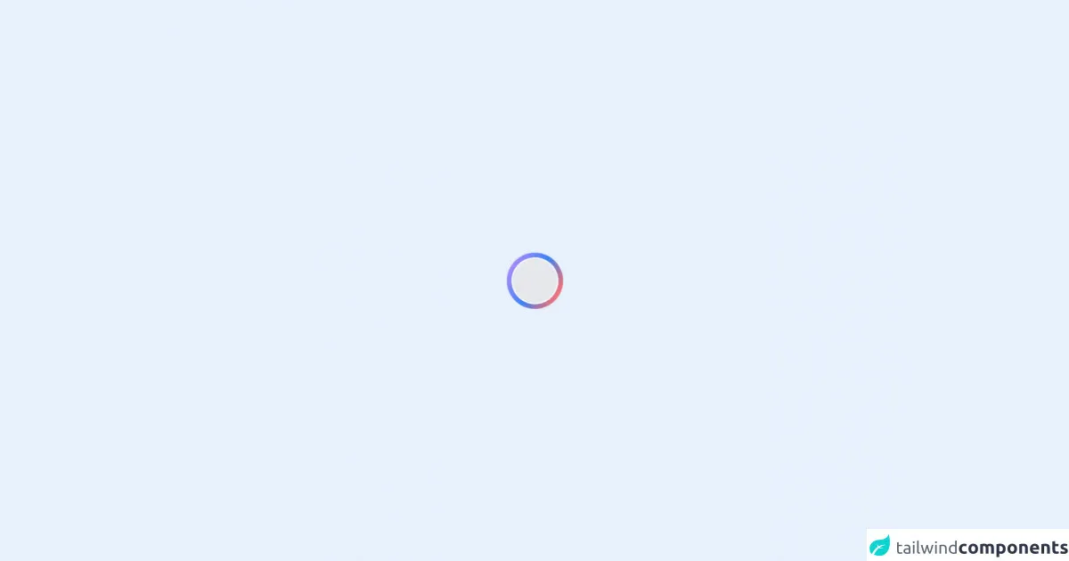
The preview of Animated gradient spinner ui component
To create an animated gradient spinner with Tailwind CSS, you will need to use a combination of CSS classes to style your spinner. The result will be a visually appealing spinner that rotates and changes color.
Free download of the Animated gradient spinner's source code
The source code of Animated gradient spinner ui component
To create an animated gradient spinner with Tailwind CSS, you will need to use a combination of CSS classes to style your spinner. The code for this spinner is relatively simple and easy to understand.
<div class="flex h-screen items-center justify-center">
  <div
    class="relative h-24 w-24 animate-spin rounded-full bg-gradient-to-r from-purple-400 via-blue-500 to-red-400 "
  >
    <div
      class="absolute top-1/2 left-1/2 h-20 w-20 -translate-x-1/2 -translate-y-1/2 transform rounded-full border-2 border-white bg-gray-200"
    ></div>
  </div>
</div>
How to create a Animated gradient spinner with Tailwind CSS?
Follow these six steps to create an animated gradient spinner with Tailwind CSS:
Step 1: Set up your HTML
The first step is to set up your HTML. You will need to create a container element for your spinner and add a child element for the spinner itself. Here's an example:
<div class="spinner-container">
  <div class="spinner"></div>
</div>
Step 2: Style your container
Next, you will need to style your container element. You can use Tailwind CSS classes to set the width and height of your container and center it on the page. Here's an example:
.spinner-container {
  width: 100%;
  height: 100%;
  display: flex;
  justify-content: center;
  align-items: center;
}
Step 3: Style your spinner
Now it's time to style your spinner. You can use Tailwind CSS classes to set the size, border, and animation of your spinner. Here's an example:
.spinner {
  border: 4px solid rgba(255, 255, 255, 0.2);
  border-top-color: #fff;
  border-radius: 50%;
  width: 2rem;
  height: 2rem;
  animation: spin 1s linear infinite;
}
Step 4: Define your animation
To create the spinning animation, you will need to define a keyframe animation using CSS. You can use Tailwind CSS classes to define your animation. Here's an example:
@keyframes spin {
  to {
    transform: rotate(360deg);
  }
}
Step 5: Add a gradient
To create the gradient effect, you will need to add a linear gradient to your spinner. You can use Tailwind CSS classes to define your gradient. Here's an example:
.spinner {
  background: linear-gradient(to right, #f00, #ff0, #0f0, #0ff, #00f, #f0f, #f00);
}
Step 6: Add a tail
Finally, you can add a tail to your spinner to create a more visually appealing effect. You can use Tailwind CSS classes to style your tail. Here's an example:
.spinner::before {
  content: '';
  position: absolute;
  top: -0.5rem;
  left: 50%;
  width: 0;
  height: 0;
  border-style: solid;
  border-width: 0 0.5rem 0.5rem 0.5rem;
  border-color: transparent transparent #fff transparent;
  transform: translateX(-50%);
}
Conclusion
Creating an animated gradient spinner with Tailwind CSS is a straightforward process that can be done in just a few steps. By using pre-defined CSS classes, you can quickly create a visually appealing spinner that rotates and changes color. With Tailwind CSS, you can easily customize the design of your spinner to fit your needs.