- Published on
Best Ways To Create A Animated Buttons With Tailwind CSS
- What is Tailwind CSS?
- The Description of Animated Buttons UI Component
- Why Use Tailwind CSS to Create an Animated Buttons UI Component?
- The Preview of Animated Buttons UI Component
- The Source Code of Animated Buttons UI Component
- How to Create Animated Buttons With Tailwind CSS?
- Conclusion
What is Tailwind CSS?
Tailwind CSS is a utility-first CSS framework that helps developers create responsive and customizable user interfaces quickly. It provides a set of pre-defined CSS classes that can be used to style HTML elements without the need for custom CSS.
The Description of Animated Buttons UI Component
Animated buttons are a popular UI component that can be used to add interactivity and engagement to a website or application. These buttons are designed to respond to user actions, such as hovering or clicking, by animating their appearance or behavior.
Why Use Tailwind CSS to Create an Animated Buttons UI Component?
Tailwind CSS is an excellent choice for creating animated buttons because it provides a wide range of utility classes that can be used to add animations and transitions to HTML elements. These classes can be combined to create complex animations without the need for custom CSS.
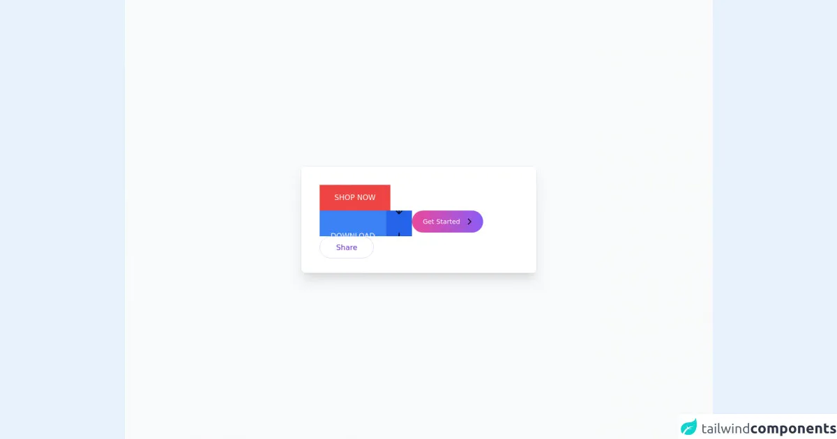
The Preview of Animated Buttons UI Component
Animated buttons can be used to add interactivity and engagement to a website or application. They can be designed to respond to user actions, such as hovering or clicking, by animating their appearance or behavior.
Free download of the Animated buttons's source code
The Source Code of Animated Buttons UI Component
To create an animated button with Tailwind CSS, you will need to use a combination of utility classes to add the desired animations and transitions.
<div
  class="relative flex min-h-screen flex-col justify-center overflow-hidden bg-gray-50 py-6 sm:py-12"
>
  <img
    src="/img/beams.jpg"
    alt=""
    class="absolute top-1/2 left-1/2 max-w-none -translate-x-1/2 -translate-y-1/2"
    width="1308"
  />
  <div
    class="absolute inset-0 bg-center [mask-image:linear-gradient(180deg,white,rgba(255,255,255,0))]"
  ></div>
  <div
    class="relative bg-white px-6 pt-10 pb-8 shadow-xl ring-1 ring-gray-900/5 sm:mx-auto sm:max-w-lg sm:rounded-lg sm:px-10"
  >
    <div class="mx-auto max-w-md">
      <div class="flex flex-wrap gap-4">
        <button
          class="group relative h-14 bg-red-500 px-8
                      before:absolute
                      before:inset-0
                      before:origin-right
                      before:scale-x-0
                      before:bg-red-700
                      before:transition
                      before:duration-300
                      hover:before:origin-left
                      hover:before:scale-x-100
                      "
        >
          <span class="relative text-base uppercase text-white">Shop now</span>
        </button>

        <button
          class="group relative h-12 overflow-hidden rounded-md bg-lime-500 px-8
                      before:absolute
                      before:inset-0
                      before:origin-bottom
                      before:scale-y-[0.1]
                      before:bg-lime-600
                      before:transition
                      before:duration-300
                      hover:before:scale-y-100
                      "
        >
          <span class="relative text-base uppercase text-white">Play now</span>
        </button>

        <button
          class="group relative flex h-14 items-center space-x-6 overflow-hidden bg-blue-500 pl-6"
        >
          <span class="relative text-base uppercase text-white">Download</span>
          <div
            aria-hidden="true"
            class="w-14 -translate-y-7 bg-blue-600 transition duration-300 group-hover:translate-y-7"
          >
            <div class="flex h-14">
              <svg
                xmlns="http://www.w3.org/2000/svg"
                class="m-auto h-5 w-5 fill-white"
                viewBox="0 0 20 20"
                fill="currentColor"
              >
                <path
                  fill-rule="evenodd"
                  d="M16.707 10.293a1 1 0 010 1.414l-6 6a1 1 0 01-1.414 0l-6-6a1 1 0 111.414-1.414L9 14.586V3a1 1 0 012 0v11.586l4.293-4.293a1 1 0 011.414 0z"
                  clip-rule="evenodd"
                />
              </svg>
            </div>
          </div>
        </button>

        <button
          class="group relative flex h-12 items-center space-x-2 overflow-hidden rounded-full bg-gradient-to-r from-pink-500 to-purple-500 px-6 hover:to-purple-600"
        >
          <span class="relative text-sm text-white">Get Started</span>
          <div class="flex translate-x-3 items-center -space-x-3">
            <div
              class="h-[1.6px] w-2.5 origin-left scale-x-0 rounded bg-white transition duration-300 group-hover:scale-x-100"
            ></div>
            <svg
              xmlns="http://www.w3.org/2000/svg"
              class="h-5 w-5 -translate-x-2 stroke-white transition duration-300 group-hover:translate-x-0"
              fill="none"
              viewBox="0 0 24 24"
              stroke="currentColor"
              stroke-width="2"
            >
              <path stroke-linecap="round" stroke-linejoin="round" d="M9 5l7 7-7 7" />
            </svg>
          </div>
        </button>

        <button
          class="group relative h-12 overflow-hidden rounded-full border border-purple-200 px-6"
        >
          <div aria-hidden="true" class="transition duration-300 group-hover:-translate-y-12">
            <div class="flex h-12 items-center justify-center">
              <span class="text-purple-700">Share</span>
            </div>
            <div class="flex h-12 items-center justify-center">
              <span class="text-purple-700">Partager</span>
            </div>
          </div>
        </button>
      </div>
    </div>
  </div>
</div>
How to Create Animated Buttons With Tailwind CSS?
To create an animated button with Tailwind CSS, follow these steps:
- Create a button element in your HTML code. For example:
<button class="bg-blue-500 hover:bg-blue-700 text-white font-bold py-2 px-4 rounded">
  Click me
</button>
- Add the desired utility classes to the button element to add animations and transitions. For example:
<button class="bg-blue-500 hover:bg-blue-700 active:bg-blue-800 text-white font-bold py-2 px-4 rounded transition duration-300 ease-in-out transform hover:-translate-y-1 hover:scale-110">
  Click me
</button>
In this example, we have added the following utility classes:
bg-blue-500: sets the background color of the button to blue.hover:bg-blue-700: changes the background color of the button to a darker shade of blue when the user hovers over it.active:bg-blue-800: changes the background color of the button to an even darker shade of blue when the user clicks on it.text-white: sets the text color of the button to white.font-bold: makes the text of the button bold.py-2: sets the padding on the top and bottom of the button to 2 units.px-4: sets the padding on the left and right of the button to 4 units.rounded: rounds the corners of the button.transition: adds a transition effect to the button.duration-300: sets the duration of the transition to 300 milliseconds.ease-in-out: sets the easing function for the transition.transform: adds a transform effect to the button.hover:-translate-y-1: moves the button 1 unit up when the user hovers over it.hover:scale-110: scales the button up by 10% when the user hovers over it.
- Customize the utility classes to create the desired animation or transition effect. For example, you can change the duration or easing function of the transition to create a different effect.
Conclusion
Animated buttons are a great way to add interactivity and engagement to a website or application. With Tailwind CSS, creating animated buttons is easy and straightforward. By using a combination of utility classes, you can create complex animations and transitions without the need for custom CSS. So, go ahead and try creating your own animated buttons with Tailwind CSS!