- Published on
Surprisingly Effective Ways To Create A Animated Blog Item With Tailwind CSS
- What is Tailwind CSS?
- The description of Animated blog item ui component
- Why use Tailwind CSS to create a Animated blog item ui component?
- The preview of Animated blog item ui component
- The source code of Animated blog item ui component
- How to create a Animated blog item with Tailwind CSS?
- Step 1: Set up your HTML
- Step 2: Add Tailwind CSS classes
- Step 3: Preview your Animated blog item
- Conclusion
If you're a FrontEnd technology blogger, you know how important it is to have a visually appealing blog. One way to make your blog stand out is by adding animated components. In this article, we'll show you how to create an animated blog item with Tailwind CSS.
What is Tailwind CSS?
Tailwind CSS is a utility-first CSS framework that allows you to quickly and easily create custom designs. It provides a set of pre-defined classes that you can use to style your HTML elements. With Tailwind CSS, you can create complex designs without writing any custom CSS.
The description of Animated blog item ui component
An animated blog item is a UI component that adds visual interest to your blog. It typically consists of an image, a title, a short description, and a call-to-action button. When a user hovers over the item, it animates in some way, such as zooming in or changing color.
Why use Tailwind CSS to create a Animated blog item ui component?
Tailwind CSS is an excellent choice for creating animated blog items because it allows you to easily add and modify styles. With Tailwind CSS, you don't have to write any custom CSS, which saves you time and effort. Additionally, Tailwind CSS provides a set of pre-defined animations that you can use to create your animated blog item.
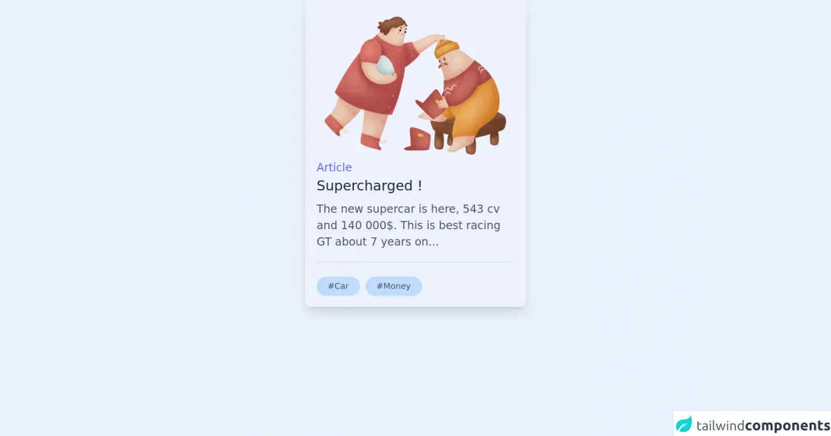
The preview of Animated blog item ui component
To create an animated blog item with Tailwind CSS, you'll need to use a combination of HTML and CSS. Here's a preview of what the final product will look like:
Free download of the Animated blog item's source code
The source code of Animated blog item ui component
To create an animated blog item with Tailwind CSS, you'll need to use a combination of HTML and CSS. Here's the source code for the animated blog item:
<div
  class="m-auto h-auto w-80 transform cursor-pointer overflow-hidden rounded-lg bg-indigo-50 p-4 shadow-lg transition duration-500 ease-in-out hover:translate-y-5 hover:shadow-2xl md:w-80"
>
  <a href="#" class="block h-full w-full">
    <img
      alt="blog photo"
      src="https://ouch-cdn2.icons8.com/7IafUowCewhP-tIcwdGHyXhsJoqElQ00jmljBiQ2GMU/rs:fit:1216:912/czM6Ly9pY29uczgu/b3VjaC1wcm9kLmFz/c2V0cy9wbmcvNjYv/YTc5MzE5ZDMtNWM5/ZS00MTVmLWJiMjQt/MzMxZjczZmQwN2Vj/LnBuZw.png"
      class="max-h-60 w-full object-cover"
    />
    <div class="w-full">
      <p class="text-md font-medium text-indigo-500">Article</p>
      <p class="mb-2 text-xl font-medium text-gray-800 dark:text-white">Supercharged !</p>
      <p class="text-md font-light text-gray-600 dark:text-gray-300">
        The new supercar is here, 543 cv and 140 000$. This is best racing GT about 7 years on...
      </p>
      <div class="justify-starts mt-4 flex flex-wrap items-center border-t-2 pt-5">
        <div class="mr-2 rounded-2xl bg-blue-200 py-1.5 px-4 text-xs text-gray-600">#Car</div>
        <div class="mr-2 rounded-2xl bg-blue-200 py-1.5 px-4 text-xs text-gray-600">#Money</div>
      </div>
    </div>
  </a>
</div>
How to create a Animated blog item with Tailwind CSS?
Now that you've seen what the final product looks like and have the source code, let's walk through how to create an animated blog item with Tailwind CSS.
Step 1: Set up your HTML
The first step is to set up your HTML. Here's an example of what your HTML might look like:
<div class="blog-item">
  <img src="https://example.com/image.jpg" alt="Blog Item Image">
  <h2 class="text-lg font-bold mt-4">Blog Item Title</h2>
  <p class="mt-2">Blog Item Description</p>
  <a href="#" class="btn mt-4">Read More</a>
</div>
In this example, we have a div element with a class of blog-item. Inside the div, we have an img element, a h2 element for the title, a p element for the description, and an a element for the call-to-action button.
Step 2: Add Tailwind CSS classes
The next step is to add Tailwind CSS classes to your HTML elements. Here's an example of what your CSS might look like:
.blog-item {
  position: relative;
  overflow: hidden;
  border-radius: 4px;
  box-shadow: 0 0 10px rgba(0, 0, 0, 0.2);
  transition: all 0.3s ease-in-out;
}

.blog-item:hover {
  transform: scale(1.05);
  box-shadow: 0 0 20px rgba(0, 0, 0, 0.4);
}

.blog-item img {
  width: 100%;
  height: auto;
}

.blog-item h2 {
  color: #333;
}

.blog-item p {
  color: #666;
}

.btn {
  display: inline-block;
  padding: 8px 16px;
  background-color: #333;
  color: #fff;
  border-radius: 4px;
  transition: all 0.3s ease-in-out;
}

.btn:hover {
  background-color: #fff;
  color: #333;
}
In this example, we're using a combination of Tailwind CSS classes and custom CSS. We've added classes like position, overflow, border-radius, and box-shadow to the blog-item class to give it a rounded, shadowed appearance. We've also added a transition property to the blog-item class to create a smooth animation when the user hovers over the item.
We've added classes like text-lg, font-bold, and mt-4 to the h2 element to give it a larger, bolded appearance with some margin at the top. We've added classes like mt-2 to the p element to give it some margin at the top.
We've added classes like btn, padding, background-color, color, and border-radius to the a element to give it a button-like appearance. We've also added a transition property to the btn class to create a smooth animation when the user hovers over the button.
Step 3: Preview your Animated blog item
Once you've added your CSS, you can preview your animated blog item. Open your HTML file in a web browser and hover over the item to see the animation in action.
Conclusion
In this article, we've shown you how to create an animated blog item with Tailwind CSS. We've explained what Tailwind CSS is, why it's a great choice for creating animated components, and how to create an animated blog item step-by-step. With this knowledge, you can add some visual interest to your blog and make it stand out from the crowd.