- Published on
6 Tips To Make A Amount Configurator With Tailwind CSS
- What is Tailwind CSS?
- The description of Amount Configurator ui component
- Why use Tailwind CSS to create a Amount Configurator ui component?
- The preview of Amount Configurator ui component
- The source code of Amount Configurator ui component
- How to create a Amount Configurator with Tailwind CSS?
- 1. Define the HTML structure
- 2. Style the component with Tailwind CSS classes
- 3. Use Flexbox to align the elements
- 4. Use JavaScript to update the selected amount
- 5. Use responsive classes to make the component mobile-friendly
- 6. Test the component on different devices
- Conclusion
What is Tailwind CSS?
Tailwind CSS is a utility-first CSS framework that provides a set of pre-defined CSS classes to help you quickly build custom user interfaces. It is a highly customizable framework that allows you to create unique designs without writing any custom CSS.
The description of Amount Configurator ui component
An amount configurator is a user interface component that allows users to select a specific amount from a predefined set of values. This component is commonly used in e-commerce applications to allow users to select the quantity of a product they want to purchase.
Why use Tailwind CSS to create a Amount Configurator ui component?
Tailwind CSS provides a set of pre-defined CSS classes that can be used to quickly build custom user interfaces. This makes it an ideal choice for creating an amount configurator UI component. Additionally, Tailwind CSS is highly customizable, which means that you can easily modify the styles of the component to match the design of your application.
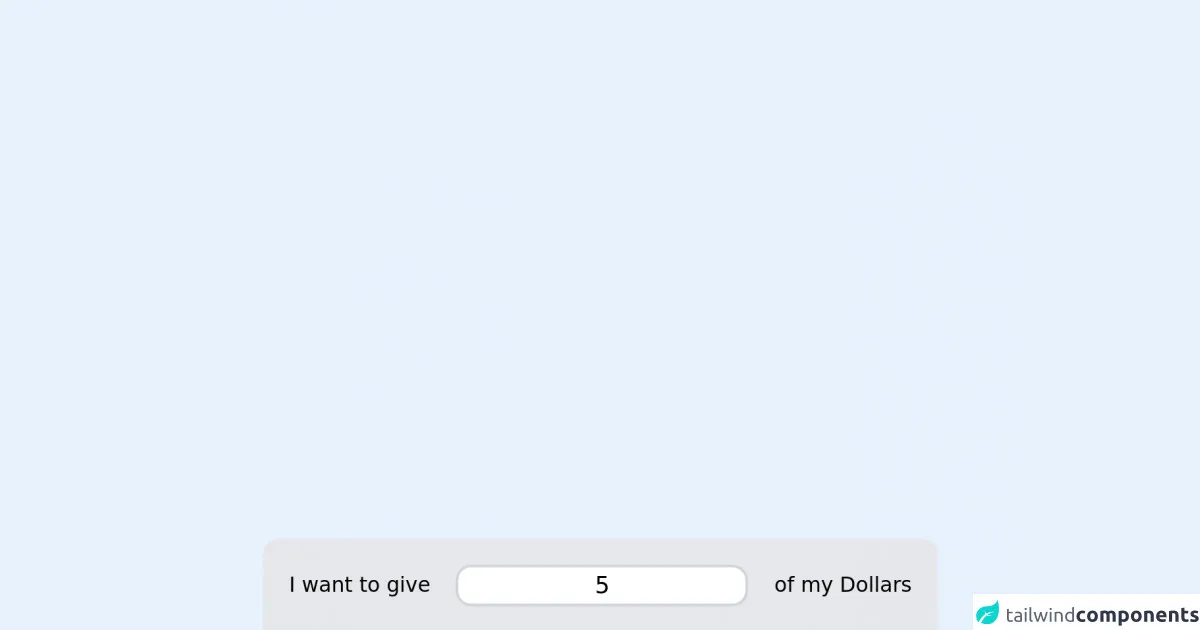
The preview of Amount Configurator ui component
To create an amount configurator UI component with Tailwind CSS, you can use a combination of HTML and CSS classes. The resulting component will allow users to select a specific amount from a predefined set of values.
Free download of the Amount Configurator's source code
The source code of Amount Configurator ui component
To create an amount configurator UI component with Tailwind CSS, you can use the following HTML and CSS code.
<script src="//unpkg.com/alpinejs" defer></script>
<link
  href="https://cdn.jsdelivr.net/npm/[email protected]/dist/full.css"
  rel="stylesheet"
  type="text/css"
/>

<div class="mx-auto max-w-screen-md">
  <script>
    function onlyNumberKey(evt) {
      var ASCIICode = evt.which ? evt.which : evt.keyCode
      if (ASCIICode > 31 && (ASCIICode < 48 || ASCIICode > 57)) {
        return false
      }
      return true
    }
    function amountConfig() {
      return {
        amount: 5,
        min_amount: 5,
        max_amount: 500,
        increase(a) {
          this.amount = Number(this.amount)
          if (this.amount + a > this.max_amount) {
            this.amount = this.max_amount
          } else {
            this.amount += a
          }
        },
        decrease(a) {
          this.amount = Number(this.amount)
          if (this.amount - a < this.min_amount) {
            this.amount = this.min_amount
          } else {
            this.amount -= a
          }
        },
      }
    }
  </script>
  <div x-data="amountConfig()" class="rounded-xl rounded-xl bg-gray-200 p-5 text-black">
    <div class="flex items-center justify-between">
      <div>I want to give</div>
      <div class="mx-5 flex-grow">
        <input
          onkeypress="return onlyNumberKey(event)"
          x-model="amount"
          type="text"
          x-bind:placeholder="min_amount"
          class="w-full rounded-xl border-2 border-gray-300 text-center text-lg focus:border-gray-800 focus:ring-gray-800"
        />
      </div>
      <div>of my Dollars</div>
    </div>

    <div class="mt-5 flex items-center justify-between">
      <div>
        <button
          @click="decrease(5)"
          class="mr-1 rounded-xl bg-gray-400 px-4 py-2 text-xs text-white "
        >
          - 5
        </button>
        <button @click="decrease(10)" class="rounded-xl bg-gray-400 px-4 py-2 text-xs text-white ">
          - 10
        </button>
      </div>
      <div class="mx-5 mt-1 flex-grow">
        <input
          x-model="amount"
          type="range"
          x-bind:max="max_amount"
          x-bind:min="min_amount"
          x-bind:value="amount"
          class="range range-primary"
        />
      </div>
      <div>
        <button @click="increase(5)" class="rounded-xl bg-gray-400 px-4 py-2 text-xs text-white ">
          + 5
        </button>
        <button
          @click="increase(10)"
          class="ml-1 rounded-xl bg-gray-400 px-4 py-2 text-xs text-white "
        >
          + 10
        </button>
      </div>
    </div>
  </div>
</div>
How to create a Amount Configurator with Tailwind CSS?
Here are 6 tips to help you create an amount configurator UI component with Tailwind CSS:
1. Define the HTML structure
The first step in creating an amount configurator UI component is to define the HTML structure. You can use a combination of HTML elements such as divs, spans, and buttons to create the component.
2. Style the component with Tailwind CSS classes
Once you have defined the HTML structure, you can start styling the component using Tailwind CSS classes. You can use classes such as bg-gray-100, rounded-md, and text-sm to style the component.
3. Use Flexbox to align the elements
Flexbox is a powerful layout tool that can be used to align the elements of the amount configurator UI component. You can use classes such as flex, justify-between, and items-center to align the elements.
4. Use JavaScript to update the selected amount
To make the amount configurator UI component interactive, you can use JavaScript to update the selected amount when the user clicks on a button. You can use classes such as cursor-pointer and hover:bg-gray-200 to make the buttons clickable.
5. Use responsive classes to make the component mobile-friendly
Tailwind CSS provides a set of responsive classes that can be used to make the amount configurator UI component mobile-friendly. You can use classes such as md:w-1/3 and lg:w-1/4 to adjust the width of the component on different screen sizes.
6. Test the component on different devices
Once you have created the amount configurator UI component, it is important to test it on different devices to ensure that it works correctly. You can use tools such as BrowserStack to test the component on different browsers and devices.
Conclusion
Creating an amount configurator UI component with Tailwind CSS is a simple and straightforward process. By following the tips outlined in this article, you can create a highly customizable and mobile-friendly component that will enhance the user experience of your application.