- Published on
How to Make A Alternative Card Design With Tailwind CSS?
- What is Tailwind CSS?
- The description of Alternative Card design ui component
- Why use Tailwind CSS to create a Alternative Card design ui component?
- The preview of Alternative Card design ui component
- The source code of Alternative Card design ui component
- How to create a Alternative Card design with Tailwind CSS?
- Conclusion
What is Tailwind CSS?
Tailwind CSS is a utility-first CSS framework that provides a set of pre-defined classes to help you quickly build custom user interfaces. It is designed to be highly customizable and easy to use, making it a popular choice for front-end developers.
The description of Alternative Card design ui component
The Alternative Card design is a popular user interface component that is commonly used to display information in a visually appealing way. It is a card-like structure that can be used to showcase products, services, or any other type of content.
Why use Tailwind CSS to create a Alternative Card design ui component?
Tailwind CSS provides a set of pre-defined classes that can be used to quickly create custom user interfaces. This makes it an ideal choice for creating Alternative Card designs, as it allows you to easily customize the design to match your specific needs.
Additionally, Tailwind CSS is designed to be highly customizable, which means that you can easily modify the design of your Alternative Card to match your brand's color scheme or other design elements.
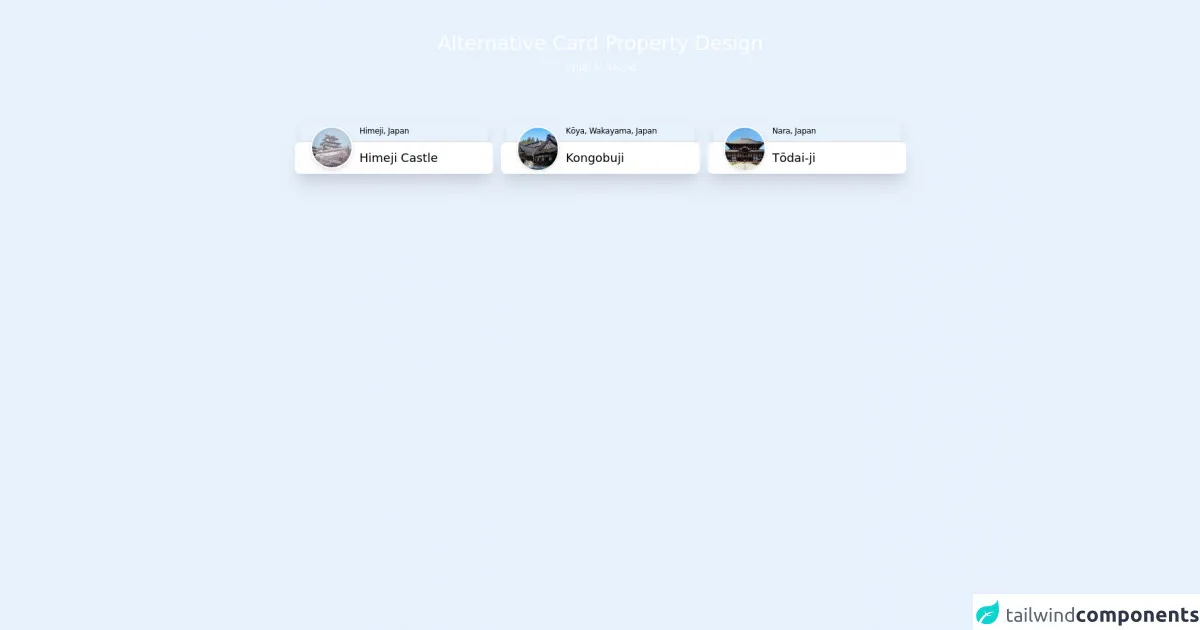
The preview of Alternative Card design ui component
Free download of the Alternative Card design's source code
The source code of Alternative Card design ui component
To create an Alternative Card design using Tailwind CSS, you can use the following code:
<div class="h-screen bg-slate-800">
  <div class="container mx-auto max-w-5xl">
    <!-- title -->
    <div class="mx-auto space-y-2 px-4 pt-12 pb-6">
      <h1 class="text-center text-3xl font-medium text-white">Alternative Card Property Design</h1>
      <h3 class="flex justify-center text-sm font-light text-white">Syidh Al Rasyid</h3>
    </div>
    <!-- Container -->
    <div class="gap-3 space-y-4 p-12 sm:grid sm:grid-cols-2 sm:space-y-0 lg:grid-cols-3">
      <!-- card-1 -->
      <div class="relative">
        <!-- box-1 -->
        <div class="px-2">
          <div
            class="flex h-8 w-full rounded-t-lg border-b-2 border-slate-300 bg-slate-100 pl-[90px] shadow-lg"
          >
            <small class="my-auto items-center text-xs font-light tracking-tight text-slate-400"
              >Himeji, Japan</small
            >
          </div>
        </div>
        <!-- box-2 -->
        <div class="flex h-12 w-full rounded-lg bg-white pl-[98px] shadow-xl">
          <small class="my-auto text-lg font-medium text-slate-700">Himeji Castle</small>
        </div>
        <!-- circle -->
        <div class="absolute top-2 left-6 h-16 w-16 rounded-full border-2 border-white shadow-md">
          <img
            class="rounded-full object-cover object-center"
            src="https://images.pexels.com/photos/1654748/pexels-photo-1654748.jpeg?auto=compress&cs=tinysrgb&w=1260&h=750&dpr=1"
            alt=""
          />
        </div>
      </div>

      <!-- card-2 -->
      <div class="relative">
        <!-- box-1 -->
        <div class="px-2">
          <div
            class="flex h-8 w-full rounded-t-lg border-b-2 border-slate-300 bg-slate-100 pl-[90px] shadow-lg"
          >
            <small class="my-auto items-center text-xs font-light tracking-tight text-slate-400"
              >Kōya, Wakayama, Japan</small
            >
          </div>
        </div>
        <!-- box-2 -->
        <div class="flex h-12 w-full rounded-lg bg-white pl-[98px] shadow-xl">
          <small class="my-auto text-lg font-medium text-slate-700">Kongobuji</small>
        </div>
        <!-- circle -->
        <div class="absolute top-2 left-6 h-16 w-16 rounded-full border-2 border-white shadow-md">
          <img
            class="h-16 w-16 rounded-full object-cover object-center"
            src="https://www.japan-guide.com/g19/4903_01.jpg"
            alt=""
          />
        </div>
      </div>

      <!-- card-3 -->
      <div class="relative">
        <!-- box-1 -->
        <div class="px-2">
          <div
            class="flex h-8 w-full rounded-t-lg border-b-2 border-slate-300 bg-slate-100 pl-[90px] shadow-lg"
          >
            <small class="my-auto items-center text-xs font-light tracking-tight text-slate-400"
              >Nara, Japan</small
            >
          </div>
        </div>
        <!-- box-2 -->
        <div class="flex h-12 w-full rounded-lg bg-white pl-[98px] shadow-xl">
          <small class="my-auto text-lg font-medium text-slate-700">Tōdai-ji</small>
        </div>
        <!-- circle -->
        <div class="absolute top-2 left-6 h-16 w-16 rounded-full border-2 border-white shadow-md">
          <img
            class="h-16 w-16 rounded-full object-cover object-center"
            src="https://upload.wikimedia.org/wikipedia/commons/2/2f/T%C5%8Ddai-ji_Kon-d%C5%8D.jpg"
            alt=""
          />
        </div>
      </div>
    </div>
  </div>
</div>
How to create a Alternative Card design with Tailwind CSS?
To create an Alternative Card design using Tailwind CSS, you can follow these steps:
Start by creating a new HTML file and adding the necessary HTML elements to create the structure of your Alternative Card design.
Next, add the necessary Tailwind CSS classes to style your Alternative Card design. You can use the code provided above as a starting point and modify it to match your specific needs.
Once you have added the necessary classes, preview your Alternative Card design to ensure that it looks the way you want it to.
Finally, make any necessary adjustments to your design and continue to test and refine your Alternative Card until you are satisfied with the final result.
Conclusion
Creating an Alternative Card design using Tailwind CSS is a great way to create a visually appealing user interface that is both functional and easy to use. By following the steps outlined in this article, you can quickly and easily create your own Alternative Card design using Tailwind CSS.