- Published on
Learn How To Make A Alpine.js + TailwindCSS Lightbox Modal With Tailwind CSS Like an Expert
- What is Tailwind CSS?
- The description of Alpine.js + TailwindCSS Lightbox Modal ui component
- Why use Tailwind CSS to create a Alpine.js + TailwindCSS Lightbox Modal ui component?
- The preview of Alpine.js + TailwindCSS Lightbox Modal ui component
- The source code of Alpine.js + TailwindCSS Lightbox Modal ui component
- How to create a Alpine.js + TailwindCSS Lightbox Modal with Tailwind CSS?
- Step 1: Create the HTML structure
- Step 2: Add Tailwind CSS styles
- Step 3: Add Alpine.js code
- Step 4: Test the lightbox modal
- Conclusion
What is Tailwind CSS?
Tailwind CSS is a utility-first CSS framework that allows you to create custom designs without writing any CSS. It provides a set of pre-defined classes that you can use to style your HTML elements. With Tailwind CSS, you can build responsive and mobile-first web applications quickly and easily.
The description of Alpine.js + TailwindCSS Lightbox Modal ui component
Alpine.js is a lightweight JavaScript framework that allows you to add interactivity to your web pages without the need for a full-fledged framework like Vue.js or React. It is a great choice for small to medium-sized projects that require some level of interactivity.
A lightbox modal is a UI component that displays an image or video in a popup window. It is a popular design pattern used on many websites to showcase images or videos in a more user-friendly way. In this tutorial, we will learn how to create a lightbox modal using Alpine.js and Tailwind CSS.
Why use Tailwind CSS to create a Alpine.js + TailwindCSS Lightbox Modal ui component?
Tailwind CSS provides a set of pre-defined classes that you can use to style your HTML elements. This makes it easy to create custom designs without writing any CSS. Additionally, Tailwind CSS is highly customizable, which means you can easily modify the default styles to match your design requirements.
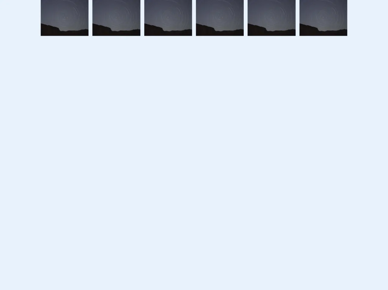
The preview of Alpine.js + TailwindCSS Lightbox Modal ui component
In this tutorial, we will create a lightbox modal that displays an image when clicked. The modal will have a dark background and a close button to close the modal.
Free download of the Alpine.js + TailwindCSS Lightbox Modal's source code
The source code of Alpine.js + TailwindCSS Lightbox Modal ui component
To create the lightbox modal, we will use Alpine.js and Tailwind CSS. We will start by creating a basic HTML structure for the modal and then add the necessary styles and JavaScript code.
<!DOCTYPE html>
<html lang="en">
  <head>
    <meta charset="UTF-8" />
    <meta name="viewport" content="width=device-width, initial-scale=1.0" />
    <title>Alpine.js-TailwindCSS-Lightbox-Modal</title>
    <link href="https://unpkg.com/tailwindcss@^1.0/dist/tailwind.min.css" rel="stylesheet" />
    <script
      src="https://cdn.jsdelivr.net/gh/alpinejs/[email protected]/dist/alpine.min.js"
      defer
    ></script>
  </head>
  <body>
    <div x-data="{ imgModal : false, imgModalSrc : '', imgModalDesc : '' }">
      <template
        @img-modal.window="imgModal = true; imgModalSrc = $event.detail.imgModalSrc; imgModalDesc = $event.detail.imgModalDesc;"
        x-if="imgModal"
      >
        <div
          x-transition:enter="transition ease-out duration-300"
          x-transition:enter-start="opacity-0 transform scale-90"
          x-transition:enter-end="opacity-100 transform scale-100"
          x-transition:leave="transition ease-in duration-300"
          x-transition:leave-start="opacity-100 transform scale-100"
          x-transition:leave-end="opacity-0 transform scale-90"
          x-on:click.away="imgModalSrc = ''"
          class="h-100 fixed inset-0 z-50 flex w-full items-center justify-center overflow-hidden bg-black bg-opacity-75 p-2"
        >
          <div @click.away="imgModal = ''" class="flex max-h-full max-w-3xl flex-col overflow-auto">
            <div class="z-50">
              <button
                @click="imgModal = ''"
                class="float-right pt-2 pr-2 outline-none focus:outline-none"
              >
                <svg
                  class="fill-current text-white "
                  xmlns="http://www.w3.org/2000/svg"
                  width="18"
                  height="18"
                  viewBox="0 0 18 18"
                >
                  <path
                    d="M14.53 4.53l-1.06-1.06L9 7.94 4.53 3.47 3.47 4.53 7.94 9l-4.47 4.47 1.06 1.06L9 10.06l4.47 4.47 1.06-1.06L10.06 9z"
                  ></path>
                </svg>
              </button>
            </div>
            <div class="p-2">
              <img :alt="imgModalSrc" class="h-1/2-screen object-contain" :src="imgModalSrc" />
              <p x-text="imgModalDesc" class="text-center text-white"></p>
            </div>
          </div>
        </div>
      </template>
    </div>

    <div x-data="{}" class="px-2">
      <div class="-mx-2 flex">
        <div class="w-1/6 px-2">
          <div class="bg-gray-400">
            <a
              @click="$dispatch('img-modal', {  imgModalSrc: 'https://picsum.photos/640/480', imgModalDesc: 'Random Image One Description' })"
              class="cursor-pointer"
            >
              <img
                alt="Placeholder"
                class="object-fit w-full"
                src="https://picsum.photos/640/480"
              />
            </a>
          </div>
        </div>

        <div class="w-1/6 px-2">
          <div class="bg-gray-400">
            <a
              @click="$dispatch('img-modal', {  imgModalSrc: 'https://picsum.photos/640/480', imgModalDesc: '' })"
              class="cursor-pointer"
            >
              <img
                alt="Placeholder"
                class="object-fit w-full"
                src="https://picsum.photos/640/480"
              />
            </a>
          </div>
        </div>
        <div class="w-1/6 px-2">
          <div class="bg-gray-400">
            <a
              @click="$dispatch('img-modal', {  imgModalSrc: 'https://picsum.photos/640/480', imgModalDesc: 'This one has description' })"
              class="cursor-pointer"
            >
              <img
                alt="Placeholder"
                class="object-fit w-full"
                src="https://picsum.photos/640/480"
              />
            </a>
          </div>
        </div>
        <div class="w-1/6 px-2">
          <div class="bg-gray-400">
            <a
              @click="$dispatch('img-modal', {  imgModalSrc: 'https://picsum.photos/640/480', imgModalDesc: '' })"
              class="cursor-pointer"
            >
              <img
                alt="Placeholder"
                class="object-fit w-full"
                src="https://picsum.photos/640/480"
              />
            </a>
          </div>
        </div>
      </div>
    </div>
  </body>
</html>
How to create a Alpine.js + TailwindCSS Lightbox Modal with Tailwind CSS?
To create the lightbox modal, follow these steps:
Step 1: Create the HTML structure
Start by creating a basic HTML structure for the lightbox modal. The modal will consist of an image, a close button, and a dark background. Here's the HTML code:
<div x-data="{ isOpen: false }">
<img src="https://via.placeholder.com/500x500.png?text=Image" class="cursor-pointer" @click="isOpen = true">
<div x-show="isOpen" class="fixed top-0 left-0 w-full h-full flex items-center justify-center bg-black bg-opacity-50">
<div class="bg-white rounded-lg w-1/2">
<div class="flex justify-end pt-4 pr-4">
<button @click="isOpen = false">×</button>
</div>
<div class="p-4">
<img src="https://via.placeholder.com/500x500.png?text=Image">
</div>
</div>
</div>
</div>
In this code, we use the x-data directive to create a new instance of Alpine.js. We also use the x-show directive to show or hide the modal based on the value of the isOpen variable.
The image element has a cursor-pointer class, which makes it look like a clickable element. When the image is clicked, the isOpen variable is set to true, which shows the modal.
The modal element has a fixed position, which makes it stay in the same position even when the user scrolls the page. It also has a bg-black background color with a 50% opacity, which creates a dark background.
The close button is a simple button element with an × symbol. When clicked, it sets the isOpen variable to false, which hides the modal.
Step 2: Add Tailwind CSS styles
To style the lightbox modal, we will use Tailwind CSS classes. Here's the CSS code:
/* Center the image vertically and horizontally */
.flex-center {
  display: flex;
  align-items: center;
  justify-content: center;
}

/* Style the close button */
button {
  background-color: transparent;
  border: none;
  font-size: 1.5rem;
  cursor: pointer;
}

/* Style the modal */
.modal {
  position: fixed;
  top: 0;
  left: 0;
  width: 100%;
  height: 100%;
  background-color: rgba(0, 0, 0, 0.5);
  z-index: 9999;
}

/* Style the modal content */
.modal-content {
  background-color: #fff;
  border-radius: 0.5rem;
  max-width: 80%;
  max-height: 80%;
  overflow: auto;
  position: relative;
  padding: 1rem;
}

/* Style the image */
.modal-content img {
  max-width: 100%;
  max-height: 100%;
}
In this code, we define some custom styles for the modal and its content. We also use some Tailwind CSS classes to style the close button and the image.
Step 3: Add Alpine.js code
To add interactivity to the lightbox modal, we will use Alpine.js. Here's the JavaScript code:
<script src="https://cdn.jsdelivr.net/npm/[email protected]/dist/alpine.js"></script>
In this code, we include the Alpine.js library from a CDN. This allows us to use the x-data and x-show directives in our HTML code.
Step 4: Test the lightbox modal
Save the HTML, CSS, and JavaScript code in separate files and open the HTML file in a web browser. Click on the image to open the lightbox modal. Click on the close button or the dark background to close the modal.
Conclusion
In this tutorial, we learned how to create a lightbox modal using Alpine.js and Tailwind CSS. We started by creating a basic HTML structure for the modal and then added the necessary styles and JavaScript code. We also learned how to use Tailwind CSS classes to style the modal and its content. By following these steps, you can create your own custom lightbox modals for your web applications.