- Published on
How To Create A Alpine Modal With Tailwind CSS From Scratch
- What is Tailwind CSS?
- The description of Alpine Modal ui component
- Why use Tailwind CSS to create a Alpine Modal ui component?
- The preview of Alpine Modal ui component
- The source code of Alpine Modal ui component
- How to create a Alpine Modal with Tailwind CSS?
- Step 1: Include the Alpine.js JavaScript library
- Step 2: Create the HTML markup for the modal
- Step 3: Add the Alpine.js code to toggle the modal
- Step 4: Customize the styles as needed
- Conclusion
What is Tailwind CSS?
Tailwind CSS is a utility-first CSS framework that allows you to quickly build custom designs without writing any CSS. It provides a set of pre-defined classes that you can use to style your HTML elements. Tailwind CSS is highly customizable and can be used with any JavaScript framework or library.
The description of Alpine Modal ui component
Alpine Modal is a user interface component that displays a modal dialog box on the screen. It is built using the Alpine.js JavaScript library and can be easily customized to fit your specific needs. The Alpine Modal component is lightweight, easy to use, and provides a great user experience.
Why use Tailwind CSS to create a Alpine Modal ui component?
Tailwind CSS is a great choice for creating the Alpine Modal UI component because it provides a set of pre-defined classes that can be used to style the modal. This makes it easy to create a consistent and professional-looking modal that fits seamlessly into your website or application. Additionally, Tailwind CSS is highly customizable, so you can easily modify the styles to fit your specific needs.
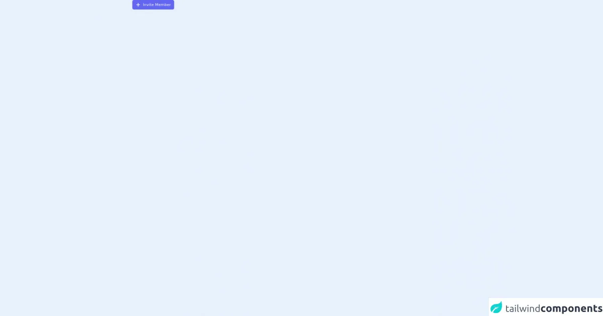
The preview of Alpine Modal ui component
The Alpine Modal UI component is a great way to display content on your website or application. It can be used to display images, videos, forms, or any other type of content that you want to show to your users.
Free download of the Alpine Modal's source code
The source code of Alpine Modal ui component
The source code for the Alpine Modal UI component is relatively simple and easy to understand. It is built using the Alpine.js JavaScript library and makes use of Tailwind CSS classes to style the modal.
<script src="https://cdn.jsdelivr.net/gh/alpinejs/[email protected]/dist/alpine.min.js" defer></script>

<div x-data="{ modelOpen: false }">
  <button
    @click="modelOpen =!modelOpen"
    class="flex transform items-center justify-center space-x-2 rounded-md bg-indigo-500 px-3 py-2 text-sm capitalize tracking-wide text-white transition-colors duration-200 hover:bg-indigo-600 focus:bg-indigo-500 focus:outline-none focus:ring focus:ring-indigo-300 focus:ring-opacity-50 dark:bg-indigo-600 dark:hover:bg-indigo-700 dark:focus:bg-indigo-700"
  >
    <svg xmlns="http://www.w3.org/2000/svg" class="h-5 w-5" viewBox="0 0 20 20" fill="currentColor">
      <path
        fill-rule="evenodd"
        d="M10 3a1 1 0 011 1v5h5a1 1 0 110 2h-5v5a1 1 0 11-2 0v-5H4a1 1 0 110-2h5V4a1 1 0 011-1z"
        clip-rule="evenodd"
      />
    </svg>

    <span>Invite Member</span>
  </button>

  <div
    x-show="modelOpen"
    class="fixed inset-0 z-50 overflow-y-auto"
    aria-labelledby="modal-title"
    role="dialog"
    aria-modal="true"
  >
    <div
      class="flex min-h-screen items-end justify-center px-4 text-center sm:block sm:p-0 md:items-center"
    >
      <div
        x-cloak
        @click="modelOpen = false"
        x-show="modelOpen"
        x-transition:enter="transition ease-out duration-300 transform"
        x-transition:enter-start="opacity-0"
        x-transition:enter-end="opacity-100"
        x-transition:leave="transition ease-in duration-200 transform"
        x-transition:leave-start="opacity-100"
        x-transition:leave-end="opacity-0"
        class="fixed inset-0 bg-gray-500 bg-opacity-40 transition-opacity"
        aria-hidden="true"
      ></div>

      <div
        x-cloak
        x-show="modelOpen"
        x-transition:enter="transition ease-out duration-300 transform"
        x-transition:enter-start="opacity-0 translate-y-4 sm:translate-y-0 sm:scale-95"
        x-transition:enter-end="opacity-100 translate-y-0 sm:scale-100"
        x-transition:leave="transition ease-in duration-200 transform"
        x-transition:leave-start="opacity-100 translate-y-0 sm:scale-100"
        x-transition:leave-end="opacity-0 translate-y-4 sm:translate-y-0 sm:scale-95"
        class="my-20 inline-block w-full max-w-xl transform overflow-hidden rounded-lg bg-white p-8 text-left shadow-xl transition-all 2xl:max-w-2xl"
      >
        <div class="flex items-center justify-between space-x-4">
          <h1 class="text-xl font-medium text-gray-800 ">Invite team memebr</h1>

          <button
            @click="modelOpen = false"
            class="text-gray-600 hover:text-gray-700 focus:outline-none"
          >
            <svg
              xmlns="http://www.w3.org/2000/svg"
              class="h-6 w-6"
              fill="none"
              viewBox="0 0 24 24"
              stroke="currentColor"
            >
              <path
                stroke-linecap="round"
                stroke-linejoin="round"
                stroke-width="2"
                d="M10 14l2-2m0 0l2-2m-2 2l-2-2m2 2l2 2m7-2a9 9 0 11-18 0 9 9 0 0118 0z"
              />
            </svg>
          </button>
        </div>

        <p class="mt-2 text-sm text-gray-500 ">
          Add your teammate to your team and start work to get things done
        </p>

        <form class="mt-5">
          <div>
            <label for="user name" class="block text-sm capitalize text-gray-700 dark:text-gray-200"
              >Teammate name</label
            >
            <input
              placeholder="Arthur Melo"
              type="text"
              class="mt-2 block w-full rounded-md border border-gray-200 bg-white px-3 py-2 text-gray-600 placeholder-gray-400 focus:border-indigo-400 focus:outline-none focus:ring focus:ring-indigo-300 focus:ring-opacity-40"
            />
          </div>

          <div class="mt-4">
            <label for="email" class="block text-sm capitalize text-gray-700 dark:text-gray-200"
              >Teammate email</label
            >
            <input
              placeholder="[email protected]"
              type="email"
              class="mt-2 block w-full rounded-md border border-gray-200 bg-white px-3 py-2 text-gray-600 placeholder-gray-400 focus:border-indigo-400 focus:outline-none focus:ring focus:ring-indigo-300 focus:ring-opacity-40"
            />
          </div>

          <div class="mt-4">
            <h1 class="text-xs font-medium uppercase text-gray-400">Permissions</h1>

            <div class="mt-4 space-y-5">
              <div
                class="flex cursor-pointer items-center space-x-3"
                x-data="{ show: true }"
                @click="show =!show"
              >
                <div
                  class="relative h-5 w-10 rounded-full transition duration-200 ease-linear"
                  :class="[show ? 'bg-indigo-500' : 'bg-gray-300']"
                >
                  <label
                    for="show"
                    @click="show =!show"
                    class="absolute left-0 mb-2 h-5 w-5 transform cursor-pointer rounded-full border-2 bg-white transition duration-100 ease-linear"
                    :class="[show ? 'translate-x-full border-indigo-500' : 'translate-x-0 border-gray-300']"
                  ></label>
                  <input
                    type="checkbox"
                    name="show"
                    class="hidden h-full w-full appearance-none rounded-full focus:outline-none active:outline-none"
                  />
                </div>

                <p class="text-gray-500">Can make task</p>
              </div>

              <div
                class="flex cursor-pointer items-center space-x-3"
                x-data="{ show: false }"
                @click="show =!show"
              >
                <div
                  class="relative h-5 w-10 rounded-full transition duration-200 ease-linear"
                  :class="[show ? 'bg-indigo-500' : 'bg-gray-300']"
                >
                  <label
                    for="show"
                    @click="show =!show"
                    class="absolute left-0 mb-2 h-5 w-5 transform cursor-pointer rounded-full border-2 bg-white transition duration-100 ease-linear"
                    :class="[show ? 'translate-x-full border-indigo-500' : 'translate-x-0 border-gray-300']"
                  ></label>
                  <input
                    type="checkbox"
                    name="show"
                    class="hidden h-full w-full appearance-none rounded-full focus:outline-none active:outline-none"
                  />
                </div>

                <p class="text-gray-500">Can delete task</p>
              </div>

              <div
                class="flex cursor-pointer items-center space-x-3"
                x-data="{ show: true }"
                @click="show =!show"
              >
                <div
                  class="relative h-5 w-10 rounded-full transition duration-200 ease-linear"
                  :class="[show ? 'bg-indigo-500' : 'bg-gray-300']"
                >
                  <label
                    for="show"
                    @click="show =!show"
                    class="absolute left-0 mb-2 h-5 w-5 transform cursor-pointer rounded-full border-2 bg-white transition duration-100 ease-linear"
                    :class="[show ? 'translate-x-full border-indigo-500' : 'translate-x-0 border-gray-300']"
                  ></label>
                  <input
                    type="checkbox"
                    name="show"
                    class="hidden h-full w-full appearance-none rounded-full focus:outline-none active:outline-none"
                  />
                </div>

                <p class="text-gray-500">Can edit task</p>
              </div>
            </div>
          </div>

          <div class="mt-6 flex justify-end">
            <button
              type="button"
              class="transform rounded-md bg-indigo-500 px-3 py-2 text-sm capitalize tracking-wide text-white transition-colors duration-200 hover:bg-indigo-600 focus:bg-indigo-500 focus:outline-none focus:ring focus:ring-indigo-300 focus:ring-opacity-50 dark:bg-indigo-600 dark:hover:bg-indigo-700 dark:focus:bg-indigo-700"
            >
              Invite Member
            </button>
          </div>
        </form>
      </div>
    </div>
  </div>
</div>
How to create a Alpine Modal with Tailwind CSS?
To create an Alpine Modal with Tailwind CSS, you will need to follow these steps:
- Include the Alpine.js JavaScript library in your HTML file.
- Create the HTML markup for the modal and add the necessary Tailwind CSS classes.
- Add the Alpine.js code to toggle the modal when a button is clicked.
- Customize the styles as needed.
Let's take a closer look at each of these steps.
Step 1: Include the Alpine.js JavaScript library
To use Alpine.js, you will need to include the script tag in your HTML file. You can do this by adding the following code to the head of your HTML file:
<head>
  <script src="https://cdn.jsdelivr.net/npm/[email protected]"></script>
</head>
Step 2: Create the HTML markup for the modal
To create the HTML markup for the modal, you will need to add a few elements to your HTML file. Here's an example of what the markup might look like:
<div x-data="{ show: false }">
  <button @click="show = true">Open Modal</button>

  <!-- Modal -->
  <div class="fixed z-10 inset-0 overflow-y-auto" x-show="show">
    <div class="flex items-end justify-center min-h-screen pt-4 px-4 pb-20 text-center sm:block sm:p-0">
      <!-- Background -->
      <div class="fixed inset-0 transition-opacity" aria-hidden="true">
        <div class="absolute inset-0 bg-gray-500 opacity-75"></div>
      </div>

      <!-- Modal Panel -->
      <div class="inline-block align-bottom bg-white rounded-lg text-left overflow-hidden shadow-xl transform transition-all sm:my-8 sm:align-middle sm:max-w-lg sm:w-full" role="dialog" aria-modal="true" aria-labelledby="modal-headline">
        <div class="bg-white px-4 pt-5 pb-4 sm:p-6 sm:pb-4">
          <div class="sm:flex sm:items-start">
            <div class="mx-auto flex-shrink-0 flex items-center justify-center h-12 w-12 rounded-full bg-green-100 sm:mx-0 sm:h-10 sm:w-10">
              <!-- Heroicon name: outline/check -->
              <svg class="h-6 w-6 text-green-600" xmlns="http://www.w3.org/2000/svg" fill="none" viewBox="0 0 24 24" stroke="currentColor" aria-hidden="true">
                <path stroke-linecap="round" stroke-linejoin="round" stroke-width="2" d="M5 13l4 4L19 7"></path>
              </svg>
            </div>
            <div class="mt-3 text-center sm:mt-0 sm:ml-4 sm:text-left">
              <h3 class="text-lg leading-6 font-medium text-gray-900" id="modal-headline">
                Payment successful
              </h3>
              <div class="mt-2">
                <p class="text-sm text-gray-500">
                  Lorem ipsum dolor sit amet consectetur adipisicing elit. Consequatur amet labore.
                </p>
              </div>
            </div>
          </div>
        </div>
        <div class="bg-gray-50 px-4 py-3 sm:px-6 sm:flex sm:flex-row-reverse">
          <button type="button" class="w-full inline-flex justify-center rounded-md border border-transparent shadow-sm px-4 py-2 bg-green-600 text-base font-medium text-white hover:bg-green-700 focus:outline-none focus:ring-2 focus:ring-offset-2 focus:ring-green-500 sm:ml-3 sm:w-auto sm:text-sm">
            Accept
          </button>
          <button @click="show = false" type="button" class="mt-3 w-full inline-flex justify-center rounded-md border border-gray-300 shadow-sm px-4 py-2 bg-white text-base font-medium text-gray-700 hover:bg-gray-50 focus:outline-none focus:ring-2 focus:ring-offset-2 focus:ring-gray-500 sm:mt-0 sm:ml-3 sm:w-auto sm:text-sm">
            Cancel
          </button>
        </div>
      </div>
    </div>
  </div>
</div>
In this example, we have a button that, when clicked, will toggle the modal. The modal itself is contained within a div that has the x-show attribute set to a variable called show. This variable is set to false by default and will be toggled to true when the button is clicked.
Step 3: Add the Alpine.js code to toggle the modal
To add the Alpine.js code to toggle the modal, you will need to add the following code to your HTML file:
<script>
  // Alpine.js code
  window.Alpine = require('alpinejs');

  // Toggle the modal when the button is clicked
  document.querySelector('button').addEventListener('click', () => {
    document.querySelector('.modal').classList.toggle('hidden');
  });
</script>
This code sets up the Alpine.js library and adds an event listener to the button that toggles the hidden class on the modal when the button is clicked.
Step 4: Customize the styles as needed
To customize the styles of the modal, you can modify the Tailwind CSS classes that are used in the HTML markup. For example, you can change the background color, font size, or padding of the modal by modifying the corresponding classes.
Conclusion
Creating an Alpine Modal with Tailwind CSS is a great way to add a professional-looking dialog box to your website or application. By using the pre-defined Tailwind CSS classes, you can easily customize the styles of the modal to fit your specific needs. Additionally, the Alpine.js library makes it easy to toggle the modal with just a few lines of code.