- Published on
Create A Alerts With Tailwind CSS Like A Pro With The Help Of These 6 Tips
- What is Tailwind CSS?
- The description of alerts UI component
- Why use Tailwind CSS to create an alerts UI component?
- The preview of alerts UI component
- The source code of alerts UI component
- How to create an alerts with Tailwind CSS?
- 1. Choose the right color
- 2. Use the right font size
- 3. Use the right padding and margin
- 4. Use the right border
- 5. Use the right icon
- 6. Use the right animation
- Conclusion
As a FrontEnd technology blogger, you must have heard of Tailwind CSS. It is a utility-first CSS framework that helps developers to quickly create responsive and customizable UI components. In this article, we will focus on creating alerts with Tailwind CSS. We will provide you with 6 tips to create professional-looking alerts that will enhance the user experience of your website.
What is Tailwind CSS?
Tailwind CSS is a utility-first CSS framework that provides a set of pre-defined classes to create UI components. It allows developers to create custom designs without writing any CSS code. Tailwind CSS is easy to learn and use, and it is highly customizable.
The description of alerts UI component
Alerts are UI components that are used to display important information to the user. They are commonly used to notify users of errors, warnings, or success messages. Alerts can be displayed in different styles, such as success, warning, danger, and info.
Why use Tailwind CSS to create an alerts UI component?
Tailwind CSS provides a set of pre-defined classes that can be used to create alerts quickly and easily. These classes can be customized to match the design of your website. Using Tailwind CSS will save you time and effort in creating alerts from scratch.
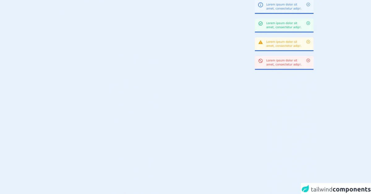
The preview of alerts UI component
Alerts can be displayed in different styles, such as success, warning, danger, and info. They can also be customized to match the design of your website.
Free download of the alerts's source code
The source code of alerts UI component
To create alerts with Tailwind CSS, you need to use the pre-defined classes provided by the framework. These classes can be customized to match the design of your website.
<div class="container text-white">
  <div class="ml-auto mr-3 flex w-72 flex-col gap-2 border-b-4 border-b-blue-600">
    <div class="rounded-t bg-blue-50 px-4 py-3 text-blue-900" role="alert">
      <div class="flex">
        <div>
          <svg
            class="mr-4 h-6 w-6 fill-current text-blue-500"
            xmlns="http://www.w3.org/2000/svg"
            viewBox="0 0 20 20"
          >
            <path
              d="M2.93 17.07A10 10 0 1 1 17.07 2.93 10 10 0 0 1 2.93 17.07zm12.73-1.41A8 8 0 1 0 4.34 4.34a8 8 0 0 0 11.32 11.32zM9 11V9h2v6H9v-4zm0-6h2v2H9V5z"
            />
          </svg>
        </div>
        <div>
          <p class="text-sm text-blue-500">Lorem ipsum dolor sit amet, consectetur adip!.</p>
        </div>
        <p class="flex cursor-pointer">
          <svg
            class="text-xl text-blue-500"
            stroke="currentColor"
            fill="currentColor"
            stroke-width="0"
            viewBox="0 0 1024 1024"
            height="1em"
            width="1em"
            xmlns="http://www.w3.org/2000/svg"
          >
            <path
              d="M685.4 354.8c0-4.4-3.6-8-8-8l-66 .3L512 465.6l-99.3-118.4-66.1-.3c-4.4 0-8 3.5-8 8 0 1.9.7 3.7 1.9 5.2l130.1 155L340.5 670a8.32 8.32 0 0 0-1.9 5.2c0 4.4 3.6 8 8 8l66.1-.3L512 564.4l99.3 118.4 66 .3c4.4 0 8-3.5 8-8 0-1.9-.7-3.7-1.9-5.2L553.5 515l130.1-155c1.2-1.4 1.8-3.3 1.8-5.2z"
            ></path>
            <path
              d="M512 65C264.6 65 64 265.6 64 513s200.6 448 448 448 448-200.6 448-448S759.4 65 512 65zm0 820c-205.4 0-372-166.6-372-372s166.6-372 372-372 372 166.6 372 372-166.6 372-372 372z"
            ></path>
          </svg>
        </p>
      </div>
    </div>
  </div>
  <br />
  <div class="ml-auto mr-3 flex w-72 flex-col gap-2 border-b-4 border-b-blue-600">
    <div class="rounded-t bg-green-50 px-4 py-3 text-green-900" role="alert">
      <div class="flex">
        <div>
          <svg
            class="mr-4 h-6 w-6 fill-current text-green-500"
            xmlns="http://www.w3.org/2000/svg"
            xmlns:xlink="http://www.w3.org/1999/xlink"
            aria-hidden="true"
            role="img"
            preserveAspectRatio="xMidYMid meet"
            viewBox="0 0 24 24"
          >
            <path
              d="M12 2C6.5 2 2 6.5 2 12s4.5 10 10 10s10-4.5 10-10S17.5 2 12 2m0 18c-4.41 0-8-3.59-8-8s3.59-8 8-8s8 3.59 8 8s-3.59 8-8 8m4.59-12.42L10 14.17l-2.59-2.58L6 13l4 4l8-8l-1.41-1.42z"
            />
          </svg>
        </div>
        <div>
          <p class="text-sm text-green-500">Lorem ipsum dolor sit amet, consectetur adip!.</p>
        </div>

        <p class="flex cursor-pointer">
          <svg
            class="text-xl text-green-500"
            stroke="currentColor"
            fill="currentColor"
            stroke-width="0"
            viewBox="0 0 1024 1024"
            height="1em"
            width="1em"
            xmlns="http://www.w3.org/2000/svg"
          >
            <path
              d="M685.4 354.8c0-4.4-3.6-8-8-8l-66 .3L512 465.6l-99.3-118.4-66.1-.3c-4.4 0-8 3.5-8 8 0 1.9.7 3.7 1.9 5.2l130.1 155L340.5 670a8.32 8.32 0 0 0-1.9 5.2c0 4.4 3.6 8 8 8l66.1-.3L512 564.4l99.3 118.4 66 .3c4.4 0 8-3.5 8-8 0-1.9-.7-3.7-1.9-5.2L553.5 515l130.1-155c1.2-1.4 1.8-3.3 1.8-5.2z"
            ></path>
            <path
              d="M512 65C264.6 65 64 265.6 64 513s200.6 448 448 448 448-200.6 448-448S759.4 65 512 65zm0 820c-205.4 0-372-166.6-372-372s166.6-372 372-372 372 166.6 372 372-166.6 372-372 372z"
            ></path>
          </svg>
        </p>
      </div>
    </div>
  </div>
  <br />
  <div class="ml-auto mr-3 flex w-72 flex-col gap-2 border-b-4 border-b-blue-600">
    <div class="rounded-t bg-yellow-50 px-4 py-3 text-yellow-900" role="alert">
      <div class="flex">
        <div>
          <svg
            class="mr-4 h-6 w-6 fill-current text-yellow-500"
            xmlns="http://www.w3.org/2000/svg"
            xmlns:xlink="http://www.w3.org/1999/xlink"
            aria-hidden="true"
            role="img"
            preserveAspectRatio="xMidYMid meet"
            viewBox="0 0 24 24"
          >
            <path d="M13 14h-2V9h2m0 9h-2v-2h2M1 21h22L12 2L1 21z" />
          </svg>
        </div>
        <div>
          <p class="text-sm text-yellow-500">Lorem ipsum dolor sit amet, consectetur adip!.</p>
        </div>

        <p class="flex cursor-pointer">
          <svg
            class="text-xl text-yellow-500"
            stroke="currentColor"
            fill="currentColor"
            stroke-width="0"
            viewBox="0 0 1024 1024"
            height="1em"
            width="1em"
            xmlns="http://www.w3.org/2000/svg"
          >
            <path
              d="M685.4 354.8c0-4.4-3.6-8-8-8l-66 .3L512 465.6l-99.3-118.4-66.1-.3c-4.4 0-8 3.5-8 8 0 1.9.7 3.7 1.9 5.2l130.1 155L340.5 670a8.32 8.32 0 0 0-1.9 5.2c0 4.4 3.6 8 8 8l66.1-.3L512 564.4l99.3 118.4 66 .3c4.4 0 8-3.5 8-8 0-1.9-.7-3.7-1.9-5.2L553.5 515l130.1-155c1.2-1.4 1.8-3.3 1.8-5.2z"
            ></path>
            <path
              d="M512 65C264.6 65 64 265.6 64 513s200.6 448 448 448 448-200.6 448-448S759.4 65 512 65zm0 820c-205.4 0-372-166.6-372-372s166.6-372 372-372 372 166.6 372 372-166.6 372-372 372z"
            ></path>
          </svg>
        </p>
      </div>
    </div>
  </div>
  <br />
  <div class="ml-auto mr-3 flex w-72 flex-col gap-2 border-b-4 border-b-blue-600">
    <div class="rounded-t bg-red-50 px-4 py-3 text-red-900" role="alert">
      <div class="flex">
        <div>
          <svg
            class="mr-4 h-6 w-6 fill-current text-red-500"
            xmlns="http://www.w3.org/2000/svg"
            xmlns:xlink="http://www.w3.org/1999/xlink"
            aria-hidden="true"
            role="img"
            preserveAspectRatio="xMidYMid meet"
            viewBox="0 0 24 24"
          >
            <path
              d="M12 2c5.5 0 10 4.5 10 10s-4.5 10-10 10S2 17.5 2 12S6.5 2 12 2m0 2c-1.9 0-3.6.6-4.9 1.7l11.2 11.2c1-1.4 1.7-3.1 1.7-4.9c0-4.4-3.6-8-8-8m4.9 14.3L5.7 7.1C4.6 8.4 4 10.1 4 12c0 4.4 3.6 8 8 8c1.9 0 3.6-.6 4.9-1.7z"
            />
          </svg>
        </div>
        <div>
          <p class="text-sm text-red-500">Lorem ipsum dolor sit amet, consectetur adip!.</p>
        </div>

        <p class="flex cursor-pointer">
          <svg
            class="text-xl text-red-500"
            stroke="currentColor"
            fill="currentColor"
            stroke-width="0"
            viewBox="0 0 1024 1024"
            height="1em"
            width="1em"
            xmlns="http://www.w3.org/2000/svg"
          >
            <path
              d="M685.4 354.8c0-4.4-3.6-8-8-8l-66 .3L512 465.6l-99.3-118.4-66.1-.3c-4.4 0-8 3.5-8 8 0 1.9.7 3.7 1.9 5.2l130.1 155L340.5 670a8.32 8.32 0 0 0-1.9 5.2c0 4.4 3.6 8 8 8l66.1-.3L512 564.4l99.3 118.4 66 .3c4.4 0 8-3.5 8-8 0-1.9-.7-3.7-1.9-5.2L553.5 515l130.1-155c1.2-1.4 1.8-3.3 1.8-5.2z"
            ></path>
            <path
              d="M512 65C264.6 65 64 265.6 64 513s200.6 448 448 448 448-200.6 448-448S759.4 65 512 65zm0 820c-205.4 0-372-166.6-372-372s166.6-372 372-372 372 166.6 372 372-166.6 372-372 372z"
            ></path>
          </svg>
        </p>
      </div>
    </div>
  </div>
</div>
How to create an alerts with Tailwind CSS?
Here are 6 tips to create alerts with Tailwind CSS:
1. Choose the right color
The color of your alert should match the type of message you want to convey. For example, a success message should be displayed in green, while a warning message should be displayed in yellow. Tailwind CSS provides a set of pre-defined colors that you can use to create alerts.
2. Use the right font size
The font size of your alert should be large enough to be easily readable. It should also be consistent with the font size of your website. Tailwind CSS provides a set of pre-defined font sizes that you can use to create alerts.
3. Use the right padding and margin
The padding and margin of your alert should be consistent with the design of your website. It should also provide enough space for the content of your alert. Tailwind CSS provides a set of pre-defined padding and margin classes that you can use to create alerts.
4. Use the right border
The border of your alert should be consistent with the design of your website. It should also provide enough contrast to make the alert stand out. Tailwind CSS provides a set of pre-defined border classes that you can use to create alerts.
5. Use the right icon
The icon of your alert should match the type of message you want to convey. For example, a success message should be displayed with a checkmark icon, while a warning message should be displayed with a warning icon. Tailwind CSS provides a set of pre-defined icons that you can use to create alerts.
6. Use the right animation
The animation of your alert should be smooth and consistent with the design of your website. It should also provide enough feedback to the user. Tailwind CSS provides a set of pre-defined animation classes that you can use to create alerts.
Conclusion
In this article, we have provided you with 6 tips to create alerts with Tailwind CSS. We have shown you how to choose the right color, font size, padding and margin, border, icon, and animation for your alerts. By following these tips, you can create professional-looking alerts that will enhance the user experience of your website.