- Published on
Imagine You Build A Alert Messages With Tailwind CSS Like An Expert. Follow These 6 Steps To Get There
- What is Tailwind CSS?
- The description of Alert messages ui component
- Why use Tailwind CSS to create a Alert messages ui component?
- The preview of Alert messages ui component
- The source code of Alert messages ui component
- How to create a Alert messages with Tailwind CSS?
- Step 1: Create the HTML structure
- Step 2: Add Tailwind CSS classes
- Step 3: Add border classes
- Step 4: Add text classes
- Step 5: Add padding and margin classes
- Step 6: Add dismiss button
- Conclusion
Are you looking to create an alert messages ui component for your website or application? Look no further than Tailwind CSS. With its vast collection of pre-built classes, Tailwind CSS makes it easy to create beautiful and functional UI components quickly and efficiently. In this article, we'll walk you through the steps to build an alert messages ui component using Tailwind CSS.
What is Tailwind CSS?
Tailwind CSS is a utility-first CSS framework that provides a collection of pre-built classes that can be used to create custom and responsive user interfaces. Unlike traditional CSS frameworks that rely on pre-built components, Tailwind CSS provides low-level utility classes that can be combined to create custom styles for your UI components.
The description of Alert messages ui component
An alert messages ui component is a common feature in web and mobile applications. It is used to display important information to the user, such as error messages, success messages, or warnings. Alert messages are typically displayed at the top of the screen and are designed to catch the user's attention.
Why use Tailwind CSS to create a Alert messages ui component?
Tailwind CSS provides a collection of pre-built classes that can be used to create custom and responsive UI components quickly and efficiently. By using Tailwind CSS, you can save time and effort in creating your UI components, allowing you to focus on the functionality of your application.
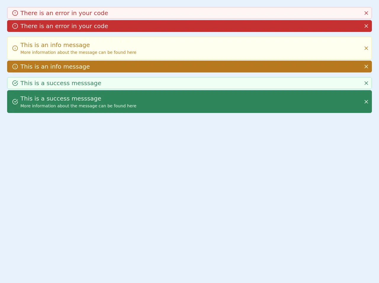
The preview of Alert messages ui component
To create an alert messages ui component with Tailwind CSS, we'll start by creating a basic HTML structure. We'll use the bg-red-100, border-red-400, and text-red-700 classes to create a red alert message with a light background, a dark border, and dark text.
Free download of the Alert messages's source code
The source code of Alert messages ui component
To create the alert messages ui component, we'll use a combination of HTML and Tailwind CSS classes. We'll start by creating a basic HTML structure for the alert message, then use Tailwind CSS classes to style the alert message.
<div class="p-5">
  <div>
    <div
      class="m-1 flex items-center justify-center rounded-md border border-red-300 bg-white bg-red-100 py-1 px-2 font-medium text-red-700 "
    >
      <div slot="avatar">
        <svg
          xmlns="http://www.w3.org/2000/svg"
          width="100%"
          height="100%"
          fill="none"
          viewBox="0 0 24 24"
          stroke="currentColor"
          stroke-width="2"
          stroke-linecap="round"
          stroke-linejoin="round"
          class="feather feather-alert-octagon mx-2 h-5 w-5"
        >
          <polygon
            points="7.86 2 16.14 2 22 7.86 22 16.14 16.14 22 7.86 22 2 16.14 2 7.86 7.86 2"
          ></polygon>
          <line x1="12" y1="8" x2="12" y2="12"></line>
          <line x1="12" y1="16" x2="12.01" y2="16"></line>
        </svg>
      </div>
      <div class="max-w-full flex-initial  text-xl font-normal">There is an error in your code</div>
      <div class="flex flex-auto flex-row-reverse">
        <div>
          <svg
            xmlns="http://www.w3.org/2000/svg"
            width="100%"
            height="100%"
            fill="none"
            viewBox="0 0 24 24"
            stroke="currentColor"
            stroke-width="2"
            stroke-linecap="round"
            stroke-linejoin="round"
            class="feather feather-x ml-2 h-5 w-5 cursor-pointer rounded-full hover:text-red-400"
          >
            <line x1="18" y1="6" x2="6" y2="18"></line>
            <line x1="6" y1="6" x2="18" y2="18"></line>
          </svg>
        </div>
      </div>
    </div>
    <div
      class="m-1 flex items-center justify-center rounded-md border border-red-700 bg-white bg-red-700 py-1 px-2 font-medium text-red-100 "
    >
      <div slot="avatar">
        <svg
          xmlns="http://www.w3.org/2000/svg"
          width="100%"
          height="100%"
          fill="none"
          viewBox="0 0 24 24"
          stroke="currentColor"
          stroke-width="2"
          stroke-linecap="round"
          stroke-linejoin="round"
          class="feather feather-alert-octagon mx-2 h-5 w-5"
        >
          <polygon
            points="7.86 2 16.14 2 22 7.86 22 16.14 16.14 22 7.86 22 2 16.14 2 7.86 7.86 2"
          ></polygon>
          <line x1="12" y1="8" x2="12" y2="12"></line>
          <line x1="12" y1="16" x2="12.01" y2="16"></line>
        </svg>
      </div>
      <div class="max-w-full flex-initial  text-xl font-normal">There is an error in your code</div>
      <div class="flex flex-auto flex-row-reverse">
        <div>
          <svg
            xmlns="http://www.w3.org/2000/svg"
            width="100%"
            height="100%"
            fill="none"
            viewBox="0 0 24 24"
            stroke="currentColor"
            stroke-width="2"
            stroke-linecap="round"
            stroke-linejoin="round"
            class="feather feather-x ml-2 h-5 w-5 cursor-pointer rounded-full hover:text-red-400"
          >
            <line x1="18" y1="6" x2="6" y2="18"></line>
            <line x1="6" y1="6" x2="18" y2="18"></line>
          </svg>
        </div>
      </div>
    </div>
    <div class="mt-4"></div>
    <div
      class="m-1 flex items-center justify-center rounded-md border border-yellow-300 bg-white bg-yellow-100 py-1 px-2 font-medium text-yellow-700 "
    >
      <div slot="avatar">
        <svg
          xmlns="http://www.w3.org/2000/svg"
          width="100%"
          height="100%"
          fill="none"
          viewBox="0 0 24 24"
          stroke="currentColor"
          stroke-width="2"
          stroke-linecap="round"
          stroke-linejoin="round"
          class="feather feather-info mx-2 h-5 w-5"
        >
          <circle cx="12" cy="12" r="10"></circle>
          <line x1="12" y1="16" x2="12" y2="12"></line>
          <line x1="12" y1="8" x2="12.01" y2="8"></line>
        </svg>
      </div>
      <div class="max-w-full flex-initial  text-xl font-normal">
        <div class="py-2">
          This is an info message
          <div class="font-base text-sm">
            More information about the message can be found <a href="/#">here</a>
          </div>
        </div>
      </div>
      <div class="flex flex-auto flex-row-reverse">
        <div>
          <svg
            xmlns="http://www.w3.org/2000/svg"
            width="100%"
            height="100%"
            fill="none"
            viewBox="0 0 24 24"
            stroke="currentColor"
            stroke-width="2"
            stroke-linecap="round"
            stroke-linejoin="round"
            class="feather feather-x ml-2 h-5 w-5 cursor-pointer rounded-full hover:text-yellow-400"
          >
            <line x1="18" y1="6" x2="6" y2="18"></line>
            <line x1="6" y1="6" x2="18" y2="18"></line>
          </svg>
        </div>
      </div>
    </div>
    <div
      class="m-1 flex items-center justify-center rounded-md border border-yellow-700 bg-white bg-yellow-700 py-1 px-2 font-medium text-yellow-100 "
    >
      <div slot="avatar">
        <svg
          xmlns="http://www.w3.org/2000/svg"
          width="100%"
          height="100%"
          fill="none"
          viewBox="0 0 24 24"
          stroke="currentColor"
          stroke-width="2"
          stroke-linecap="round"
          stroke-linejoin="round"
          class="feather feather-info mx-2 h-5 w-5"
        >
          <circle cx="12" cy="12" r="10"></circle>
          <line x1="12" y1="16" x2="12" y2="12"></line>
          <line x1="12" y1="8" x2="12.01" y2="8"></line>
        </svg>
      </div>
      <div class="max-w-full flex-initial  text-xl font-normal">This is an info message</div>
      <div class="flex flex-auto flex-row-reverse">
        <div>
          <svg
            xmlns="http://www.w3.org/2000/svg"
            width="100%"
            height="100%"
            fill="none"
            viewBox="0 0 24 24"
            stroke="currentColor"
            stroke-width="2"
            stroke-linecap="round"
            stroke-linejoin="round"
            class="feather feather-x ml-2 h-5 w-5 cursor-pointer rounded-full hover:text-yellow-400"
          >
            <line x1="18" y1="6" x2="6" y2="18"></line>
            <line x1="6" y1="6" x2="18" y2="18"></line>
          </svg>
        </div>
      </div>
    </div>
    <div class="mt-4"></div>
    <div
      class="m-1 flex items-center justify-center rounded-md border border-green-300 bg-white bg-green-100 py-1 px-2 font-medium text-green-700 "
    >
      <div slot="avatar">
        <svg
          xmlns="http://www.w3.org/2000/svg"
          width="100%"
          height="100%"
          fill="none"
          viewBox="0 0 24 24"
          stroke="currentColor"
          stroke-width="2"
          stroke-linecap="round"
          stroke-linejoin="round"
          class="feather feather-check-circle mx-2 h-5 w-5"
        >
          <path d="M22 11.08V12a10 10 0 1 1-5.93-9.14"></path>
          <polyline points="22 4 12 14.01 9 11.01"></polyline>
        </svg>
      </div>
      <div class="max-w-full flex-initial  text-xl font-normal">This is a success messsage</div>
      <div class="flex flex-auto flex-row-reverse">
        <div>
          <svg
            xmlns="http://www.w3.org/2000/svg"
            width="100%"
            height="100%"
            fill="none"
            viewBox="0 0 24 24"
            stroke="currentColor"
            stroke-width="2"
            stroke-linecap="round"
            stroke-linejoin="round"
            class="feather feather-x ml-2 h-5 w-5 cursor-pointer rounded-full hover:text-green-400"
          >
            <line x1="18" y1="6" x2="6" y2="18"></line>
            <line x1="6" y1="6" x2="18" y2="18"></line>
          </svg>
        </div>
      </div>
    </div>
    <div
      class="m-1 flex items-center justify-center rounded-md border border-green-700 bg-white bg-green-700 py-1 px-2 font-medium text-green-100 "
    >
      <div slot="avatar">
        <svg
          xmlns="http://www.w3.org/2000/svg"
          width="100%"
          height="100%"
          fill="none"
          viewBox="0 0 24 24"
          stroke="currentColor"
          stroke-width="2"
          stroke-linecap="round"
          stroke-linejoin="round"
          class="feather feather-check-circle mx-2 h-5 w-5"
        >
          <path d="M22 11.08V12a10 10 0 1 1-5.93-9.14"></path>
          <polyline points="22 4 12 14.01 9 11.01"></polyline>
        </svg>
      </div>
      <div class="max-w-full flex-initial  text-xl font-normal">
        <div class="py-2">
          This is a success messsage
          <div class="font-base text-sm">
            More information about the message can be found <a href="/#">here</a>
          </div>
        </div>
      </div>
      <div class="flex flex-auto flex-row-reverse">
        <div>
          <svg
            xmlns="http://www.w3.org/2000/svg"
            width="100%"
            height="100%"
            fill="none"
            viewBox="0 0 24 24"
            stroke="currentColor"
            stroke-width="2"
            stroke-linecap="round"
            stroke-linejoin="round"
            class="feather feather-x ml-2 h-5 w-5 cursor-pointer rounded-full hover:text-green-400"
          >
            <line x1="18" y1="6" x2="6" y2="18"></line>
            <line x1="6" y1="6" x2="18" y2="18"></line>
          </svg>
        </div>
      </div>
    </div>
  </div>
</div>
How to create a Alert messages with Tailwind CSS?
Now that we have a basic understanding of Tailwind CSS and the alert messages ui component, let's dive into the steps to create an alert messages ui component with Tailwind CSS.
Step 1: Create the HTML structure
The first step in creating an alert messages ui component is to create the HTML structure. We'll start by creating a div element with a class of alert. Inside the div element, we'll add a p element to display the alert message text.
<div class="alert">
  <p>Alert message text goes here.</p>
</div>
Step 2: Add Tailwind CSS classes
Next, we'll add Tailwind CSS classes to style the alert message. We'll start by adding the bg-red-100 class to give the alert message a light red background.
<div class="alert bg-red-100">
  <p>Alert message text goes here.</p>
</div>
Step 3: Add border classes
To add a border to the alert message, we'll add the border and border-red-400 classes. The border class adds a default border to the element, while the border-red-400 class adds a dark red border to the element.
<div class="alert bg-red-100 border border-red-400">
  <p>Alert message text goes here.</p>
</div>
Step 4: Add text classes
To style the text of the alert message, we'll add the text-red-700 class. This class sets the text color to a dark red.
<div class="alert bg-red-100 border border-red-400 text-red-700">
  <p>Alert message text goes here.</p>
</div>
Step 5: Add padding and margin classes
To add some space between the alert message and the surrounding elements, we'll add the p-4 class to add padding to the alert message, and the mb-4 class to add margin to the bottom of the alert message.
<div class="alert bg-red-100 border border-red-400 text-red-700 p-4 mb-4">
  <p>Alert message text goes here.</p>
</div>
Step 6: Add dismiss button
Finally, we'll add a dismiss button to the alert message. We'll use the flex and justify-between classes to align the button to the right of the alert message. We'll also use the hover:bg-red-200 class to change the background color of the button when the user hovers over it.
<div class="alert bg-red-100 border border-red-400 text-red-700 p-4 mb-4 flex justify-between">
  <p>Alert message text goes here.</p>
  <button class="bg-red-400 text-white px-4 py-2 rounded hover:bg-red-200">Dismiss</button>
</div>
And there you have it! A fully functional alert messages ui component created with Tailwind CSS.
Conclusion
In this article, we've walked through the steps to create an alert messages ui component using Tailwind CSS. By using Tailwind CSS, we were able to create a beautiful and functional UI component quickly and efficiently. We hope that this article has been helpful in getting you started with Tailwind CSS and creating your own UI components.