- Published on
6 Easy Ways To Build A Airbnb-like Navbar With Tailwind CSS
- What is Tailwind CSS?
- The description of Airbnb-like Navbar ui component
- Why use Tailwind CSS to create a Airbnb-like Navbar ui component?
- The preview of Airbnb-like Navbar ui component.
- The source code of Airbnb-like Navbar ui component.
- How to create a Airbnb-like Navbar with Tailwind CSS?
- Conclusion
As a FrontEnd technology blogger, you may have heard of Tailwind CSS, a utility-first CSS framework that lets you design web pages without writing custom CSS. It's a popular choice for developers who want to create beautiful and responsive UI components quickly and efficiently. In this article, we'll show you how to build an Airbnb-like Navbar using Tailwind CSS.
What is Tailwind CSS?
Tailwind CSS is a CSS framework that provides a set of pre-defined classes that you can use to style your HTML elements. Unlike other CSS frameworks, Tailwind CSS doesn't come with pre-designed components. Instead, it provides a set of utility classes that you can use to create your own custom components.
The description of Airbnb-like Navbar ui component
An Airbnb-like Navbar is a UI component that's commonly used on websites to help users navigate through the site. It typically consists of a logo, a search bar, and a set of links to different sections of the website. The Airbnb-like Navbar is a popular choice for websites that want to provide a clean and modern user interface.
Why use Tailwind CSS to create a Airbnb-like Navbar ui component?
Tailwind CSS provides a set of utility classes that make it easy to create responsive and beautiful UI components. Using Tailwind CSS to create an Airbnb-like Navbar can save you a lot of time and effort. Instead of writing custom CSS, you can simply use the pre-defined classes to style your Navbar.
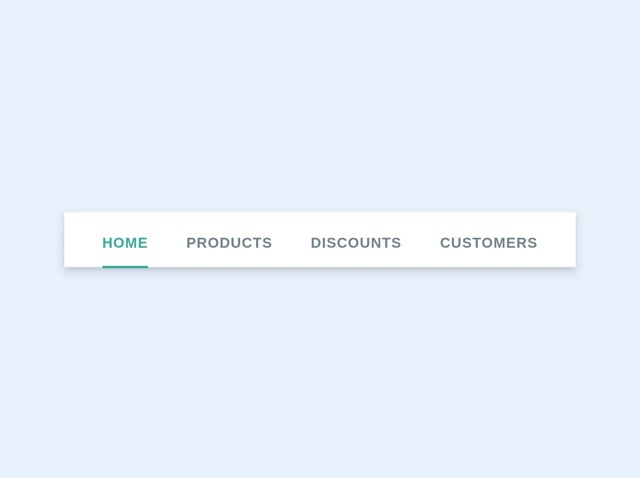
The preview of Airbnb-like Navbar ui component.
To create an Airbnb-like Navbar with Tailwind CSS, you'll need to use a combination of utility classes to style your HTML elements. Here's a preview of what the Navbar will look like:
Free download of the Airbnb-like Navbar's source code
The source code of Airbnb-like Navbar ui component.
To create the Airbnb-like Navbar, you'll need to write some HTML and CSS code. Here's the source code for the Navbar:
<nav class="bg-white px-8 pt-2 shadow-md">
  <div class="-mb-px flex justify-center">
    <a
      class="text-teal-dark border-teal-dark mr-8 border-b-2 py-3 text-xs font-bold uppercase tracking-wide no-underline"
      href="#"
    >
      Home
    </a>
    <a
      class="text-grey-dark mr-8 border-b-2 border-transparent py-3 text-xs font-bold uppercase tracking-wide no-underline"
      href="#"
    >
      Products
    </a>
    <a
      class="text-grey-dark mr-8 border-b-2 border-transparent py-3 text-xs font-bold uppercase tracking-wide no-underline"
      href="#"
    >
      Discounts
    </a>
    <a
      class="text-grey-dark border-b-2 border-transparent py-3 text-xs font-bold uppercase tracking-wide no-underline"
      href="#"
    >
      Customers
    </a>
  </div>
</nav>
How to create a Airbnb-like Navbar with Tailwind CSS?
Now that you've seen the preview and source code for the Airbnb-like Navbar, let's walk through the steps to create it.
Step 1: Set up your HTML
Start by creating a new HTML file and adding the basic structure. Add a header tag and a nav tag inside the header tag.
<!DOCTYPE html>
<html>
  <head>
    <title>Airbnb-like Navbar with Tailwind CSS</title>
  </head>
  <body>
    <header>
      <nav>
        <!-- Navbar content goes here -->
      </nav>
    </header>
  </body>
</html>
Step 2: Add the logo
Inside the nav tag, add an image tag for the logo. Use the Tailwind CSS classes to style the logo.
<nav class="flex items-center justify-between flex-wrap bg-gray-800 p-6">
  <div class="flex items-center flex-shrink-0 text-white mr-6">
    <img class="h-8 w-8" src="https://tailwindui.com/img/logos/workflow-mark-indigo-500.svg" alt="Workflow">
    <span class="font-semibold text-xl tracking-tight ml-2">Airbnb</span>
  </div>
  <!-- Navbar content goes here -->
</nav>
Step 3: Add the search bar
Next, add a search bar to the Navbar. Use the Tailwind CSS classes to style the search bar.
<nav class="flex items-center justify-between flex-wrap bg-gray-800 p-6">
  <div class="flex items-center flex-shrink-0 text-white mr-6">
    <img class="h-8 w-8" src="https://tailwindui.com/img/logos/workflow-mark-indigo-500.svg" alt="Workflow">
    <span class="font-semibold text-xl tracking-tight ml-2">Airbnb</span>
  </div>
  <div class="w-full block flex-grow lg:flex lg:items-center lg:w-auto">
    <div class="text-sm lg:flex-grow">
      <input class="bg-gray-700 appearance-none border-2 border-gray-700 rounded w-full py-2 px-4 text-gray-300 leading-tight focus:outline-none focus:bg-white focus:border-purple-500" type="text" placeholder="Search">
    </div>
  </div>
</nav>
Step 4: Add the links
Finally, add the links to the Navbar. Use the Tailwind CSS classes to style the links.
<nav class="flex items-center justify-between flex-wrap bg-gray-800 p-6">
  <div class="flex items-center flex-shrink-0 text-white mr-6">
    <img class="h-8 w-8" src="https://tailwindui.com/img/logos/workflow-mark-indigo-500.svg" alt="Workflow">
    <span class="font-semibold text-xl tracking-tight ml-2">Airbnb</span>
  </div>
  <div class="w-full block flex-grow lg:flex lg:items-center lg:w-auto">
    <div class="text-sm lg:flex-grow">
      <input class="bg-gray-700 appearance-none border-2 border-gray-700 rounded w-full py-2 px-4 text-gray-300 leading-tight focus:outline-none focus:bg-white focus:border-purple-500" type="text" placeholder="Search">
    </div>
    <div>
      <a href="#" class="block mt-4 lg:inline-block lg:mt-0 text-gray-300 hover:text-white mr-4">
        Home
      </a>
      <a href="#" class="block mt-4 lg:inline-block lg:mt-0 text-gray-300 hover:text-white mr-4">
        About
      </a>
      <a href="#" class="block mt-4 lg:inline-block lg:mt-0 text-gray-300 hover:text-white">
        Contact
      </a>
    </div>
  </div>
</nav>
Step 5: Style the Navbar
Finally, add some custom CSS to style the Navbar. You can use the Tailwind CSS classes to style the Navbar further.
<style>
  /* Custom CSS for the Navbar */
  nav a {
    font-size: 1.2rem;
  }
</style>
Conclusion
Creating an Airbnb-like Navbar with Tailwind CSS is easy and efficient. By using the pre-defined utility classes, you can create a beautiful and responsive Navbar in just a few steps. With Tailwind CSS, you can save time and effort while still creating a professional-looking UI component.