- Published on
Ultimate Guide: Make A Movie Zone Cards With Tailwind CSS
- What is Tailwind CSS?
- The description of Movie zone cards UI component
- Why use Tailwind CSS to create a Movie zone cards UI component?
- The preview of Movie zone cards UI component
- The source code of Movie zone cards UI component
- How to create a Movie zone cards with Tailwind CSS?
- Step 1: Set up your HTML
- Step 2: Style your Movie zone cards with Tailwind CSS
- Step 3: Add your movie posters
- Conclusion
Are you looking to create a stunning movie zone cards UI component for your website? Look no further than Tailwind CSS! With its easy-to-use utility classes, you can create beautiful and responsive designs in no time. In this article, we will guide you through the process of creating a movie zone cards UI component using Tailwind CSS.
What is Tailwind CSS?
Tailwind CSS is a utility-first CSS framework that provides a set of pre-defined classes that can be used to style HTML elements. It is designed to be highly customizable and easy to use, making it a popular choice for front-end developers.
The description of Movie zone cards UI component
A movie zone cards UI component is a design element that displays a collection of movie posters in a grid layout. Each poster is accompanied by the movie title and a brief description. This UI component is commonly used on movie websites and streaming platforms to showcase new releases, popular titles, and recommendations.
Why use Tailwind CSS to create a Movie zone cards UI component?
Tailwind CSS provides a set of pre-defined classes that can be used to create a responsive and visually appealing movie zone cards UI component. It also allows for easy customization, making it possible to create a unique design that fits your website's branding.
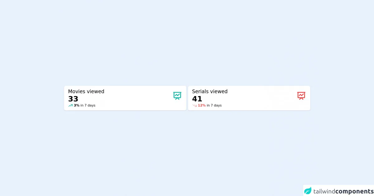
The preview of Movie zone cards UI component
To give you an idea of what the movie zone cards UI component will look like, here is a preview:
Free download of the Movie zone cards's source code
The source code of Movie zone cards UI component
Here is the source code for the movie zone cards UI component:
<div class="flex h-screen items-center">
  <div class="container mx-auto px-10 align-middle">
    <div class="grid grid-cols-2 gap-2">
      <div class="rounded-lg bg-white py-3 px-5 shadow">
        <div class="flex flex-row items-center justify-between">
          <div>
            <h6 class="text-2xl">Movies viewed</h6>
            <h4 class="text-left text-4xl font-bold text-black">33</h4>
          </div>
          <div>
            <svg
              xmlns="http://www.w3.org/2000/svg"
              class="h-12 w-12"
              fill="none"
              viewBox="0 0 24 24"
              stroke="#14B8A6"
              stroke-width="2"
            >
              <path
                stroke-linecap="round"
                stroke-linejoin="round"
                d="M7 12l3-3 3 3 4-4M8 21l4-4 4 4M3 4h18M4 4h16v12a1 1 0 01-1 1H5a1 1 0 01-1-1V4z"
              />
            </svg>
          </div>
        </div>
        <div class="flex flex-row items-center justify-start text-left">
          <span class="mr-1">
            <svg
              xmlns="http://www.w3.org/2000/svg"
              class="h-6 w-6"
              fill="none"
              viewBox="0 0 24 24"
              stroke="#14B8A6"
              stroke-width="2"
            >
              <path
                stroke-linecap="round"
                stroke-linejoin="round"
                d="M13 7h8m0 0v8m0-8l-8 8-4-4-6 6"
              />
            </svg>
          </span>
          <p><span class="font-bold text-teal-500">3%</span> in 7 days</p>
        </div>
      </div>
      <div class="rounded-lg bg-white py-3 px-5 shadow">
        <div class="flex flex-row items-center justify-between">
          <div>
            <h6 class="text-2xl">Serials viewed</h6>
            <h4 class="text-left text-4xl font-bold text-black">41</h4>
          </div>
          <div>
            <svg
              xmlns="http://www.w3.org/2000/svg"
              class="h-12 w-12"
              fill="none"
              viewBox="0 0 24 24"
              stroke="#EF4444"
              stroke-width="2"
            >
              <path
                stroke-linecap="round"
                stroke-linejoin="round"
                d="M7 12l3-3 3 3 4-4M8 21l4-4 4 4M3 4h18M4 4h16v12a1 1 0 01-1 1H5a1 1 0 01-1-1V4z"
              />
            </svg>
          </div>
        </div>
        <div class="flex flex-row items-center justify-start text-left">
          <span class="mr-1">
            <svg
              xmlns="http://www.w3.org/2000/svg"
              class="h-6 w-6"
              fill="none"
              viewBox="0 0 24 24"
              stroke="#EF4444"
              stroke-width="{2}"
            >
              <path
                stroke-linecap="round"
                stroke-linejoin="round"
                d="M13 17h8m0 0V9m0 8l-8-8-4 4-6-6"
              />
            </svg>
          </span>
          <p><span class="font-bold text-red-500">12%</span> in 7 days</p>
        </div>
      </div>
    </div>
  </div>
</div>
How to create a Movie zone cards with Tailwind CSS?
Now that you have an idea of what the movie zone cards UI component will look like and the source code, let's dive into the steps to create it using Tailwind CSS.
Step 1: Set up your HTML
Start by setting up your HTML structure. You will need a container element to hold the movie zone cards and individual card elements for each movie poster. Here is an example:
<div class="container mx-auto">
  <div class="grid grid-cols-1 sm:grid-cols-2 md:grid-cols-3 lg:grid-cols-4 gap-4">
    <div class="bg-white rounded-lg shadow-md">
      <img src="movie-poster.jpg" alt="Movie Poster" class="rounded-t-lg">
      <div class="p-4">
        <h2 class="text-lg font-bold mb-2">Movie Title</h2>
        <p class="text-gray-700">Brief description of the movie.</p>
      </div>
    </div>
    <!-- Repeat card element for each movie poster -->
  </div>
</div>
In this example, we have a container element with a grid layout that will display one column on small screens, two columns on medium screens, and four columns on large screens. Each card element has a white background, rounded corners, and a shadow. The movie poster image has rounded corners at the top, and the title and description are displayed below the image.
Step 2: Style your Movie zone cards with Tailwind CSS
Now that you have your HTML structure in place, it's time to style your movie zone cards using Tailwind CSS. Here are some of the classes you can use:
container: sets the max-width of the container element and centers it on the page.grid: sets up a grid layout for the movie zone cards.grid-cols-1,grid-cols-2,grid-cols-3,grid-cols-4: sets the number of columns in the grid layout for different screen sizes.gap-4: sets the gap between the cards.bg-white: sets the background color of the card to white.rounded-lg: adds rounded corners to the card.shadow-md: adds a shadow to the card.rounded-t-lg: adds rounded corners to the top of the movie poster image.text-lg: sets the font size of the movie title to large.font-bold: sets the font weight of the movie title to bold.text-gray-700: sets the color of the description text to gray.
You can also use Tailwind CSS's color classes to customize the background color of the cards, the font color, and the border color.
Step 3: Add your movie posters
Finally, add your movie posters to the card elements. You can do this by adding an img element with the src attribute set to the URL of the movie poster image.
<div class="bg-white rounded-lg shadow-md">
  <img src="movie-poster.jpg" alt="Movie Poster" class="rounded-t-lg">
  <div class="p-4">
    <h2 class="text-lg font-bold mb-2">Movie Title</h2>
    <p class="text-gray-700">Brief description of the movie.</p>
  </div>
</div>
Repeat this card element for each movie poster you want to display.
Conclusion
In this article, we have shown you how to create a movie zone cards UI component using Tailwind CSS. With its easy-to-use utility classes, you can create a visually appealing and responsive design in no time. We hope this guide has been helpful, and you can use it to create your own movie zone cards UI component. Happy coding!