- Published on
6 Ideas To Help You Make A Action Panel With Button On Right With Tailwind CSS Like A Pro
- What is Tailwind CSS?
- The description of Action Panel with button on right ui component
- Why use Tailwind CSS to create a Action Panel with button on right ui component?
- The preview of Action Panel with button on right ui component
- The source code of Action Panel with button on right ui component
- How to create a Action Panel with button on right with Tailwind CSS?
- Step 1: Set up your HTML file
- Step 2: Style the button and panel
- Step 3: Add the list of options
- Step 4: Add the relative class to the container
- Step 5: Customize the styles
- Conclusion
What is Tailwind CSS?
Tailwind CSS is a utility-first CSS framework that helps you quickly build responsive and customizable user interfaces. It provides a set of pre-defined classes that you can use to style your HTML elements without writing any CSS code. With Tailwind CSS, you can create complex layouts and designs with ease.
The description of Action Panel with button on right ui component
An Action Panel with button on right is a UI component that is commonly used in web applications and mobile apps. It consists of a panel that contains a list of actions or options and a button on the right side of the panel. When the user clicks on the button, the panel expands to reveal the actions or options.
Why use Tailwind CSS to create a Action Panel with button on right ui component?
Tailwind CSS is a great choice for creating UI components like Action Panels because it provides a set of pre-defined classes that you can use to style your elements. This means that you don't have to write any CSS code from scratch, which saves you time and effort. Additionally, Tailwind CSS is highly customizable, so you can easily tweak the styles to match your design requirements.
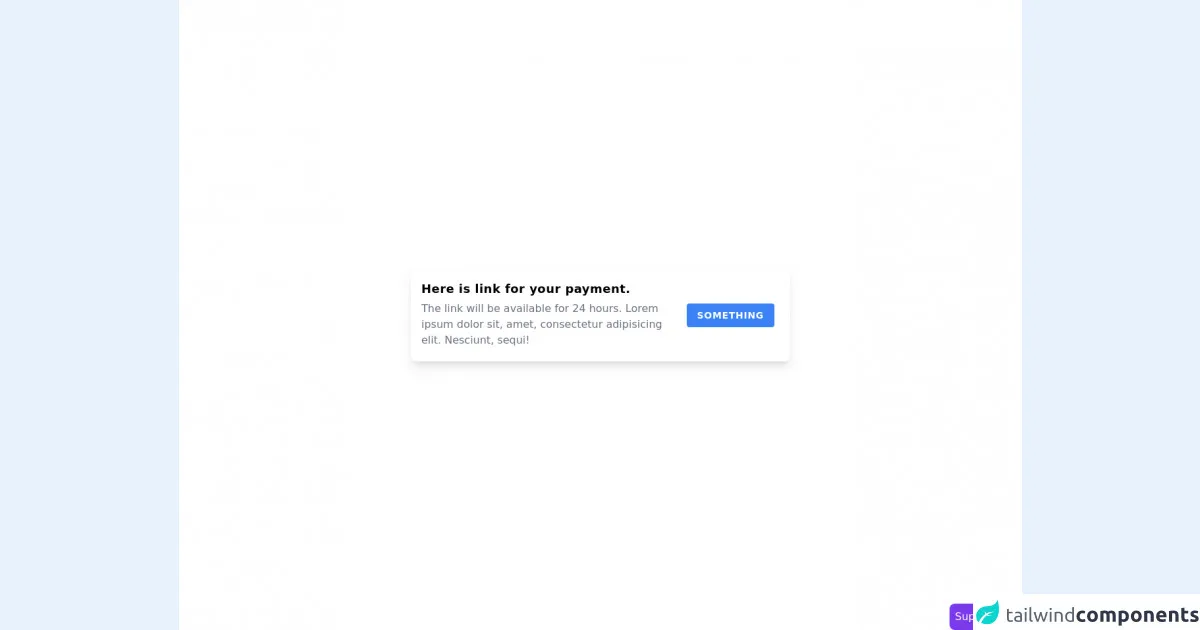
The preview of Action Panel with button on right ui component
To create an Action Panel with button on right, we will use Tailwind CSS classes to style our HTML elements. Here's a preview of what the component will look like:

Free download of the Action Panel with button on right's source code
The source code of Action Panel with button on right ui component
To create the Action Panel with button on right, we will use HTML and Tailwind CSS classes. Here's the source code:
<div class="relative">
  <button class="bg-blue-500 text-white px-4 py-2 rounded-md absolute right-0 top-0">
    Action
  </button>
  <div class="bg-gray-100 p-4 rounded-md shadow-md">
    <ul class="list-disc pl-4">
      <li>Option 1</li>
      <li>Option 2</li>
      <li>Option 3</li>
    </ul>
  </div>
</div>
<section class="flex min-h-screen items-center justify-center bg-white px-4">
  <div class="flex w-full max-w-xl flex-col rounded-lg p-4 shadow-lg md:flex-row">
    <div class="flex-1">
      <h3 class="text-lg font-semibold tracking-wide">Here is link for your payment.</h3>
      <p class="my-1 text-gray-500">
        The link will be available for 24 hours. Lorem ipsum dolor sit, amet, consectetur
        adipisicing elit. Nesciunt, sequi!
      </p>
    </div>
    <div class="mt-3 flex items-center md:mt-0 md:px-2">
      <button
        class="rounded bg-blue-500 px-4 py-2 text-sm font-bold uppercase tracking-wider text-white hover:bg-blue-600 focus:outline-none"
      >
        Something
      </button>
    </div>
  </div>
</section>

<!-- support me by buying a coffee -->
<a
  href="https://www.buymeacoffee.com/danimai"
  target="_blank"
  class="fixed right-0 bottom-0 rounded-lg bg-purple-600 p-2 text-white"
>
  Support me
</a>
Let's break down the code:
- We start by creating a
divelement with therelativeclass. This is used to position the button and the panel. - Inside the
div, we create abuttonelement with thebg-blue-500,text-white,px-4,py-2, androunded-mdclasses. These classes are used to style the button with a blue background, white text, and rounded corners. Thepx-4andpy-2classes add padding to the button to make it more clickable. - We also add the
absolute,right-0, andtop-0classes to position the button on the top right corner of the panel. - Next, we create another
divelement with thebg-gray-100,p-4,rounded-md, andshadow-mdclasses. These classes are used to style the panel with a gray background, padding, rounded corners, and a shadow effect. - Inside the panel, we create a
ulelement with thelist-discandpl-4classes. These classes are used to style the list with bullet points and left padding. - Finally, we add three
lielements to create a list of options.
How to create a Action Panel with button on right with Tailwind CSS?
Now that we have seen the preview and source code of the Action Panel with button on right, let's go over the steps to create it with Tailwind CSS:
Step 1: Set up your HTML file
Create a new HTML file and add the following code:
<!DOCTYPE html>
<html lang="en">
<head>
  <meta charset="UTF-8">
  <title>Action Panel with button on right</title>
  <link rel="stylesheet" href="https://cdn.jsdelivr.net/npm/[email protected]/dist/tailwind.min.css">
</head>
<body>
  <div class="relative">
    <button class="bg-blue-500 text-white px-4 py-2 rounded-md absolute right-0 top-0">
      Action
    </button>
    <div class="bg-gray-100 p-4 rounded-md shadow-md">
      <ul class="list-disc pl-4">
        <li>Option 1</li>
        <li>Option 2</li>
        <li>Option 3</li>
      </ul>
    </div>
  </div>
</body>
</html>
This code sets up the basic HTML structure and includes the Tailwind CSS file.
Step 2: Style the button and panel
To style the button and panel, we will use Tailwind CSS classes. Here's the code:
<button class="bg-blue-500 text-white px-4 py-2 rounded-md absolute right-0 top-0">
  Action
</button>
<div class="bg-gray-100 p-4 rounded-md shadow-md">
  <!-- List of options goes here -->
</div>
- The
bg-blue-500class sets the background color of the button to blue. - The
text-whiteclass sets the text color of the button to white. - The
px-4andpy-2classes add padding to the button to make it more clickable. - The
rounded-mdclass rounds the corners of the button. - The
absolute,right-0, andtop-0classes position the button on the top right corner of the panel. - The
bg-gray-100class sets the background color of the panel to gray. - The
p-4class adds padding to the panel. - The
rounded-mdclass rounds the corners of the panel. - The
shadow-mdclass adds a shadow effect to the panel.
Step 3: Add the list of options
To add the list of options, we will use an unordered list (ul) and list item (li) elements. Here's the code:
<div class="bg-gray-100 p-4 rounded-md shadow-md">
  <ul class="list-disc pl-4">
    <li>Option 1</li>
    <li>Option 2</li>
    <li>Option 3</li>
  </ul>
</div>
- The
list-discclass adds bullet points to the list. - The
pl-4class adds left padding to the list items.
Step 4: Add the relative class to the container
To position the button and panel correctly, we need to add the relative class to the container element. Here's the updated code:
<div class="relative">
  <button class="bg-blue-500 text-white px-4 py-2 rounded-md absolute right-0 top-0">
    Action
  </button>
  <div class="bg-gray-100 p-4 rounded-md shadow-md">
    <ul class="list-disc pl-4">
      <li>Option 1</li>
      <li>Option 2</li>
      <li>Option 3</li>
    </ul>
  </div>
</div>
Step 5: Customize the styles
If you want to customize the styles of the Action Panel with button on right, you can use Tailwind CSS classes to tweak the colors, padding, font sizes, and more. For example, you can change the background color of the panel to red by adding the bg-red-500 class:
<div class="bg-red-500 p-4 rounded-md shadow-md">
  <ul class="list-disc pl-4">
    <li>Option 1</li>
    <li>Option 2</li>
    <li>Option 3</li>
  </ul>
</div>
Conclusion
In this article, we have learned how to create an Action Panel with button on right using Tailwind CSS. We have seen the preview, source code, and steps to create the component. Tailwind CSS makes it easy to create complex UI components with minimal effort. With its pre-defined classes and customization options, you can build beautiful and responsive user interfaces in no time.