- Published on
How To Make A Account Setting With Tailwind CSS In 6 Easy Steps?
- What is Tailwind CSS?
- The description of Account Setting ui component
- Why use Tailwind CSS to create a Account Setting ui component?
- The preview of Account Setting ui component
- The source code of Account Setting ui component
- How to create a Account Setting with Tailwind CSS?
- Step 1: Set up a new HTML file
- Step 2: Add the form element
- Step 3: Add the input fields
- Step 4: Add the buttons
- Step 5: Style the form
- Step 6: Test the component
- Conclusion
What is Tailwind CSS?
Tailwind CSS is a utility-first CSS framework that allows you to create custom and responsive designs quickly. It provides a set of pre-defined classes that you can use to style your HTML elements without writing any CSS code. Tailwind CSS is easy to use and highly customizable, making it a popular choice among developers.
The description of Account Setting ui component
An account setting UI component is a user interface that allows users to manage their account settings. This component typically includes fields for users to update their personal information, change their password, and manage their notification preferences.
Why use Tailwind CSS to create a Account Setting ui component?
Tailwind CSS is a great choice for creating an account setting UI component because it provides a set of pre-defined classes that you can use to style your HTML elements without writing any CSS code. This saves you time and allows you to focus on the functionality of your component rather than the design.
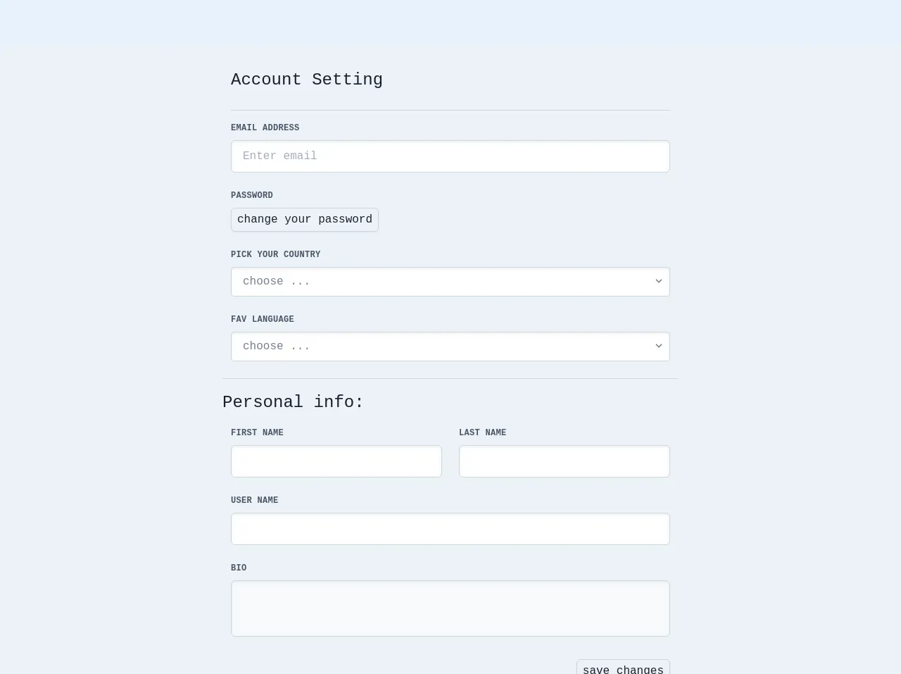
The preview of Account Setting ui component
To create an account setting UI component with Tailwind CSS, we will use a form with several input fields. The form will include fields for the user's name, email address, password, and notification preferences. We will also include buttons for submitting the form and canceling any changes.
Free download of the Account Setting's source code
The source code of Account Setting ui component
To create the account setting UI component, we will use HTML and Tailwind CSS classes. The HTML code will include a form with input fields and buttons, and we will use Tailwind CSS classes to style the form and its elements.
<!-- component -->
<div class="my-16 min-h-screen bg-gray-200 pt-2 font-mono">
  <div class="container mx-auto">
    <div class="inputs mx-auto w-full max-w-2xl p-6">
      <h2 class="text-2xl text-gray-900">Account Setting</h2>
      <form class="mt-6 border-t border-gray-400 pt-4">
        <div class="-mx-3 mb-6 flex flex-wrap">
          <div class="mb-6 w-full px-3 md:w-full">
            <label
              class="mb-2 block text-xs font-bold uppercase tracking-wide text-gray-700"
              for="grid-text-1"
              >email address</label
            >
            <input
              class="block w-full appearance-none rounded-md border border-gray-400 bg-white py-3 px-4 leading-tight text-gray-700 shadow-inner focus:border-gray-500  focus:outline-none"
              id="grid-text-1"
              type="text"
              placeholder="Enter email"
              required
            />
          </div>
          <div class="mb-6 w-full px-3 md:w-full ">
            <label class="mb-2 block text-xs font-bold uppercase tracking-wide text-gray-700"
              >password</label
            >
            <button
              class="appearance-none rounded-md border border-gray-400 bg-gray-200 px-2 py-1 text-gray-900 shadow-sm "
            >
              change your password
            </button>
          </div>
          <div class="mb-6 w-full px-3 md:w-full">
            <label class="mb-2 block text-xs font-bold uppercase tracking-wide text-gray-700"
              >pick your country</label
            >
            <div class="relative inline-block w-full flex-shrink">
              <select
                class="block w-full appearance-none rounded border border-gray-400 bg-white px-4 py-2 pr-8 text-gray-600 shadow-inner"
              >
                <option>choose ...</option>
                <option>USA</option>
                <option>France</option>
                <option>Spain</option>
                <option>UK</option>
              </select>
              <div
                class="pointer-events-none absolute top-0 right-0  mt-3 flex items-center px-2 text-gray-600"
              >
                <svg
                  class="h-4 w-4 fill-current"
                  xmlns="http://www.w3.org/2000/svg"
                  viewBox="0 0 20 20"
                >
                  <path
                    d="M9.293 12.95l.707.707L15.657 8l-1.414-1.414L10 10.828 5.757 6.586 4.343 8z"
                  />
                </svg>
              </div>
            </div>
          </div>
          <div class="mb-6 w-full px-3 md:w-full">
            <label class="mb-2 block text-xs font-bold uppercase tracking-wide text-gray-700"
              >fav language</label
            >
            <div class="relative inline-block w-full flex-shrink">
              <select
                class="block w-full appearance-none rounded border border-gray-400 bg-white px-4 py-2 pr-8 text-gray-600 shadow-inner"
              >
                <option>choose ...</option>
                <option>English</option>
                <option>France</option>
                <option>Spanish</option>
              </select>
              <div
                class="pointer-events-none absolute top-0 right-0  mt-3 flex items-center px-2 text-gray-600"
              >
                <svg
                  class="h-4 w-4 fill-current"
                  xmlns="http://www.w3.org/2000/svg"
                  viewBox="0 0 20 20"
                >
                  <path
                    d="M9.293 12.95l.707.707L15.657 8l-1.414-1.414L10 10.828 5.757 6.586 4.343 8z"
                  />
                </svg>
              </div>
            </div>
          </div>
          <div class="personal w-full border-t border-gray-400 pt-4">
            <h2 class="text-2xl text-gray-900">Personal info:</h2>
            <div class="mt-4 flex items-center justify-between">
              <div class="mb-6 w-full px-3 md:w-1/2">
                <label class="mb-2 block text-xs font-bold uppercase tracking-wide text-gray-700"
                  >first name</label
                >
                <input
                  class="block w-full appearance-none rounded-md border border-gray-400 bg-white py-3 px-4 leading-tight text-gray-700 shadow-inner focus:border-gray-500  focus:outline-none"
                  type="text"
                  required
                />
              </div>
              <div class="mb-6 w-full px-3 md:w-1/2">
                <label class="mb-2 block text-xs font-bold uppercase tracking-wide text-gray-700"
                  >last name</label
                >
                <input
                  class="block w-full appearance-none rounded-md border border-gray-400 bg-white py-3 px-4 leading-tight text-gray-700 shadow-inner focus:border-gray-500  focus:outline-none"
                  type="text"
                  required
                />
              </div>
            </div>
            <div class="mb-6 w-full px-3 md:w-full">
              <label class="mb-2 block text-xs font-bold uppercase tracking-wide text-gray-700"
                >user name</label
              >
              <input
                class="block w-full appearance-none rounded-md border border-gray-400 bg-white py-3 px-4 leading-tight text-gray-700 shadow-inner focus:border-gray-500  focus:outline-none"
                type="text"
                required
              />
            </div>
            <div class="mb-6 w-full px-3 md:w-full">
              <label class="mb-2 block text-xs font-bold uppercase tracking-wide text-gray-700"
                >Bio</label
              >
              <textarea
                class="h-20 w-full resize-none rounded-md border border border-gray-400 bg-gray-100 py-2 px-3 font-medium leading-normal placeholder-gray-700 shadow-inner focus:bg-white focus:outline-none"
                required
              ></textarea>
            </div>
            <div class="flex justify-end">
              <button
                class="mr-3 appearance-none rounded-md border border-gray-400 bg-gray-200 px-2 py-1 text-gray-900 shadow-sm"
                type="submit"
              >
                save changes
              </button>
            </div>
          </div>
        </div>
      </form>
    </div>
  </div>
</div>
How to create a Account Setting with Tailwind CSS?
Here are the six easy steps to create an account setting UI component with Tailwind CSS:
Step 1: Set up a new HTML file
Create a new HTML file and add the basic structure of an HTML document. We will use this file to build our account setting UI component.
Step 2: Add the form element
Add a form element to your HTML file. This will be the container for all the input fields and buttons.
<form class="w-full max-w-lg mx-auto">
  <!-- Input fields and buttons will go here -->
</form>
Step 3: Add the input fields
Add the input fields for the user's name, email address, password, and notification preferences. We will use Tailwind CSS classes to style these input fields.
<div class="mb-4">
  <label class="block text-gray-700 font-bold mb-2" for="name">
    Name
  </label>
  <input
    class="shadow appearance-none border rounded w-full py-2 px-3 text-gray-700 leading-tight focus:outline-none focus:shadow-outline"
    id="name"
    type="text"
    placeholder="John Doe"
  >
</div>
<div class="mb-4">
  <label class="block text-gray-700 font-bold mb-2" for="email">
    Email Address
  </label>
  <input
    class="shadow appearance-none border rounded w-full py-2 px-3 text-gray-700 leading-tight focus:outline-none focus:shadow-outline"
    id="email"
    type="email"
    placeholder="[email protected]"
  >
</div>
<div class="mb-4">
  <label class="block text-gray-700 font-bold mb-2" for="password">
    Password
  </label>
  <input
    class="shadow appearance-none border rounded w-full py-2 px-3 text-gray-700 leading-tight focus:outline-none focus:shadow-outline"
    id="password"
    type="password"
    placeholder="********"
  >
</div>
<div class="mb-4">
  <label class="block text-gray-700 font-bold mb-2">
    Notification Preferences
  </label>
  <div>
    <label class="inline-flex items-center">
      <input
        type="checkbox"
        class="form-checkbox h-5 w-5 text-gray-600"
        checked
      >
      <span class="ml-2 text-gray-700">Email</span>
    </label>
    <label class="inline-flex items-center ml-6">
      <input
        type="checkbox"
        class="form-checkbox h-5 w-5 text-gray-600"
      >
      <span class="ml-2 text-gray-700">SMS</span>
    </label>
  </div>
</div>
Step 4: Add the buttons
Add the buttons for submitting the form and canceling any changes. We will use Tailwind CSS classes to style these buttons.
<div class="flex items-center justify-between">
  <button
    class="bg-blue-500 hover:bg-blue-700 text-white font-bold py-2 px-4 rounded focus:outline-none focus:shadow-outline"
    type="button"
  >
    Save Changes
  </button>
  <button
    class="bg-gray-500 hover:bg-gray-700 text-white font-bold py-2 px-4 rounded focus:outline-none focus:shadow-outline"
    type="button"
  >
    Cancel
  </button>
</div>
Step 5: Style the form
Use Tailwind CSS classes to style the form and its elements. You can customize the styles to match your design.
<form class="w-full max-w-lg mx-auto">
  <div class="mb-4">
    <label class="block text-gray-700 font-bold mb-2" for="name">
      Name
    </label>
    <input
      class="shadow appearance-none border rounded w-full py-2 px-3 text-gray-700 leading-tight focus:outline-none focus:shadow-outline"
      id="name"
      type="text"
      placeholder="John Doe"
    >
  </div>
  <div class="mb-4">
    <label class="block text-gray-700 font-bold mb-2" for="email">
      Email Address
    </label>
    <input
      class="shadow appearance-none border rounded w-full py-2 px-3 text-gray-700 leading-tight focus:outline-none focus:shadow-outline"
      id="email"
      type="email"
      placeholder="[email protected]"
    >
  </div>
  <div class="mb-4">
    <label class="block text-gray-700 font-bold mb-2" for="password">
      Password
    </label>
    <input
      class="shadow appearance-none border rounded w-full py-2 px-3 text-gray-700 leading-tight focus:outline-none focus:shadow-outline"
      id="password"
      type="password"
      placeholder="********"
    >
  </div>
  <div class="mb-4">
    <label class="block text-gray-700 font-bold mb-2">
      Notification Preferences
    </label>
    <div>
      <label class="inline-flex items-center">
        <input
          type="checkbox"
          class="form-checkbox h-5 w-5 text-gray-600"
          checked
        >
        <span class="ml-2 text-gray-700">Email</span>
      </label>
      <label class="inline-flex items-center ml-6">
        <input
          type="checkbox"
          class="form-checkbox h-5 w-5 text-gray-600"
        >
        <span class="ml-2 text-gray-700">SMS</span>
      </label>
    </div>
  </div>
  <div class="flex items-center justify-between">
    <button
      class="bg-blue-500 hover:bg-blue-700 text-white font-bold py-2 px-4 rounded focus:outline-none focus:shadow-outline"
      type="button"
    >
      Save Changes
    </button>
    <button
      class="bg-gray-500 hover:bg-gray-700 text-white font-bold py-2 px-4 rounded focus:outline-none focus:shadow-outline"
      type="button"
    >
      Cancel
    </button>
  </div>
</form>
Step 6: Test the component
Open your HTML file in a web browser and test the account setting UI component. Make sure that the input fields and buttons are functional and that the styles look correct.
Conclusion
Creating an account setting UI component with Tailwind CSS is easy and efficient. By using pre-defined classes, you can quickly style your HTML elements and focus on the functionality of your component. With these six easy steps, you can create a custom and responsive account setting UI component that meets your needs.