- Published on
The Ninja Guide To How To Create A Accordion Flush With Tailwind CSS Better
- What is Tailwind CSS?
- The description of Accordion Flush ui component
- Why use Tailwind CSS to create a Accordion Flush ui component?
- The preview of Accordion Flush ui component
- The source code of Accordion Flush ui component
- How to create a Accordion Flush with Tailwind CSS?
- Conclusion
What is Tailwind CSS?
Tailwind CSS is a utility-first CSS framework that provides a set of pre-defined CSS classes to help you build custom designs quickly. It allows you to create responsive, mobile-first designs with ease. Tailwind CSS is highly customizable and can be used with any front-end framework or library.
The description of Accordion Flush ui component
Accordion Flush is a user interface component that allows users to expand and collapse content sections. It is a popular design pattern used in many websites and applications. The Accordion Flush component is a variation of the traditional accordion design, where the content sections are flush with each other, creating a seamless and modern look.
Why use Tailwind CSS to create a Accordion Flush ui component?
Tailwind CSS provides a set of pre-defined CSS classes that can be used to create the Accordion Flush component quickly and easily. It eliminates the need to write custom CSS code, which can be time-consuming and error-prone. With Tailwind CSS, you can create a responsive and mobile-first design that looks great on any device.
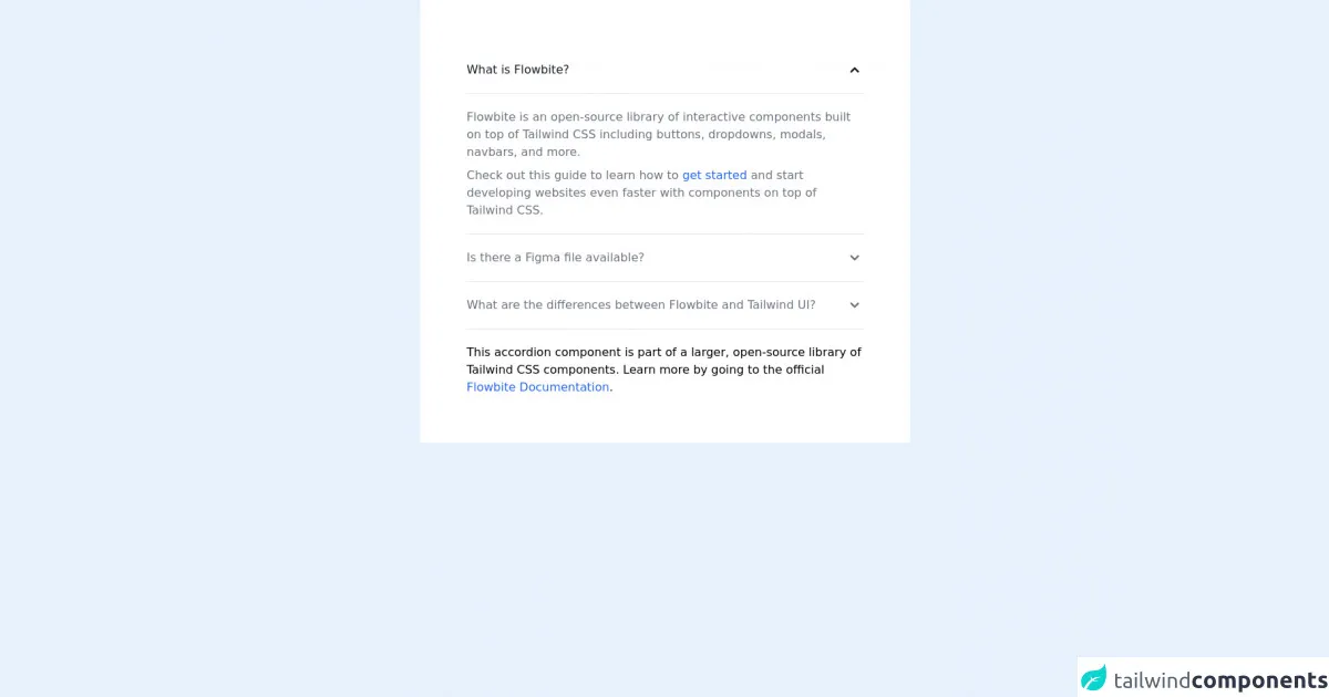
The preview of Accordion Flush ui component
The Accordion Flush component is a modern and sleek design pattern that is perfect for displaying content in a clean and organized way. It allows users to easily expand and collapse content sections, making it ideal for websites and applications that have a lot of information to display.
Free download of the Accordion Flush's source code
The source code of Accordion Flush ui component
The source code for the Accordion Flush component is relatively simple and can be created using only a few CSS classes. The HTML structure consists of a parent container with child elements for each content section. The CSS classes are used to style the container and child elements, as well as to add the expand and collapse functionality.
<!-- This is an example component -->
<div class="mx-auto max-w-2xl rounded bg-white p-16">
  <div
    id="accordion-flush"
    data-accordion="collapse"
    data-active-classes="bg-white dark:bg-gray-900 text-gray-900 dark:text-white"
    data-inactive-classes="text-gray-500 dark:text-gray-400"
  >
    <h2 id="accordion-flush-heading-1">
      <button
        type="button"
        class="flex w-full items-center justify-between rounded-t-xl border-b border-gray-200 py-5 text-left font-medium text-gray-900 dark:border-gray-700 dark:text-white"
        data-accordion-target="#accordion-flush-body-1"
        aria-expanded="true"
        aria-controls="accordion-flush-body-1"
      >
        <span>What is Flowbite?</span>
        <svg
          data-accordion-icon
          class="h-6 w-6 shrink-0 rotate-180"
          fill="currentColor"
          viewBox="0 0 20 20"
          xmlns="http://www.w3.org/2000/svg"
        >
          <path
            fill-rule="evenodd"
            d="M5.293 7.293a1 1 0 011.414 0L10 10.586l3.293-3.293a1 1 0 111.414 1.414l-4 4a1 1 0 01-1.414 0l-4-4a1 1 0 010-1.414z"
            clip-rule="evenodd"
          ></path>
        </svg>
      </button>
    </h2>
    <div id="accordion-flush-body-1" aria-labelledby="accordion-flush-heading-1">
      <div class="border-b border-gray-200 py-5 dark:border-gray-700">
        <p class="mb-2 text-gray-500 dark:text-gray-400">
          Flowbite is an open-source library of interactive components built on top of Tailwind CSS
          including buttons, dropdowns, modals, navbars, and more.
        </p>
        <p class="text-gray-500 dark:text-gray-400">
          Check out this guide to learn how to
          <a
            href="https://flowbite.com/docs/getting-started/introduction/"
            class="text-blue-600 hover:underline dark:text-blue-500"
            >get started</a
          >
          and start developing websites even faster with components on top of Tailwind CSS.
        </p>
      </div>
    </div>
    <h2 id="accordion-flush-heading-2">
      <button
        type="button"
        class="flex w-full items-center justify-between border-b border-gray-200 py-5 text-left font-medium text-gray-500 dark:border-gray-700 dark:text-gray-400"
        data-accordion-target="#accordion-flush-body-2"
        aria-expanded="false"
        aria-controls="accordion-flush-body-2"
      >
        <span>Is there a Figma file available?</span>
        <svg
          data-accordion-icon
          class="h-6 w-6 shrink-0"
          fill="currentColor"
          viewBox="0 0 20 20"
          xmlns="http://www.w3.org/2000/svg"
        >
          <path
            fill-rule="evenodd"
            d="M5.293 7.293a1 1 0 011.414 0L10 10.586l3.293-3.293a1 1 0 111.414 1.414l-4 4a1 1 0 01-1.414 0l-4-4a1 1 0 010-1.414z"
            clip-rule="evenodd"
          ></path>
        </svg>
      </button>
    </h2>
    <div id="accordion-flush-body-2" class="hidden" aria-labelledby="accordion-flush-heading-2">
      <div class="border-b border-gray-200 py-5 dark:border-gray-700">
        <p class="mb-2 text-gray-500 dark:text-gray-400">
          Flowbite is first conceptualized and designed using the Figma software so everything you
          see in the library has a design equivalent in our Figma file.
        </p>
        <p class="text-gray-500 dark:text-gray-400">
          Check out the
          <a
            href="https://flowbite.com/figma/"
            class="text-blue-600 hover:underline dark:text-blue-500"
            >Figma design system</a
          >
          based on the utility classes from Tailwind CSS and components from Flowbite.
        </p>
      </div>
    </div>
    <h2 id="accordion-flush-heading-3">
      <button
        type="button"
        class="flex w-full items-center justify-between border-b border-gray-200 py-5 text-left font-medium text-gray-500 dark:border-gray-700 dark:text-gray-400"
        data-accordion-target="#accordion-flush-body-3"
        aria-expanded="false"
        aria-controls="accordion-flush-body-3"
      >
        <span>What are the differences between Flowbite and Tailwind UI?</span>
        <svg
          data-accordion-icon
          class="h-6 w-6 shrink-0"
          fill="currentColor"
          viewBox="0 0 20 20"
          xmlns="http://www.w3.org/2000/svg"
        >
          <path
            fill-rule="evenodd"
            d="M5.293 7.293a1 1 0 011.414 0L10 10.586l3.293-3.293a1 1 0 111.414 1.414l-4 4a1 1 0 01-1.414 0l-4-4a1 1 0 010-1.414z"
            clip-rule="evenodd"
          ></path>
        </svg>
      </button>
    </h2>
    <div id="accordion-flush-body-3" class="hidden" aria-labelledby="accordion-flush-heading-3">
      <div class="border-b border-gray-200 py-5 dark:border-gray-700">
        <p class="mb-2 text-gray-500 dark:text-gray-400">
          The main difference is that the core components from Flowbite are open source under the
          MIT license, whereas Tailwind UI is a paid product. Another difference is that Flowbite
          relies on smaller and standalone components, whereas Tailwind UI offers sections of pages.
        </p>
        <p class="mb-2 text-gray-500 dark:text-gray-400">
          However, we actually recommend using both Flowbite, Flowbite Pro, and even Tailwind UI as
          there is no technical reason stopping you from using the best of two worlds.
        </p>
        <p class="mb-2 text-gray-500 dark:text-gray-400">Learn more about these technologies:</p>
        <ul class="list-disc pl-5 text-gray-500 dark:text-gray-400">
          <li>
            <a
              href="https://flowbite.com/pro/"
              class="text-blue-600 hover:underline dark:text-blue-500"
              >Flowbite Pro</a
            >
          </li>
          <li>
            <a
              href="https://tailwindui.com/"
              rel="nofollow"
              class="text-blue-600 hover:underline dark:text-blue-500"
              >Tailwind UI</a
            >
          </li>
        </ul>
      </div>
    </div>
  </div>

  <p class="mt-5">
    This accordion component is part of a larger, open-source library of Tailwind CSS components.
    Learn more by going to the official
    <a
      class="text-blue-600 hover:underline"
      href="https://flowbite.com/docs/getting-started/introduction/"
      target="_blank"
      >Flowbite Documentation</a
    >.
  </p>
  <script src="https://unpkg.com/[email protected]/dist/flowbite.js"></script>
</div>
How to create a Accordion Flush with Tailwind CSS?
To create an Accordion Flush component with Tailwind CSS, follow these steps:
- Create a parent container element and add the
divide-yclass to it. This class adds a dividing line between each child element.
<div class="divide-y">
- Create child elements for each content section and add the
py-4andpx-6classes to them. These classes add padding to the top and bottom and left and right of each child element.
<div class="py-4 px-6">
  <h2 class="text-lg font-medium">Section 1</h2>
  <p class="mt-1">Lorem ipsum dolor sit amet, consectetur adipiscing elit.</p>
</div>
- Add the
cursor-pointerclass to each child element to make it clickable.
<div class="py-4 px-6 cursor-pointer">
  <h2 class="text-lg font-medium">Section 1</h2>
  <p class="mt-1">Lorem ipsum dolor sit amet, consectetur adipiscing elit.</p>
</div>
- Add the
transition-allclass to the parent container element to add a smooth transition when expanding and collapsing content sections.
<div class="divide-y transition-all">
- Add the
h-0andoverflow-hiddenclasses to each child element to hide the content section by default.
<div class="py-4 px-6 cursor-pointer h-0 overflow-hidden">
  <h2 class="text-lg font-medium">Section 1</h2>
  <p class="mt-1">Lorem ipsum dolor sit amet, consectetur adipiscing elit.</p>
</div>
- Add the
group-hover:h-autoclass to each child element to expand the content section when it is clicked.
<div class="py-4 px-6 cursor-pointer h-0 overflow-hidden group-hover:h-auto">
  <h2 class="text-lg font-medium">Section 1</h2>
  <p class="mt-1">Lorem ipsum dolor sit amet, consectetur adipiscing elit.</p>
</div>
Repeat steps 2-6 for each content section.
Add any additional CSS classes or styles as needed to customize the design.
Conclusion
Creating an Accordion Flush component with Tailwind CSS is a simple and efficient way to add a modern and sleek design pattern to your website or application. With Tailwind CSS, you can create responsive and mobile-first designs that look great on any device. By following the steps outlined in this guide, you can create a beautiful and functional Accordion Flush component in no time.